In the first article in this series, I provided an overview of registered index-linked annuities (RILAs) and in the second article, I contrasted different approaches (DIY, ETF, and RILA)to implement options-based strategies. In this article, I’m going to more dig into buffer-and-floor strategies, with a particular focus on the underlying options-pricing dynamics. Buffers subject the investor to tail risk (i.e., large possible negative returns), while floors limit losses to some predefined level (e.g., 10%).
Options-pricing dynamics mean the relative attractiveness of floors and buffers is going to vary over time, where buffers will be more attractive when implied volatility is higher (e.g., now). Overall, though, historical evidence shows that buffers are likely to offer more attractive return profiles than floors, given the shape of the historical implied-volatility curve. While buffers subject the investor to tail risk, the risk exposure is effectively identical to what an investor would experience if he or she owned the underlying index directly (e.g., the S&P 500). Therefore, the tail risk needs to be considered in the correct context.
In the next (and final) piece of this series, I’m going to provide some context as to how these options-based strategies can fit within a total-portfolio structure, using a utility-based resampled optimization framework.
Buffers and floors: A brief review
There are two primary options-based strategies considered in this series, both of which are common in RILAs as well as a growing number of ETFs: floors and buffers. With floor products, the downside is limited to a stated percentage, such as 10%. For example, if the floor is 10%, you can’t lose more than 10% regardless of the return of the underlier (e.g., the S&P 500). A RILA (or ETF) with a 0% floor would have the same risk profile as a fixed-index annuity (FIA).
With buffer products, some of the loss is absorbed first by the product, based on the buffer level; the investor suffers any loss beyond that point. For example, if the buffer is 10% and the return of the underlier is -40%, the annuitant would lose 30%. If the return of the underlier is negative, but not less than the noted buffer, the investor return would be 0%.
Floors are considered more “bond-like” than buffers, since the maximum negative return is known in advance; however, their risk depends on the respective level. For example, a product with a 20% floor is still relatively risky (i.e., relatively “equity-like”).
Buffers versus floors: Evolving cap rates
Assuming a constant interest rate (i.e., the same product structure), the difference in the upside potential (i.e., “cap rate”) between buffers and floors will be based on the difference in the costs of the underlying financial options used to build the products (i.e., puts and calls).
The upside for a floor strategy is generated by selling an at-the-money put option and buying an out-of-the-money put option. The greater the floor (i.e., the greater the potential downside), the greater the upside potential.
The upside for a buffer strategy is generated by selling an out-of-the-money put option. The smaller the buffer (e.g., 10% versus 20%), the greater the upside potential.
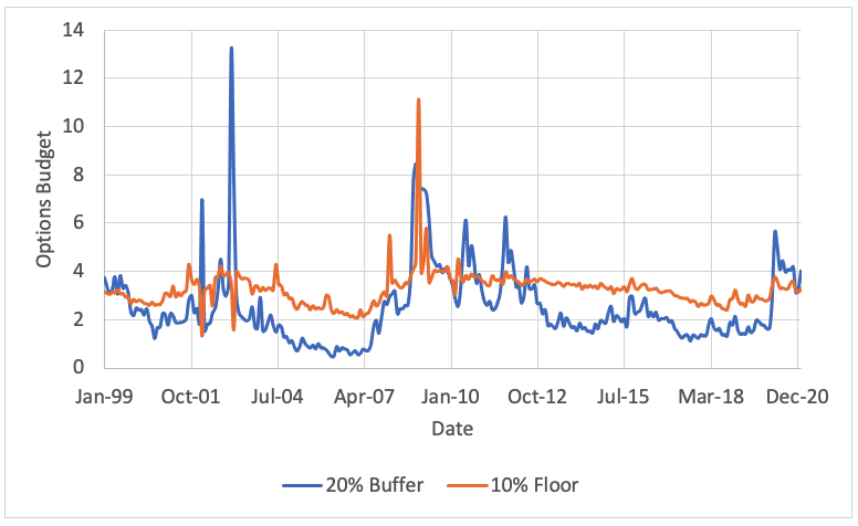
The premiums generated by these strategies have varied over time, as demonstrated in the exhibit below, which includes an estimate of the premiums (or options budget) generated from a 20% buffer and a 10% floor strategy from December 1999 to December 2020 based on options prices obtained from deltaneutral.com on SPX (i.e., the S&P 500). I selected those two strategies since they’ve had relatively similar average options budgets over the period.
Historical premium for a 20% buffer and 10% floor: December 1999 to December 2020
The differences in the respective options budgets shows there are going to be periods when the potential upside varies between the strategies. This is important since, while this article focuses on the long-term averages, the pricing environment plays a significant role when determining the appropriate strategy for a client.
Implied volatility
One of the most important assumptions in options-pricing models, such as Black-Scholes1, is implied volatility. Implied volatility is not directly observable and instead is “implied” by the market price of the option (hence its name). It is the volatility (i.e., input) that yields a theoretical value for the option equal to the market price of that option when using a given pricing model. While implied volatility has been historically correlated to past (realized) volatility, it is a forward-looking measure.
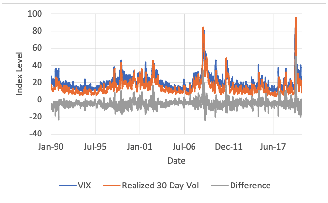
The exhibit below provides some perspective as to how implied volatility has varied over time, based on the historical values of the VIX Index and the Cboe S&P 500 1-Year Volatility Index (which has a January 2007 inception date) from January 1990 to December 2020.
Historical implied volatility: January 1990 to December 2020
There have been notable spikes in implied volatility over the period, which tend to occur after major market events.
Implied volatility has generally been higher than realized volatility, as demonstrated in the exhibit below, which uses 30-day volatility metrics. For this analysis, I estimated realized volatility using the same approach as the S&P 500 for its realized volatility indexes,2 which is based on the 21-day absolute-rolling deviation in S&P 500 price returns.
Historical implied and realized 30-day volatility: 1990-2020
The fact that realized volatility is typically less than implied volatility means that options are generally overpriced. The actual volatility is lower than the expected (or implied) volatility used to price the option. This suggests the average expected value of buying an option is likely negative; however, the value of selling an option could be positive.
Implied volatility across strike prices
Implied volatility is not generally constant across strike prices. The effect is often described by its shape, which tends to either resemble a smile or a “smirk.”
Differences in implied volatility across strike prices are important because implementing buffer or floor strategies requires buying and selling different options. For example, a floor requires buying an out-of-the-money put option while a buffer requires selling one. The cost and expected payout of those options have implications when determining the efficacy of the respective approach.
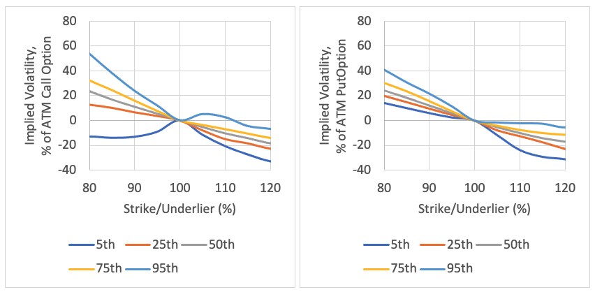
In the exhibit below, I show that variation using at-the-money implied volatility for calls and puts for one-year options (i.e., its historical shape) on SPX (i.e., the S&P 500) obtained from deltaneutral.com from January 1990 to December 2020. Since options that have a precise one-year expiration are not generally available, I used interpolation and ran a series of regressions to estimate the costs over time.
Differences in implied volatility estimates versus at-the-money strike options: December 1990 – January 2020
Call options Put options
Implied volatility for one-year options has exhibited a smirk for both calls and puts. This means in-the-money call options and out-of-the-money put options have historically had higher levels of implied volatility than out-of-the-money call options and in-the-money put options.
When implementing a buffer strategy, an investor is effectively “buying” tail risk by selling an out-of-the-money put option. The premium for this option has historically been relatively expensive compared to the actual underlying risk of the underlier (i.e., implied volatility is generally higher than realized volatility, on average, and the implied volatility for out-of-the-money put options is especially higher, which creates additional funds to generate upside).
In contrast, while the floor strategy does buy some risk (e.g., selling the at-the-money put option), it also requires buying an out-of-the-money put option. This out-of-the-money option is relatively expensive (when considering how implied volatility changes across strike prices), which reduces the overall options budget associated with the approach (versus a buffer).
Return distributions
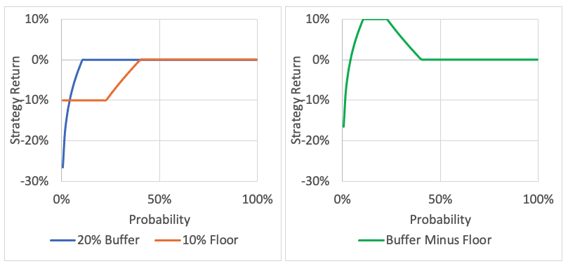
The exhibit below shows the expected negative returns for a 10% floor and 20% buffer strategy (i.e., focusing only on the downside risks). The potential upside of the strategies is ignored (i.e., only the downside risk is considered) because the upside (i.e., cap rate) will depend on the key pricing assumptions (e.g., implied volatility), which is addressed next.
These strategies are selected since they typically have relatively similar cap rates (see previous exhibit). The analysis assumes a price return of 5% and a standard deviation of 20% for the underlier.
Return profiles: 20% buffer strategy vs. 10% floor strategy
Strategy returns Strategy return differences
Given the key assumption (mean return of 5% and a standard deviation of 20%), the return of the underlier will be negative approximately 40% of the time, and less than -20% only 10% of the time. Therefore the 20% buffer returns are mostly zero (i.e., ~90% of the time). For an investor with a 20% buffer strategy to experience a loss, the equity return must be worse than the respective target level, which is 20% in this case.
In this example, the buffer strategy will be worse than the floor strategy if the price return of the index is less than -30%. At that point, the return of the buffer and the floor strategy would both be -10%.
Annual equity returns lower than -30% are relatively rare. Assuming a normal distribution, with an average return of 5% and a standard deviation of 20%, this occurs in approximately 4% of scenarios. Focusing on calendar year returns of the S&P 500 from 1872 to 2020, based on data obtained from Robert Shiller’s website,3 the price return of the S&P 500 has been less than -30% in five out of the 149 calendar years available, or 3.4% of the time.
If we assume implied volatility for at-the-money put options is 25%, the implied volatility for a put option used for a 20% buffer strategy would likely be closer to 30%. Assuming an average return of 5% and a standard deviation of 30% (consistent with the implied volatility in options pricing), the probability of the price return of the S&P 500 being less than -30% is approximately 12%. The tail risk, as estimated by the implied volatility, is approximately three times more than the historical average.
While the 20% buffer strategy return can be much lower than the 10% floor, that doesn’t mean the strategy is less efficient. Instead of owning the buffer, the investor could have owned the underlier (S&P 500). In other words, an investor can have exposure to the tail risk in different ways, either by owning the underlier (which is most common) or through options. The key is contrasting the relative benefits of the different approaches, which I’ll explore in part 4.
Even if the realized standard deviation increases or the negative tail has additional skewness or kurtosis, the average return of the 20% buffer is going to be higher than the 10% floor strategy by approximately 2%. This means if the cap rates for the products were identical, the buffer would outperform the floor approach by 2%. The historical options budgets for the approaches have been different, but not enough to make up for this difference.
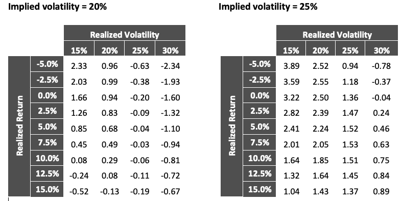
While the 10% floor may result in a higher premium than the 20% buffer strategy (depending on pricing assumptions such as the implied volatility level), it is not generally enough to offset the lower expected average return when considering outcomes. This effect is demonstrated below, which includes the expected premium generated by the strategies (in addition to the returns), where the options are priced assuming a risk-free rate of 1% and implied volatility level of 20% and 25%. The results are the differences in the returns of the 20% buffer strategy versus the 10% floor strategy (i.e., how much better is the buffer versus floor).
Average return differences in the 20% buffer strategy minus a 10% floor strategy
If implied volatility is only 20%, the return of the 20% buffer strategy exceeds the return of the 10% floor strategy (even after considering the premium differences), as long as the realized volatility is less than 25%. From a payout perspective, higher implied volatility makes buffers more attractive than floors, ceteris paribus. These estimates are for a risk-neutral investor, and the effective benefits of the strategies will change when considering risk aversion.
Conclusions
This article explored the pricing and risk considerations associated with buffer and floor strategies. The relative attractiveness of each strategy will vary based on market dynamics (e.g., options pricing); however, historical evidence shows that buffers generate more upside (i.e., they have a greater options budget) given the shape of implied volatility across strike prices (the “smirk”) and the respective financial options used to create the market exposures.
While the tail risk in buffer strategies can be scary (black swans!), it needs to be put in the correct context; owning equities involves tail risk.
All this is not to say that floor strategies don’t work. They do, especially for investors who are risk averse and looking for upside as a replacement for other “safe” assets like fixed income. I’ll explore this more directly in the next article.
David Blanchett is head of retirement research for Morningstar Investment Management LLC. Views expressed are his own and do not necessarily reflect the views of Morningstar Investment Management LLC. This blog is provided for informational purposes only and should not be construed by any person as a solicitation to effect or attempt to effect transactions in securities or the rendering of investment advice.
Note: References to specific securities or other investment options should not be considered an endorsement of or a recommendation or offer to purchase or sell that specific investment.
1 Black, Fischer and Myron Scholes. 1973. "The Pricing of Options and Corporate Liabilities." Journal of Political Economy, vol. 81, no. 3: 637–654.
2 https://www.spglobal.com/spdji/en/documents/methodologies/methodology-realized-vol-indices.pdf
3 http://www.econ.yale.edu/~shiller/data.htm
Read more articles by David Blanchett
 In the first article in this series, I provided an overview of registered index-linked annuities (RILAs) and in the second article, I contrasted different approaches (DIY, ETF, and RILA)to implement options-based strategies. In this article, I’m going to more dig into buffer-and-floor strategies, with a particular focus on the underlying options-pricing dynamics. Buffers subject the investor to tail risk (i.e., large possible negative returns), while floors limit losses to some predefined level (e.g., 10%).