Navigating the macroeconomic landscape in the first half of 2026 has been a study in contrasts. Markets have marched toward all-time highs even as historic valuation metrics flash warning signs behind the scenes. To help make sense of the volatile year so far, we are looking back at the data points that captured the most attention.
These are our top 10 most-read charts from the first six months of the year, tracking everything from underlying equity trends and historic debt levels to real-world consumer pressures.
-
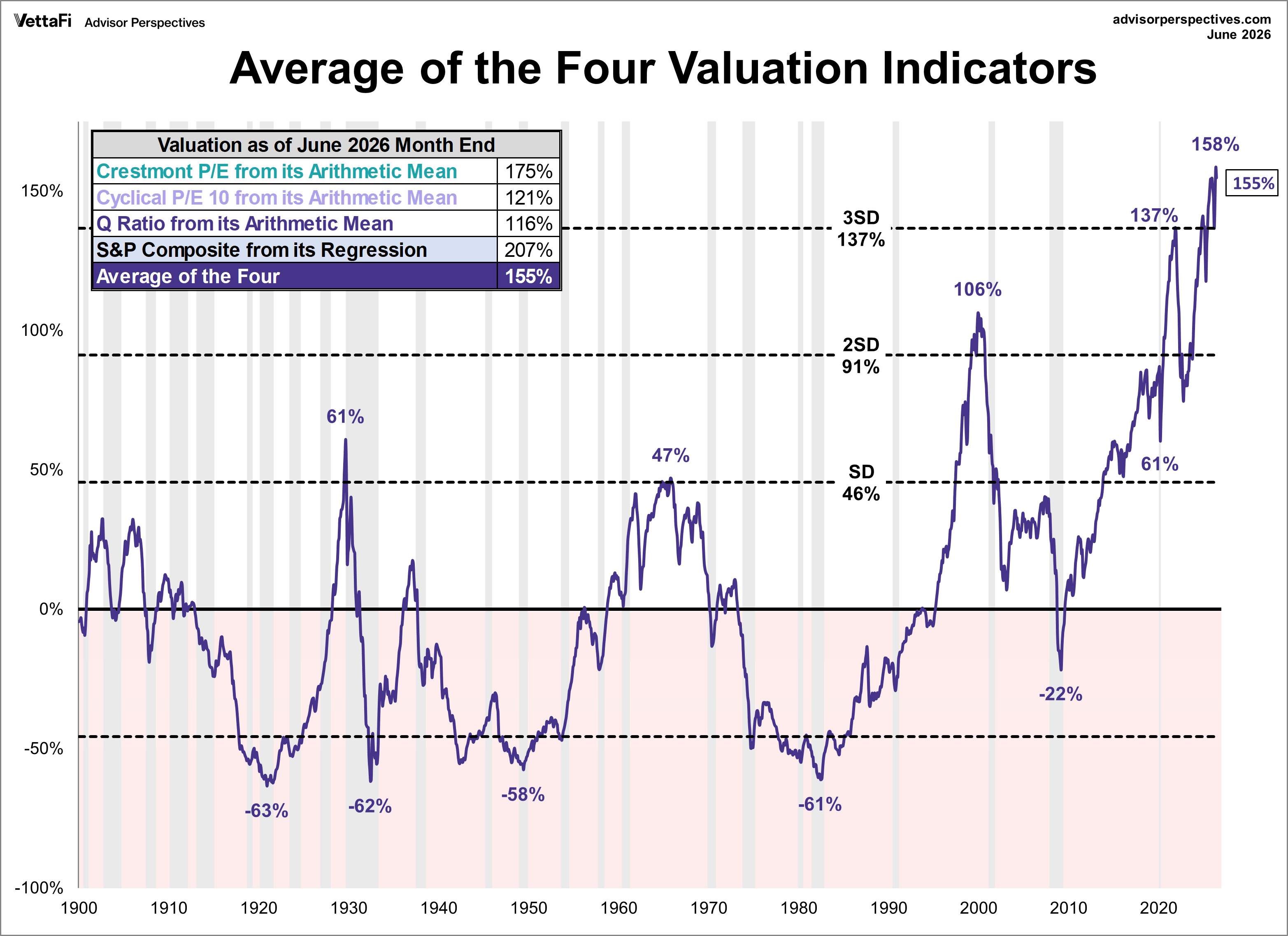
When assessing long-term equity risk, relying on a single metric can create blind spots. A comparative analysis of four foundational valuation indicators (Regression to Trend, Crestmont P/E, Q-Ratio, and the P/E 10) reveals an undeniable consensus: the S&P 500 is historically stretched. Based on the latest monthly data, the market is OVERVALUED somewhere in the range of 116% to 207%, depending on the indicator. This represents one of the highest overvaluation ranges in market history.

-
Bull markets are fueled by confidence, but they can also be amplified by leverage. Margin debt, the capital investors borrow from brokers to purchase securities, climbed to a record-breaking $1.42 trillion in May. While high margin debt can signal confidence, extreme spikes may also signal excessive speculation and increase the risk of market instability.
-
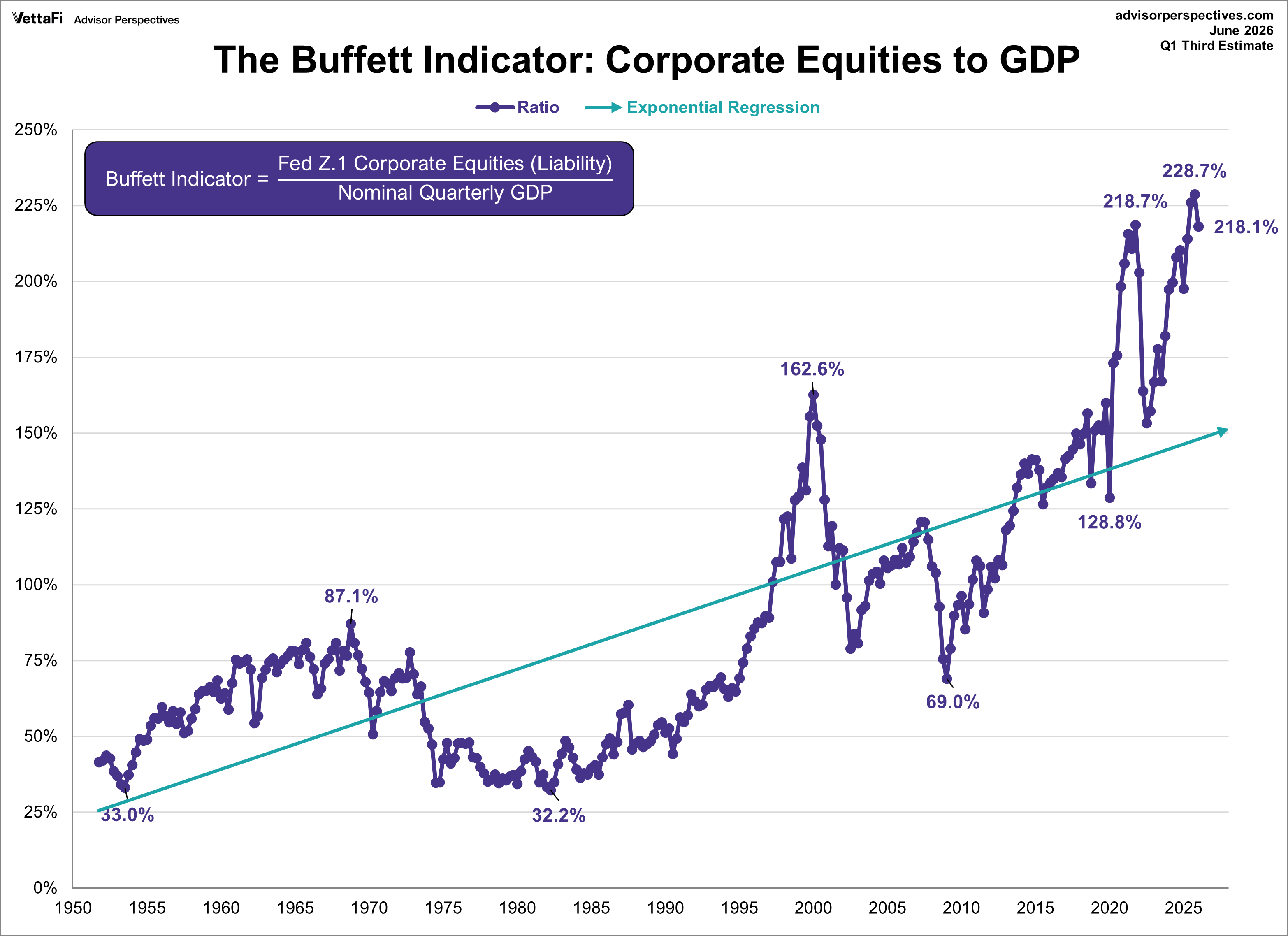
Often cited as Warren Buffett’s preferred macro metric, this chart compares the total market value of publicly traded stocks U.S. GDP. In Q1 2026, the Buffett Indicator stood at 218.1%, placing it a staggering 56.6% above its historical trendline.
-
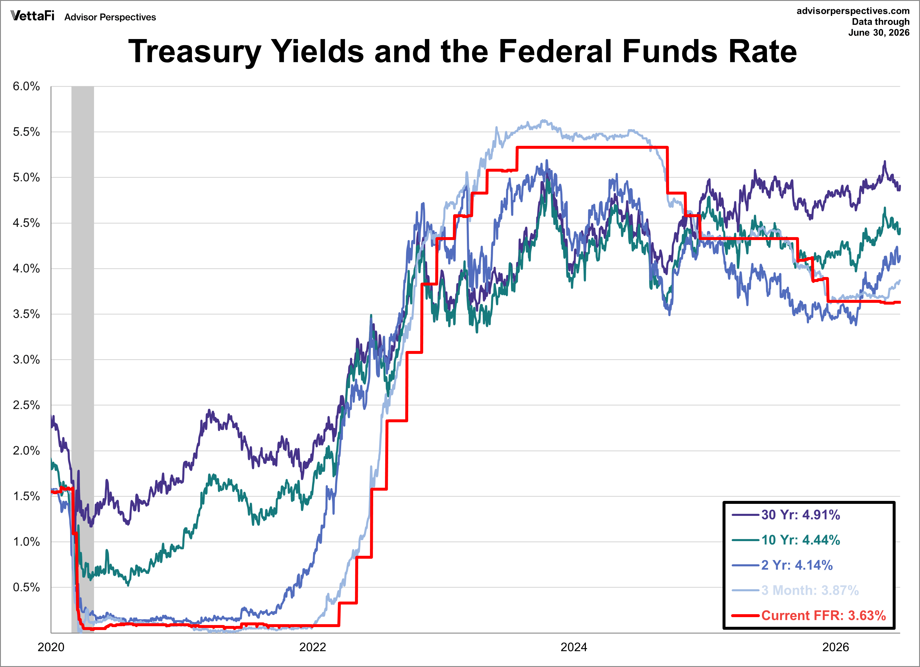
Fixed income markets spent the first half of the year navigating shifting monetary policy expectations. The 10-year Treasury note fluctuated between a range of 3.97% to 4.67% before concluding June at 4.44%. Meanwhile, the 2-year note moved between a 3.38% to 4.24% range across the first six months, ultimately settling at 4.14%.
-
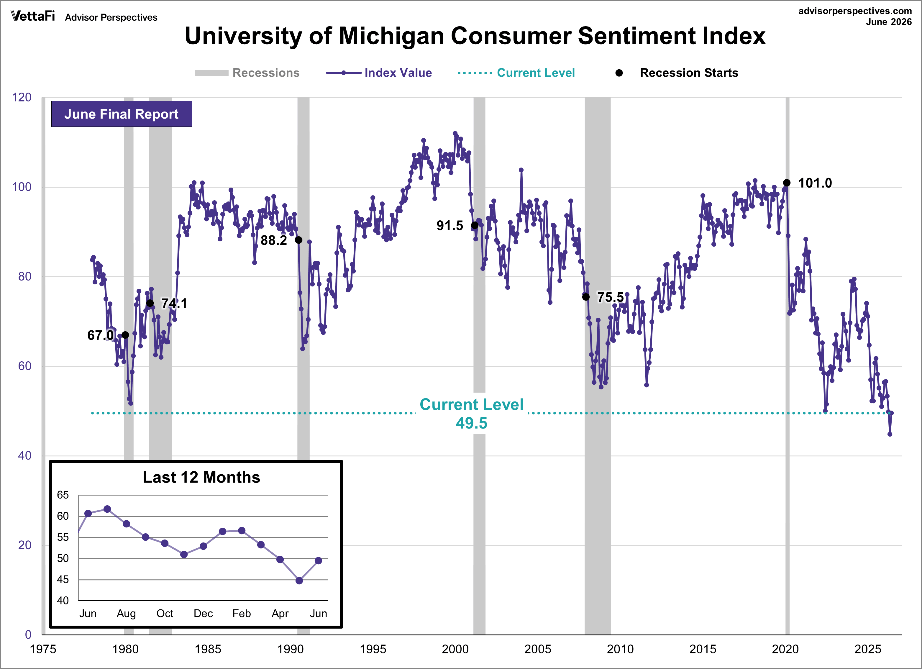
While financial markets flirted with highs, consumer confidence told a different story. The University of Michigan Consumer Sentiment Index saw its sharpest one-month improvement in a year, jumping 10.5% to land at 49.5 to close out the first half. Yet, despite this bounce, June’s reading represents the second-lowest level in the history of the index, beating out only the previous month's historic low.
-
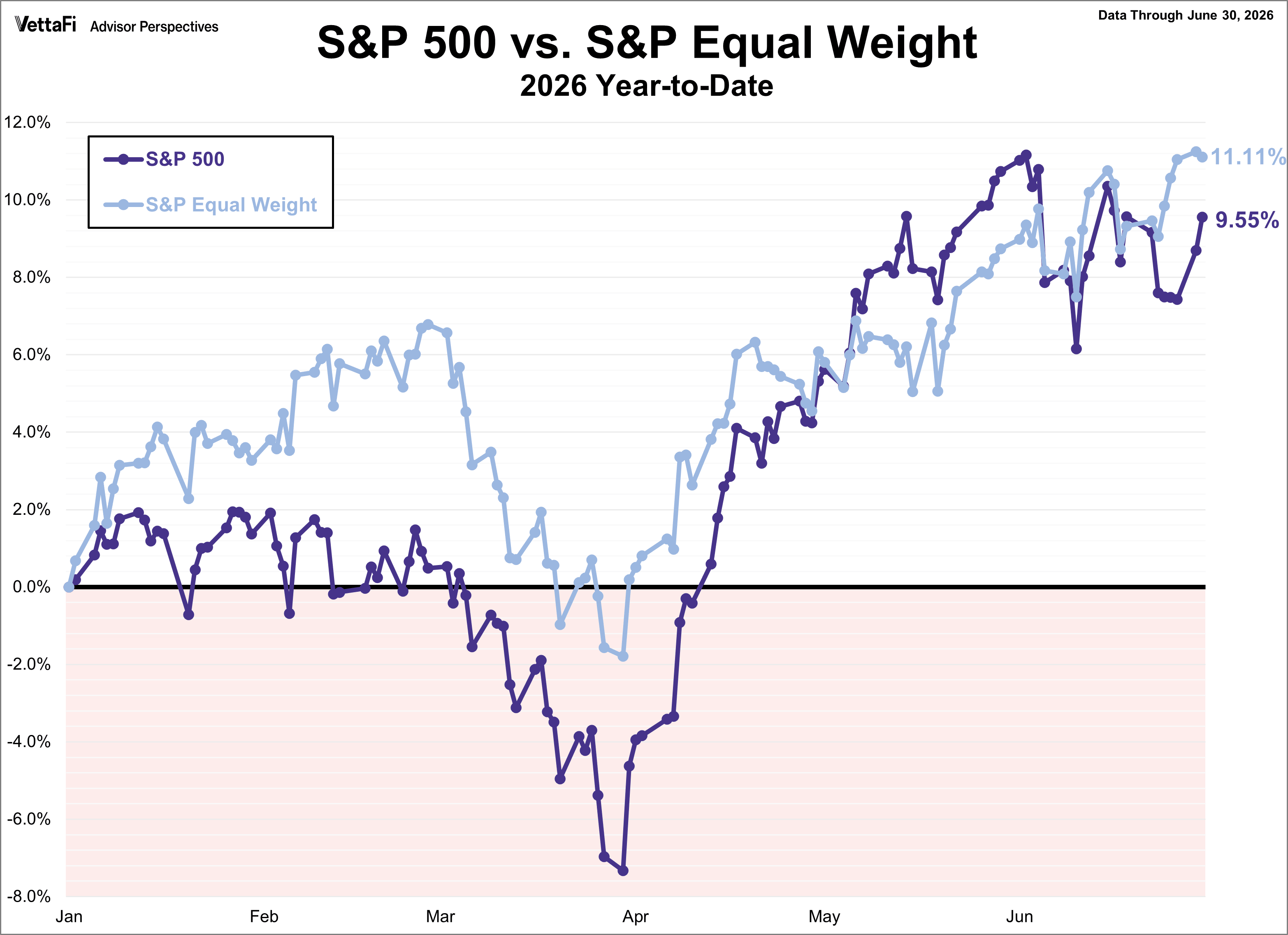
The S&P 500 experienced a volatile first half of the year, ultimately finishing June up 9.55%, just below its all-time high. Meanwhile, S&P 500 Equal Weight Index, which strips out the mega-cap concentration bias, actually outperformed the broader index for most of the year, wrapping up the first half up 11.11%.
ETFs associated with the S&P 500 index and S&P 500 Equal Weight index include: iShares Core S&P 500 ETF (IVV), SPDR S&P 500 ETF Trust (SPY), Vanguard S&P 500 ETF (VOO), SPDR Portfolio S&P 500 ETF (SPYM), and Invesco S&P 500® Equal Weight ETF (RSP).
-
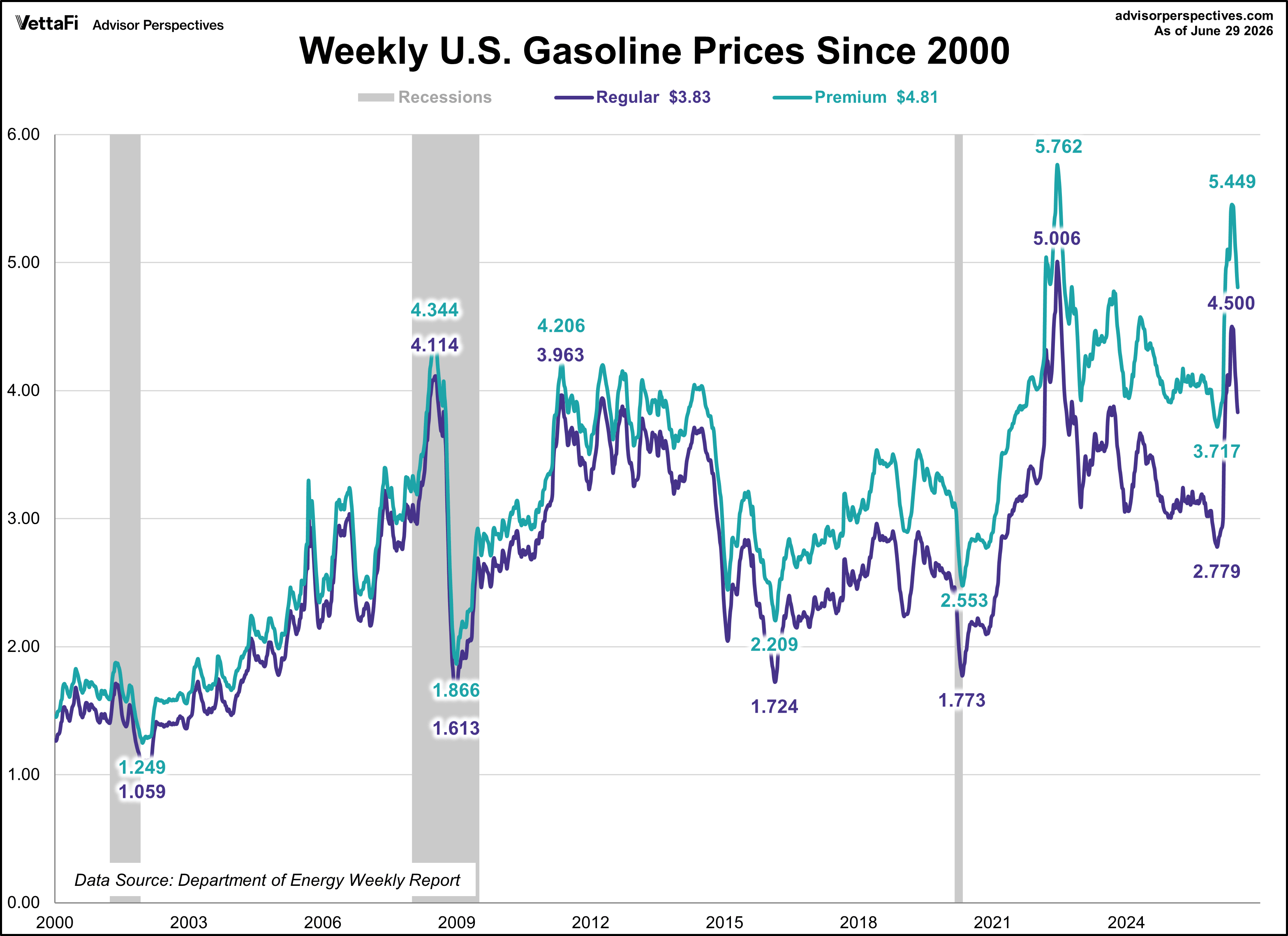
A major catalyst driving consumer anxiety is the rising cost of energy. By the end of June, regular gasoline prices skyrocketed by $1.02 per gallon (up 36%) from the start of the year, while premium gasoline climbed $1.05 per gallon (up 28%). Rising fuel prices act as an everyday drain on income, dragging down discretionary spending and fueling inflation expectations.
-
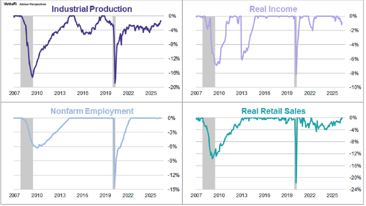
To gauge the true health of the economic expansion, we track the National Bureau of Economic Research (NBER) "Big Four" metrics: Employment, Industrial Production, Real Retail Sales, and Real Personal Income. At the end of H1, the average percentage off the historical highs for these four indicators sat at a 0.60%. This marks the narrowest margin in nearly seven years.
-
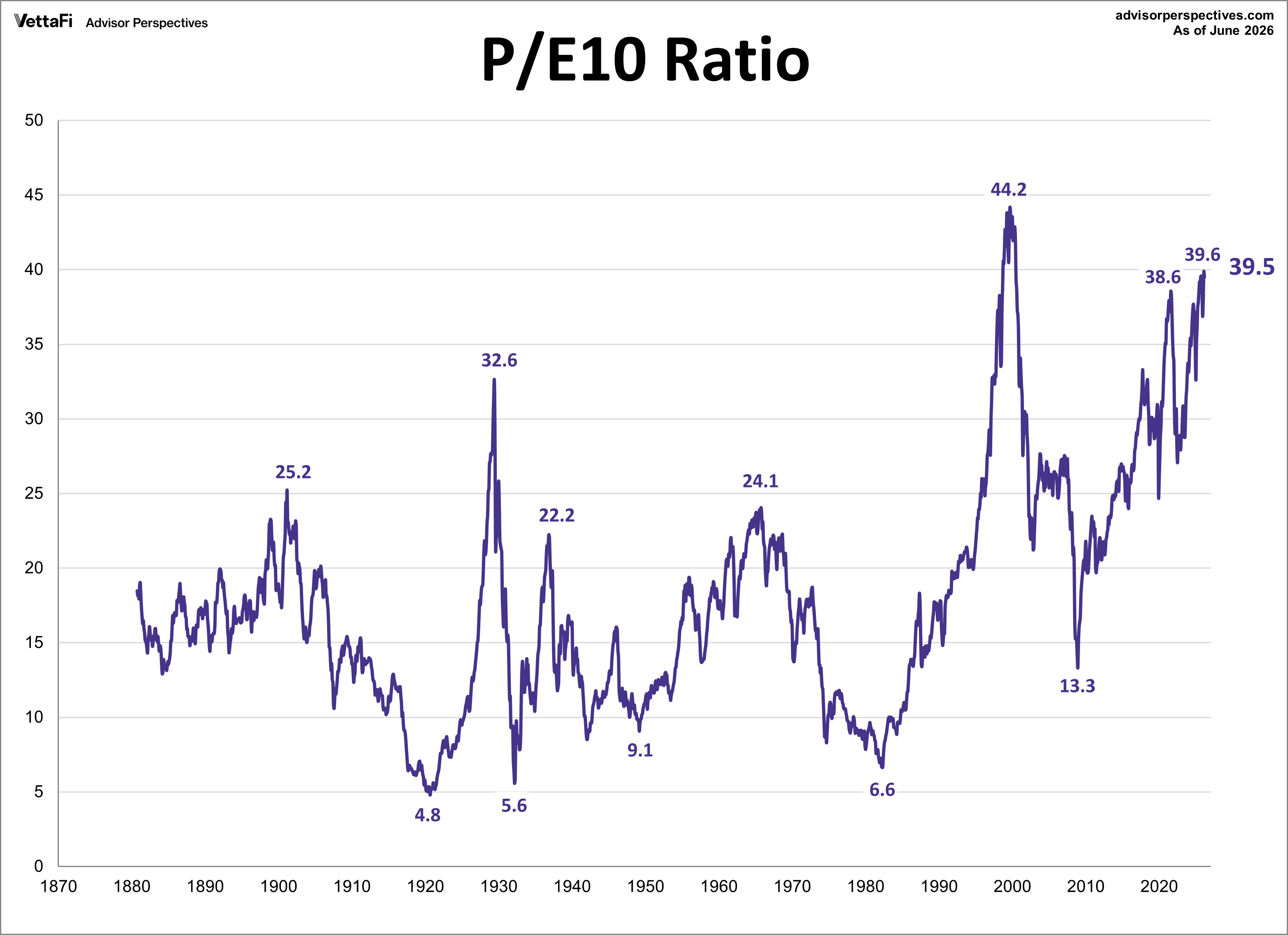
The cyclically adjusted price-to-earnings ratio (CAPE), or P/E 10, closed out June at 39.5, signaling a highly overvalued market. By dividing the current S&P 500 price by average inflation-adjusted earnings over the past decade, this metric irons out short-term cyclical noise.
-
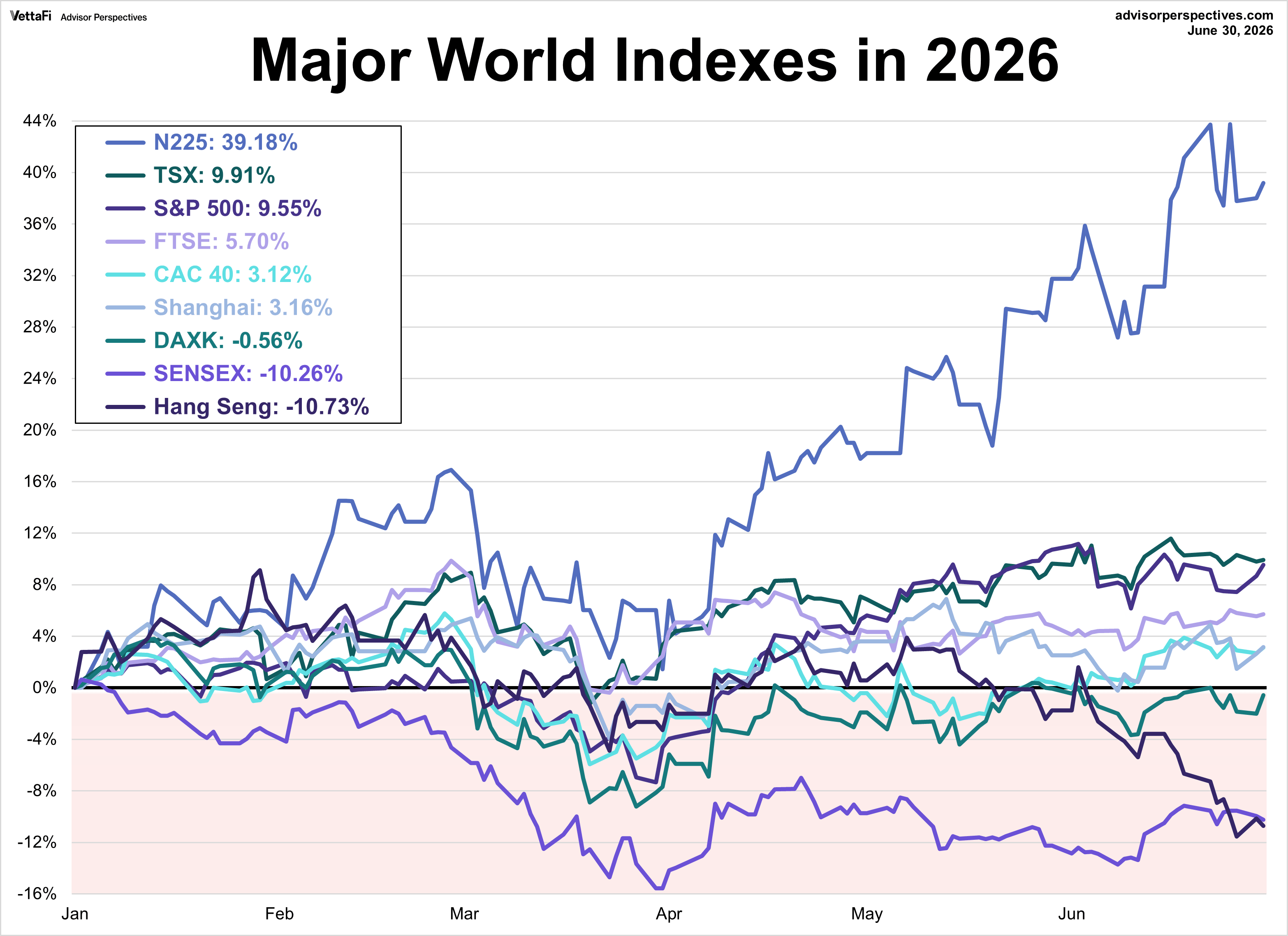
On the international stage, performance diverged sharply across the nine major global indexes on our weekly watchlist. Six of the nine indexes posted positive year-to-date gains through June. Japan’s Nikkei 225 led the way with a 39.2% gain while Hong Kong’s Hang Seng struggled the most with a 10.7% loss.
Examples of single country ETFs include: WisdomTree Japan Hedged Equity Fund (DXJ), WisdomTree Europe Hedged Equity Fund (HEDJ), KraneShares CSI China Internet ETF (KWEB), iShares MSCI India ETF (INDA), iShares MSCI Hong Kong ETF (EWH), iShares MSCI Canada ETF (EWC), SPDR S&P 500 ETF Trust (SPY).
Summary for the Second Half
The first half of 2026 has delivered undeniable equity gains alongside underlying economic resilience. However, with market leverage and valuations testing historic limits, the path forward requires careful attention to the data. Whether these trends persist or reverse will be the defining story of the back half of the year.
More Global Markets Topics >