A Deep Analytic Perspective of the 2022 Market Correction
Membership required
Membership is now required to use this feature. To learn more:
View Membership BenefitsAdvisor Perspectives welcomes guest contributions. The views presented here do not necessarily represent those of Advisor Perspectives.
The U.S. stock market corrected during the first half of 2022, especially during the second quarter, causing widespread panic. While nobody can reliably predict the future, we can gain a historical perspective using deep analytics, a patented technology developed by my firm, Andes Wealth Technologies.
I will demonstrate how financial advisors can combine behavioral finance and deep analytics to have a robust conversation with clients during financial turmoil, showing compassion and understanding on the one hand, while telling a compelling long-term story on the other hand.
How bad has it been?
When a client calls in a panic, first show that you understand, starting with the obvious, which is the daily price chart.
Figure 1. Market movement of the S&P 500 Index for the one-year period ending 06/17/2022
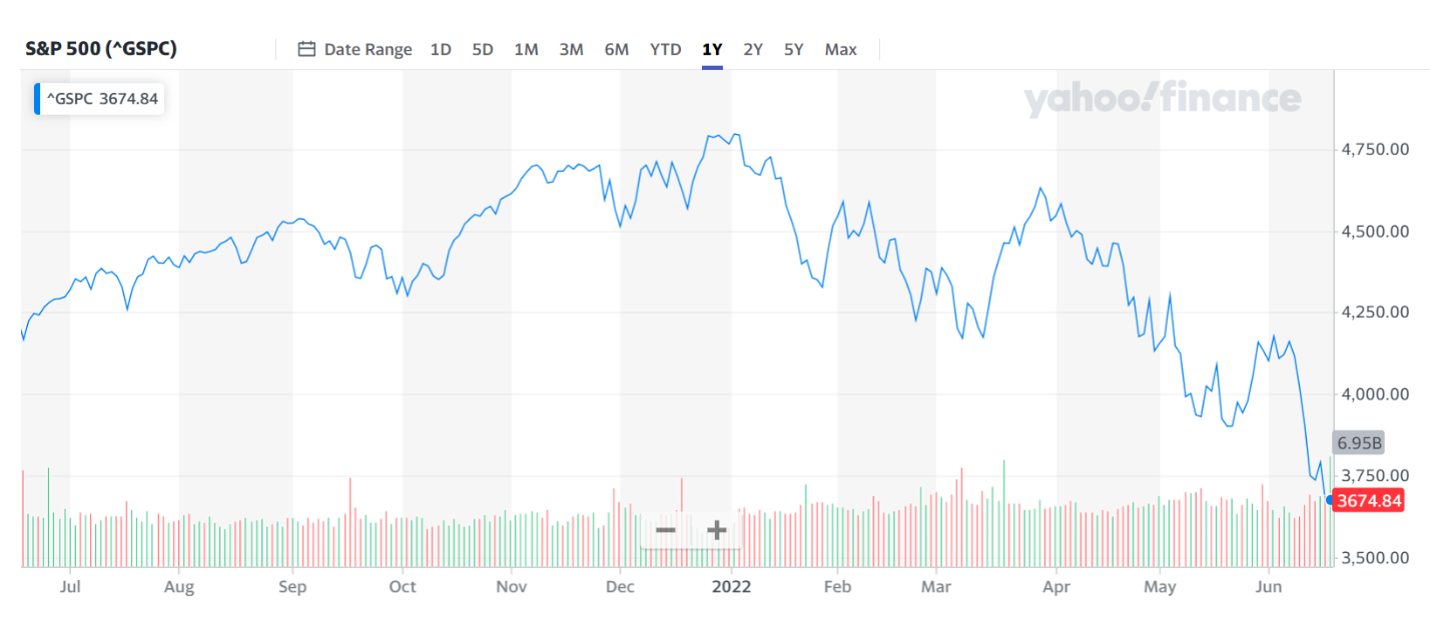
Source: Yahoo! Finance.
Explain to the client that their perception of the market risk is often influenced by recent events, a behavioral trait known as the “recency bias.” This can take some edge off the panic. Risk perception is an integral part of a risk-measurement framework, and irrational responses are often triggered by the wrong perception of market risk.
How bad has it been? Figure 2 shows the drawdown of the S&P 500. The recent market decline was a significant drawdown of 23%, but it is nowhere near the magnitude of the drawdowns during 2001-2002 and 2007-2008.
Figure 2. The drawdown of S&P 500 from 1/1/2000 to 06/17/2022
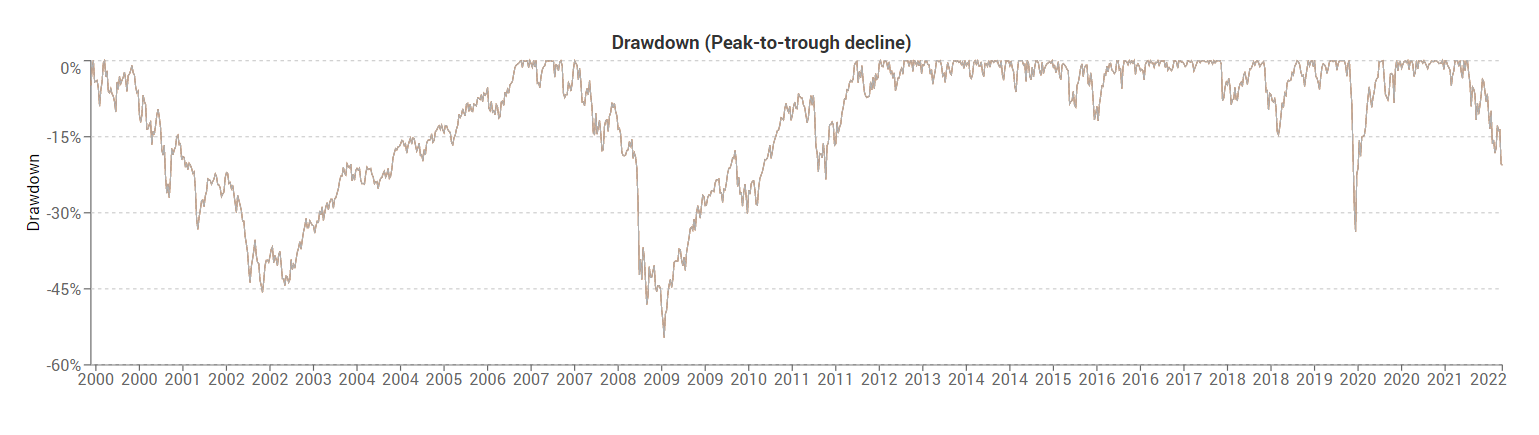
Source: Andes Wealth Technologies.
Does it mean that we are relatively stable, or is there is more to come? We don’t know. We only know that so far things are not as bad as they might feel. All of us are subject to a behavioral bias called loss aversion. It says that the pain of losing is twice as strong as the pleasure of gaining because our brain is hardwired to magnify the pain of losing[1]. Having this awareness can help clients keep their emotions in perspective.
Figure 3. Loss aversion, a common behavioral bias, says that the pain of losing is twice as strong as the pleasure of gaining
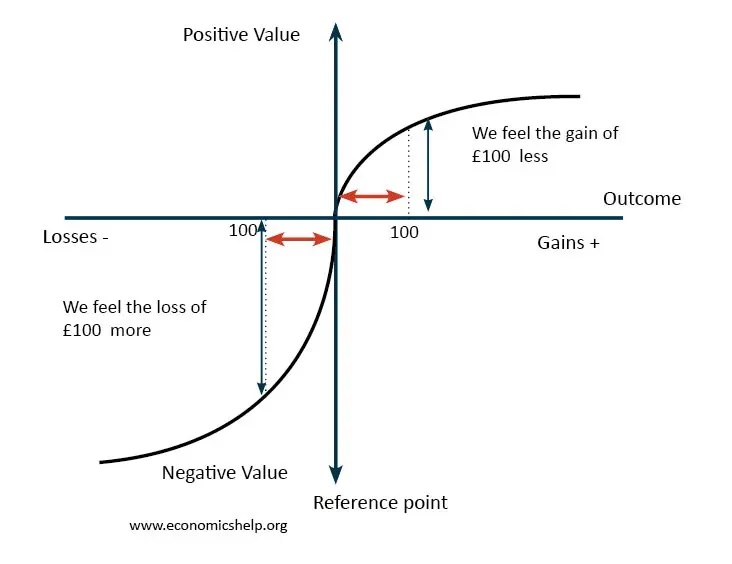
Source: www.economicshelp.org.
To further ease the anxiety, figure 4 shows the growth of $1 for the past 10 years. If you invested $1 in the S&P 500 10 years ago, you would have $3.3 on 06/18/2022, translating to an annualized return of 12.7%. As a point of reference, the long-term average return for U.S. equities is 10%, and for planning purpose, 8% is often assumed to be safe. Considering that inflation has been low for the past 10 years, that is a good outcome. As with everything else in life, we win sometimes and lose other times, and we can all learn to win and lose with some grace.
Figure 4. Growth of $1 of S&P 500 for the ten-year period ending 06/18/2022
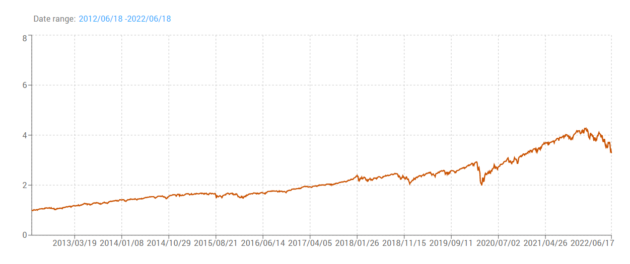
Source: Andes Wealth Technologies.
Efficient frontier visualization
Clients who want to dig deeper will appreciate the efficient frontier visualization. Powered by deep analytics, it reveals timely insights that clients can’t get from CNBC and Yahoo! Finance.
Figure 5 shows the static efficient frontier formed by a set of models, with each model’s position based on its target risk and return, i.e., its capital-market assumptions. This is the “normal” efficient frontier, indicating how the models are expected to behave, which should be close to their long-term averages.
Figure 5. Classic efficient frontier shows a set of model portfolios consisting of two ETFs representing the bond market and S&P 500
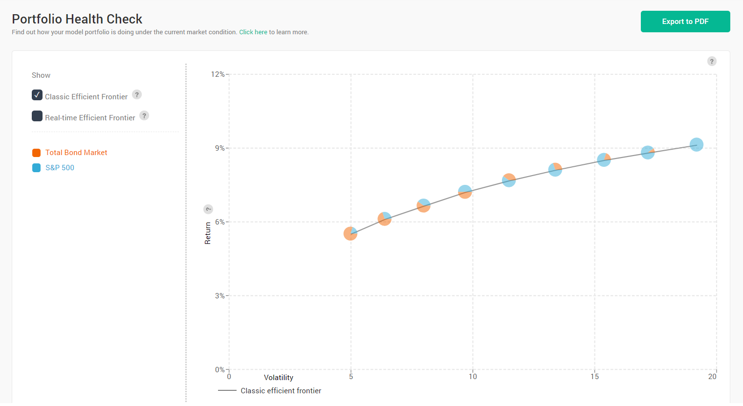
Source: Andes Wealth Technologies.
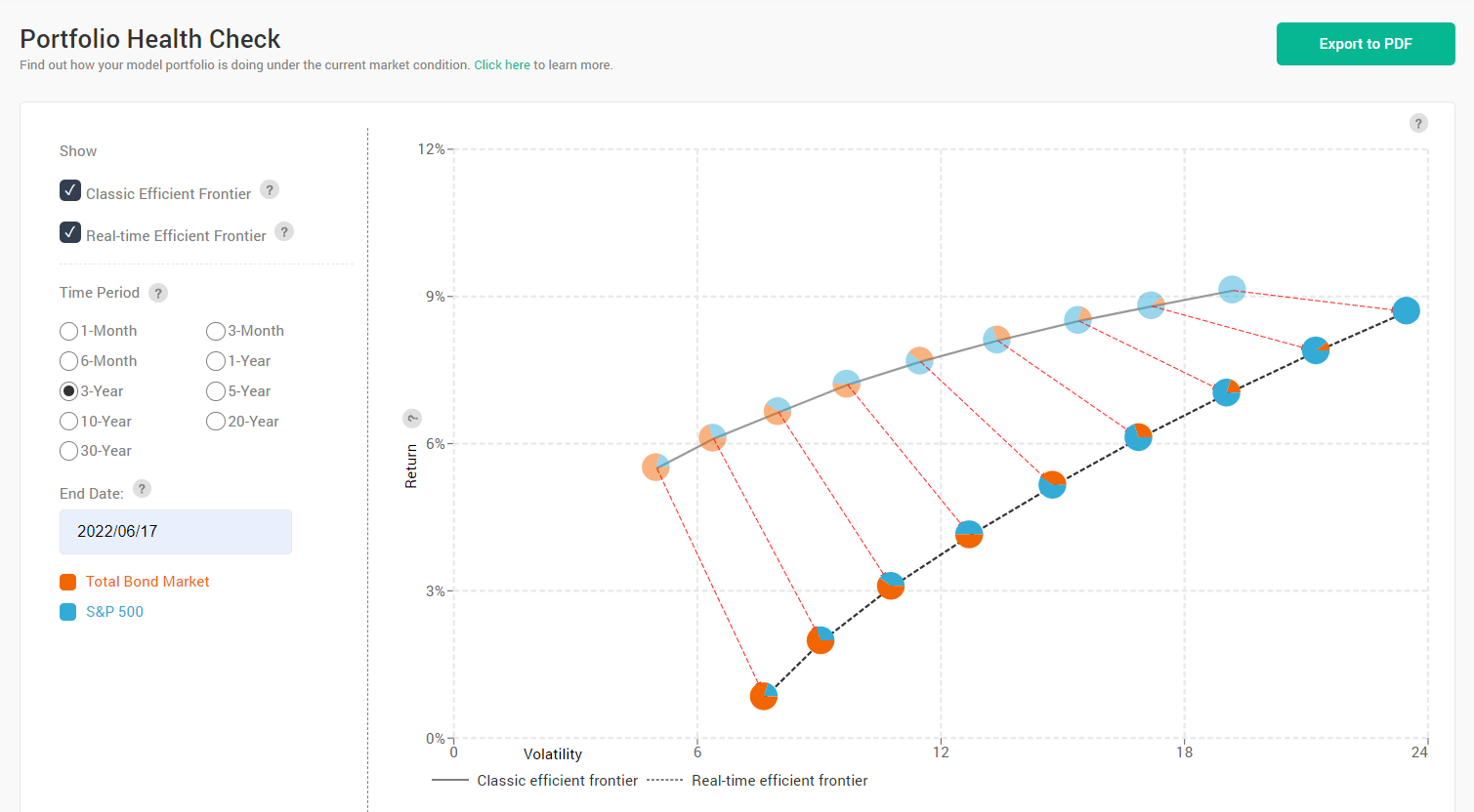
But the market often deviates from its “normal” state. Figure 6 shows how the market behaved relative to its normal state for the past month, showing negative returns across the board. The actual return for the 100% equity portfolio (the right-most pie chart with all blue) was -7.9% for the month ending 06/17/2022.
Figure 6. Efficient frontier visualization that shows the normal efficient frontier (the dimmed one on the top) and the actual efficient frontier (the one below) for the one-month period ending 06/17/2022

Source: Andes Wealth Technologies.
You may be nervous about showing a chart like this, which confirms that things don’t look good. Clients know that already, so there is no harm showing a different way to look at it. On the contrary, you can demonstrate empathy and expertise, and then launch into the long-term story below.
Taking a longer-term view, figure 7 shows the annualized return for the past three years. While the returns were below their capital-market assumptions across the board, the actual annualized return for the 100% equity portfolio (the blue pie chart) was only slightly lower than the capital-market assumption, and the actual risk was just a bit higher than its capital-market assumption.
Figure 7. Efficient frontier visualization showing the normal efficient frontier (the dimmed pie charts along the top line) and the actual efficient frontier (the line below) for the three-year period ending 06/17/2022
Source: Andes Wealth Technologies.
Most investors can relate to a three-year investment horizon, as opposed to a 30-year horizon, so this information can bring real comfort. It is also a good time to look back at the risk tolerance assessment that the investor has taken, and what they have agreed to.
Figure 8 shows the Risk Tolerance Test, also a patented technology developed by my firm, Andes Wealth Technologies. It shows the upsides and downsides of a set of models covering the entire risk spectrum, from conservative to aggressive, so a client can choose the one that they are most comfortable with; it will map directly to one of the advisor’s models. In this example, the investor has chosen the 100% equity model, knowing that they could lose 15.5% in a relatively normal year. During extreme market conditions, they could lose even more. Now you can show that the three-year result is well within the parameters of the risk-tolerance test.
Figure 8. Risk Tolerance Test by Andes Wealth Technologies
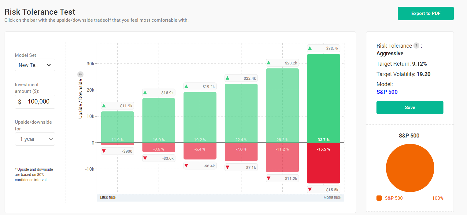
Source: Andes Wealth Technologies.
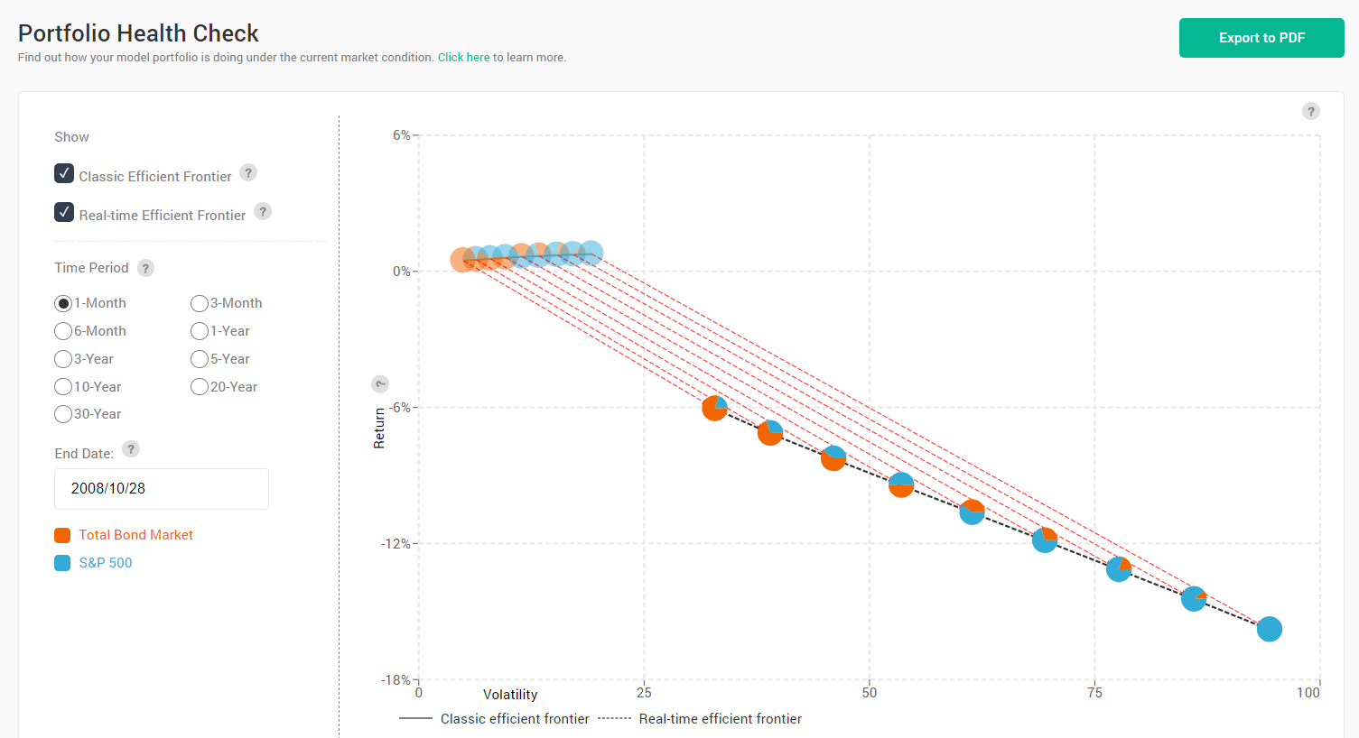
Now let’s see how the recent episode compared with some of the worst historical periods. The worst one-month return for the S&P 500 was -32.75%, for the period ending 03/23/2020, while the highest volatility was 94.50 for the one-month ending 10/28/2008.
Figures 9 show the risk and return for the one-month ending 10/28/2008. Comparing to figure 6, it is easy to see that the recent episode is much milder.
Figure 9. Efficient frontier visualization showing the normal efficient frontier (the dimmed pie charts along the top line) and the actual efficient frontier (the line below) for the one-month period ending 10/28/2008
Source: Andes Wealth Technologies.
If you are wondering how some individual securities did in the recent downturn, figure 10 shows the risk and return of a random basket of securities for the six-month ending 6/17/2022. Gold (ticker: IAU) sits right above the brown line that marks 0% return. Bonds (ticker: BND) had a six-month return of -12%, while both the S&P 500 (ticker: SPY) and the international equity market (ticker: ACWS) returned -19%.
Figure 10. The risk and return of a random basket of securities for the six-month ending 06/17/2022
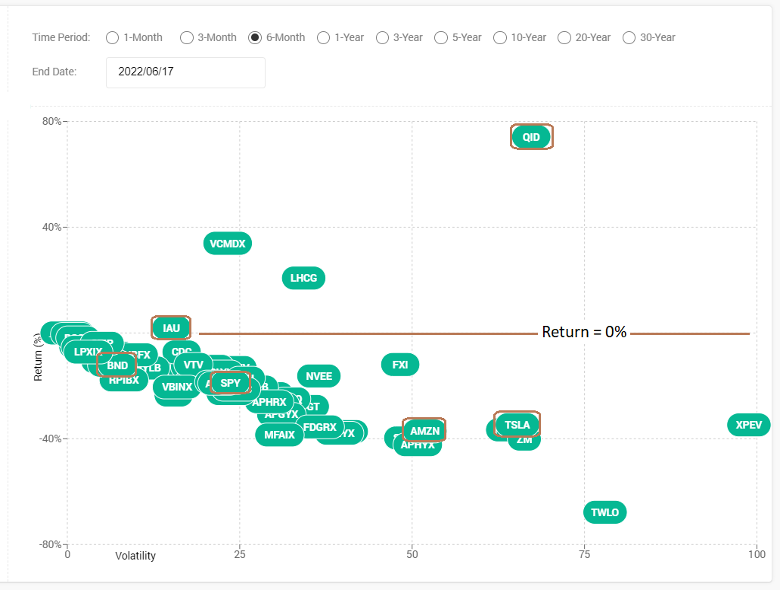
Source: Andes Wealth Technologies.
Time series and deep analytics
A time-series chart is another way to use deep analytics. It is a great way to see the market trend, but it may be too technical for most people. But for those who are so inclined, it offers rich insights.
Figure 11 shows the one-month rolling return for the S&P 500 for the past three years. You can see the huge dip in early 2020, and the subsequent strong recovery. You can also see that the one-month rolling return has been often below zero in 2022.
Figure 11. One-month rolling return for S&P 500 for the past three years
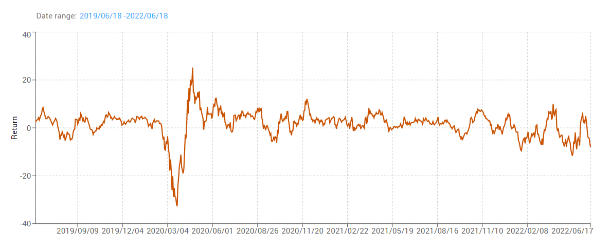
Source: Andes Wealth Technologies.
Now let’s overlay the one-month volatility. In figure 12, the Y axis on the left is for the return, while the Y axis on the right is for volatility. You can see that the volatility was relatively stable after the spike in early 2020. As a point of reference, the long-term volatility of the U.S. stock market is approximately 20.
Figure 12. One-month rolling return and volatility for S&P 500 for the past three years
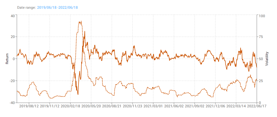
Source: Andes Wealth Technologies.
Volatility is only one measure of market risk. If the market declines every day for 1%, the volatility is zero, but it doesn’t mean that the risk is zero, although we typically see those periods of market declines accompanied by high volatility.
We can also look at longer rolling windows. The longer the rolling window, the less noise there is, but it is also causes a loss of information.
Figure 13 shows the three-year rolling return for the S&P 500 for the past 20 years. Except for 2000-2002 and the 2007-2008 financial crisis, the three-year rolling return has generally been above zero. For the three-year period ending 6/18/2022, the annualized return was 8.7%, which is just less than the long-term historical average.
Figure 13. Three-year rolling return for S&P 500 for the past twenty years
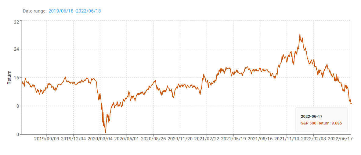
Source: Andes Wealth Technologies.
Conclusion
Managing investor emotions and expectations is half of the battle in wealth management. Taking the long-term view is the right discipline, but we need to tell the story better. This article shows how to tell a compelling long-term story by combining behavioral finance and deep analytics.
It is important to leverage behavioral finance to help clients understand their biases so they can keep their emotions in perspective. But we cannot talk about behavior in a vacuum; financial advisors need to show insights grounded in historical data to build credibility. My firm invented deep analytics to help financial advisors deliver timely investment insights that clients can’t get from CNBC and Yahoo! Finance.
While painful, the recent market correction has been long anticipated and is much needed. The path forward will be challenging given the macroeconomic environment, and financial advisors need to tell a compelling long-term story.
Helen Yang, CFA, is the founder and CEO of Andes Wealth Technologies, a Lexington, MA-based provider of technology solutions for financial advisors.
1Loss aversion has helped our ancestors survive in the wild over millions of years of evolution. From a survival perspective, a shortage of food and water can have fatal consequences while the overabundance doesn’t bring benefits of the same magnitude, hence asymmetric responses. However, the same instinct that has helped our ancestors survive can be counterproductive in economic settings, hence the need to build the discipline to resist the natural urge to take irrational actions during market turmoil.
Membership required
Membership is now required to use this feature. To learn more:
View Membership BenefitsSponsored Content
Upcoming Virtual Events View All


