Using Deep Analytics to Align Risk Perception
Membership required
Membership is now required to use this feature. To learn more:
View Membership BenefitsAdvisor Perspectives welcomes guest contributions. The views presented here do not necessarily represent those of Advisor Perspectives.
The extreme volatility from November 26 to December 3 caused many clients to panic. By using deep analytics, advisors can illustrate that this episode – and others like it – were not that unusual.
Our perception of the market is influenced by recent events, a behavioral trait known as the “recency bias.” Risk perception is an integral part of a risk-measurement framework, and irrational responses are often triggered by the wrong perception of market risk.
How do we get a more reliable sense of market risk? Daily prices are readily available, but they have too much noise. We need an average to see how it changes over time. One way of doing it is to use the one-month rolling return.
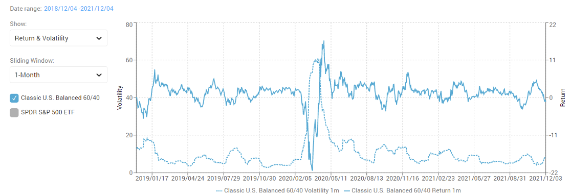
Figure 1 shows the one-month rolling return for a 60/40 balanced portfolio – 60% SPY and 40% BND – for the past three years (from December 3, 2018 to December 3, 2021). By calculating the one-month rolling return using daily prices, you can see the huge dip in early 2020, the subsequent strong recovery, and the recent market decline towards the end of the chart.
Figure 1. One-month rolling return for a 60/40 balanced portfolio from 12/3/2018 to 12/3/2021

Source: Andes Wealth Technologies.
Figure 2 shows the market movement between November 26 and December 3, 2021, which caused considerable panic, as illustrated by the fear and greed index from CNN Money (see figure 3).
Figure 2. Market movement of SPDR S&P 500 ETF
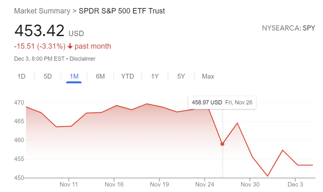
Source: Google.com.
Figure 3. The fear and greed index as of December 3, 2021
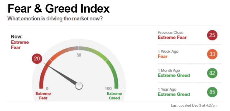
Source: CNN Money.
Was the extreme fear justifiable? Figure 1 suggests that it was not. Declines of similar scale have happened many times in the past three years, without triggering sustained losses.
To get a better historical view, figure 4 shows the one-month rolling return for the past 20 years.
Figure 4. One-month rolling return for a 60/40 balanced portfolio from 12/04/2001 to 12/03/2021
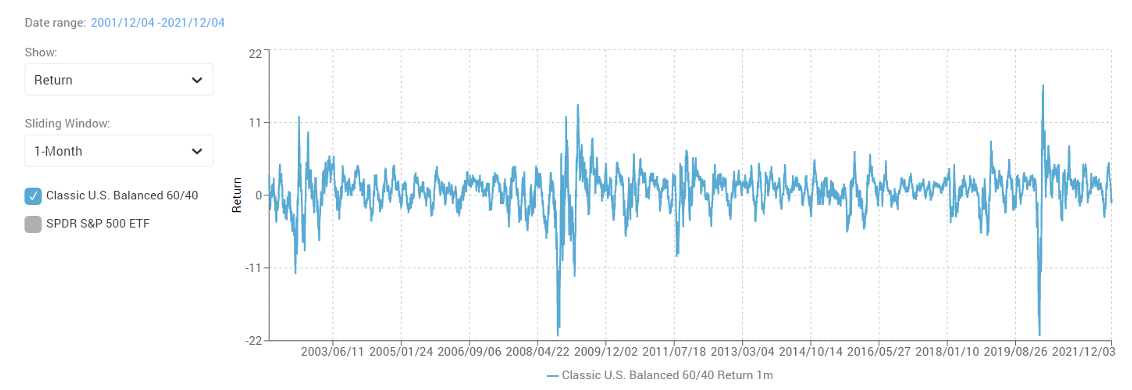
Source: Andes Wealth Technologies.
Why the one-month rolling return?
Can we use the rolling three-month or 30-year return instead? Of course. In fact, each interval provides a valuable perspective, and together, they form a fuller picture. The longer the interval, the less noise there is, but information can be lost. For example, if you look at the rolling 10-year return, you can expect a much smoother line than with the one-month return.
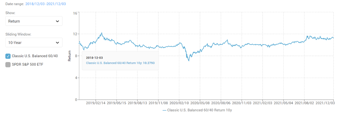
Figure 5 shows the 10-year rolling return for the 60/40 balanced portfolio for the past three years. The 10-year return for 12/03/2018 is for the 10-year period ending this date (from 12/04/2008 to 12/03/2018).
Figure 5. 10-year rolling return for a 60/40 balanced portfolio from 12/03/2018-12/03/2021
Source: Andes Wealth Technologies.
Comparing this to figure 1. Many of the ups and downs have been smoothed out by the 10-year averaging. Advisors can use this to demonstrate why it makes sense to adhere to a long-term investment horizon.
What about the 10-day rolling returns? I don’t use it for two reasons: The one-month rolling return is responsive enough to show the market dynamics in the context of wealth management; and, when calculating volatility, the 10-day interval has too few data points for a meaningful standard deviation.
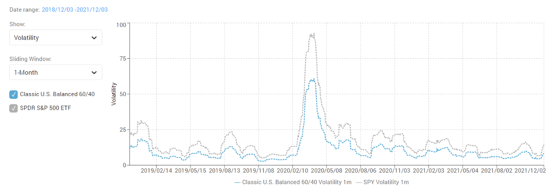
Let’s look at volatility. Figure 6 shows the one-month rolling volatility of the balanced portfolio (the blue dotted line) as compared to the market (the gray dotted line). The current level of volatility is quite normal.
Figure 6. One-month rolling volatility of the 60/40 balanced portfolio compared with the market from 12/03/2018 to 12/03/2021
Source: Andes Wealth Technologies.
The volatility of the balanced portfolio is indeed much lower than the market. This is a great way to illustrate the power of diversification. Another great way to do this is to compare the annual return and drawdown of the balanced portfolio versus the market (see figure 7 and 8).
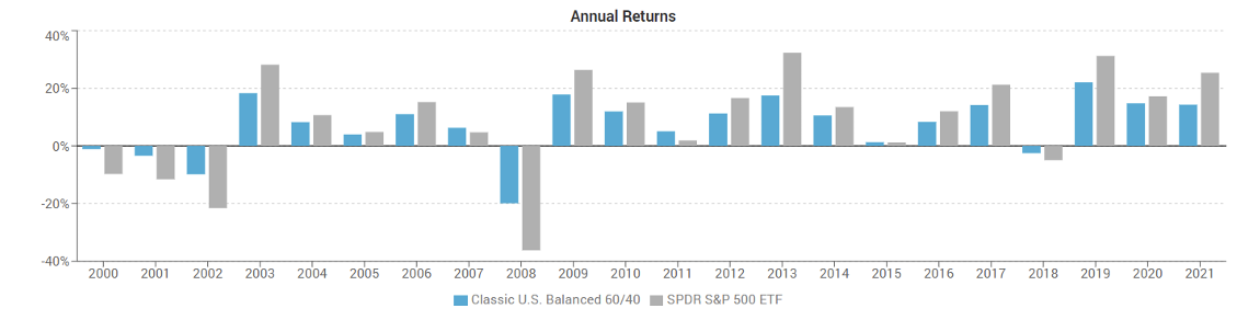
Figure 7. Annual return of the 60/40 balanced portfolio compared to the market since 2000
Source: Andes Wealth Technologies.
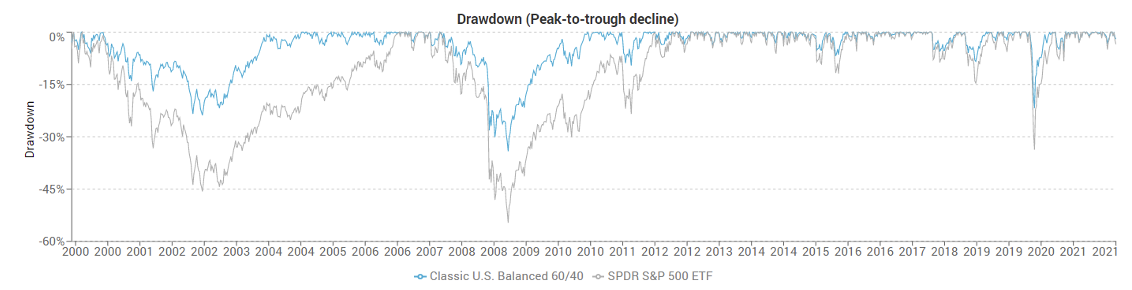
According to figure 7, while the balanced portfolio (the blue bars) doesn’t get all the upside of the market (the gray bars) in a good year, it didn’t suffer all the downside in a bad year. The drawdown chart in figure 8 further brings this message home. You see that the drawdown, defined as the peak-to-bottom decline, of a balanced portfolio (the blue line) is much less than the market (the gray line). (“Drawdown” has another meaning, which is the withdrawal from a retirement fund. But that is not relevant here.)
Figure 8. Drawdown of the 60/40 balanced portfolio compared to the market since 2000
Source: Andes Wealth Technologies.
If you put the one-month rolling risk and return on the same chart (see figure 9), you will see something seemingly paradoxical – they are almost mirror images of each other, which means periods of low risk corresponded to high returns, and high risk corresponded to low or negative returns.
Figure 9. One-month rolling risk and return of the 60/40 balanced portfolio from 12/03/2018 to 12/03/2021
The scale for the risk (volatility) is on the left Y axis, while the return on the right axis. Source: Andes Wealth Technologies.
Does it contradict with the adage of “high risk, high return”? No. “High risk, high return” is generally true when comparing different asset classes over a long period of time, such as equities versus bonds. “High risk, low return” may be true for different time periods for the same asset, in this case the U.S. stock market. Advisors must understand this distinction so that they don’t overgeneralize the relationship between risk and return and say something that undermines their credibility.
The efficient frontier visualization is another way to reveal market dynamics. Figure 10 shows the classic efficient frontier formed by a set of model portfolios from a 20/80 conservative portfolio to 100% equity portfolio. Each portfolio is positioned on the risk-return chart based on its target risk and return, i.e., its capital market assumptions. This is the “normal” efficient frontier, indicating how the models are expected to behave, which is often close to their long-term averages.
Figure 10. Classic efficient frontier shows a set of model portfolios based on the capital market assumption of each model
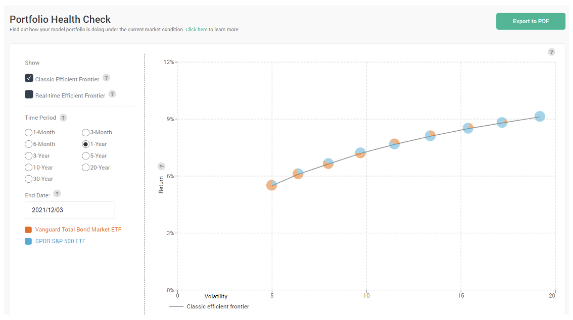
Source: Andes Wealth Technologies.
Below is a list of those model portfolios and their capital market assumptions.
Figure 11. List of model portfolios that form an efficient frontier and their capital market assumptions
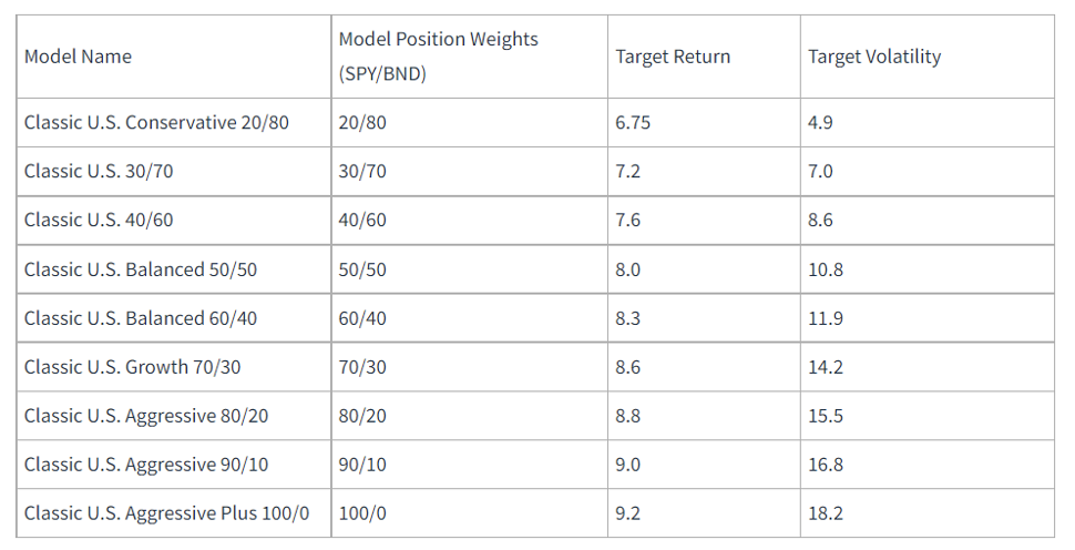
Source: Andes Wealth Technologies.
But the market often deviates from its “normal” state. Figure 12 shows how the market behaved in relative to its normal state for the one-year ending Dec 3, 2021.
Figure 12. Efficient frontier visualization that shows the normal efficient frontier (the dimmed one on the bottom) and the actual efficient frontier (the one on the top) for the 1-year period ending 2021/12/03.
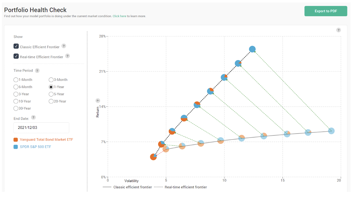
Source: Andes Wealth Technologies.
The dimmed line on the bottom shows the same “normal” efficient frontier (except that the scale of the Y axis is slightly different), while the top line is the actual efficient frontier, indicating the actual risk and return of each model portfolio. Across the board, the return was much greater than normal, and volatility was lower.
Instead of panicking, advisors should show their clients that the returns they have seen this year were not normal and that they should not expect the same returns next year.
Managing investor emotions and expectations is half of the battle in wealth management. It is important to leverage behavioral finance to help clients understand their own biases so they can keep their emotions in perspective. However, we cannot talk about behavior in a vacuum. Advisors need to show insights grounded in historical data to build credibility.
I call this “deep analytics.” I hope that visualizing deep analytics helps you see the market dynamics more clearly.
There are many reasons to be concerned about the market, but the decline from November 26 to December 3 was not one of them.
Helen Yang, CFA, is the founder and CEO of Andes Wealth Technologies, a Lexington, MA-based provider of technology solutions for financial advisors.
Membership required
Membership is now required to use this feature. To learn more:
View Membership BenefitsSponsored Content
Upcoming Virtual Events View All