Advisor Perspectives welcomes guest contributions. The views presented here do not necessarily represent those of Advisor Perspectives.
In Part 1 of this series, I presented Primary-ID, a rules- and evidence-based model that identifies major price movements, which are traditionally called cyclical bull and bear markets. This article debuts Secondary-ID, a complementary model that objectively defines minor price movements, which are traditionally called rallies and corrections within bull and bear markets.
The traditional definitions of market cycles
Market analysts define market cycles by the magnitude of price movements. Sequential up and down price movements in excess of 20% are called primary cycles. Price advances more than 20% are called bull markets. Declines worse than -20% are called bear markets. Sequential up and down price movements within 20% are called secondary cycles. Price retracements milder than -20% are called corrections. Advances shy of 20% are called rallies. Talking heads at CNBC frequently use this financial vernacular.
But has anyone bothered to ask how factual these fancy terms and lofty labels really are?
Experts also measure market cycles by their durations. They reported that since 1929, there have been 25 bull markets with gains over 20% with a median duration of 13.1 months, and 25 bear markets with losses worse than 20% with a median duration of 8.3 months.
But is "median duration" the proper statistical yardstick to measure stock market cycle lengths?
Fact-checking the 20% thresholds
Before presenting Secondary-ID, let’s pause to fact-check these two market cycle yardsticks. The ±20% primary cycle rules-of-thumb have little practical use in guiding investment decisions. If we wait for a +20% confirmation before entering the market, we would have missed the bulk of the upside. Conversely, if we wait for an official kick-off of a new cyclical bear market, our portfolios would have shrunk by -20%. The ±20% thresholds may be of interests to stock market historians, but offer no real benefit to investors.
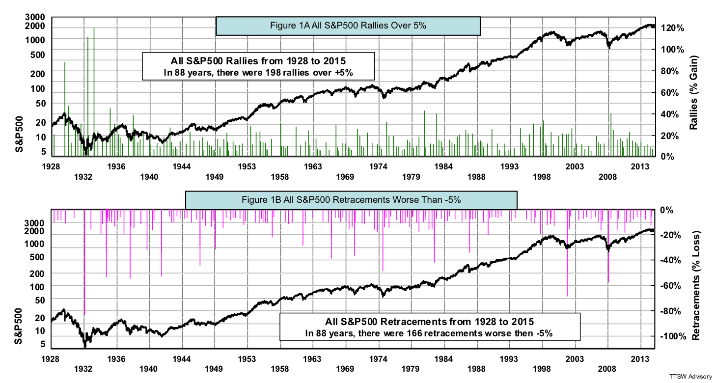
Besides being impractical, the ±20% demarcations are also baseless. This falsehood can be demonstrated by examining the historical evidence. Figures 1A and 1B show the daily closing prices of the S&P 500 from 1928 to 2015. The green bars in Figure 1A are price advances from an interim low to an interim high of over +5%. The red bars in Figure 1B are price retracements from an interim high to an interim low worse than -5%. Price movements less than ±5% are ignored as noise. There were a total of 198 advances and 166 retracements in 88 years. From the figures, it's not obvious why ±20% were picked as the thresholds for bull and bear markets. The distributions of green and red bars show no unique feature near the ±20% markers.

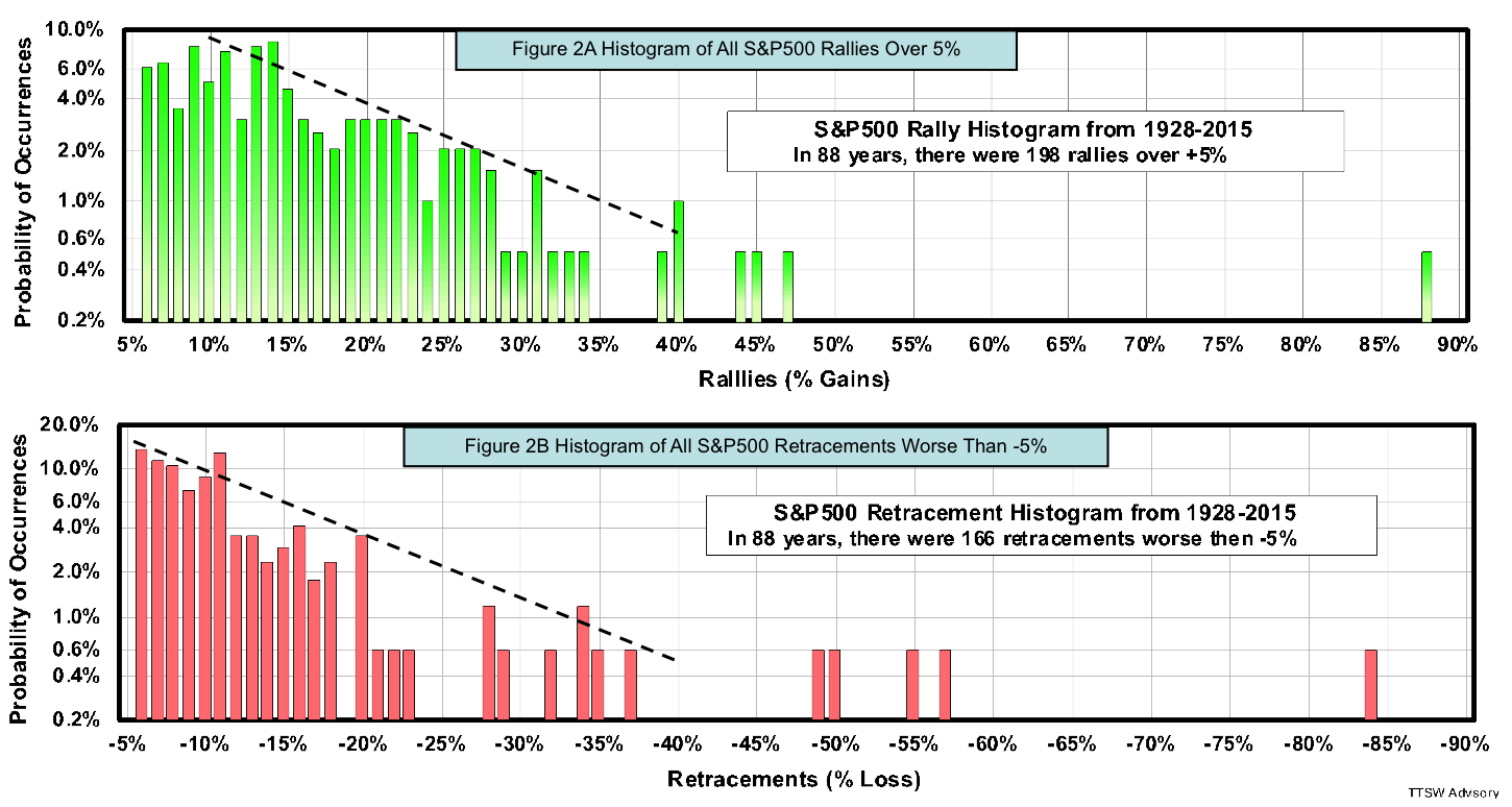
To determine how indistinct the ±20% markers are in the distributions, I plot the same daily data in histograms as shown in Figures 2A and 2B. The probabilities of occurrence are displayed on the vertical axes for each price change in percent on the horizontal axes. For example, Figure 2A shows that a +20% rally has a 3% chance of occurring; and Figure 2B shows that a -20% retreat has near a 3.5% chance. There is no discontinuity either at +20% in Figure 2A that separates bull markets from rallies, nor at -20% in Figure 2B that differentiates bear markets from corrections.
There are, however, two distinct distribution patterns in both up and down markets. Figure 2A shows an exponential drop in the probability distribution with increasing rally sizes from +10% to +40%. Above +45%, the histogram is flat. Figure 2B shows a similar exponential decline in the probability distribution with increasing retracements from -5% to -40%. Beyond -45%, the histogram is again flat. The reasons behind the exponential declines in the distributions and the two-tier histogram pattern are beyond the scope of this paper. It's clear, however, that there is no distinct inflection point at ±20% from Figures 2A and 2B. In fact, it would be more statistically correct to use the ±45% as the thresholds for bull and bear markets. But such large thresholds for primary cycles would be worthless for investors.
Figures 2A and 2B also expose one other fallacy. It's often believed that price support and resistance levels are set by the Fibonacci ratios. One doesn't have to read scientific dissertations using advanced mathematical proofs to dispel the Fibonacci myth. A quick glance at Figure 2A or 2B would turn any Fibonacci faithful into a skeptic. If price tops and bottoms are set by the Fibonacci ratios, we would have found such footprints at ±23.6%, ±38.2%, ±50.0%, ±61.8%, or ±100%. No Fibonacci pivot points can be found in 88 years of daily S&P 500 data.
Fact-checking the market duration yardstick
I now turn to the second cyclical market yardstick-cycle duration. It's been reported that since 1929, the median duration for bull markets is 13.1 months and the median duration for bear markets is 8.1 months. The same report also notes that the spread in bull market durations spans from 0.8 to 149.8 months; and the dispersion among bear market durations extents from 1.9 to 21 months. When the data is so widely scattered, the notion of median is meaningless. Let me explain why with the following charts.
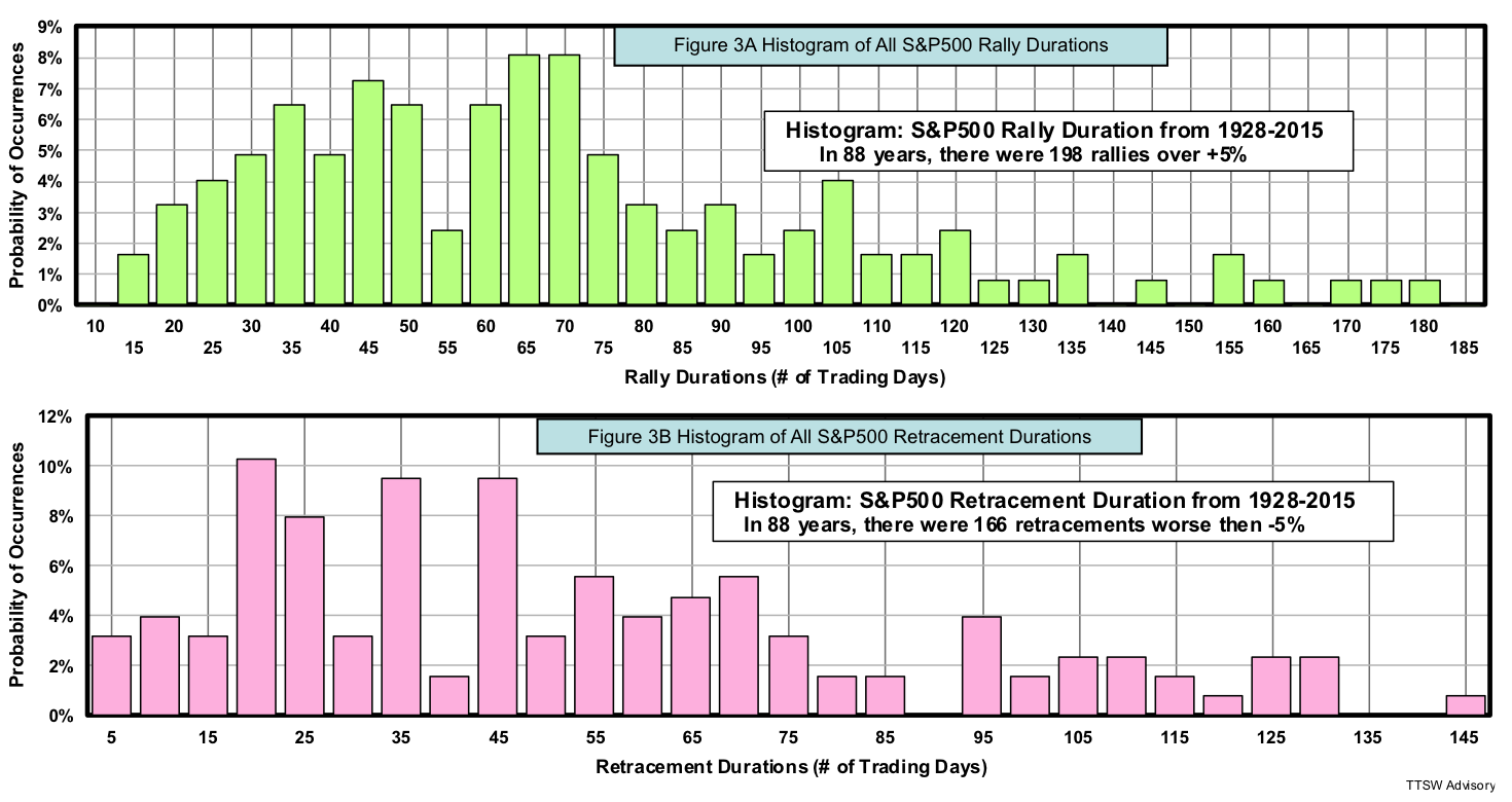
Figures 3A and 3B show duration histograms for all rallies and retreats, respectively. The vertical axes are the probabilities of occurrence for each duration shown on the horizontal axes. The notions of median and average are only useful when the distributions have a central tendency. When the frequency distributions are skewed to the extent seen in Figure 3A or both are skewed and dispersed like in Figure 3B, median durations cited in those reports are meaningless.
Figures 3A and 3B also expose one other myth. We often hear market gurus warning us that the bull (or bear) market is about to end because it's getting old. Chair Yellen was right when she said that economic expansions don't die of old age. Cyclical markets don't follow an actuarial table. They can live on indefinitely until they get hit by external shocks. Positive shocks (pleasant surprises) end bear markets and negative shocks (abrupt panics) kill bull markets. These black swans follow Taleb distributions in which average and median are not mathematically defined. In my concluding remarks I further expand on the origin of cyclical markets.
Many Wall Street beliefs and practices are just glorified folklores decorated with Greek symbols and pseudo-scientific notations to puff up their legitimacy. Many widely followed technical and market-timing indicators are nothing but glamorized traditions and legends. Their theoretical underpinnings must be carefully examined and their claims must be empirically verified. It's unwise to put ones' hard earned money at risk by blindly following any strategy without fact-checking it first, no matter how well accepted and widely followed it may be.
Envisioning cyclical markets through a calculus lens
Now that I have shown how absurd these two yardsticks are in gauging market cycles, I would like to return to the subject at hand – modeling cyclical markets. The methodology is as follows: First, start with a metric that is fundamentally sound. The Super Bowl indicator, for example, is an indicator with no fundamental basis. Next, transform the metric into a quasi range-bound indicator. Then devise a set of rational rules using the indicator to formulate a hypothesis. High correlations without causations are not enough. Causations must be grounded in logical principles such as economics, behavioral finance, fractal geometry, chaos theory, game theory, number theory, etc. Finally, a hypothesis must be empirically validated with adequate samples to be qualified as a model.
Let me illustrate my modeling approach with Primary-ID. The Shiller CAPE (cyclically adjusted price-earnings ratio) is a fundamentally sound metric. But when the CAPE is used in its original scalar form, it is prone to calibration error because it's not range-bound. To transform the scalar CAPE into a range-bound indicator, I compute the year-over-year rate-of-change of the CAPE (e.g. YoY-ROC % CAPE). A set of logically sound buy-and-sell rules is devised to activate the indicator into actionable signals. After the hypothesis is validated empirically over a time period with multiple bull and bear cycles, Primary-ID is finally qualified as a model.
This modeling approach can be elucidated with a calculus analogy. The scalar Shiller CAPE is analogous to "distance." The vector indicator YoY-ROC % CAPE is analogous to "velocity." When "velocity" is measured in the infinitesimal limit, it's equivalent to the "first derivative" in calculus. In other words, Primary-ID is similar to taking the first derivative of the CAPE. There are, however, some differences between the YoY-ROC % CAPE indicator and calculus. First, a derivative is an instantaneous rate-of-change of a continuous function. The YoY-ROC % CAPE indicator is not instantaneous, but with a finite time interval of one year. Also, the YoY-ROC % CAPE indicator is not a continuous function, but is based on a discrete monthly time series – the CAPE. Finally, a common inflection point of a derivative is the zero crossing, but the signal crossing of Primary-ID is at -13%.
Secondary-ID – a model for minor market movements
I now present a model called Secondary-ID. If Primary-ID is akin to "velocity" or the first derivative of the CAPE and is designed to detect major price movements in the stock market, then Secondary-ID is analogous to "acceleration/deceleration" or the second derivative of the CAPE and is designed to sense minor price movements. Secondary-ID is a second-order vector because it derives its signals from the month-over-month rate-of-change (MoM-ROC %) of the year-over-year rate-of-change (YoY-ROC %) in the Shiller CAPE metric.
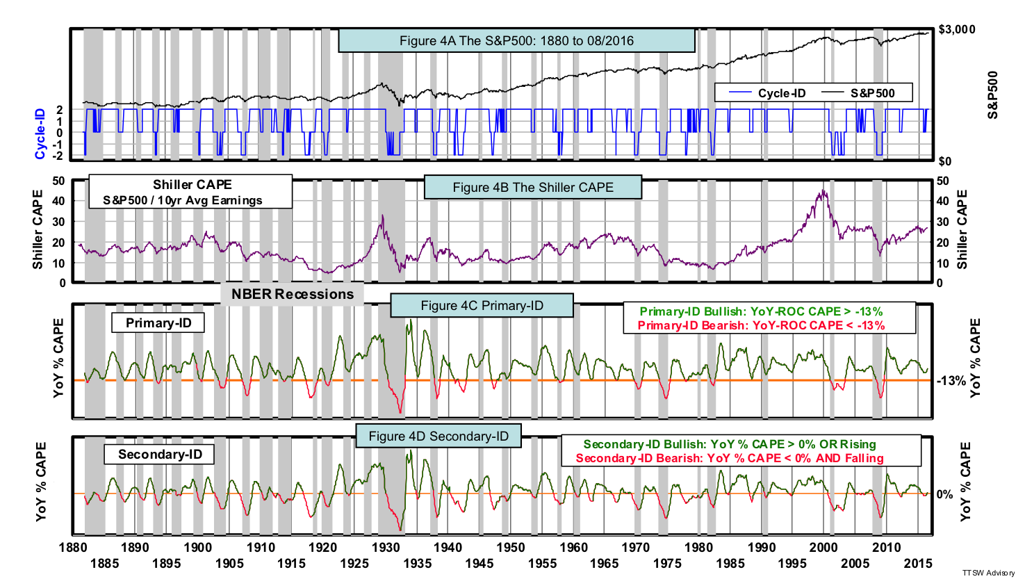
Figures 4A to 4D show the S&P 500, the Shiller CAPE, Primary-ID signals and Secondary-ID signals, respectively. The indicator of Primary-ID (Figure 4C) is identical to that of Secondary-ID (Figure 4D), namely, the YoY-ROC % CAPE. But their signals differ. The signals in Figures 4C and 4D are color-coded – bullish signals are green and bearish signals are red. The details of the buy and sell rules for Primary-ID were described in Part 1. The bullish and bearish rules for Secondary-ID are presented below.
Bullish signals are triggered by a rising YoY-ROC % CAPE indicator or when the indicator is above 0%. For bearish signals, the indicator must be both falling and below 0%. "Rising" is defined as a positive month-over-month rate-of-change (MoM-ROC %) in the ROC % CAPE indicator; and "falling", a negative MoM-ROC %. Because it is a second-order vector, Secondary-ID issues more signals than Primary-ID. It's noteworthy that the buy and sell signals of Secondary-ID often lead those of Primary-ID. The ability to detect acceleration and deceleration makes Secondary-ID more sensitive to changes than Primary-ID that detects only velocity.
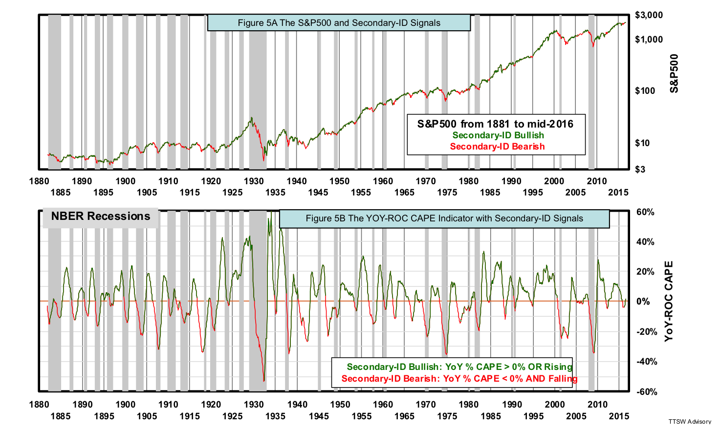
For ease of visual examination, Figures 5A shows the S&P 500 color-coded with Secondary-ID signals. Figure 5B is the same as Figure 4D describing how those signals are triggered by the buy and sell rules. Since 1880, Secondary-ID has called 26 of the 28 recessions (a 93% success rate). The two misses were in 1926 and 1945, both were mild recessions. Secondary-ID turned bearish in 1917, 1941, 1962, 1966 and 1977 but no recessions followed. However, these bearish calls were followed by major and/or minor price retracements. If Mr. Market makes a wrong recession call and the S&P 500 plummets, it's pointless to argue with him and watching our portfolios tank. Secondary-ID is designed to detect accelerations and decelerations in market appraisal by the mass. Changes in appraisal often precede changes in market prices, regardless of whether those appraisals lead to actual economic expansions or recessions.
Secondary-ID not only meets my five criteria for robust model design (simplicity, sound rationale, rule-based clarity, sufficient sample size, and relevant data), it has one more exceptional merit – no overfitting. In the development of Secondary-ID, there is no in-sample training involved and no optimization done on any adjustable parameter. Secondary-ID has only two possible parameters to adjust. The first one is the time-interval for the second-order rising and falling vector. Instead of looking for an optimum time interval, I choose the smallest time increment in a monthly data series – one month. One month in a monthly time series is the closest parallel to the infinitesimal limit on a continuous function. The second possible adjustable parameter is the signal crossing. I select zero crossing as the signal trigger because zero is the natural center of an oscillator. The values selected for these two parameters are the most logical choices and therefore no optimization is warranted. Because no parameters are adjusted, there's no need for in-sample training. Hence Secondary-ID is not liable to overfitting.
Performance comparison: Secondary-ID, Primary-ID and the S&P 500
The buy and sell rules of Secondary-ID presented above are translated into executable trading instructions as follows: When the YoY-ROC CAPE is rising (i.e. a positive MoM-ROC %), buy the S&P 500 (e.g. SPY) at the close in the following month. When the YoY-ROC CAPE is below 0% and falling (i.e. a negative MoM-ROC %), sell the S&P 500 at the close in the following month and use the proceeds to buy U.S. Treasury bond (e.g. TLT). The return while holding the S&P 500 is the total return with dividends reinvested. The return while holding the bond is the sum of both bond coupon and bond price changes caused by interest rate movements.
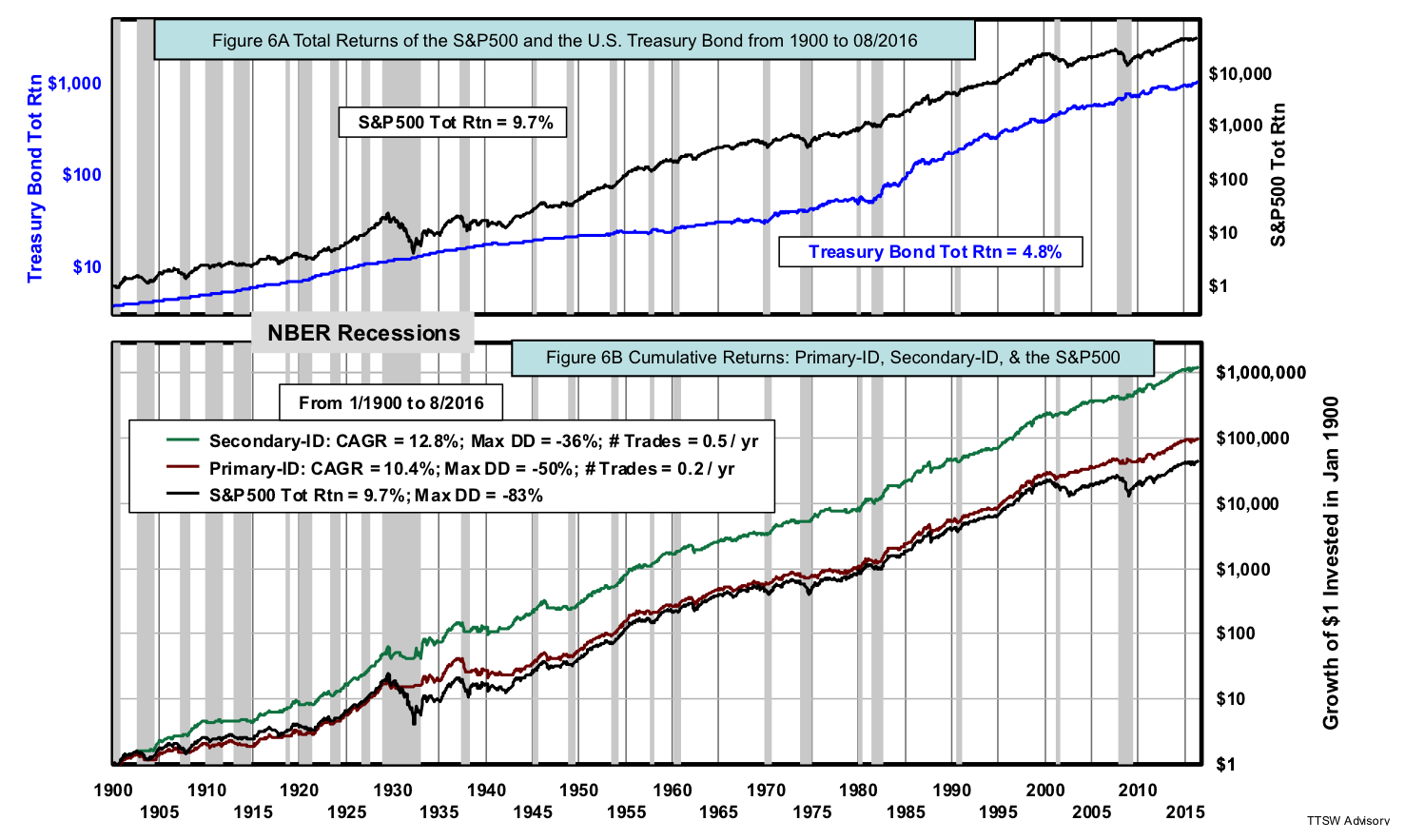
Figures 6A shows the S&P 500 total return index and the total return of the U.S. Treasury bond. In 116 years, return on stocks is nearly twice that of bonds. But in the last three decades, bond prices have risen dramatically thanks to a steady decline in inflation since 1980 and the protracted easy monetary policies since 1995. Figures 6B shows the cumulative total returns of Primary-ID, Secondary-ID and the S&P 500 on a $1 investment made in January 1900. The S&P 500 has a total return of 9.7% with a maximum drawdown of -83%. By comparison, Primary-ID has a hypothetical compound annual growth rate (CAGR) of 10.4% with a maximum drawdown of -50% and trades once every five years on average. The performance stats on Primary-ID are slightly different from that shown in Figure 5B in Part 1 because Figure 6B is updated from July to August 2016.
Secondary-ID delivers a hypothetical CAGR of 12.8% with a -36% maximum drawdown and trades once every two years on average. Note that Primary-ID and Secondary-ID are working in parallel to avoid most if not all bear markets. Secondary-ID offers an extra performance edge by minimizing the exposure to bull market corrections and by participating in selected bear market rallies.
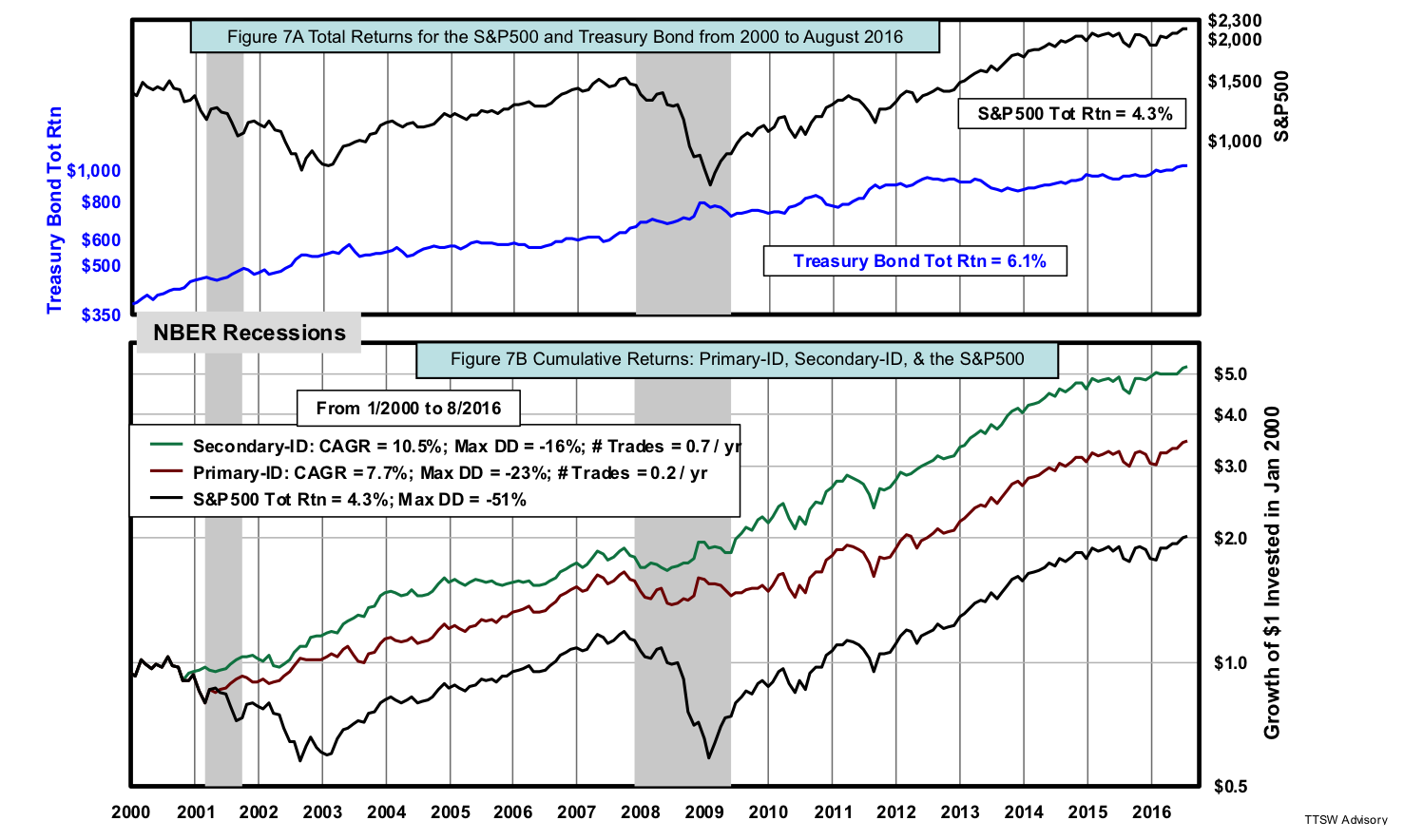
I now apply the same buy and sell rules in the recent 16 years to see how the model would have performed in a shorter but more recent sub-period. This is not an out-of-sample test since there's no in-sample training. Rather, it's a performance consistency check with a much shorter and more recent period. Figures 7A shows the total return of the S&P 500 and the U.S. Treasury bond price index from 2000 to August 2016. The return on bonds in this period is higher than that of the S&P 500. Record easy monetary policies since 2003 and large-scale asset purchases by global central banks since 2010 pumped up bond prices. Two severe back-to-back recessions dragged down the stock market. Figures 7B shows the cumulative total returns of Primary-ID, Secondary-ID and the S&P 500 on a $1 investment made in January 2000.
Since 2000, the total return index of the S&P 500 has returned 4.3% compounded with a maximum drawdown of -51%. By comparison, Primary-ID has a CAGR of 7.7% with a maximum drawdown of -23% and trades once every five years on average. Again, the performance stats on Primary-ID shown in Figure 7B are slightly different from that shown in Figure 5B in Part 1 because Figure 7B is updated to August 2016. Secondary-ID delivers a hypothetical CAGR of 10.5% with a maximum drawdown of only -16% and trades once every 1.4 years on average. The performance edge in return and risk of Secondary-ID over both Primary-ID and the S&P 500 total return index is remarkable. The consistency in performance gaps in both the entire 116-year period and in the most recent 16-year sub-period lends credence to Secondary-ID.
Theoretical support for both cyclical market models
The traditional concepts of "primary cycles" and "secondary cycles" rely on amplitude and periodicity yardsticks to track market cycles in the past and to predict market cycles in the future. Primary-ID and Secondary-ID do not deal with primary or secondary market cycles. Their focus is on cyclical markets – major and minor price movements. All market movements are driven by changes in investors' collective market appraisals. The Shiller CAPE is selected as the core metric because it is a value assessment gauge-based fundamental indicator – appraising the inflation adjusted S&P 500 price relative to its rolling 10-year average earnings. Although the scalar-CAPE is prone to overshoot and valuations misinterpretation, the first- and second-order vectors of the CAPE are not. Primary-ID and Secondary-ID sense both major changes and minor shifts in investors' collective market appraisal that often precede market price action.
Like Primary-ID, Secondary-ID also finds support from many of the behavioral economics principles. First, prospect theory shows that a -10% loss hurts investors twice as much as the pleasure a +10% gain brings. Such reward-risk disparities are recognized by the asymmetrical buy and sell rules in both models. Second, both models use vector-based indicators. This is supported by the findings of Daniel Kahneman and Amos Tversky that investors are sensitive to the relative changes (vectors) in their wealth much more so than to the absolute levels of their wealth (scalars). Finally, the second-order vector in Secondary-ID is equivalent to the second derivative of the concave and convex value function described by the two distinguished behavioral economists in 1979.
Concluding remarks – cyclical markets vs. market cycles
I developed rules- and evidence-based models to assess cyclical markets and not market cycles. The traditional notion of market cycles is defined with a prescribed set of pseudo-scientific attributes such as amplitude and periodicity that are neither substantiated by historical evidence nor grounded in statistics. Cyclical markets, on the other hand, are the outcomes of random external shocks imposing big tidal waves and small ripples on a steadily rising economic growth trend. Cyclical markets cannot be explained or predicted using the traditional cycle concepts because past cyclical patterns are the outcomes of non-Gaussian randomness. Let me illustrate with a simple but instructive narrative.
Cyclical markets can be visualized with a simple exercise. Draw an ascending line on a graph paper with the y-axis in a logarithmic scale and the x-axis in a linear time scale. The slope of the line is the long-term compound growth rate of the U.S. economy. Next, disrupt this steadily rising trendline with sharp ruptures of various amplitudes at erratic time intervals. These abrupt ruptures represent man-made crises (e.g., recessions) or natural calamities (e.g., earthquakes). Amplify these shocks with overshoots in both up and down directions to emulate the cascade-feedback loops driven by the herding mentality of human psychology. You now have a proxy of the S&P 500 historical price chart.
This descriptive model of cyclical markets explains why conventional market cycle yardsticks – the ±20% thresholds and median durations will never work. Unpredictable shocks will not adhere to a prescribed set of amplitude or duration. Non-Gaussian randomness cannot be captured by the mathematical formulae defining average and median. The conceptual framework of market cycles is flawed and that's why it fails to explain cyclical markets.
Looking from the perspective of Primary-ID and Secondary-ID, cyclical bull markets can last as long as the CAPE velocity is positive and/or accelerating. Cyclical bear markets can last as long as the CAPE velocity is negative and/or decelerating. Stock market movements are not constrained by the ±20% thresholds or cycle life-expectancy stats. Primary-ID detects the velocity of the stock market valuation assessment by all stock market participants that drives bull or bear markets. Secondary-ID senses subtle accelerations and decelerations in the same collective market valuation assessment. These second-order waves manifest themselves in stock market rallies and corrections. It doesn't matter whether the market is down less than -20%, labeled by experts as a correction, or plunges by worse than -20%, which is called a cyclical bear market, Primary-ID and Secondary-ID capture the price movements just the same.
Does synergy exist between Primary-ID and Secondary-ID? Would the sum of the two offer performance greater than those of the parts? A composite index of the two models enables the use of leverage and short strategies that pave the way for more advanced portfolio engineering and risk management tactics. Do these more complex strategies add value? For answers, please stay tuned for Part 3.
Theodore Wong graduated from MIT with a BSEE and MSEE degree and earned an MBA degree from Temple University. He served as general manager in several Fortune-500 companies that produced infrared sensors for satellite and military applications. After selling the hi-tech company that he started with a private equity firm, he launched TTSW Advisory, a consulting firm offering clients investment research services. For almost four decades, Ted has developed a true passion for studying the financial markets. He applies engineering design principles and statistical tools to achieve absolute investment returns by actively managing risk in both up and down markets. He can be reached at mailto:[email protected].
Read more articles by Theodore Wong