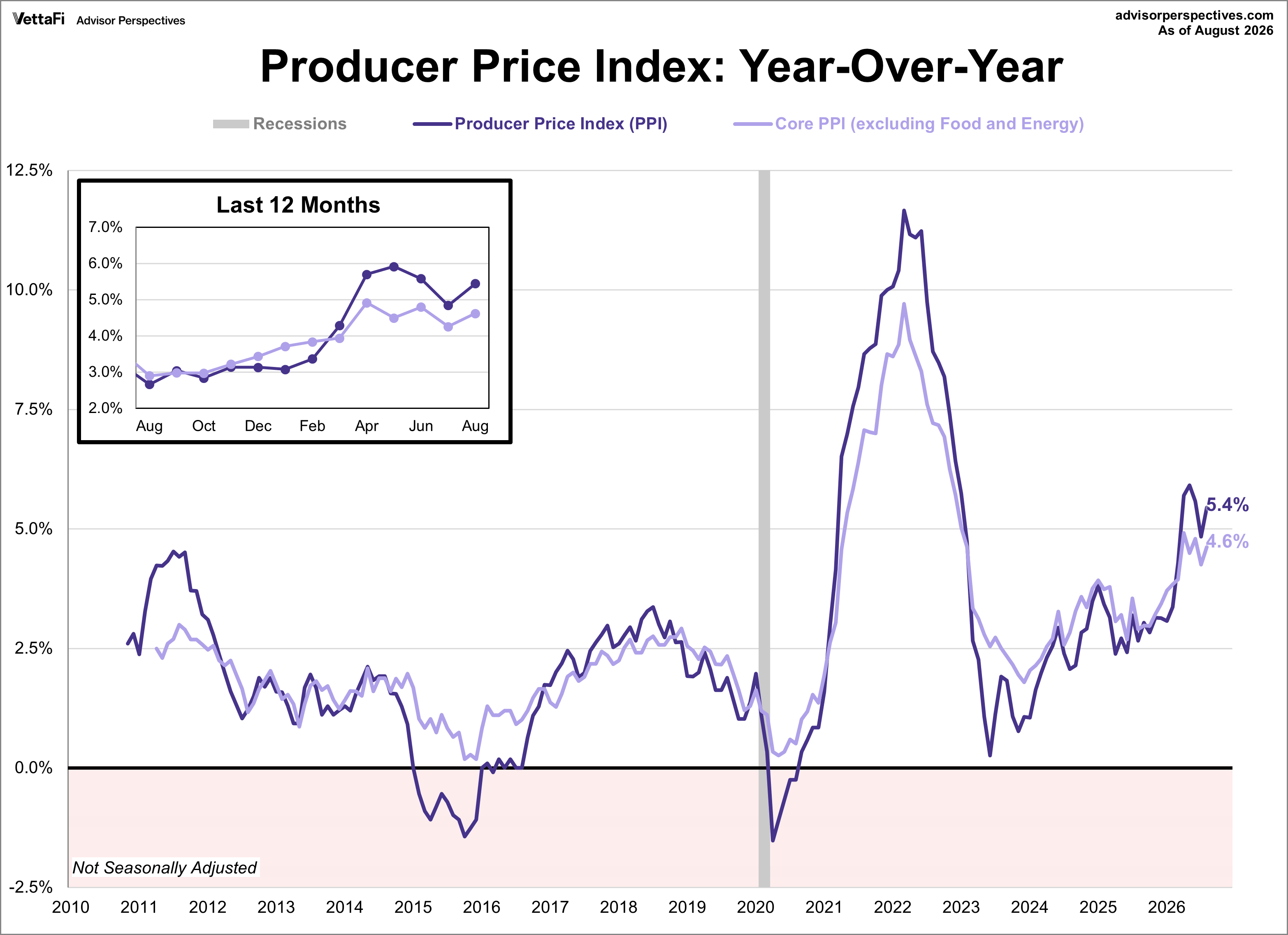
The Producer Price Index (PPI) was up 0.4% in August. This was better than the anticipated 0.1% reading. On an annual basis, headline PPI increased from 4.8% in July to 5.4% in August, above the 4.8% forecast.
Key Takeaways
- Headline PPI was up 0.4% in August, better than expectations of 0.1%.
- Year-over-year headline wholesale inflation increased to 5.4%, above the 4.8% forecast.
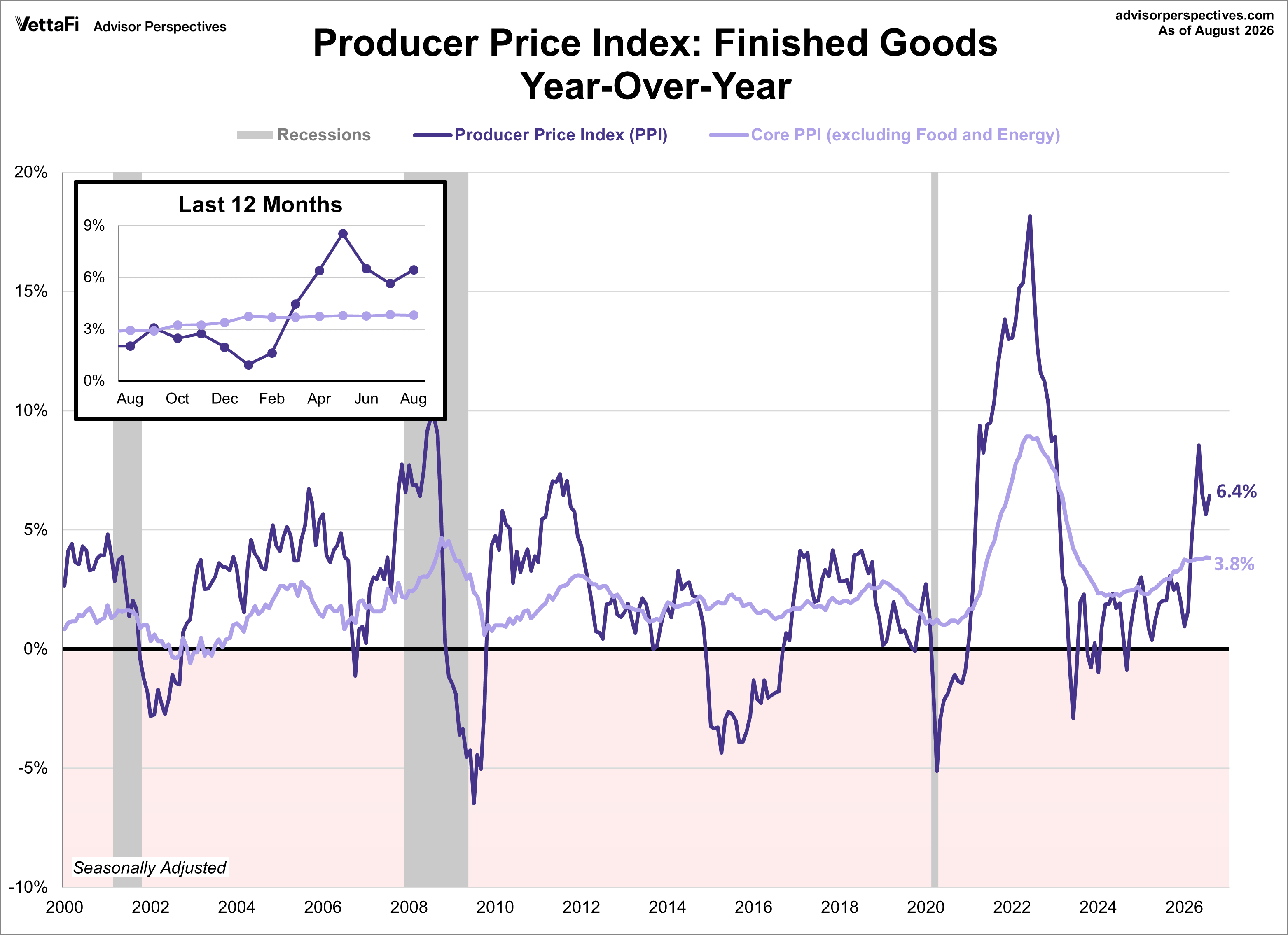
- Legacy PPI for finished goods increased 0.9% month-over-month and 6.4% on an annual basis.
Core PPI, which strips out volatile food and energy costs, came in lower than projected on a month-over-month basis. It rose 0.2% for the month, just below the 0.3% forecast. It increased 4.6% on an annual basis, better than the 4.3% forecast.

Analyzing the Legacy Producer Price Index for Finished Goods
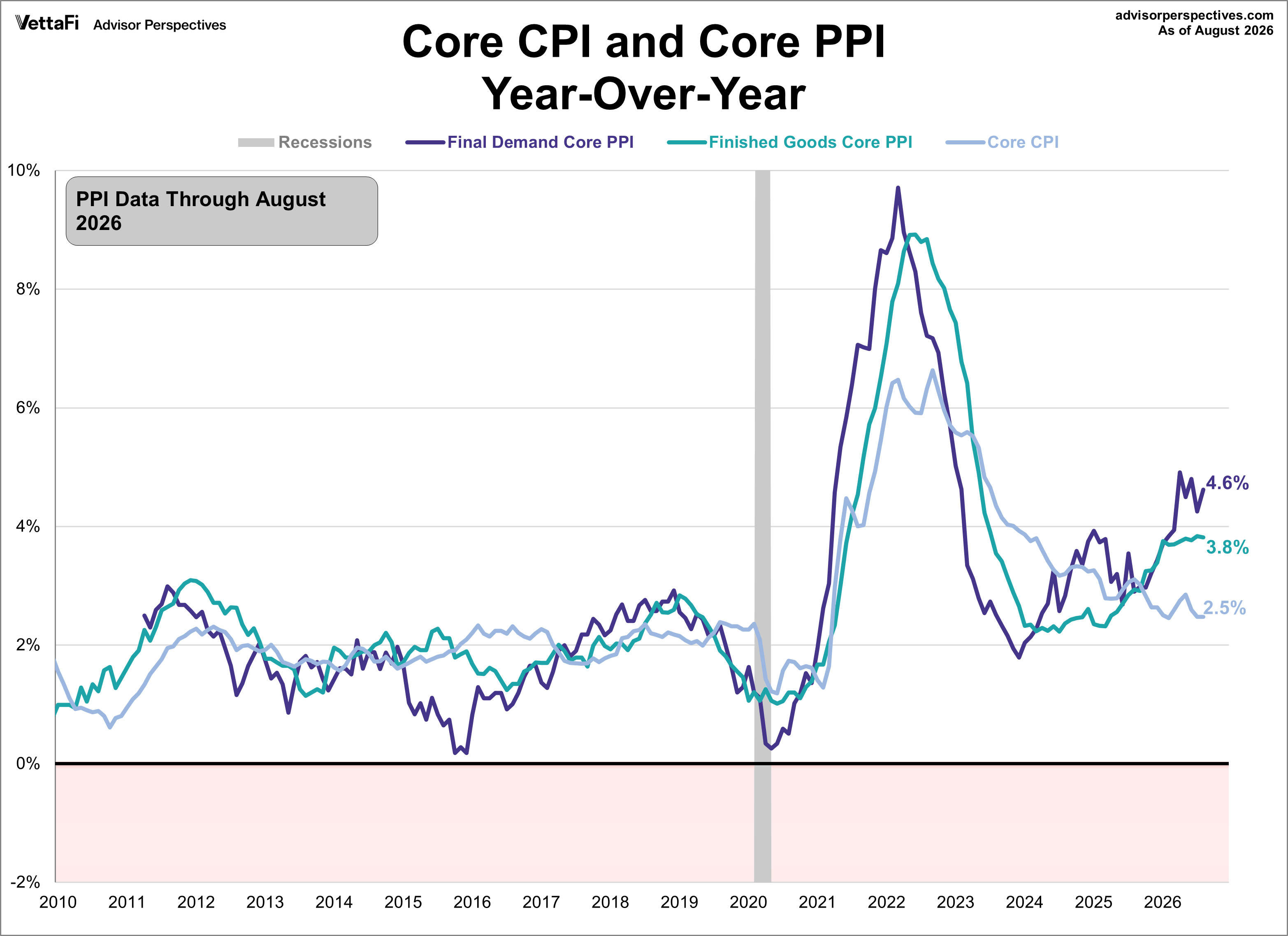
The BLS shifted its focus to the "final demand" PPI series in 2014, but data for these series extend only back to November 2009 for headline PPI and April 2010 for core PPI. Our analysis emphasizes longer-term trends. Consequently, we continue to track the legacy PPI for finished goods, which the BLS still includes in monthly updates. As a later overlay chart will illustrate, the final demand and finished goods indexes remain highly correlated.
In August, the PPI for finished goods was up 0.9% month-over-month. Year-over-year, headline PPI for finished goods increased from 5.6% to 6.4%. Meanwhile, core PPI for finished goods was up 0.4% on the month and 3.8% annually.
How the Producer Price Index (PPI) Compares to the Consumer Price Index (CPI)
Both PPI and CPI illustrate monthly price changes. The Producer Price Index measures price changes from the producer perspective. In contrast, the Consumer Price Index measures price changes from the consumer perspective.
Economists view PPI as a leading indicator of consumer inflation because, for the most part, when producers pay more for goods and services they are likely to pass along those higher costs to the consumer. the next chart illustrates this relationship.
Read more updates by Jen Nash