U.S. Household Incomes Over 50+ Years: The Great Divide
Membership required
Membership is now required to use this feature. To learn more:
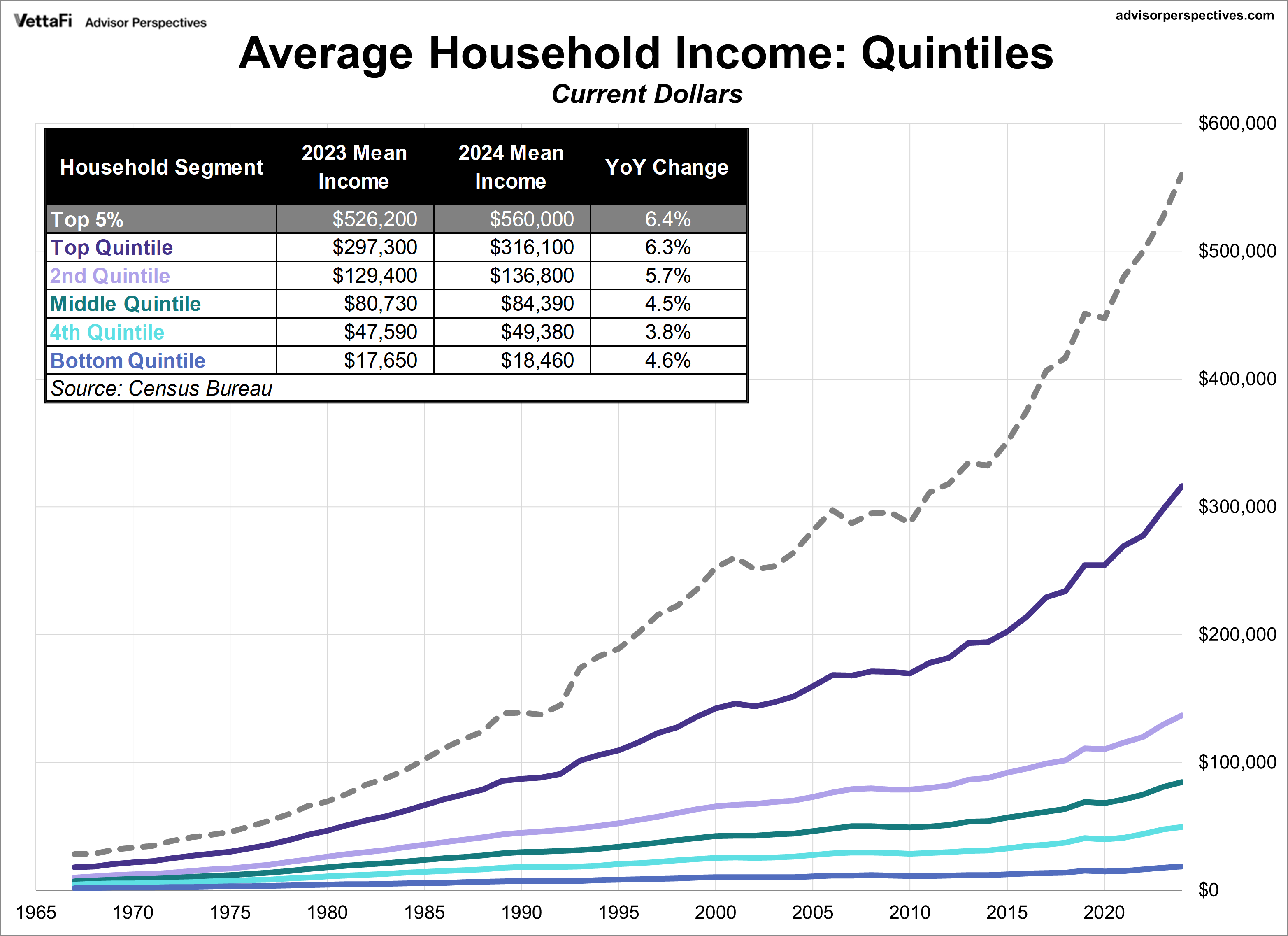
View Membership BenefitsThe Census Bureau recently released its annual report on household income data for 2024. The mean (average) household income for the middle quintile rose 4.5% to $84,390. Let's take a closer look at the quintile averages, which date back to 1967, along with the statistics for the top 5%.
Most people think in nominal terms, so the chart below illustrates the current dollar values for the six cohorts across the 50+ year period (in other words, the value of a dollar at the time received — not adjusted for inflation). As the chart shows, all segments saw a year-over-year increase in nominal average household income.
Household Income: Inflation-Adjusted Reality
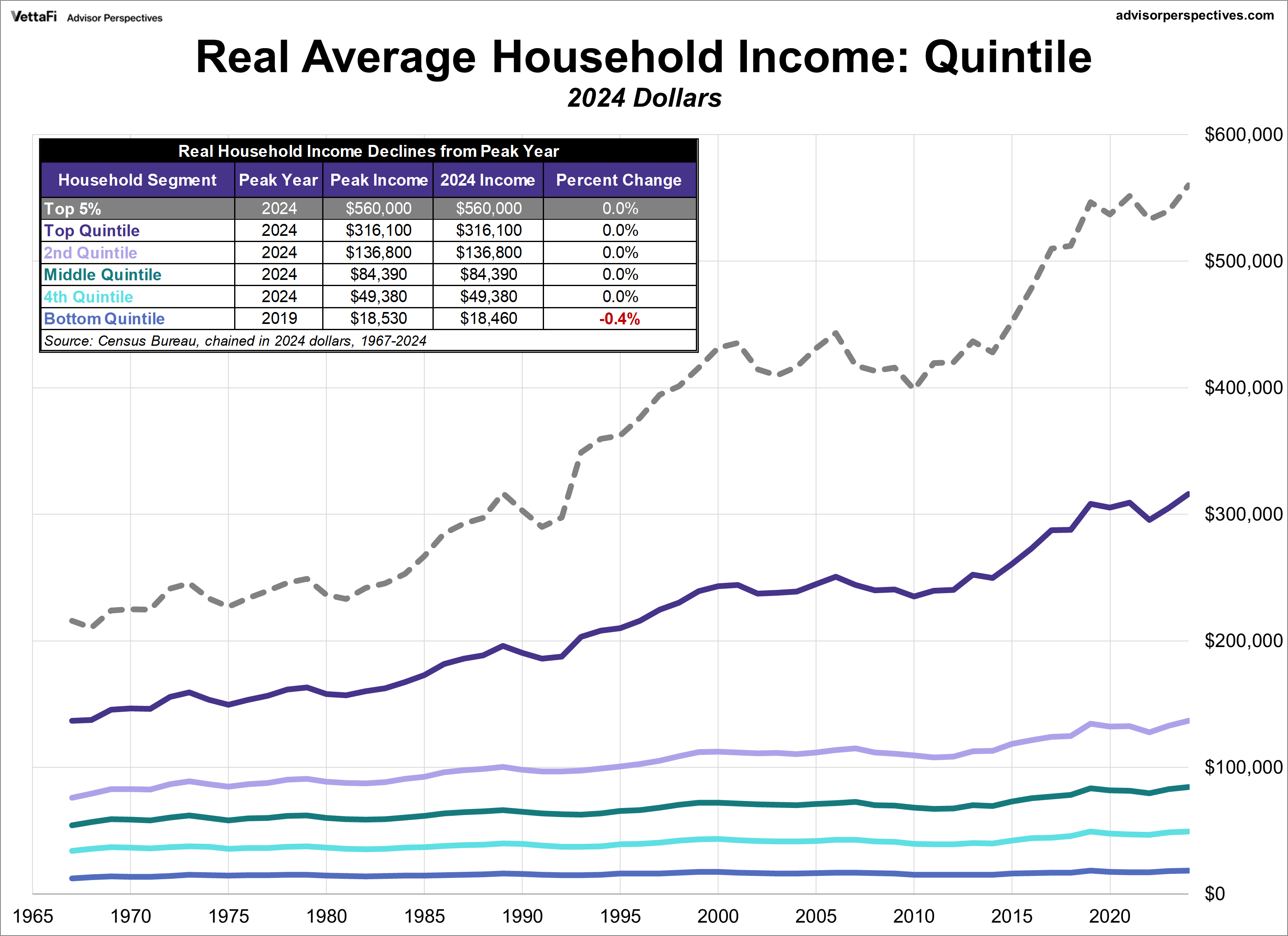
The chart below adjusts for inflation in chained 2024 dollars using a research variant of the Consumer Price Index, the CPI-U-RS, which is the Census Bureau's preferred deflator for inflation adjustment. The incomes in earlier years have been adjusted upward to the purchasing power of the most recent year in the series. Even after adjusting for inflation, all cohorts saw increases in 2024 from the previous year.
The most noteworthy trend is that he top four quintiles and the top 5% are now sitting at their highest real income levels in history. In contrast, the bottom quintile is less than 1% below its peak from 2019.
Real Household Income Growth
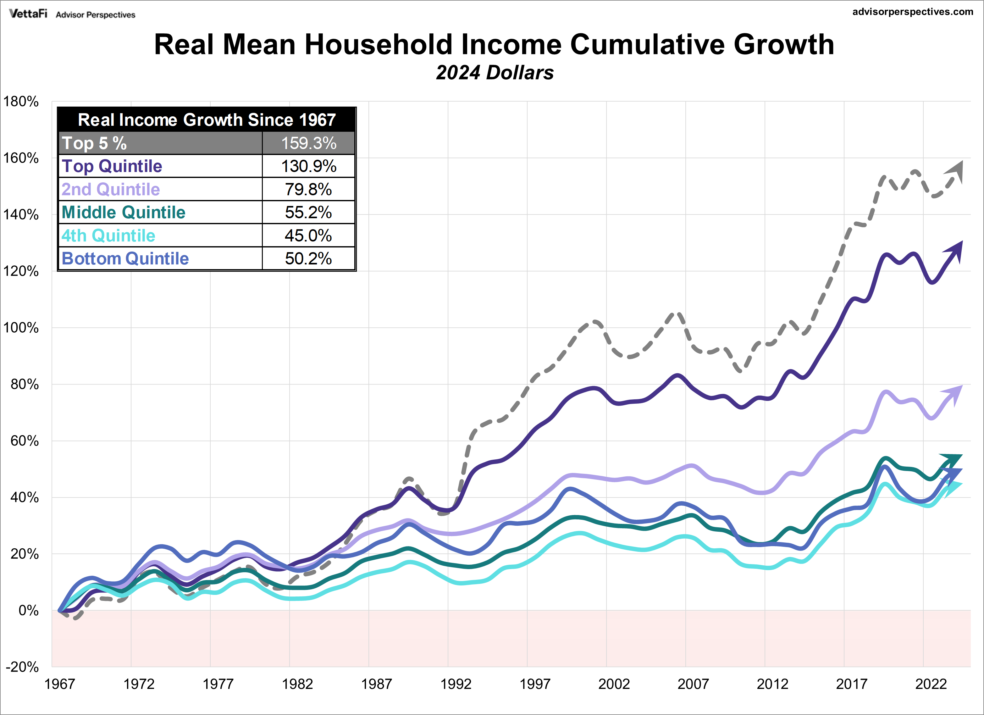
To give us a better idea of the underlying trends in household incomes, we've also prepared a chart of the real cumulative household income growth by segment since 1967. This chart visually confirms a growing chasm. While all segments saw growth, the lines for the top quintile (and especially the top 5%) began to steeply separate from the others in the mid-1980s.
This divergence coincides with the Reagan administration, an era of Supply Side Economics (also known as "Reaganomics" and "Trickle-Down Economics"). The chart serves as a stark rebuttal to the "trickle-down" theory, demonstrating that tax and other policy changes designed to benefit the wealthiest households did not benefit other income groups equally. As the accompanying table shows, the top quintile saw a staggering 130.9% real income growth since 1967, compared to the bottom quintile's 50.2%.
It's important to understand that the data in the charts above is for the mean (average) income for each of these segments. For U.S. households quintiles, the mean (average) income is higher than the median (middle of the range).
Membership required
Membership is now required to use this feature. To learn more:
View Membership BenefitsSponsored Content
Editorial Calendar
View Full Calendar Eastern Time Zone
+ Add the editorial calendar to your Google Calendar.
Upcoming Virtual Events View All