The Big Four Economic Indicators: Industrial Production Increases for Second Straight Month
Membership required
Membership is now required to use this feature. To learn more:
View Membership BenefitsOfficial recession calls are the responsibility of the NBER Business Cycle Dating Committee, which is understandably vague about the specific indicators on which it bases its decisions. This committee statement is about as close as it gets to identifying its method.
There is, however, a general belief that there are four big indicators that the committee weighs heavily in their cycle identification process. They are:
- Nonfarm Employment
- Industrial Production
- Real Retail Sales
- Real Personal Income (excluding Transfer Receipts)
The Latest Indicator Data: Industrial Production
Industrial production increased for a second straight month in August, surpassing expectations yet again. On a monthly basis, industrial production rose 0.4%, outpacing the projected 0.1% growth. Additionally, compared to one year ago, industrial production showed an increase of 0.25%.
Here is the overview from the Federal Reserve:
Industrial production increased 0.4 percent in August, and manufacturing output inched up 0.1 percent. The August reading for manufacturing was held back by a drop of 5 percent in the output of motor vehicles and parts; factory output elsewhere rose 0.6 percent. The index for mining moved up 1.4 percent, and the index for utilities climbed 0.9 percent. At 103.5 percent of its 2017 average, total industrial production in August was 0.2 percent above its year-earlier level. Capacity utilization moved up to 79.7 percent in August, in line with its long-run (1972–2022) average. [view full report]
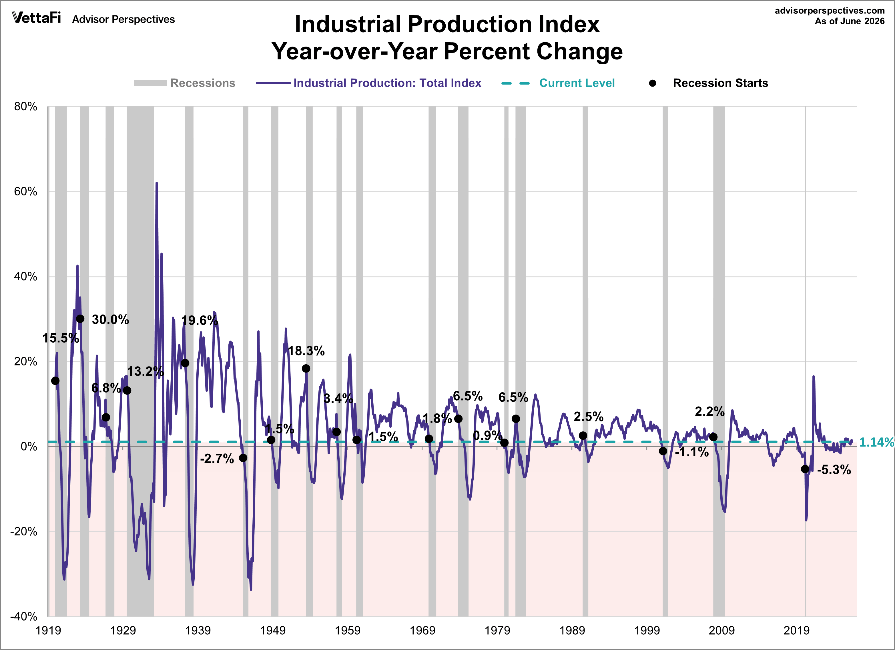
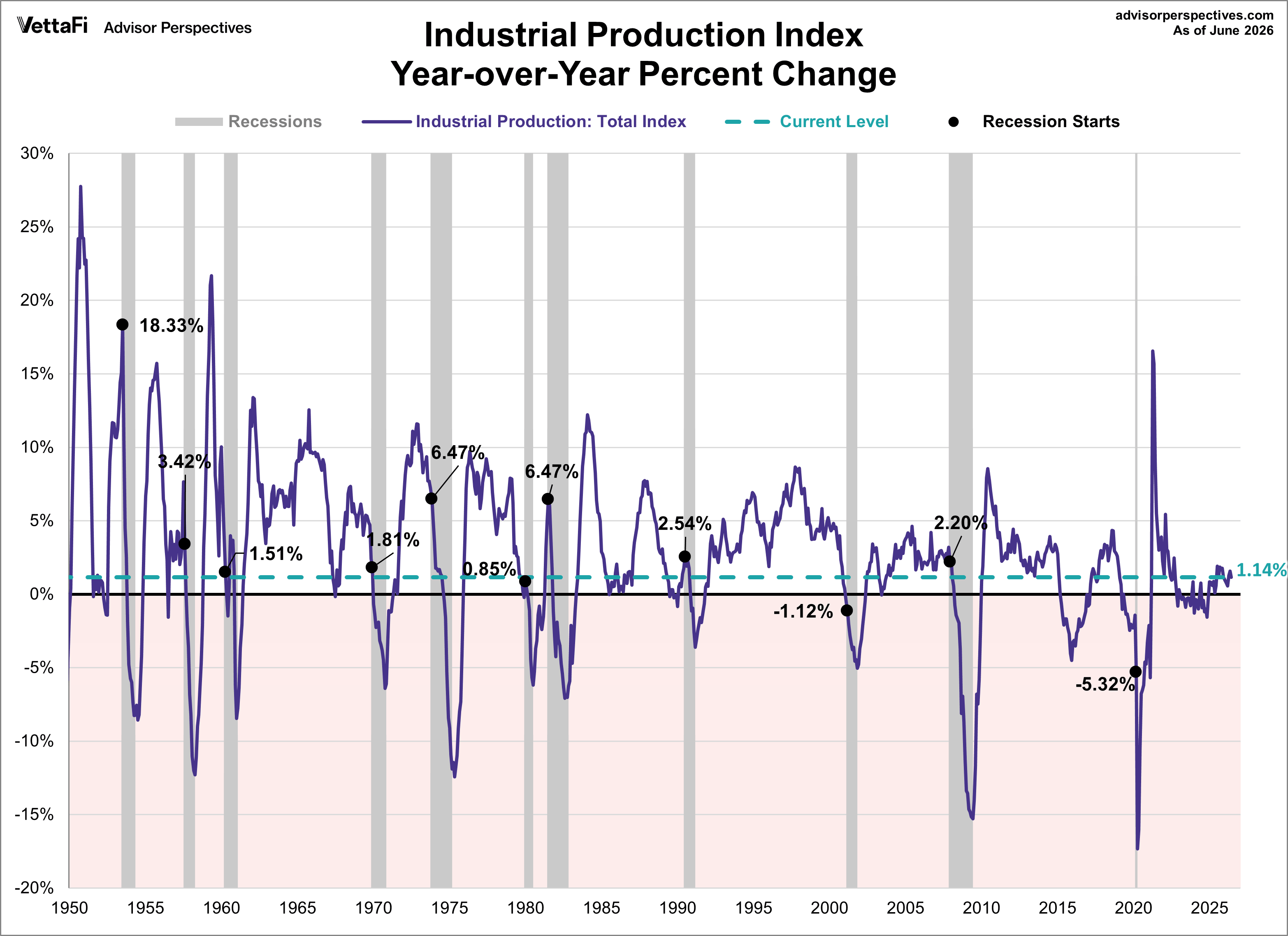
The chart below shows the year-over-year percentage change in industrial production since the series inception in 1919. The current level is lower than at the onset of 15 of 18 recessions over this time frame of nearly a century.
Industrial Production: Visualizing the Data
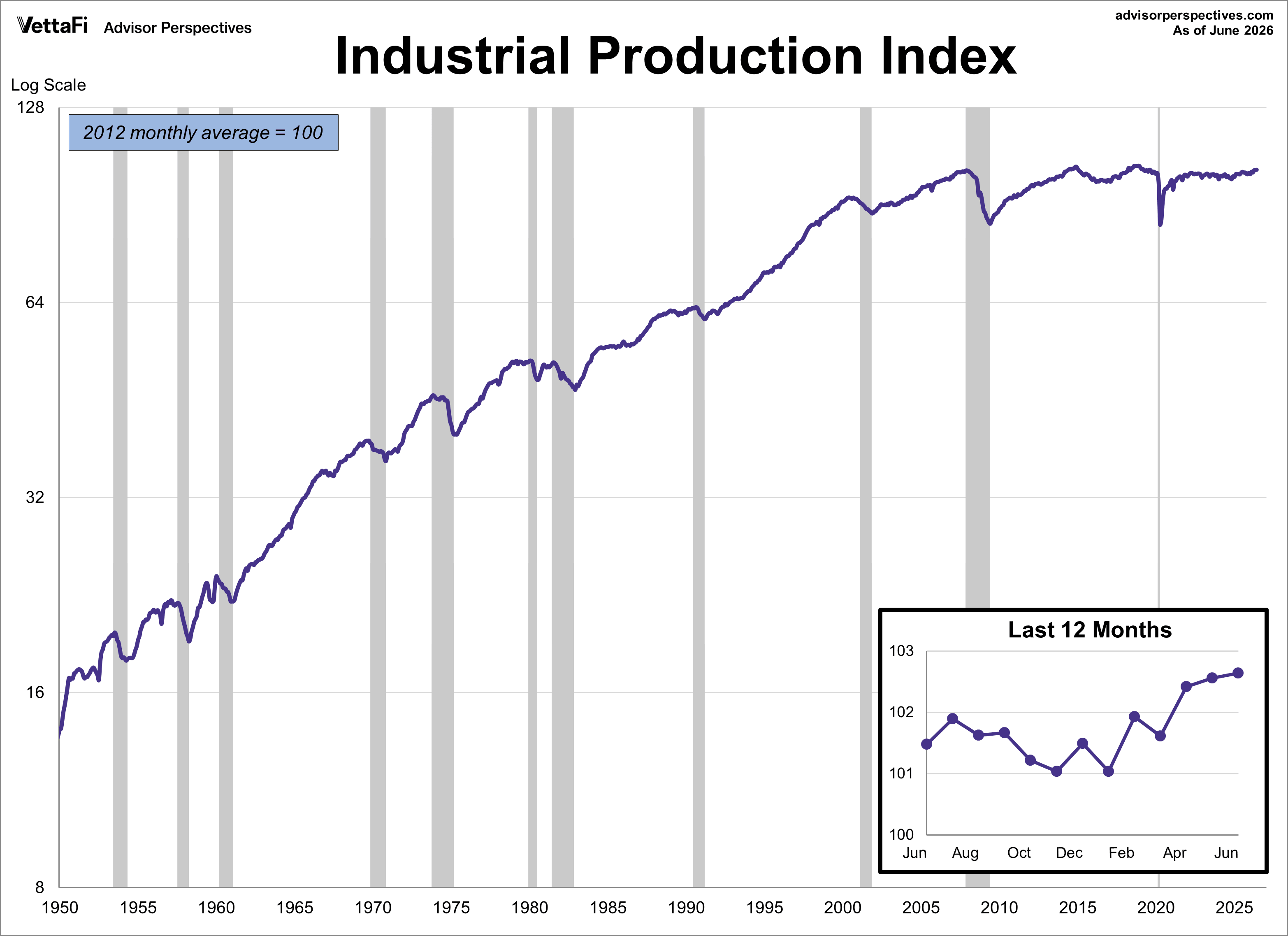
Industrial production measures the output of goods produced or mined in the U.S. While the manufacturing sector only makes up less than 20% of the economy, this indicator is closely watched as it is highly sensitive and quick to react to changes in the business cycle. The US industrial production Index (INDPRO) is the oldest of the four indicators, stretching back to 1919, although we've dropped the earlier decades and started in 1950.
In the charts below we have illustrated three different data manipulations:
- A log scale plotting of the complete data series to ensure that distances on the vertical axis reflect true relative growth. This adjustment is particularly important for data series that have changed significantly over time.
- A year-over-year representation to help, among other things, identify broader trends over the years. Industrial production year-over-year is currently below the level at the start of 9 of the 11 recessions that have started since 1950.
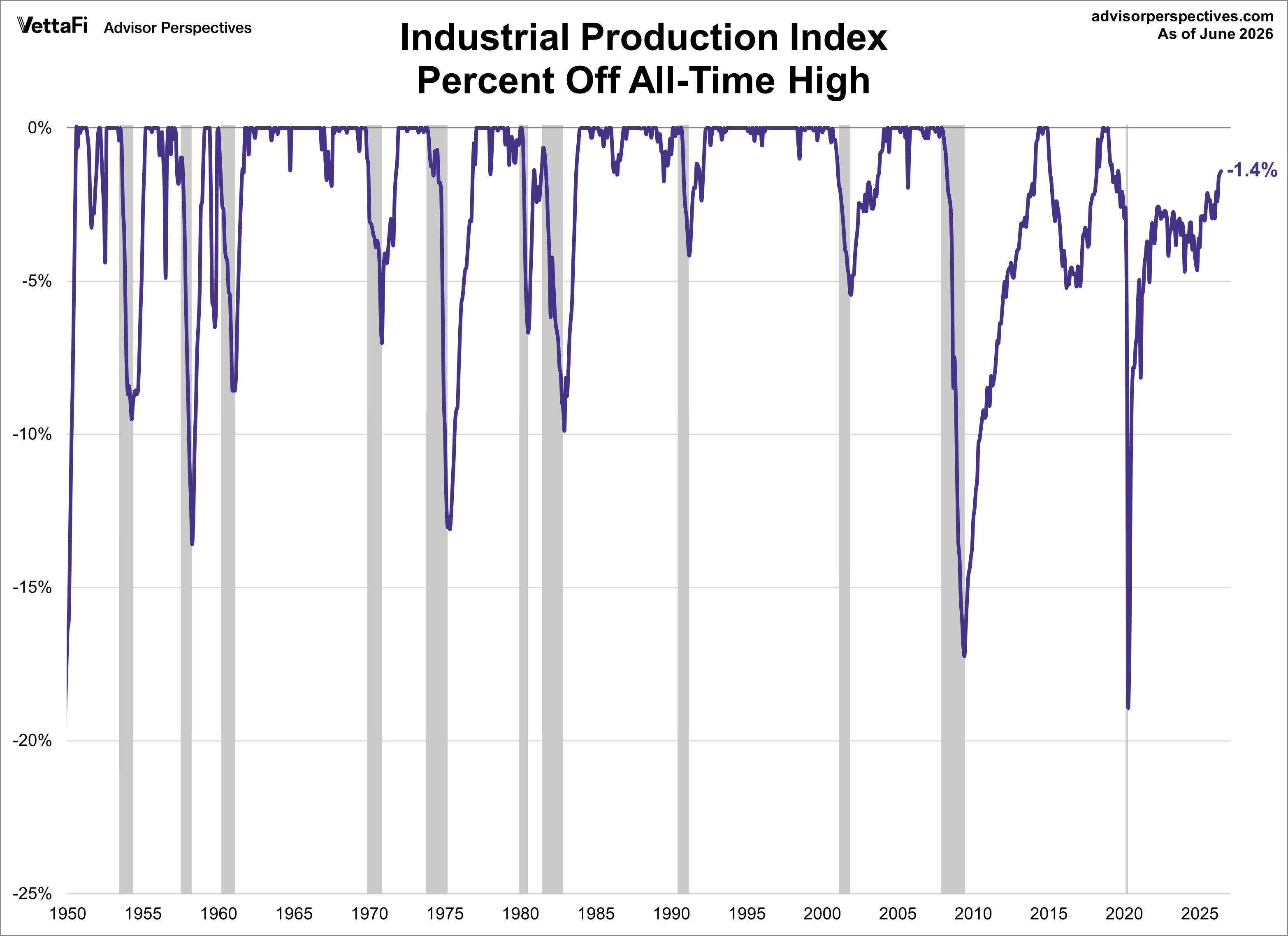
- A percent-off-high manipulation, which is particularly useful for better understanding of trend behavior and secular volatility. Industrial production is currently 0.6% off it's all-time high.
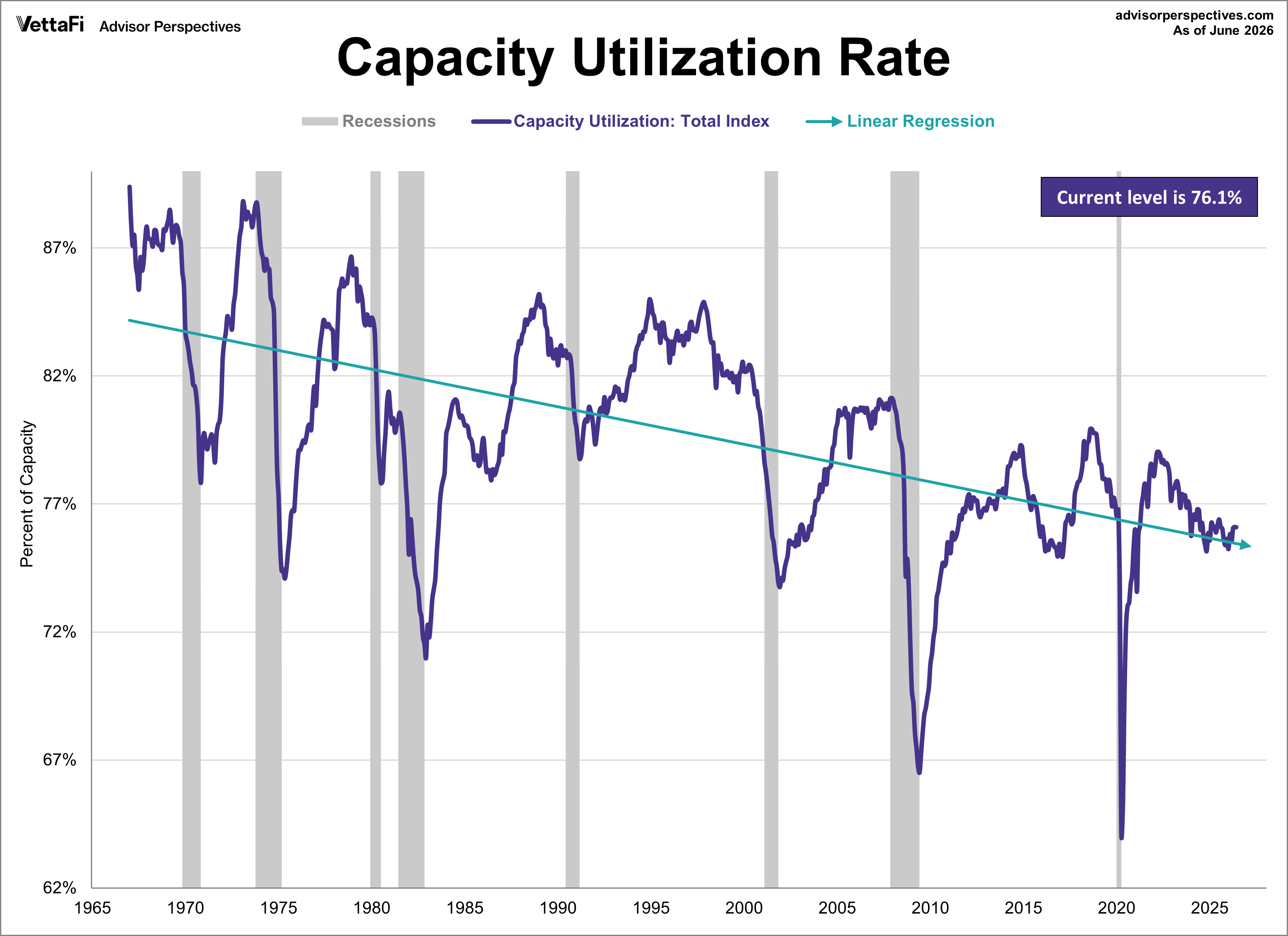
Industrial Production: Capacity Utilization
The Fed's monthly industrial production estimate is accompanied by another closely watched indicator, capacity utilization, which is the percentage of US total production capacity being used (available resources include manufacturing, mining, and electric and gas utilities). In other words, capacity utilization measures the amount of slack in the economy by looking at how much industries in the U.S. are presently producing and comparing that output to what they could potentially produce if the industrial sector was running at maximum capacity. In addition to showing cycles of economic growth and demand, capacity utilization also serves as a leading indicator of inflation because as American industry gets closer to operating at full capacity, shortages emerge which can generate inflation. When the economy is robust, the capacity utilization rate for manufacturing typically rises however when demand softens, the rate typically falls.
In August, the capacity utilization rate exceeded expectations at 79.7%, slightly surpassing the anticipated rate of 79.3%. While this reflects a monthly growth of 0.3%, it indicates a 1.3% decline on an annual basis. Here is a chart of the complete capacity utilization series, which the Fed began tracking in 1967. The linear regression assists our understanding of the long-term trend. The 2022 peak is likely due in part to supply chain issues as a result of the COVID pandemic.
The Generic Big Four Economic Indicators
The chart and table below illustrate the performance of the generic big four with an overlay of a simple average of the four since the end of the most recent recession (2020). The data points show the cumulative percent change from a zero starting point for April 2020.
Assessment and Outlook
The NBER declared the recent "COVID" recession to be just two months, ending in April 2020. This is the shortest recession on record - here is its announcement on the topic.
Retail sales bounced back most rapidly, due to pent-up demand and savings by consumers. This continues to improve but causes issues for producers and suppliers.
Industrial production has shown the second-best recovery out of the four. Producers and suppliers struggle with limited inventory and continued supply-chain issues.
Employment has improved since the official "end of the recession", but employers cannot fill many open positions for a variety of reasons.
Real income has shown the weakest recovery. Income has been an ongoing issue in terms of trends and matching inflation over the years.
Here is a percent-off-high chart based on an average of the big four. The average set a new all-time high in November of 2018.
Below is the same percent change chart as from two above, but shows the performance of the generic big four since the end of the great recession. The data points show the cumulative percent change from a zero starting point for June 2009.
Background Analysis: The Big Four Indicators and Recessions
The charts above don't really show us the individual behavior of the big four leading up to the 2007 recession. To achieve that goal, I've plotted the same data using a "percent-off-high" technique. In other words, I show successive new highs as zero and the cumulative percent declines of months that aren't new highs. The advantage of this approach is that it helps us visualize declines more clearly and to compare the depth of declines for each indicator and across time (e.g., the short 2001 recession versus the great recession). Here is our four-pack showing the indicators with this technique.
It's difficult to discuss the behavior of the big four leading up to the "COVID" recession - it likely would have occurred regardless of the strength of each of the four. Industrial production had not yet fully recovered from the great recession and was well of its high when COVID "hit". Employment and real income were not terribly far off their highs, and retail sales wavered but had recovered.
Now let's examine the behavior of these indicators across time. The first chart below graphs the period from 2000 to the present, thereby showing us the behavior of the four indicators before and after the two most recent recessions and now. Rather than having four separate charts, we've created an overlay to help us evaluate the relative behavior of the indicators at the cycle peaks and troughs. (See the note below on recession boundaries).
The chart above is an excellent starting point for evaluating the relevance of the four indicators in the context of two very different recessions. In both cases, the bounce in industrial production matches the NBER trough, while employment and personal incomes lagged in their respective reversals.
As for the start of these two 21st century recessions, the indicator declines are less uniform in their behavior. We can see, however, that employment and personal income were laggards in the declines.
Now let's look at the 1972-1985 period, which included three recessions -- the savage 16-month oil embargo recession of 1973-1975 and the double dip of 1980 and 1981-1982 (6-months and 16-months, respectively).
And finally, for sharp-eyed readers who can don't mind squinting at a lot of data, here's a cluttered chart from 1959 to the present. That is the earliest date for which all four indicators are available. The main lesson of this chart is the diverse patterns and volatility across time for these indicators. For example, retail sales and industrial production are far more volatile than employment and income.
The charts above focus on the big four individually, either separately or overlaid. Now let's take a quick look at an aggregate of the four. The next chart is an index created by equally weighting the four and indexing them to 100 for the January 1959 start date. I've used a log scale to give an accurate indication of growth and also added an exponential regression to assist us in seeing the secular patterns of faster and slower growth. As we can readily see, growth of this aggregate indicator has slowed dramatically since the end of the last recession.
Now let's plot the percent off high for this aggregate index. As we immediately recognize, it is completely worthless as a leading indicator of recessions. The aggregate index set a new high the month before the recession began for five of the eight recessions since the early 1960s.
We can construct a better leading indicator by plotting the average of the percent off highs for each of the four, which is the technique we've used in the next chart. Here we've highlighted the months when all four indicators were at all-time highs. The dashed line shows the -0.91% average of the four at recession starts.
A note on recessions: Recessions are represented as the peak month through the month preceding the trough to highlight the recessions in the charts above. For example, the NBER dates the last cycle peak as December 2007, the trough as June 2009 and a duration of 18 months. The "peak through the period preceding the trough" series is the one FRED uses in its monthly charts, as explained in the FRED FAQs illustrated in this Industrial Production chart.
This article was originally written by Doug Short. From 2016-2022, it was improved upon and updated by Jill Mislinski. Starting in January 2023, AP Charts pages will be maintained by Jennifer Nash at VettaFi | Advisor Perspectives
Membership required
Membership is now required to use this feature. To learn more:
View Membership BenefitsSponsored Content
Editorial Calendar
View Full Calendar Eastern Time Zone
+ Add the editorial calendar to your Google Calendar.
Upcoming Webinars View All


