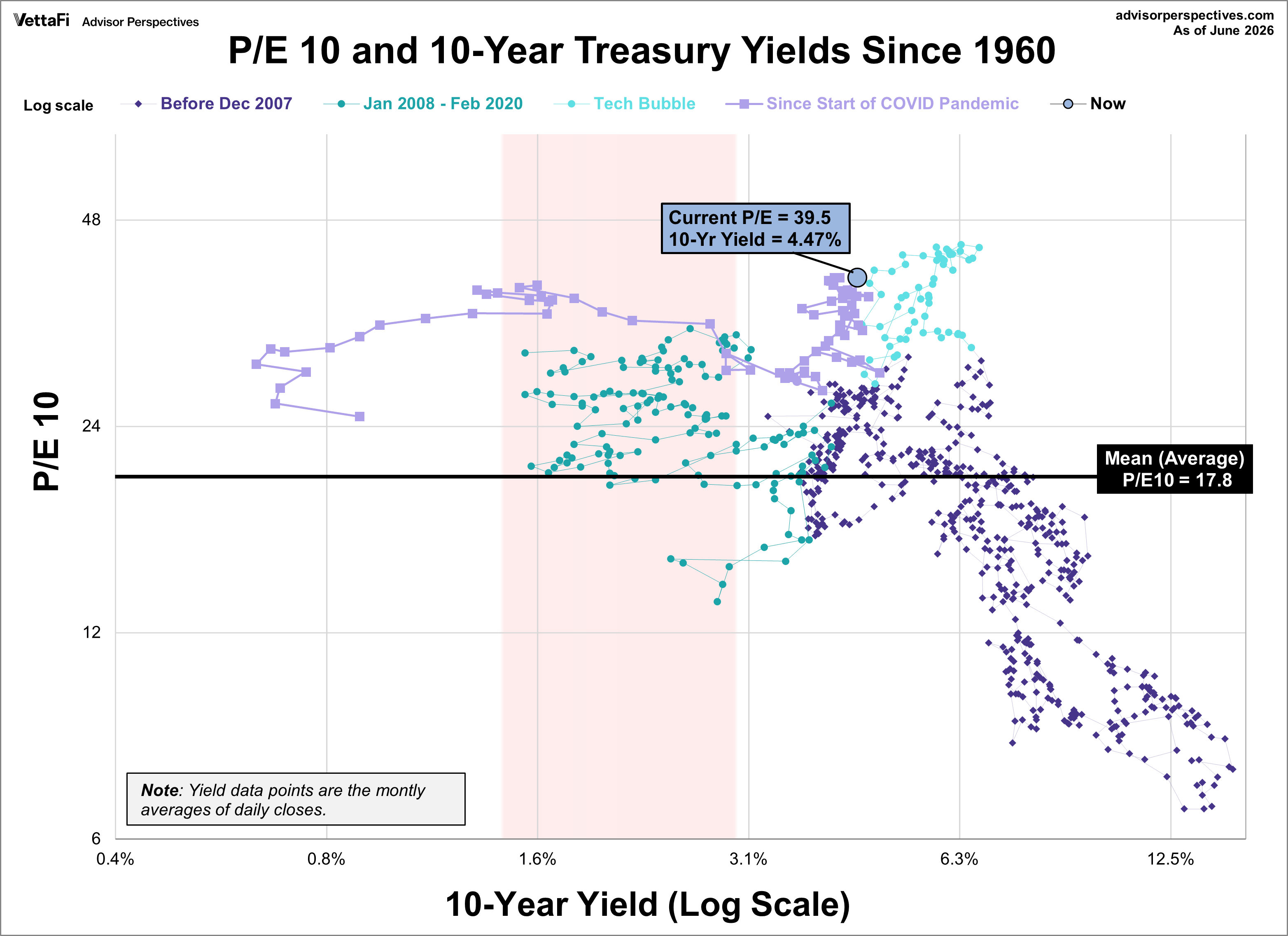
Our monthly market valuation updates have long had the same conclusion: US stock indexes are significantly overvalued, which suggests cautious expectations for investment returns. This analysis focuses on the P/E10 ratio, a key indicator of market valuation, and its correlation with inflation and the 10-year Treasury yield.
Market Valuation (P/E10) and Inflation
The relationship between market valuation, as represented by the P/E10 ratio, and inflation reveals crucial patterns. The following scatter graph illustrates this relationship across three distinct periods: January 1881 to December 2007, January 2008 to February 2020, and March 2020 to the present.
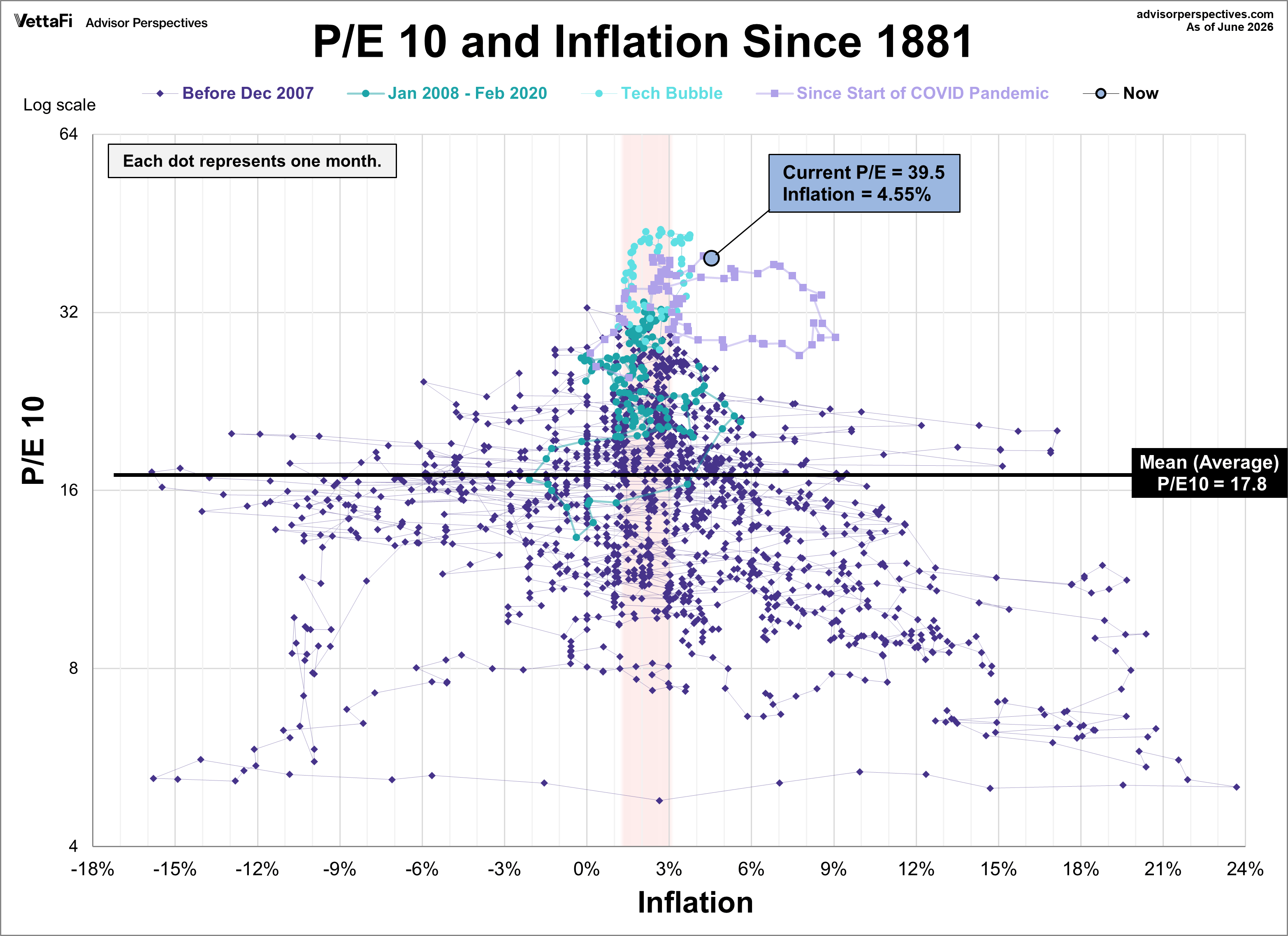
Key observations from the graph include:
- Historical Periods: The graph clearly delineates the three timeframes, allowing for comparative analysis.
- Tech Bubble: The extreme overvaluation during the tech bubble (June 1997 to January 2002), defined arbitrarily as a P/E10 of 25 or higher, is highlighted.
- Average P/E10: The graph displays the historical average P/E10 of 17.8, providing a benchmark for current valuations.
- Current Position: The current P/E10 and inflation rate are clearly marked.
- Inflation "Sweet Spot": The shaded red area indicates the inflation "sweet spot" (approximately 1.4% to 3.0%), a range historically associated with higher valuations.
The inflation figure presented is the year-over-year change. Note: Due to the lapse in official Consumer Price Index (CPI) reports from the government shutdown in 2025, the inflation figure for October 2025 been extrapolated using the two prior months' data.
Understanding the Inflation "Sweet Spot"
The "sweet spot" of 1.4% to 3.0% inflation has historically supported higher market valuations. Currently, the P/E10 stands at 39.5, with a year-over-year inflation rate of 4.55%. This places us outside the "sweet spot" and within the "extreme valuation territory" previously observed during the tech bubble. This means that the current valuation is very high compared to historical norms, and traditionally, these periods are associated with higher risk of market downturns.