The stock market's only certainty is its cyclical nature: long-term overperformance eventually leads to underperformance, and vice versa. Using regression analysis, we can examine the historical pattern of this movement.
The Current Market vs. The Long-Term Trend
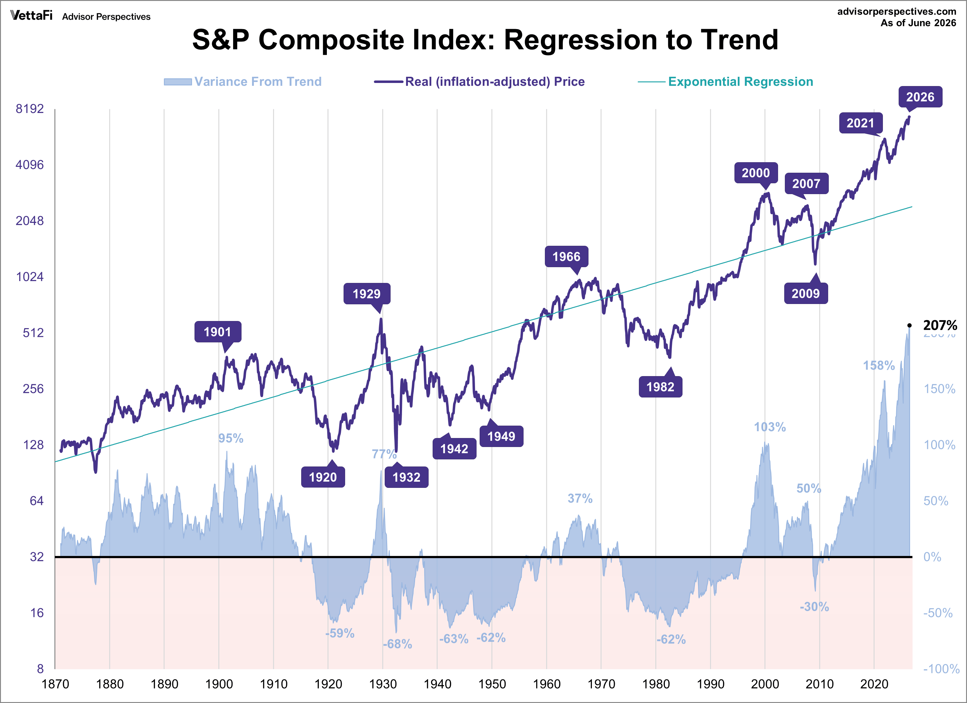
A chart of the inflation-adjusted S&P Composite Index, dating back to 1871, reveals a long-term pattern. Using a semi-log scale, a regression trendline shows the market's multi-year periods of trading above and below this trend. This trendline, incidentally, represents an average annual growth rate of 2.01%.

The index has been consistently above its trend for nearly three decades, with one brief exception during the 2008-2009 period, when it dropped to 30% below trend. This is notable because past troughs saw declines exceeding 50% below the trend. For context, if the S&P 500 were currently on its long-term regression, its value would be 2,428.
The stock market's current departure from its long-term trend is entirely unprecedented. While the dot-com peak in 2000 set a record at the time, recent years have completely shattered it:
-
Old Historical Peaks: 1929 (77%), 1901 (95%), and 2000 (103%)
-
Recent Acceleration: 2021 (158%), 2024 (175%), and 2025 (199%)
-
Current Record: June 2026 (207% above trend)
Note: Due to the lapse in official Consumer Price Index (CPI) reports from the government shutdown in 2025, the inflation figure for October 2025 been extrapolated using the two prior months' data.
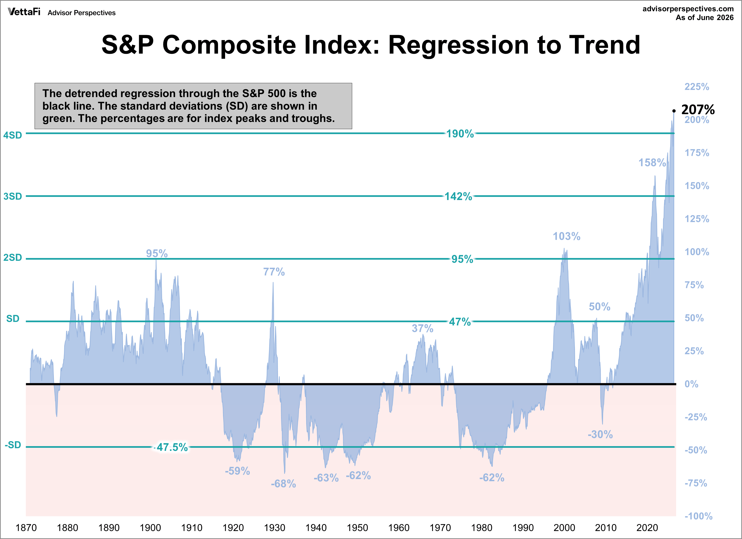
Analyzing Volatility with Standard Deviation
The standard deviation for prices above and below the trend is approximately 47%. The chart below illustrates the historical performance of the S&P Composite Index relative to its long-term trend, highlighting standard deviation bands.
Historically, major peaks in the early 20th century occurred around the +2 standard deviation range, while troughs before 2009 typically fell more than -1 standard deviation below the trend.
Recent movements have been more extreme. From early 2021 to mid-2022, the index briefly reached the +3 standard deviation range before falling back to +2SD territory. However, starting in 2024, it moved back into the +3SD range and was nearing the unprecedented +4 standard deviation territory by the end of the year. In September 2025, the index has moved into the +4SD range for the first time in history. The index briefly retreated to +3SD range in March 2026 but quickly moved back into +4SD range the following month where it remains today.
ETFs associated with the S&P 500 include: iShares Core S&P 500 ETF (IVV), SPDR S&P 500 ETF Trust (SPY), Vanguard S&P 500 ETF (VOO), and SPDR Portfolio S&P 500 ETF (SPYM).
Footnote on calculating the regression: The regression on the Excel chart above is an exponential regression to match the logarithmic vertical axis. I used the Excel growth function to draw the line. The percentages above and below the regression are calculated as the real average of daily closes for the month in question divided by the growth function value for that month minus 1. For example, if the monthly average of daily closes for a given month was 2,000. The growth function value for the month was 1,000. Thus, the former divided by the latter minus 1 equals 100%.
Read more updates by Jen Nash