Summary: The cumulative advance-decline (A-D) line for both the NYSE and SPX made a new all-time high (ATH) last week. That's good news for stocks, as they most often move higher in the following weeks/months, also to new highs.
This is probably the best way to use the A-D line in equity research. Other common uses of A-D line are fraught with issues.
For example, while it's true that the A-D line has often weakened before stocks have encountered a major decline, you'll need hindsight to make use of this information. For every time a weakening A-D line has signaled a major fall it has signaled nothing special at least twice as often. "Negative divergences" happen all the time. In real-time, it is impossible to know when a divergence is worth paying attention to.
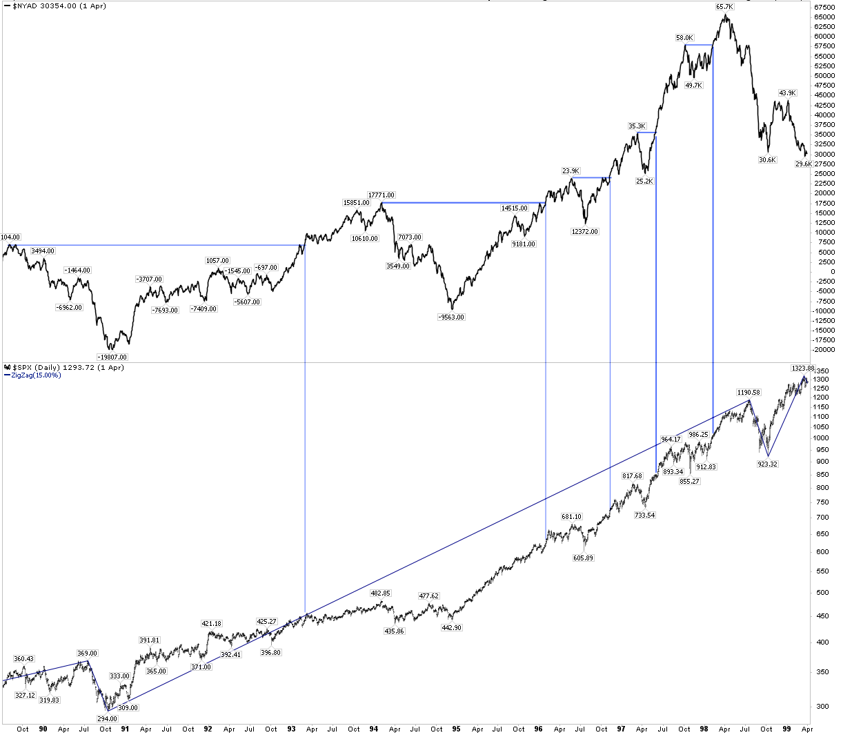
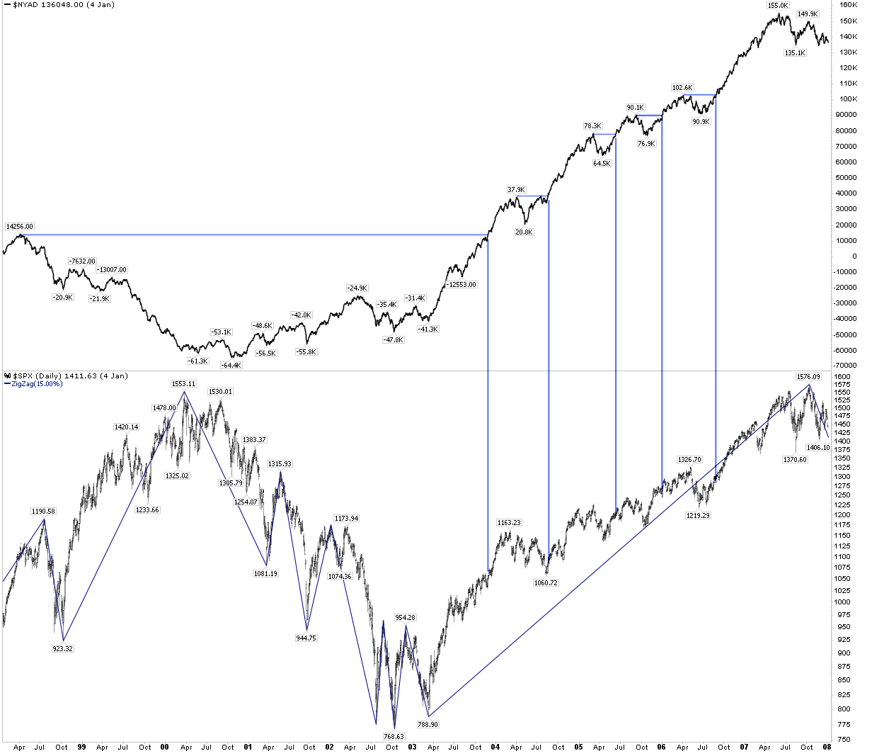
Last week, the cumulative advance-decline (A-D) line for both the NYSE and SPX made a new all-time high (ATH). The A-D line sums the net number of stocks moving up on the day added to yesterday's total. The idea is that when the A-D line is rising, more stocks are moving higher and breadth is considered healthy. In other words, it's a bullish sign for stocks.
Let's start with the good news.
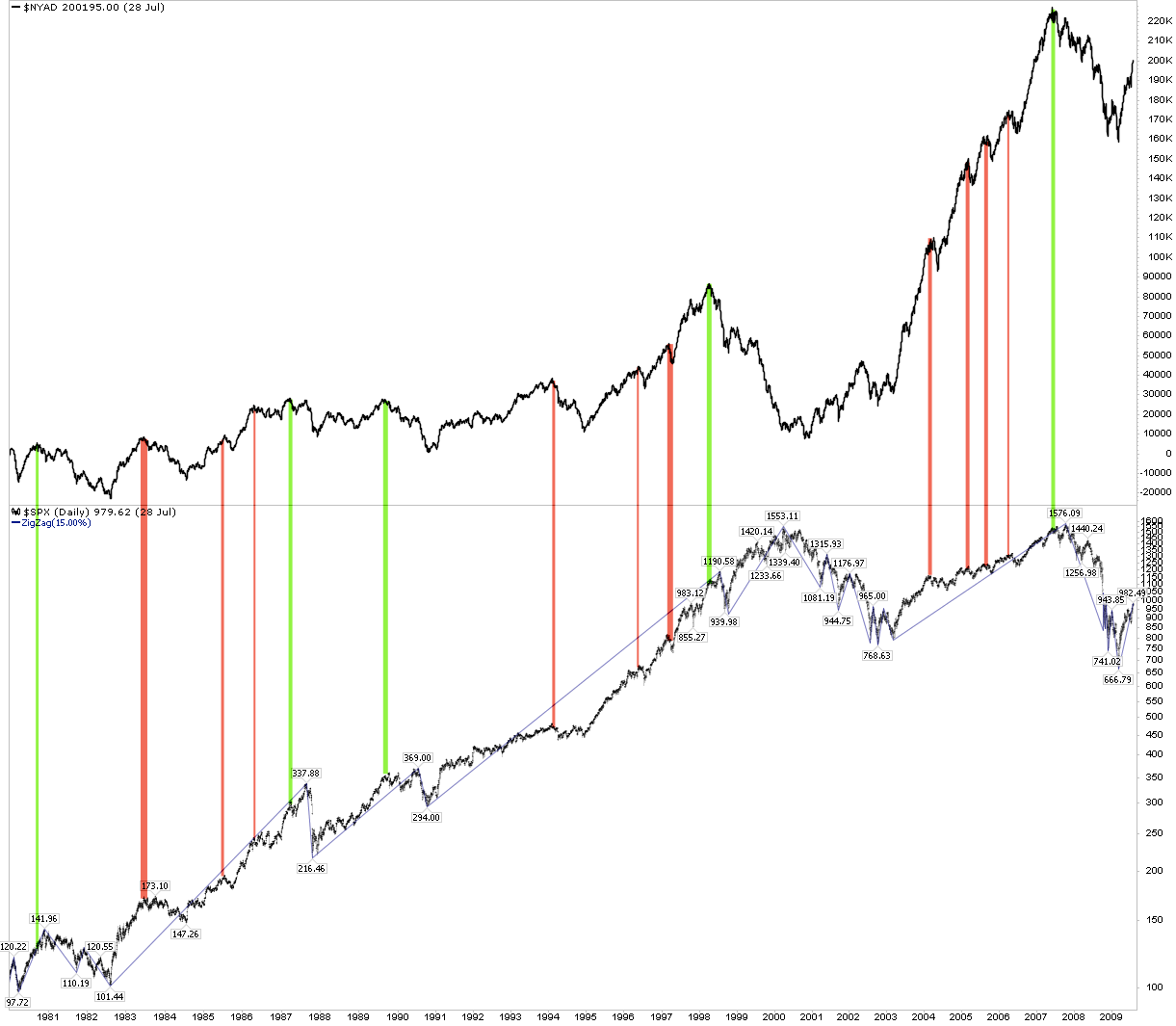
The charts below show every "breakout" in the NYSE A-D line to a new high (top panel) and what happened next to SPX (lower panel) in the past 30 years. What we find is that in every case, SPX has moved higher in the weeks/months ahead. Enlarge any chart by clicking on it.

The not so good news is that the gains haven't always been right away. In the chart above, note how SPX went nowhere for several months in 2016. That was also the case in 1993 and 1996, for example.
So if you are expecting the A-D line to signal weakness in stocks ahead of a decline in stocks of 5-10%, you're in for a bad surprise.
Why is the utility of the A-D line so limited?
We have previously described the problems in using breadth for identifying market inflection points. In short, the conventional wisdom that new highs in the stock indices should be confirmed by an expansion in breadth is empirically false. Indices have typically been driven higher based on a small number of stocks contributing disproportionately large gains. Over the past 20 years, just 4% of stocks have accounted for an astounding 68% of the gains in the SPX (read further here).
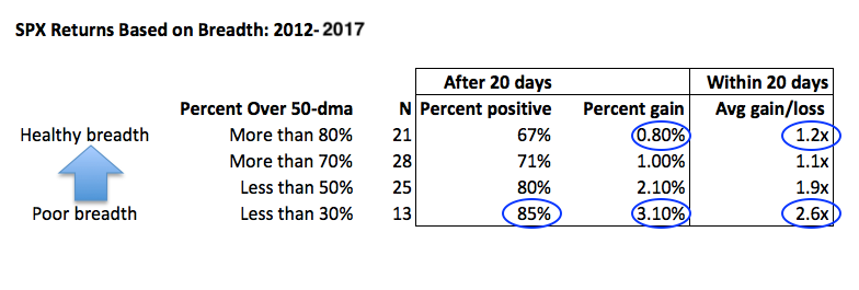
Moreover, stock market returns have typically been best when breadth is worst. From 2012 to 2017, the SPX has gained more than 3 times as much over the following month when breadth was weak compared to when breadth was "healthy." Risk/reward was more than twice as favorable when breadth has been weak as when it was healthy.
The A-D line has specific conceptual issues. Again, the A-D line sums the net number of stocks moving up on the day added to yesterday's total. But if a lot of small stocks move up by one penny on low volume but slightly fewer large companies move down a dollar on high volume, the cumulative advance-decline line still moves higher. Or, if a large number of defensive stocks move up while "risk-on" cyclical stocks move down, the cumulative advance-decline line moves higher. Neither of these is a sign of market health.
In summary, the new ATH in the A-D line for both the NYSE and SPX last week is good news for stocks, as they most often move higher in the following weeks/months. This is probably the best way to use the A-D line in equity research.
© The Fat Pitch
Read more commentaries by The Fat Pitch