These Three Charts Will Convince Investors That Time May Be Running Out
Membership required
Membership is now required to use this feature. To learn more:
View Membership Benefits
Before we get to looking at those three charts, I want to talk about trade for a moment. Today the Trump administration made good on its threat to raise tariffs on as much as $200 billion worth of Chinese imports to 25 percent from the previous 10 percent. The president also said that a decision could be made soon on whether to impose the same 25 percent rate on an additional $325 billion of Chinese goods, which, all told, would cover approximately the total amount of goods the U.S. imported from China in 2018.
So what does this mean? As I’ve made clear here, here and elsewhere, a tariff—beside being a strain on international relations—is essentially a tax that must be paid to the U.S. government before a shipment can clear customs. But here’s the kicker: Tariffs are typically paid not by the exporting company but by the importer. In other words, it’s U.S.-based companies that are picking up the tab—then passing the extra expense on to American consumers.
With the exception of the U.S. Treasury, which collects the tariff payments, few stand to benefit here. A February study by Washington, D.C.-based Trade Partnership Worldwide (TPW) estimated that 25 percent tariffs on Chinese goods cost families of four close to $2,300 extra on average per year. They also have the potential to impact upwards of 2.2 million American jobs as well as risk diverting trade to other markets.
“By any measure, the imposition of tariffs by the United States and U.S. imports of steel, aluminum, motor vehicles and parts… is a net loss for the U.S. economy and U.S. workers,” the report reads. Workers “experience greater losses than gains,” and in many cases, according to TPW, “the tariff actions erase all of the anticipated gains from tax reform.”
Market Sentiment at Its Lowest in 10 Months
Stocks sold off this week on the tariff news and are now officially in oversold territory. Our own U.S. Global Sentiment Indicator, which tracks as many as 126 commodities, indices, sectors, currencies and international markets, calculates the percentage of positions whose five-day moving averages are above or below their 20-day moving averages. Then we compare the data to the S&P 500 Index. This week the sentiment indicator fell to 20 percent, showing that the market is at its most oversold since July 2018.

Stocks may still have further to slide before a resolution to the trade dispute is reached. But for now this could be a good opportunity for investors to pick up some distressed stocks as we await mean reversion. In a Frank Talk post this week, I recommended that investors who seek to get access to the robust U.S. economy but limit their exposure to international trade would do well to look at high-quality small and mid-cap equities. Smaller firms, those with market caps between $1 billion and $10 billion, have the potential to outperform right now because they rely much less on trade than their larger multinational peers. They’re also supported by a stronger U.S. dollar.
I would also recommend considering government and investment-grade municipal bonds, which historically have helped investors improve their risk-adjusted returns in times of economic uncertainty. And of course there’s always exposure to gold and other metals that are expected to be in greater demand in the coming years, copper chief among them.
This leads us to the main event. Below are three charts that I think will convince investors that time is running out to prepare for the next major downturn. All charts and data were brought to my attention by Michael Kantrowitz, head of portfolio strategy at market research firm Cornerstone Macro, who visited our office this week.
1. Is U.S. Manufacturing Growth Projected to Stall?
I reported last week that the ISM Manufacturing Index for the U.S. fell sharply in April to 52.8, down from 55.3 in March. This means that although the manufacturing sector is still expanding, it’s doing so at a much slower pace. What’s more, the manufacturing index could soon fall below 50.0, indicating a slowdown. For this we’d largely have the Federal Reserve to thank.
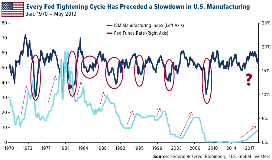
That’s according to Michael, who pointed out to us that every Fed tightening cycle going back to the 1950s has preceded a pullback in the ISM Manufacturing Index. And each of these pullbacks coincided with an economic recession and/or market selloff. (One notable exception was 1995, when the market continued to rally despite manufacturing weakness.)
So will this time be different?
I’ll let my friend Bob Moriarty—whose excellent book Basic Investing in Resource StocksI reviewed earlier this month—tackles this one: “The most dangerous words in investing are ‘This time it’s different.’ It’s never different.”
2. Trying to Predict Future Earnings Per Share Growth? Monitor Lumber Prices
One of the most eye-opening charts Michael shared illustrates the close relationship between lumber prices and future earnings per share (EPS) growth. “Believe it or not,” he told us, “lumber prices are among the most reliable leading indicators available.”
I believe it. Housing is a massive part of the U.S. economy, contributing between 15 percent and 18 percent to gross domestic product (GDP), according to the National Association of Home Builders (NAHB). Housing also has an extremely high multiplier effect. Every 100 homes in the U.S. can support up to 70 jobs on average and generate as much as $4.1 million in local income on an ongoing annual basis.
So it stands to reason that lumber prices can give us an incredibly accurate forecast of where the market is headed. In the chart below, lumber prices have been advanced forward six months to illustrate the lag time between changes in price and EPS estimates. When lumber tanked over the 12-month period, EPS followed around six months later. And when lumber soared, EPS estimates shot up.
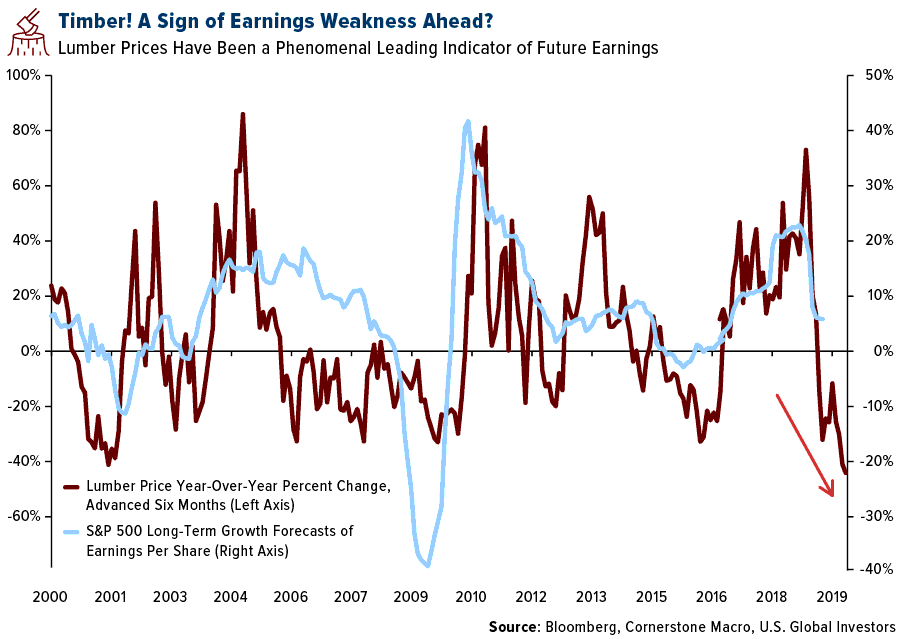
You may have already detected the warning signal that lumber’s flashing right now. From its high in May of last year, the lumber price has plunged almost 50 percent. That’s the commodity’s sharpest 12-month decline on record. Going forward, then, keep your eyes on earnings, which are a central driver of stock prices.
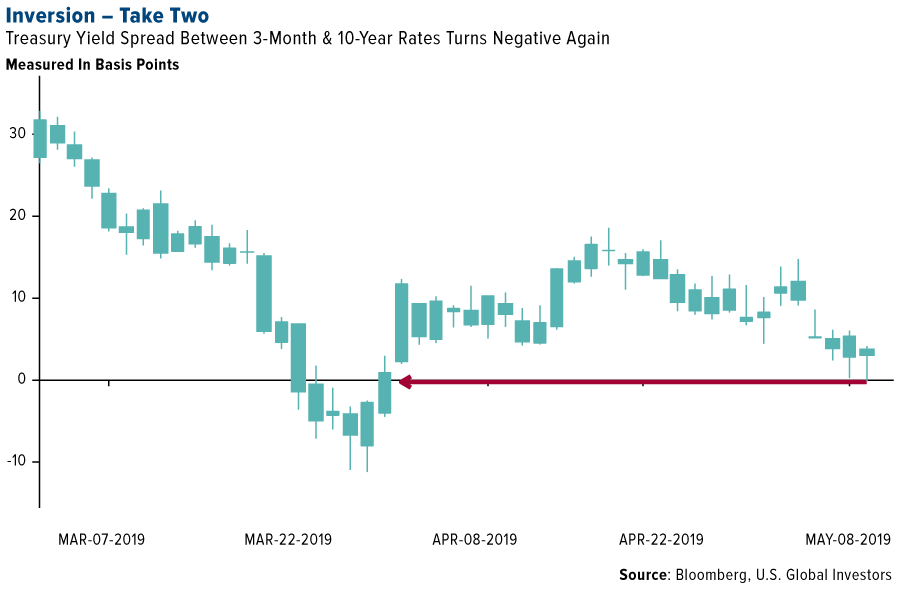
3. New York Fed on Recession Watch
Every month, the New York Fed updates its probability of an economic recession in the next 12 months. Probabilities are calculated using the spread between the 10-year and three-month Treasury yield—which inverted again this week for the first time since March.
According to the Fed’s most recent report, the probability that a recession will make landfall between now and April 2020 rose to 27.49 percent, its highest reading since January 2007 (as it was ascending, not falling), and before that, September 1999.

Past performance does not guarantee future results, of course, but the point I’m trying to make by sharing these charts is that it might be time to consider making some adjustments to your portfolio. That doesn’t mean rotating entirely into safe havens, especially since the market is so oversold right now.
When Picking Gold Stocks, Be Sure to Focus on Quality
But if you’re concerned about what the data suggests, it might be prudent to ensure you have exposure to fixed income, specifically tax-free muni bonds, as well as gold and gold stocks. One of our favorite gold names, Franco-Nevada, just reported record net revenue of $179.8 million and record net income of $65.2 million in the March quarter. But when selecting gold stocks, it’s important to stick with quality companies that have competent management, little to no debt and a portfolio of high-grade mines. Go gold!
Is the eurozone slowdown over? In case you missed this week’s commentary from European research analyst Joanna Sawicka, watch it now by clicking here!
Gold Market
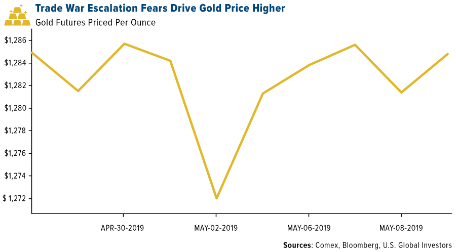
This week spot gold closed at $1,286.00, up $6.85 per ounce, or 0.54 percent. Gold stocks, as measured by the NYSE Arca Gold Miners Index, ended the week lower by just 0.03 percent. The S&P/TSX Venture Index came in off 1.14 percent. The U.S. Trade-Weighted Dollar fell 0.22 percent.
| Date | Event | Survey | Actual | Prior |
|---|---|---|---|---|
| May-9 | Initial Jobless Claims | 220k | 228k | 230k |
| May-9 | PPI Final Demand YoY | 2.3% | 2.2% | 2.2% |
| May-10 | CPI YoY | 2.1% | 2.0% | 1.9% |
| May-14 | Germany CPI YoY | 2.0% | -- | 2.0% |
| May-14 | ZEW Survey Current Situation | 6.0 | -- | 5.5 |
| May-14 | ZEW Survey Expectations | 5.0 | -- | 3.1 |
| May-14 | China Retail Sales YoY | 8.6% | -- | 8.7% |
| May-16 | Housing Starts | 1209k | -- | 1139k |
| May-16 | Initial Jobless Claims | 220k | -- | 228k |
| May-17 | Eurozone CPI Core YoY | 1.2% | -- | 1.2% |
Strengths
- The best performing metal this week was gold, up 0.54 percent. Gold traders ended the week neutral on the price of gold as many are awaiting more details on the trade talks between the U.S. and China, according to the weekly Bloomberg survey. The BullionVault gold index measuring the balance between buyers against sellers held steady in April at 54.5 after hitting a six-month high in March, reports Bloomberg.
- China has now bought gold for the fifth straight month. The People’ Bank of China grew gold reserves to 61.1 million ounces in April, marking the biggest boost since 2016. Ole Hansen, head of commodity strategy at Saxo Bank A/S, told Bloomberg that “banks buying is the underlying demand story which continues to develop from central banks seeking to de-dollarize their reserves.” Gold imports by India grew to 121 tons last month from 52.8 tons a year earlier, as prices fell and demand grew ahead of the second-biggest gold-buying day in the Hindu calendar.
- The growing trade dispute between the U.S. and China helped gold regain some of its luster as investors look to it as a safe haven during times of geopolitical tension. The yellow metal and the U.S. dollar usually move in separate directions. However, if tensions keep getting worse, the two could climb alongside one another, writes Bloomberg’s Eddie van der Walt. The London Metal Exchange has named its first female chairman, Gay Huey Evans, and plans to continue increasing the number of females in senior positions via external hiring and internal promotion. This is positive for the industry, which is heavily dominated by men.
Weaknesses
- The worst performing metal this week was silver, down 1.05 percent, likely on the threat of new counter tariffs hinted at by China. Turkey’s gold reserves fell $14 million from the previous week, according to weekly figures from the central bank. South Africa saw its gold output fall for an 18th straight month in March, extending the longest run of contractions since the financial crisis, reports Bloomberg. Gold output fell 18 percent from a year earlier. South Africa is also the world’s biggest platinum producer and saw output of platinum-group metals fall 0.5 percent – the first drop in seven months.
- Although gold rose on trade war news, palladium fell briefly below $1,300 an ounce on Thursday for the first time since January, as weakening car sales hurt the outlook for demand, writes Bloomberg’s Rupert Rowling. Another hit to demand for platinum lies with the share of diesel passenger cars in new registrations in Europe falling below 33 percent in the first quarter of this year. Despite diesel engines becoming cleaner, they have still fallen out of favor with consumers hurting platinum but helping palladium which is used more in gasoline engines.
- A minor dispute occurred between Acacia Mining and its parent company Barrick Gold after Barrick CEO Mark Bristow expressed his frustration over the failure to resolve a tax dispute between Acacia and the Tanzanian government, reports Bloomberg. Acacia CEO Peter Geleta pushed back saying that Acacia was already in talks with the government before Barrick stepped in. Acacia was hit with a $190 billion tax bill, but then Barrick’s executive chairman struck a deal for Acacia to only pay $300 million to the Tanzanian government and agree to split returns from operations moving forward.
Opportunities
- Barrick Gold plans on raising $1.5 billion from asset sales after completing its acquisition of Randgold Resources at the beginning of this year, according to CEO Mark Bristow. The gold sector had been awaiting a wave of asset sales in the wake of the mega-merger. Bristow also commented they would not rule out adding new assets to the portfolio though.
- AngloGold Ashanti plans on selling its last South African mine, which is the world’s deepest. The sale would be the final step in AngloGold’s withdrawal from the nation after it sold and shut other mines in the country to stem losses, writes Bloomberg. South Africa’s gold mining industry was once the world’s largest, but has faced many challenges in trying to remain profitable in recent years. Gold Fields had a smooth sailing bond sale this week that raised $1 billion that will be used to refinance existing debt.
- Norilsk Nickel analysts, including Anton Berlin, said in a report this week that they see no signs of substituting palladium with platinum by automakers in pollution-control devices. The world’s largest palladium miner also said in the report that only a small portion of palladium can be substituted in gasoline cars. This is positive for palladium demand.
Threats
- Updating a 147-year-old mining law could be a big threat for miners in the United States. House Republicans have showed some willingness to work with Democrats on updating a law that helped spur mineral exploration after the discovery of gold in California. Existing mining law doesn’t require companies to pay royalty fees or be financially responsible for cleaning up abandoned mining laws, reports Bloomberg. The proposed bill will institute an 8 to 12.5 percent royalty rate on mines, have companies pay for cleanup and give communities more control over the location of new mines.
- Venezuelan President Nicolas Maduro is cracking down on arrests of opposition leaders after last week there was an attempt to topple the autocrat, which many nations have now declared is a defunct ruler. The longer Maduro is in power, the longer the threat remains of the nation selling more of its gold reserves to generate some cash flow.
- Junk bond issuance hit a 20-month high, pricing $3 billion in bonds on Thursday. Sales of $12 billion in this week alone make it the busiest since September 2017, reports Bloomberg’s Gowri Gurumurthy. This is a signal that investors are fleeing the market.
Index Summary
- The major market indices finished down this week. The Dow Jones Industrial Average lost 2.12 percent. The S&P 500 Stock Index fell 2.31 percent, while the Nasdaq Composite fell 3.03 percent. The Russell 2000 small capitalization index lost 2.68 percent this week.
- The Hang Seng Composite lost 5.09 percent this week; while Taiwan was down 3.45 percent and the KOSPI fell 4.02 percent.
- The 10-year Treasury bond yield fell 6 basis points to 2.466 percent.
Domestic Equity Market
Strengths
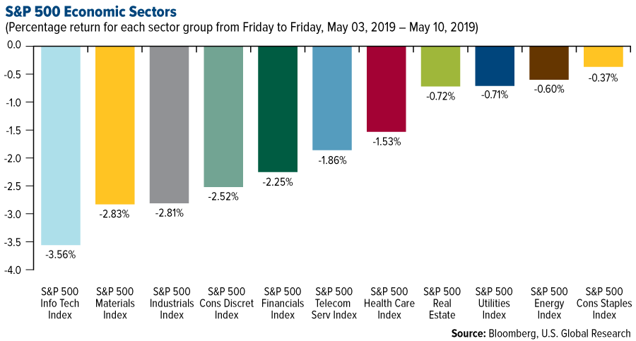
- Consumer staples was the best performing sector of the week, decreasing 0.37 percent compared to an overall decrease of 2.18 percent for the S&P 500.
- American International Group was the best performing stock for the week, increasing 9.62 percent.
- Wingstop same-store sales surged in the first quarter. The chicken-wing chain reported first quarter same-store sales growth of 7.1 percent, which easily beat the 3.7 percent that Wall Street analysts were expecting.
Weaknesses
- Information technology was the worst performing sector for the week, decreasing 3.56 percent compared to an overall decrease of 2.18 percent for the market.
- Mylan was the worst performing stock for the week, falling 20.85 percent.
- Disney took a $353 million write-down of its stake in Vice, the second huge impairment on the investment in the last year. Disney wrote down another $157 million of its stake in the September 2018 quarter.
Opportunities
- General Motors' Cruise business raised $1.15 billion in a funding round, giving it a valuation of $19 billion, the company announced on Tuesday.
- Lyft announced it is partnering with Waymo to launch robo-taxis in Arizona. The cars are fully autonomous, according to Waymo, but they'll still employ safety drivers to take over if there are any hiccups during rides.
- Profit margins at U.S. companies are likely to avoid a “steep and sustained collapse” this year, according to BMO Capital Markets. Corporate tax law changes, new and improved technology, increased globalization and lower interest rates point to sustained profitability. The S&P 500 Index’s margin has declined only 0.2 percent since peaking at 10.4 percent in January, according to data compiled by Bloomberg. “We do not see this drop as a start of a new, prolonged trend,” the firm wrote.
Threats
- Apple will be the focus of a new EU antitrust investigation after a complaint from Spotify. The Financial Times reports that the probe will launch after Spotify said Apple abuses the dominance of the App Store.
- Facebook co-founder Chris Hughes called for the breakup of his former company and argued that CEO Mark Zuckerberg has too much power, in an opinion piece for the New York Times. In a subsequent interview with NBC News, Hughes said he wasn't sure if he and Zuckerberg would remain friends.
- Samsung is cancelling pre-orders of the $2,000 Galaxy Fold if it doesn't ship by the end of May. The device was scheduled to come out in late April, but when several review units given to the media broke in half, the Korean smartphone giant pushed back the release date indefinitely.
The Economy and Bond Market
Strengths
- U.S. consumer prices rose in April but underlying inflation remained muted, supporting the Federal Reserve’s neutral stance on interest rates. The Labor Department said on Friday its Consumer Price Index (CPI) increased 0.3 percent last month, lifted by rising gasoline, rent and health care costs. In the 12 months through April, the CPI increased 2 percent. Excluding the volatile food and energy components, the CPI edged up 0.1 percent as apparel prices dropped for a second straight month.
- The number of people who applied for jobless benefits in early May fell slightly to 228,000, showing little change in one of the strongest labor markets in decades. Initial jobless claims fell by 2,000 from a seasonally adjusted 230,000 in the prior week, the government said Thursday.
- The U.S. goods trade deficit with China shrank to its smallest in five years in March. The deficit decreased 16.2 percent to a seasonally unadjusted $20.7 billion, the lowest level since March 2014, as exports, including soybeans, surged 23.6 percent. Imports from China fell 6.1 percent.
Weaknesses
- Trade talks between the U.S. and China ended on Friday with no announcement of an agreement. The end to the negotiating round follows a series of tweets from President Donald Trump earlier Friday defending his decision to more than double tariffs on $200 billion worth of Chinese imports, putting the rest of the world on notice that he will follow through on his protectionist agenda no matter the blowback.
- The U.S. economy is growing at a 1.6 percent annualized rate in the second quarter based on the government’s latest jobless-claims and trade reports, the Atlanta Federal Reserve’s GDPNow forecast model showed Thursday. This was slower than the 1.7 percent pace estimated by the Atlanta Fed’s GDP program last Friday.
- Global air freight volumes are falling at some of the fastest rates since the end of the great recession in a warning sign that recessionary forces are building in the world economy. Freight indicators are available with a much shorter lag than most macroeconomic statistics, which makes them a good barometer of the economy’s health. Air freight carries some of the highest-value cargo and reacts quickly to changes in demand, making it a good leading indicator for freight movements and the economy in general. Freight volumes are now declining at major airports around the world in a signal the global manufacturing and distribution system is under growing stress. Hong Kong International Airport, the busiest cargo hub in the world, reported volume down 7 percent for the three months between February and April compared with the same period a year earlier.
Opportunities
- Few U.S. data series have been as choppy in recent months as retail sales. December’s drop in core sales was the largest in nearly two decades, only to be followed by an equally large swing to the upside in January. Demand for big-ticket items like cars then pushed the March total to the highest in 18 months. Consumer resilience, emboldened by a strong job market, was a key pillar of support for the U.S. economy in the first quarter. The April reading next week will show if that willingness to spend continues into the second quarter. Reuters estimates point to the first back-to-back rise in retail sales since November with headline sales growth forecasted at 0.2 percent.
- Manufacturing activity will be in focus next week as the Empire State manufacturing index for May and industrial output figures for April are out.
- The University of Michigan’s preliminary print of the consumer sentiment index will provide a read on continued consumer sentiment.
Threats
- A closely watched section of the U.S. yield curve has inverted once again. The yield on 10-year Treasury notes briefly fell below the 3-month bill yield this week for the first time since March. Normally the spread is positive to compensate investors for inflation risk, so when it turns negative, it may herald an economic slump.
- A Pimco investment chief warns of the “riskiest corporate market we've ever had. A lot of people don't recognize that. But it is that way, because it's doubled in size in the past decade, because everybody's levered up,” the chief investment officer of U.S. core strategies at Pimco, told Business Insider.
- Iran abandoned key parts of the nuclear deal. Iranian President Hassan Rouhani on Wednesday said his government would roll back commitments to the 2015 international nuclear deal, giving a 60-day deadline to negotiate sanctions relief — at the end of which it would restart its uranium-enrichment program.
Energy and Natural Resources Market
Strengths
- The best performing major commodity for the week was natural gas, which gained 2.18 percent despite a supply avalanche as rising exports and warmer weather offset the surge. The U.S. raised tariffs to 25 percent on $200 billion worth of Chinese goods, but oil and copper shrugged it off somewhat after struggling earlier in the week. Copper climbed Friday morning as traders hoped that the U.S. and China would strike a trade deal. Chevron dropped its offer for Anadarko Petroleum, leading the way for Occidental to acquire Anadarko in a $38 billion acquisition that is 78 percent cash. Occidental sweetened its buyout proposal just hours after Total SA agreed to buy $8.8 billion in Anadarko assets in four African nations, contingent upon Occidental completing the takeover.
- Rio Tinto is partnering with Caterpillar to provide autonomous heavy machinery for an iron ore mining operation in Western Australia, according to a company statement. Caterpillar will supply a fleet of 20 autonomous 793F trucks plus four blast drills, and will study other ways to increase automation at that specific project.
- Bloomberg’s Jeremy Hodges writes that the United Kingdom had gone five days without burning any coal, which is the longest streak the country has managed since the Industrial Revolution. The U.K. was an early adopter of clean energy and has more wind turbines installed offshore than any other country. The nation aims to quit burning coal for power entirely by 2025. New York State passed regulations this week that require all power generators to meet new carbon-dioxide emissions limits, which coal plants can’t meet. This is part of the state’s goal of banning coal at power plants by the end of 2020.
Weaknesses
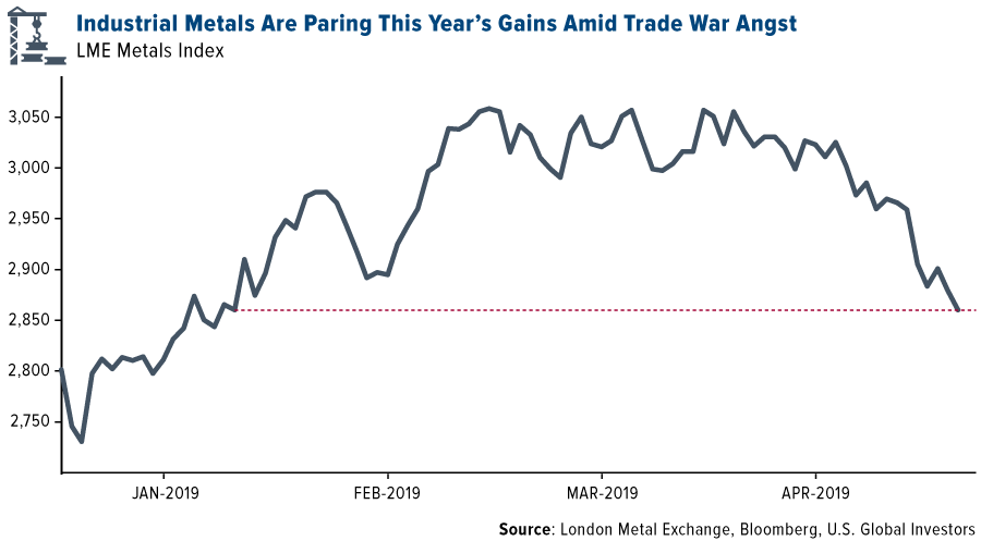
- The worst performing major commodity for the week was cotton, which fell 8.46 percent on news from the Department of Agriculture that the U.S. will produce more than analyst estimated for the 2019-2020 crop years. Base metals extended losses this week ahead of the ongoing trade talks between the U.S. and China, although they did see a small bounce on Friday morning even as new tariffs took effect. The LMEX Metals Index has fallen since its peak in March, with zinc leading the declines and hitting a two-month low.
- Bloomberg reports that Vale SA’s sales of iron ore and pellets shrank 30 percent in the first quarter from the previous quarter. Vale, the world’s biggest iron producer, struggled to revive some of its projects that were halted after its deadly dam accident in January. Supply of the metal is tightening and futures have climbed 29 percent in Singapore so far this year.
- Codelco, the world’s largest copper miner, reported the lowest production in more than a decade during the first quarter of this year after heavy rains hit operations in Chile. Production fell 27 percent in the first quarter.
Opportunities
- Bloomberg New Energy Finance (BNEF) reports that 5 percent of demand for class-1 nickel comes from batteries, but this will increase to over 40 percent in the next 6 years. The combined supply of the top 10 miners was over 900,000 metrics tons in 2018, with the potential to expand supply by an additional 150,000 tons by 2025. A supply deficit for the “very pure” class-1 nickel is expected by 2024. BNEF also reported that it expects electricity demand for air conditioning to surge over the next 30 years. They forecast demand reaching 4,764 terawatt hours by 2050, mainly out of emerging economies in Asia due to growing incomes.
- In iron news, China is set to actively study policies to boost development of domestic iron ore mines and increase effective supply, according to the National Development and Reform Commission. Fortescue Metals Group, an Australian iron ore miner, said it is “exploring and setting up” an opportunity to conduct business in the yuan in China, as some customers prefer to do business in smaller lots and in yuan-denominated transactions, says chief operating officer Greg Lilleyman.
- Cynthia Carroll, former CEO of Anglo American, says the male-dominated mining industry needs to change to include more women. Carroll was the first female CEO of Anglo and said in an interview this week that “companies should require, not ask that executives promote, recruit and include women.” The Responsible Mining Foundation found that there was “little or no evidence of efforts” to strengthen the gender balance of leadership teams in 30 companies.
Threats
- The biggest looming threat this week is the ongoing trade war between the U.S. and China and the additional tariffs levied on Friday against Chinese goods. Tata Steel Europe, Europe’s second-largest steelmaker, said that it expects to see less demand from China if the trade war is not resolved this week. Prices of raw materials could immediately feel the pressure from tariffs, while safe havens like gold should rise. Copper could also see big headwinds if the dispute continues.
- According to the International Lead and Zinc Study Group, global zinc mine supply is expected to climb 6.2 percent in 2019. The increases will be driven by a 29 percent jump in Australian output and a 3.3 increase out of China. However, demand is expected to rise marginally this year by 0.6 percent. A greater supply might trigger lower prices, which is negative for miners.
- Germany is exiting coal, but it might be too quick of a move. Bloomberg reports that Germany’s phasing out of coal coincides with its ongoing shutdown program of nuclear plants, which together would remove almost a third of Germany’s capacity by 2022. Tobias Federico, managing director of consultant Energy Brainpool, said, “I am really insecure on the security of this supply.”
Emerging Europe
Strengths
- Hungary was the best relative performing country this week, losing 1.7 percent. First quarter GDP data will be released next week. Most analysts expect growth of 4.1 percent on a year-over-year basis, supported mostly by strong domestic demand and industrial activity. Next week, Hungarian Prime Minister Viktor Orban will visit President Donald Trump in Washington.
- The euro was the best performing currency this week, gaining 30 basis points against the U.S. dollar. Eurozone investor confidence rose in May to a level last seen in November 2018, mostly supported by the removal of the risk of the U.K. leaving the eurozone without deal for now.
- Health care was the best performing sector among eastern European markets this week.
Weaknesses
- Turkey was the worst performing country this week, losing 5.8 percent. Domestic and international political developments put further pressure on equites and the lira. Turkey cancelled Istanbul municipal elections per President Erdogan’s request.
- The Turkish lira was the worst performing currency this week, losing 80 basis points against the U.S. dollar. The lira fell more than 4 percent in the first four days of trading this week and bounced sharply on Friday after Turkish banks were selling dollars to support the local currency. Additionally, the central bank paused 1-week repo auctions, sending borrowers to higher yielding instruments. Late in the day on Friday, there was also a rumor that Turkey had made a decision not to take the delivery of the S-400 missiles from Russia.
- Industrials was the worst performing sector among eastern European markets this week.
Opportunities
- The latest political developments in Turkey pushed the lira and domestic equites lower. The Borsa Istanbul 100 Index now trades at 5.6 times projected earnings, below the valuation for stocks trading on the Moscow exchange. Turkish stocks have the lowest price-earnings ratio in a decade. It could be a potential buying opportunity for investors looking for a bargain in emerging markets.

- Polish Prime Minister Mateusz Marowiecki set a goal for Poland to have 1 million electric vehicles by 2025, compared with less than 5,000 at the end of March. Poland is the largest eastern European country, but now has about the same number of chargers and registered e-cars as the Czech Republic, a neighboring country with a quarter of the people. Refiner PKN Orlen SA and utility PGE SA are working with charger distributor GreenWay Polska to build out the charging infrastructure.
- German industrial output, including construction, rose 0.5 percent in the first quarter, which was above the expected 0.5 percent decline. This is reassuring news, suggesting stronger growth in the first three months of the year. Eurozone’s preliminary first quarter GDP data will be released next week and 40 basis points growth is expected on a quarter-over-quarter basis.
Threats
- Turkey will hold another municipal election in Istanbul on June 23, after the nation’s High Election Board annulled the results of the prior elections, followed by the request of the ruling AKP party over alleged irregularities. According to the polls, 60 to 70 percent of voters in Istanbul do not believe AKP’s argument that there have been election irregularities. More political short-term noise is expected in the coming weeks in Turkey, which could add to further weakness in the lira.
- Morgan Stanley plans to give up its Russian banking and brokerage banking licenses after sanctions reduced opportunities for global banks in the local market. Morgan Stanley opened a representative office in Russia in 1994 and is now planning to exit the market in the first quarter of 2020.
- Europe might be stuck in the middle of United States and China trade discussions. This week President Trump imposed higher tariffs on imported goods from China, and China may retaliate. One of the retaliatory measures that China may take is to support domestic car production, which would be a negative event not only for U.S. exports, but for Europe as well, as Europe exports a large amount of domestically produced cars to China.
China Region
Strengths
- China’s Foreign Reserves reading held relatively steady at some $3.095 trillion, stable and not far off of estimates.
- Utilities was the top-performing sector amid the risk-off week in Hong Kong’s Hang Seng Composite Index, falling by only 2.42 percent.
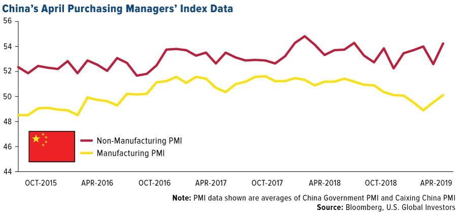
- The Caixin China Services PMI actually beat expectations slightly early in the week, clocking in with a 54.5 print, ahead of analysts’ anticipated 54.2 reading and making the Caixin Services reading the only China PMI number out over the last couple of weeks that beat. All four PMI readings did remain above 50, notably, marking continued expansion.
Weaknesses
- Despite a solid over 3 percent showing from China on Friday on presumed intervention post-tariff, the Shanghai Composite tumbled a total of 4.48 percent since it returned from the early May Labor Day holidays last week. Hong Kong’s HSCI declined by 5.08 percent this week, Korea’s KOSPI dropped 4.02 percent in that time, and the rest of the region finished red as well.
- Consumer Services was the worst-performing sector in Hong Kong’s Hang Seng Composite Index on the week, falling by 6.99 percent.
- Indonesian GDP came in low at only 5.07 percent for the first quarter, missing expectations for a 5.20 percent pace of growth and down from the prior quarter’s reading of 5.18 percent.
Opportunities
- While the U.S.-China trade spat can only be said to have escalated over the past week, it remains the case that the two sides are talking, and that Vice Premier Liu He did come to Washington despite the promised hiking of U.S. tariffs on Friday and despite promises of unspecified Chinese retaliation. President Trump is reportedly issuing a roughly one month ultimatum to wrap up talks for a deal (or not) before the U.S. will place another $325 billion of Chinese goods under tariffs. Now, how can any of this be good or represent an opportunity? Well, the trade talks haven’t fallen apart yet, and from what Secy. Mnuchin has said, the text and deal were some 90 percent finished before last weekend’s alleged backsliding. And at the end of the day, can’t one argue that the “truce” declared at the end of December has already been extended at this point? Thus the high-stakes game continues, with a higher ante at this point and—at least it seems—a firmer deadline looming to wrap the game up in timely fashion.
- A possible silver lining amid the trade war escalation remains a Chinese government that has indicated numerous times it stands ready with stimulus if necessary, and while lately the assurances had been scaled back with better-than-expected data and some positive statements from Premier Li Keqiang, it may well be that if the trade war goes sideways bad news, as they say, could become good news from a stimulus standpoint.
- With the recent pullback, Hong Kong’s blue chip Hang Seng Index is down to a price-to-earnings ratio of 10.92. The S&P 500, on the other hand, stands at 18.84.
Threats
- Well, well, well. As mentioned several times, “It ain’t over till it’s over.” So where does that leave us? The U.S.-China trade talks do remain ongoing but tariffs no longer remain delayed in implementation, which brings the threat of an overall collapse of the talks closer to reality. China has already vowed to retaliate—though without specification of precisely how, since monetarily a direct counter-tariff remains out of play given the balance of trade between the U.S. and China—but so too, Liu He remained in Washington today and President Xi Jinping reached out to President Donald Trump yesterday about working together. Today President Trump said there is no “rush” to the China trade talks and he continues to sell his “excellent” alternative of bringing in money through tariffs as a win anyway.
- North Korea continues to keep up the recent saber-rattling, with Kim Jong Un overseeing a strike drill this week.
- The U.S. dollar remains relatively strong versus the rest of the world, and could pose a threat for emerging markets. Note also that the Chinese yuan weakened heavily this week, closing up at 6.8448.
Blockchain and Digital Currencies
Strengths
- Of the cryptocurrencies tracked by CoinMarketCap, the best performing for the week ended May 10 was Japan Content Token, up 388.04 percent.
- PepsiCo has conducted a blockchain trial known as “Project Proton,” to examine if the technology could address industry challenges in programmatic advertising, reports CoinDesk. According to an announcement by the company’s project partner and media agency Mindshare on Monday, the trial brought a 28 percent boost in supply chain efficiency.
- Bullish sentiment for bitcoin remains strong, as the popular digital currency looks set to break above $6,000, writes CoinDesk. The leading cryptocurrency by market cap crossed above the key resistence level of $5,780 at the start of the week. The rally comes in the lead up to Blockchain Week NYC along with CoinDesk’s Consensus 2019 event, which takes place May 13-15.

Weaknesses
- Of the cryptocurrencies tracked by CoinMarketCap, the worst performing for the week ended May 10 was RoboCalls, down 80.64 percent.
- In what is being called a “large scale security breach,” cryptocurrency exchange Binance reports that hackers stole more than $40 million worth of bitcoin from its platform, according to MarketWatch. Binanace said it discovered on Tuesday that 7,000 bitcoins were stolen from a single wallet, the article continues, amounting to roughly 2 percent of the company’s total bitcoin holdings.
- Industry giant Bitmain has disclosed that its internal bitcoin mining operations are generating 88 percent less computing power than a month ago, reports CoinDesk. The reduction in power could suggest that the industry giant has cut back on capacity.
Opportunities
- Fidelity Investments, one of the largest asset managers in the world, will offer cryptocurrency trading within a few weeks, writes Bloomberg, citing a person familiar with the matter. In October the company created Fidelity Digital Assets, in a bet that the appetite for trading and safeguarding digital currencies would grow. The move puts Fidelity a step ahead of its top competitors, the article continues, as it plans to begin targeting institutional customers first.
- Cryptocurrency trading firms came together at a round-table event in Chicago this week to discuss ways to prevent the rising number of hacks and scams in the industry, reports CoinDesk. Names like Ripple, Cumberland and Galaxy Digital Holdings attended the meeting where one of the ideas shared included creating a list of entities involved directly or indirectly in criminal activities such as money laundering and drug trafficking. According to the article, another idea included giving companies in good standing some form of accreditation.
- Not only did bitcoin see a jump in price this week, the digital coin’s dominance rate has also jumped to 57.14 percent, according to CoinMarketCap. The dominance rate tracks its percentage of the total crypto market capitalization, and a rising rate essentially means the demand for bitcoin is greater than the demand for alternative cryptocurrencies (altoins), suggesting investors are buying bitcoin for the long-haul, reports CoinDesk.
Threats
- Complaints about a notorious cryptocurrency investment scheme OneCoin, have been ongoing since at least 2016, reports CoinDesk, but the alleged pyramid scheme is being sued again by a former investor. In a lawsuit filed Tuesday in New York, investor Christine Grablis, says that OneCoin fraudulently promoted crypto investments and violated federal securities laws. Grablis claims to have lost around $130,000 in the scheme.
- A popular dark market search and news site, DeepDotWeb, has been seized by the FBI and accused of money laundering, reports CoinDesk. In a “sweeping international raid” disclosed Tuesday, police in five countries arrested alleged operators and took down the .com and .onion sites, replacing them with notices of seizures, the article continues.
- Following a $40 million bitcoin hack to Binance earlier in the week, the company’s CEO Zhao Changpeng suggested in a video and series of tweets, that he considers making a push to rewrite a chunk of the digital ledger that underpins the cryptocurrency, writes Bloomberg. His theory is this would invalidate the theft of the crypto exchange’s digital coins. However, according to the article, Changpeng caused the cryptocurrency world to be shaken to its core, as his comments suggest the bitcoin network might not be as immutable as advertised.
© US Global Investors
Membership required
Membership is now required to use this feature. To learn more:
View Membership Benefits