Summary: Most of the US indices made new all-time highs this week. SPY is making 'higher highs' and 'higher lows' and is above all of its rising moving averages; this is the definition of an uptrend. Moreover, the cumulative advance-decline lines made new highs this week, indicating that breadth generally remains supportive. Net, there appears to be little reason to suspect the indices have reached an important top.
That said, NDX has opened a noteworthy crack in US equities. NDX has fallen 4.5% in the past week. In the past 7 years, falls of more than 4% in NDX have preceded falls in SPY of at least 3%. That doesn't sound like much, but it would be the largest drop so far in 2017. A key watch out now is whether NDX weakens further and breaks both its 50-d as well as its mid-May low; if so, then SPY is likely to follow with its first 5% correction since the US election. These are the consistent historical patterns. Moreover, by at least one measure, bullish sentiment is at a 3-1/2 year high.
* * *
Our overall message continues to be that (a) trend persistence in equity prices, together with decent underlying macro data, is likely to lead US indices higher over the next several months and probably through year-end; and (b) an interim drawdown of at least 3-5%, sooner rather than later, seems to be odds-on. A number of studies supporting this view were recently detailed here.
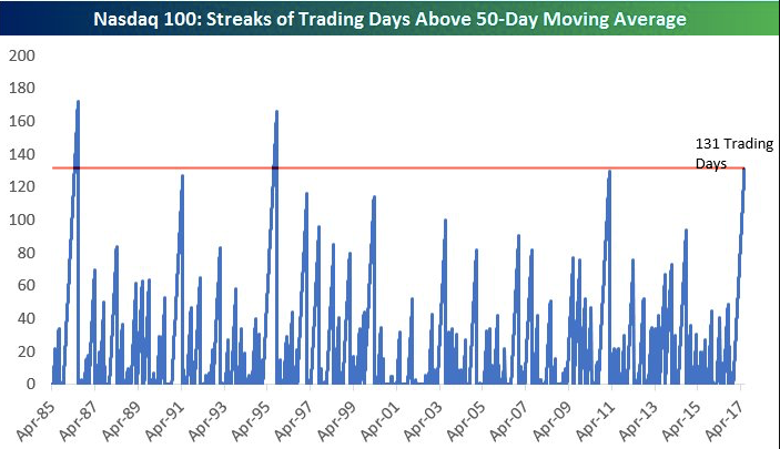
This week, SPY, DJIA, NYSE and RUT all closed at new all-time highs (ATH) on Tuesday. SPX has made 23 new ATHs this year. NDX, meanwhile, has closed above its 50-dma for more than 130 days in a row, the longest such streak since 1995 (from Bespoke). Both of these are clear indications of strong trend persistence. Enlarge any chart by clicking on it.

That the very broad NYSE (comprised of 2800 stocks) is also at an ATH confirms that breadth remains supportive of trend. Add to this: the cumulative advance-decline line for both the SPX as well as the NYSE (common stock only) reached new highs this week.
Several commentators have pointed to two indictions that the market is at high risk. Both appear to be without validity.
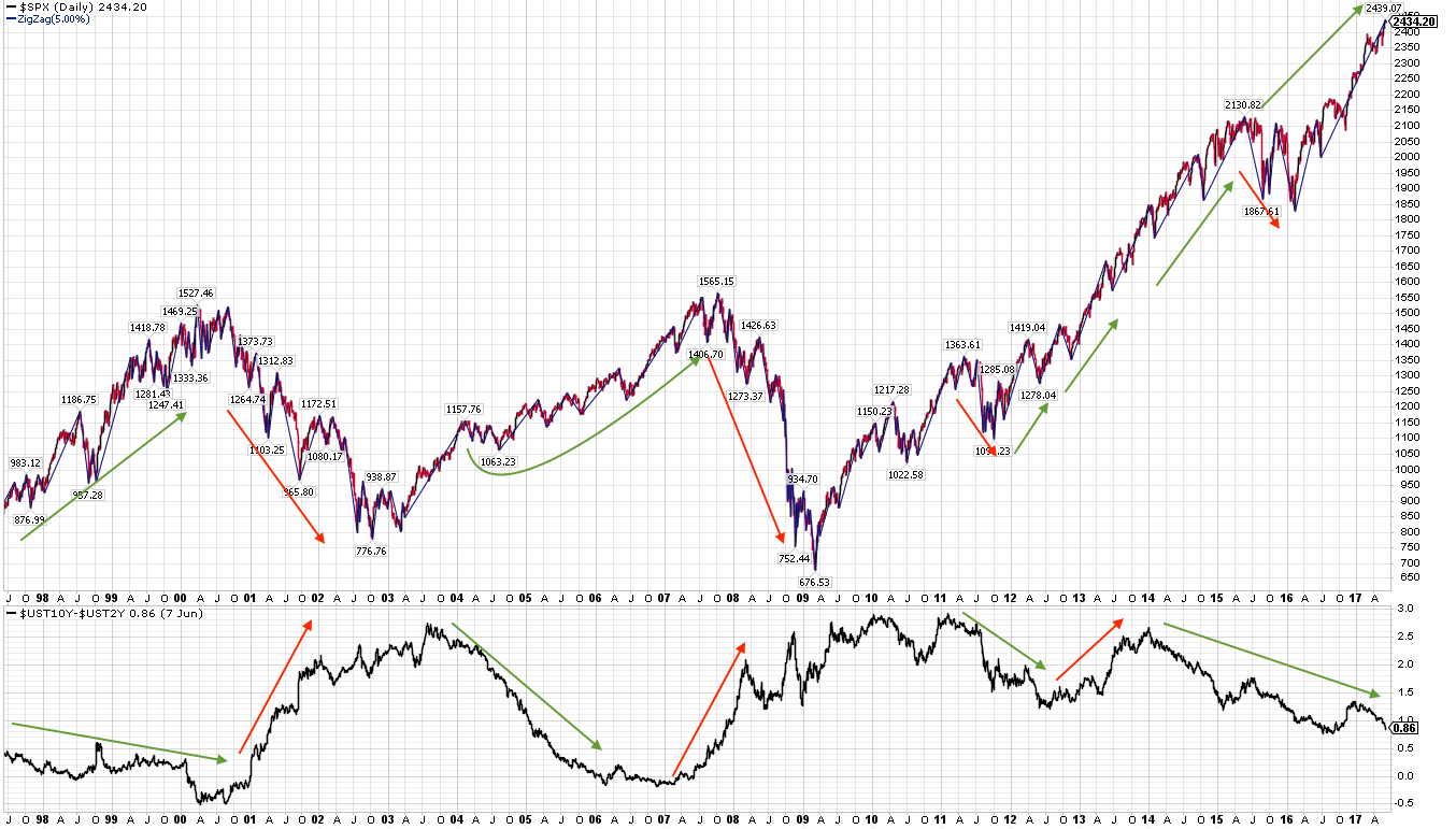
First, the yield curve has been flattening, supposedly indicating that the bond market views downside risk to growth (lower panel). That should, in turn, negatively impact equities (top panel). But the yield curve has been flattening for 3-1/2 years, and SPX has continued higher. The green arrows in the chart below show that this not been a reliable indicator in the past 20 years.
In fact, the yield curve has been of declining predictive ability over the past 30 years (red line; from the Leuthold Group).
The second concern that has been voiced is that the correlation of SPX to the volatility index (Vix) has spiked higher over the past 10 days (lower panel). When volatility rises together with equities, it can sometimes be a warning of a correction. But, as the chart below makes clear, that relationship is very inconsistent. Over the past 8 years, the odds of SPX (top panel) subsequently falling more than 2% has been equal to a 50-50 coin toss.
All of that said, NDX has opened a noteworthy crack in US equities.
Starting a week ago Friday and then continuing this past Monday, NDX fell 4.5%. The bounce since then has been weak. To be clear, NDX (a) is still above its rising 50-d, (b) has not made a 'lower low' and © is marginally oversold (yellow lines); this
combination suggests a pause in the uptrend that normally resolves higher. So far, there's no foul.
But there are several important watch outs. Weakness in small caps (RUT) are often ignored by SPX (as discussed here). But the same is not true with weakness in NDX. NDX is a much larger index (meaning, there is much more investor money invested in it) and it shares many component stocks with SPX.
During the past 7 years, whenever NDX has fallen 4% from a recent high (blue zig zag line), SPX has also fallen at least 3% (red line). There were two lags between NDX and SPX dropping (yellow shading), but no exceptions, even during the remarkable 2013-14 period. This implies a move to 236.5 for SPY (chart later in this post). 3% doesn't sound like much, but it would be the largest drop so far in 2017.
Should NDX weaken further, SPX is likely to fall more than 3%. In particular, should NDX break its mid-May low (the blue horizontal line two charts above), it will have (a) corrected about 6%, (b) broken its 50-d and © made a 'lower low'. This combination is a foul. Since 2000, whenever NDX has fallen 6% from a recent high (blue zig zag) SPX has in turn fallen at least 5% (red line). There was a short lag in 2016 and three lags between 2004-06 (green shading), but no exceptions.
As stated, NDX has been above its rising 50-d for more than 130 days in a row. So long as that streak continues, NDX is now simply taking a pause within an uptrend: in short, there's no foul at present.
But, as shown in the charts below, closing below the 50-d after a long streak above it has been a negative. Many times, this preceded an extended period where NDX gave up any subsequent gains and traded sideways or lower. In other words, it tended to make the end of the persistent uptrend and the start of, at least, some consolidation and/or retracement. Since the mid-1990s, the only exception was in late-2013. (The shading in each chart shows the period after the streak ended; the number above the shading shows the length of the streak).
So, if NDX breaks below its 50-d in the week(s) ahead, either (a) the index continues lower, dragging SPX with it, or (b) it bounces but gives all those subsequent gains back and enters into a multi-month consolidation/retracement period.
It's true that the end of the long, persistent uptrend marked the exact top for NDX in March 2000, but in all other cases the index's bull market proceeded higher. Like other studies we have shared, the balance of evidence suggests any interim pause leads to further gains in the months ahead.
So far, SPY has barely corrected 1% despite the weakness in NDX. Breaking this week's double bottom at 241 targets the mid-May resistance area just below 240, equal to a total fall of just 2%. Below that, a 3% fall in SPY targets the 236.5 area; a 5% fall targets 231.5 (horizontal lines).
Again, there is no foul in SPY either: it is above all of its rising moving averages, even the very short 5-d. This is the definition of an uptrend.
This uptrend is extended, however. The last 5% drawdown was in early November, 153 days ago. In the past 22 years, 158 days in 2014 and 173 days in 2006-07 are the only longer streaks since the epic 296 day stretch in 1995-96. In short, these streaks can go longer, but that is a rarity.
We've been tracking the one-month weighted average equity-only put/call ratio in recent posts; it is now at it's lowest since January 2014. By this measure, bullish sentiment is at a 3-1/2 year high. SPX fell 6% later that month (green shading in the second chart. Near term investor sentiment is a headwind (from Larry McMillan).
Unlike bearish sentiment, bullish sentiment extremes can work with long lags. Sentiment, therefore, constitutes part of a 'set up', but there is no 'trigger' until the uptrend in the index falters. Notably, however, the retail-only buy to open put/call ratio (a purer measure of retail investor sentiment) recently dropped to its lowest level since June and July 2015, ahead of a 15% drop in SPX. That was an especially large fall; current sentiment supports the hypothesis that a 3-5% in SPX is odds-on in the weeks ahead.
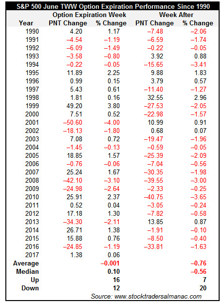
Seasonality is also headwind into the coming week. SPX has been down the week after June OpX 74% of the time in the past 27 years (from
Stock Almanac).
Fund managers polled by BAML are nearly the most overweight European equities in the past 10 years, and nearly the most overweight emerging markets in the past 5 years. A new post explains why US equities might outperform on a relative basis (
here).
Higher environmental standards are being blamed for killing jobs and economic growth. A new post explains why this is not the case; in fact, the reverse is probably more true (
here).
Despite analogues arguing to the contrary, today is not like 1987 (
here).
The calendar is light for this week, with only new home sales on Friday.
© The Fat Pitch
Read more commentaries by The Fat Pitch