If you were on vacation last week and weren’t following markets, let me update you. The S&P 500 was up 0.9% for the week, the Dow was up 1.1%, and most global equity markets finished higher on the week as well … so, not much to write about. What?!?! It’s hard to fathom that after record-breaking volatility last week—which included what some are calling another Black Monday—stocks ended the week up from where they began the week.
One of my favorite cartoons of all time is below, which really does say it all. Investor psychology and behavior is an incredibly fascinating thing to study.
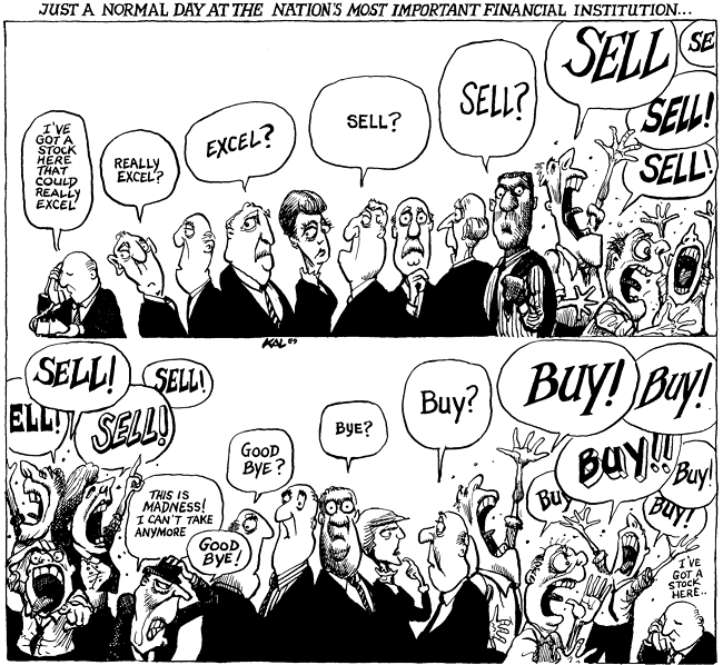
Source: Kevin KAL Kallaugher, www.Kaltoons.com.
BIG week
Let’s dive in and look at the data. Many of the more interesting statistics and history lessons in this report (and many others I’ve written) are courtesy of the folks at Bespoke Investment Group (BIG). For those readers who have watched my Straight Talk series of videos, I urge you to tune in to the next one, which I’ll be taping on September 9, and which will post on schwab.com shortly thereafter. It will feature Paul Hickey, the founder of BIG and I promise it will be an interesting and entertaining look at markets.
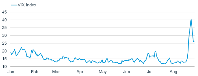
Below, is a short-term chart of the S&P 500 highlighting last week’s gyrations; followed by a year-to-date chart of the CBOE Volatility Index (VIX).
A Wild Week for US Stocks
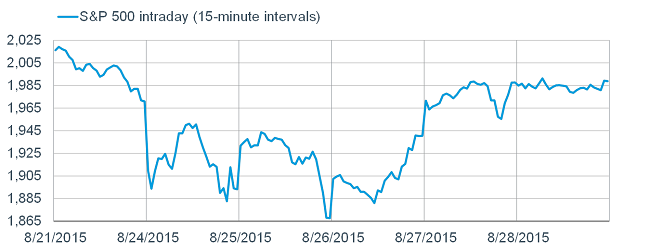
Source: FactSet, as of August 28, 2015.
At Monday’s peak in the VIX, it was up 100% from its recent low. The spike in such a short span was a record-breaker. The VIX itself has options traded on it as well—considered the volatility of volatility (VVIX). The VVIX is an index representing implied volatilities of options on the volatility implied by options on an index of 500 different stocks. Confused? It’s understandable! That said, the VVIX reached its highest level in history last week. As BIG noted, fear went from fairly low to full-blown panic; and there were complicated knock-on effects throughout the US equity market, through derivatives, positioning, and the strategies market participants use to manage the risk. The gyrations last week went well beyond the change in the fundamentals.
Media headlines
During Monday’s rout, there was a short span when the Dow was down over 1,000 points. That is remarkable; but some of the associated headlines in various media outlets, were arguably irresponsible. I saw multiple headlines that read something like this: “Dow’s losses are an all-time record for a day!” Or: “Dow loses twice as much as during the Crash of ’87!” Are those headlines true? Yes, but only if you care more about points than percentages. In fact, the Dow has experienced 51 days in the past when the percentage losses exceeded last Monday’s—the big whammy of which was the Crash of ’87. Below, I show the top-10 worst single-day losses for the Dow; and how last Monday’s compared.
Monday’s Drop Nowhere Near a Record
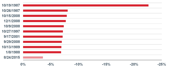
Source: FactSet, as of August 28, 2015. Chart plots 10 largest one day % losses in DJIA since 1987.
Scary headlines may attract eyeballs, but they can be irresponsible and send the wrong message.
What’s next?
The more cautious outlook we’ve had on US stocks all year has been partly a function of expectations for higher volatility as the September Federal Reserve (Fed) meeting approaches. Higher volatility we have gotten—in spades—along with the first correction in nearly four years. The most asked question I’ve been getting from investors and the media is whether we think this is a harbinger of a bear market. As long as the global economy (including the United States) avoids a recession—which is our base case—the correction will likely go in the books as just that—a correction, not a bear market.
Our confidence in the sustainability of the US economic expansion—albeit a weak one—was reinforced by the data released recently. In particular—and perhaps lost in the haze of the market’s volatility—was the revision to second quarter gross domestic product (GDP) released last week. Instead of the 2.3% real (inflation-adjusted) growth from the prior release, the revision took it way up to 3.7% real growth; with strength among all categories: consumer spending, government spending, trade, non-residential investment, and residential investment. If you subtract the drag from the oil industry, real GDP would have been 4.5%, according to Mauldin Economics. The better data helps explain the fact that longer-term Treasury yields finished the week higher.
Recession unlikely
The major triggers and imbalances leading to past recessions don’t appear to be present today: accelerating inflation in the 1970s, the S&L crisis in the late-1980s/early-1990s, the tech capex boom in the late-1990s, and the housing bubble of the 2000s. Some are pointing to the recent rout in oil prices as a harbinger of economic doom; however, falling oil prices have never correctly forecasted a recession. GavekalDragonomics notes that on every recent occasion when oil prices halved—1982-1983, 1985-1986, 1992-1993, 1997-1998 and 2001-2002—faster global growth followed. Conversely, every global recession in the past 50 years has been preceded by a sharp increase in oil prices.
In fact, the better US economic data recently helps explain why expectations for the initial rate hike by the Fed moved back up alongside the rally in stocks. We continue to believe September is on the table for the Fed to begin lift-off; but also believe it’s the path of rate hikes that matters more than the start point. In our mind, this will be a very slow cycle—typically a better backdrop for stocks.
What conspired to cause the rout and recovery last week?
China is in the blame crosshairs, but my view is that it was more the straw than the cause. With the exception of the surprise currency devaluation China announced a couple of weeks ago, the slowing growth story about China is not a new one. Nor is uncertainty around monetary and government policy in China. Nor is the commodity bear market and related hits to emerging markets (EMs). Nor is uncertainty about Fed policy.
We recently wrote about the technical deterioration in the US stock market averages leading to this correction; including stretched valuations, weak earnings, overbought technical conditions and much weaker market breadth. The market is a sum of its parts; and if the parts get rusty, the sum of those parts will eventually rust as well. The aforementioned macro straws finally broke the back of a market that had already seen a lot of internal damage.
But just as quickly as the market fell, it rebounded; leaving investors wondering what the heck happened; and asking where we go from here. We can look at history as a possible guide.
Rapid 10% declines
The S&P 500 fell more than 10% in only four trading days. Since 1940, there were 10 other periods when stocks fell at least 10% in just four days. As you can see in the Barclays Capital table below, the market often struggled in the near-term (as we expect this time), but was up nine out of 10 times after 250 trading days; and in most cases it was substantially higher. The only negative came at the outset of World War II.
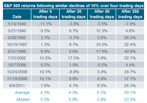
Source: Barclay’s Research, FactSet as of August 28, 2015.
Breadth thrusts
My start in this business was in 1986, when I began what would be a 13-year period working for the late, great Marty Zweig. I learned a tremendous amount about how markets work from this legend; including the concept of “breadth thrusts” which Marty pioneered. These are times when stocks become greatly oversold, but then buying interest comes in so aggressively that it greatly skews breadth figures to the upside. We saw this last week: during the huge two-day rally on Wednesday and Thursday last week, up volume on the New York Stock Exchange (NYSE) exceeded 85% of total volume. Historically, when you see a historic level of panic, and then at least a couple of days of aggressive buying pressure, it has almost always led to medium-term gains, even if volatility remained high (and retests of the lows occurred) in the near-term.
I won’t add in the table from SentimenTrader.com because it’s extremely large; but they looked at every period in history when the 10-day average of up volume was oversold (below 45%), then there were back-to-back days of at least 80% up volume. This has happened 27 times since 1962, with 21 of them seeing positive returns one year later; and a median gain of 19%. But again, there was often continued weakness in the near-term; which would not surprise us this time.
Standard deviations
According to BIG, at its worst point last week, the rolling three-day sum of standard deviations from the S&P 500’s 50-day moving average, nearly reached a record -14.07. As you can see in the chart below, the only worse reading was on May 15, 1940, when the Blitzkrieg pointed itself at France.
Standard Deviations Crash
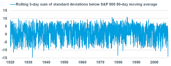
Source: Bespoke Investment Group, as of August 28, 2015.
Death cross!
Another attention-grabber last week was the supposedly-deadly “death cross”, experienced by the S&P 500 last week. These crosses occur when the index sees its 50-day moving average cross below its 200-day moving average asboth moving averages are declining themselves. There have only been 10 death crosses in the history of the S&P 500 (since 1928). As you can see in the table below, performance over the next month has been rough (consistent with our thinking this time). But over the following three and six months, the index has been up significantly; and much more than the average return for all three and six month periods throughout history. The only time the index was lower in the six months following a death cross was following the October 2000 period when the tech bubble burst.
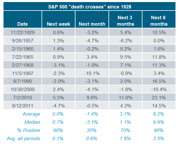
Source: Bespoke Investment Group, as of August 28, 2015.
In sum
It would not be a surprise to see continued volatility—and perhaps even a retest of the lows, which would likely come with less drama relative to the initial low. This likelihood is further pronounced by seasonal tendencies: Septembers have historically been weak for stocks; and Octobers have generally seen better forward returns than Augusts when stocks became oversold.
But instead of trying to time the market, it might be more helpful to look at how you reacted to last week. Corrections test investors’ resolve and discipline. Did you panic and sell on Monday or Tuesday? If so, perhaps you are taking more risk in your portfolio than you assumed you could handle. Or did the correction give you an opportunity to rebalance your portfolio? These are the important considerations when markets become more volatile. Last week I revised and posted a report I originally wrote in 2008 about the perils of panic: Panic Is Not a Strategy—Nor Is Greed.