“Bull markets are born in pessimism, they grow in skepticism, they mature in optimism and they die in euphoria.” Sir John Templeton
- v The S&P 500 index of large capitalization U.S stocks has gotten more expensive over the last 6 months and its current valuation implies future 10 year compound annual returns of just 6%
- v Historically, the S&P 500 has done well for a period of time after the FED starts raising interest rates
- v However, when short term interest rates rise close to or above the level of long term ones (i.e. a flat or inverted yield curve), a stock bear market almost always occurs
- v We don’t think the current stock bull market is over just yet, but do think that it is in the latter innings, all the while being fueled by Federal Reserve largesse
Since our last letter in November of 2014, the S&P 500 index of large capitalization U.S. stocks has continued to climb, albeit with several fits and starts, and recently celebrated its sixth anniversary of the current bull market on March 9, 2015. In addition, the index was up again in 2014, marking the sixth consecutive calendar year of positive performance. Interestingly, the S&P 500 has never risen 7 calendar years in a row on a price basis, although it has on a total return basis (i.e. including reinvested dividends). As we mentioned in our last letter, such anecdotes don’t drive our investment decision making. However, they are sometimes correlated to valuations and we believe that is the case this time around. In Table 1, we present the same valuation format as in previous letters, but updated with current values.
Table 1: Stock Price Overvaluation Continues
Source: Standard and Poor’s, Robert Shiller, Federal Reserve, Bureau of Labor Statistics
As you can see, stocks remain overvalued on all 7 metrics and, in fact, have become slightly more so since last Fall. As we discussed previously, such overvaluation is not a very good predictor of short-term performance, but is quite accurate over the long term. And unfortunately, today’s high valuations are historically correlated with lower than average future returns. Based on the data in the table, we would estimate that the S&P 500 will only return about 6% per year over the next 10 years vs. the historical long-term average of 9%-10%. However, it is unlikely that such returns will be the same from year to year. More likely, in our opinion, is that we will continue to experience the kind of severe bull and bear market volatility that has occurred since the late 1990s. In fact, we believe it was the record-breaking valuations at the top of the tech boom in 2000 (and the subsequent Federal Reserve monetary policies) that have caused the extreme roller coaster of stock prices since then.
Where’s the Top?
In our last letter, we illustrated that 12 out of the 14 declines in the S&P 500 that exceeded 15% over the last 60 years were preceded by the Federal Reserve (FED) raising the Federal Funds Rate (FFR) during the previous 3 years (as a reminder, we have found a more natural breakpoint at declines of 15% vs. the traditional 20% level that the financial media uses to denote bear markets). And while the FED didn’t actually raise the FFR prior to the 2010 and 2011 declines of 16% and 19%, respectively, it did end Quantitative Easing Parts 1 and 2 just prior. So, in 100% of cases since 1954, every S&P 500 decline of at least 15% has been correlated with (if not caused by) significant FED action. And with the FED poised to raise the FFR from its current level of 0% sometime later this year, we thought it wise to explore how stocks have performed during such tightening cycles historically.
Table 2: S&P 500 Performance After the FED Starts Raising Interest Rates
Source: NY FED (FFR for 1971-present), Federal Reserve (effective FFR prior to 1971), Standard and Poor’s
As detailed in Table 2, the good news is that stocks don’t usually start declining significantly right after the FED starts raising interest rates. Rather, it usually takes a few rate increases before stocks start to lose steam. To point, since 1954 the S&P 500 has risen an average of 63% over nearly 3 years following significant FFR increases before declining at least 15%. However, the range around these averages is huge, implying that neither the length of time since FFR increases begins nor the amount of the increases is very predictive in determining when the current stock bull market is likely to end. However, there is a metric we monitor that does have a strong track record of predicting such events – the yield curve.
No Trouble With the Curve…Yet
As discussed in previous letters, the FED’s primary monetary policy tool is adjusting the FFR, which is the interest rate at which big financial institutions lend money to each other overnight. While this very short term rate does indirectly influence medium and long term interest rates, the FED traditionally did not directly affect such rates. That all changed during the Great Recession in 2008 with the birth of Quantitative Easing (QE), which entailed the FED printing trillions of dollars and buying U.S. Treasury and mortgage-backed securities in an effort to bring medium and long term rates down to stimulate the economy. Together, all of these interest rates (i.e. short, medium, and long term) collectively form what is called the yield curve. There are yield curves for all different kinds of bonds, but we will focus exclusively on U.S. Treasury bills (maturity of a few days to a year), notes (2-10 years), and bonds (up to 30 years).
In normal environments, investors demand higher interest rates on longer maturity bonds than shorter maturity ones (i.e. the yield curve slopes upward from shorter to longer maturities). This makes sense, as there is a cost associated with having a fixed return over a longer period of time. However, sometimes the FED raises short term interest rates too much (usually to head off inflation), leading to a contraction in credit and a recession. Often times, such economic environments are predicted by bond investors, which buy long term U.S. Treasuries for their perceived safety, forcing the price of those bonds up and the interest rate down. If the long term interest rate falls below the artificially set short term one, the yield curve is said to be “inverted”. Kind of like when Goose and Maverick were “keeping up foreign relations” while doing a 4G dive with a MiG-28 in the movie Top Gun. And while the pilots “got a great Polaroid” of their encounter, the economy typically does not enjoy inversions quite so much.
Chart 1: Yield Curve (10 Yr. U.S. Treasury Yield Minus Effective FFR) with 15%+ S&P 500 Declines
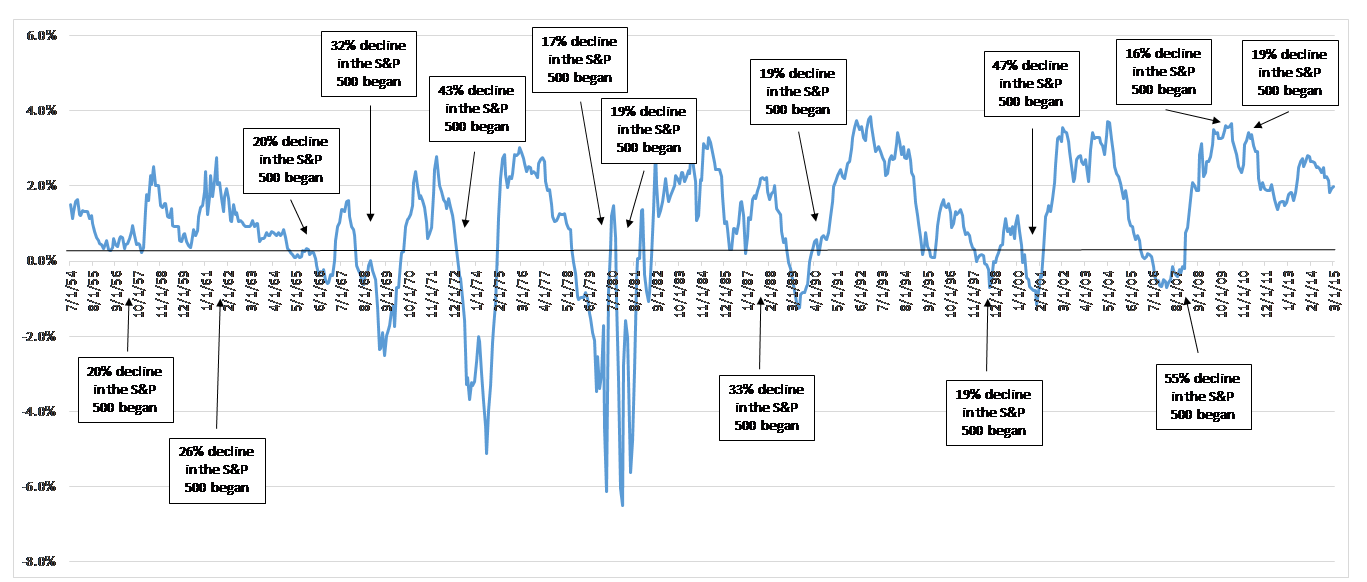
Source: NY FED (FFR for 1971-present), Federal Reserve (effective FFR prior to 1971), Robert Shiller, S&P
As shown in Chart 1, over the last 60 years virtually every time (i.e. 12 out of 13 occurrences) the yield curve has significantly flattened (i.e. 0.3% or smaller difference between short and long term rates), the S&P 500 has declined at least 15% within about 18 months. The only false positive during this time was in late 1995, when the yield curve flattened to just 0.1% but the S&P 500 did not experience a material decline. On the flip side, almost every time (i.e. 12 out of 14 occurrences) the S&P 500 has declined at least 15%, it has been preceded by a nearly inverted yield curve during the prior 18 months. The only false negatives occurred recently when the S&P 500 declined slightly more than 15% in 2010 and again in 2011 during which time the yield curve was nowhere near inverted, but the FED had recently ended QE parts 1 and 2 (interestingly, there were several significant bear markets in the 1930s and 1940s without inverted yield curves, but that is a topic for another letter). So, the yield curve is not a perfect predictor of bear markets, but it does a have pretty good track record since WWII, particularly when combined with analysis of the FFR and stock market valuations. In our next letter, we will discuss how these 3 Bear Market Horsemen almost always precede particularly large declines in stock prices.
So What?
So, what does all this mean for your money? With stocks at historically high valuations, it means that we are focusing very closely on interest rates movements, among other indicators. Fortunately, the yield curve is far from inverted at about 2% today. However, with the FED actively discussing raising the FFR later this year, it is time to be vigilant. Referring back to the quote at the beginning of this letter from investment legend Sir John Templeton, we believe investors are currently optimistic and will soon be euphoric, which typically marks the beginning of the end of the bull market. So, we don’t think the current stock bull market is over just yet, but do think that it is in the latter innings, all the while being fueled by Federal Reserve largesse.
Sean Butson, CFA
President
DC Capital Management LLC
All comments in this letter are strictly the opinions of the writer and in no way should be construed as guaranteed. Opinions expressed are subject to change without notice and, due to the rapidly changing nature of capital markets, may quickly become outdated. The opinions and information presented do not constitute a solicitation for the purchase or sale of any securities or options on securities. Please contact DC Capital Management if there are any changes in your financial situation or investment objectives, or if you wish to impose, add or modify any restrictions to the management of your account. Our current disclosure statement is set forth on Part II of Form ADV and is available for your review upon request.