NY Fed Models Forecasting Excess Returns Through 2018
Encounter The Year of the Horse, Valuation Mean Reversions, &
George Lindsay’s Three Peaks and a Domed House
The NY Federal Reserve has an equity research department. Their research department determined in 2013 that “stocks are cheap” and that investors should enjoy “excess high returns” in an abnormally low or negative real interest rate environment for the next five years through 2018. Before reviewing potential mean reversions, implications from the Year of the Horse, & George Lindsay’s bearish Three Peaks and Domed House model, let’s attempt to quantify the NY Fed models. How high the Dow Jones might climb if it is to enjoy “excess high returns” through 2018.
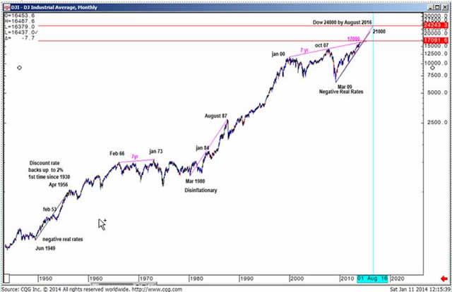
Goldman Sachs research team, based on their earnings growth models, forecasts the SP500 to rally a modest 19% to 2200 by 2016 from the 2013 yr close. That amounts to roughly 6% annualized returns for the next three years in US equities. 6% annualized returns hardly qualifying as “excess high returns.” The two behavioral models shown below suggest the Dow can rally another 30%-50% by 2016. The first model correlates the March 09 negative real rate environment to the June 1949 negative real rate environment low. This model targets 21,000 by 2016. The second model correlates the March 09 negative real rate environment low to the March 1980 disinflationary low. That model targets 24,000 by August 2016, about 50% higher than today. It seems a disinflationary environment may be better for equities than a negative real rate environment.
Bullish Disinflationary and Negative Real Rate Models to 2016
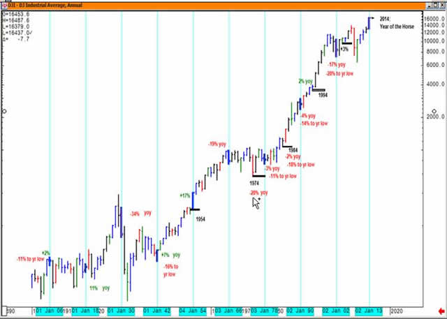
2014 is the Year of the Horse and the 4th year in a Decennial pattern. Verticals are placed on the Year of the Horse dating back to 1906. With the exception of 1954, the Year of the Horse finds the Dow Jones down at least –11% from the previous years close at some point during the year before rebounding.
The 4th year in the Decennial pattern dating back to 1974 has produced mixed results for investors. In 2004 and 1994, the Dow ended up just 3% and 2%. In 1984, the Dow ended the year down –2%. In 1974, the Dow was down –28% y-o-y.
Decennial and “duodecennial” (year of the horse) observations are not stand alone rationales for making investment considerations. Duodecennial observations should be supported by other considerations, such as mean reversion tendencies, valuations, and long-term pattern recognition. Which is to where we turn our attention to now.
The Year of the Horse & The 4th Year in a Decennial Pattern
The Fed decision to remove asset purchases beginning in January 2014 represents a shift in a policy that it has pursued for the past five years. As such it is an attempt at mean reversion. QE policies have indirectly been supporting US equity prices for the past five years. The positive correlation between QE and stock prices have been running as high or higher than 0.9. For instance, when QE1 was removed in mid 2010, the stock market corrected. Deflating equity prices that summer may have been a precipitating factor to Bernanke’s QE2 telegraph from Jackson Hole WY in late August 2010 (which came first the chicken or the egg, we don’t know). The partial removal of QE3 & QE4 may be a precipitating factor to a potential valuation mean reversion in US equity prices. Likewise, the onset of “QE5” in response to deflating equity prices (or deflation more generally) would likely spark yet another stock market rally.
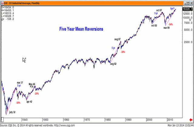
Regardless of the partial removal of Federal Reserve asset purchases, historical evidence shows that financial markets themselves tend to revert after trending strongly for three to five years. The historical examples below show mean reversions after a 5 yr run into 1937, 1987, and 2007, along with one 4 year mean reversion in June 1946. This most recent bull campaign fell just one quarter shy of 5 yrs. Four to five year mean reversions in the Dow Jones exhibit a tendency to lose 25% or more of its value.
Based on current valuation metrics, the Goldman Sachs global research team headed by David Kostin, Elaine Garzarelli et. al., downgraded the SP500 in January 2014 to an underweight and see risk of a 10% drawdown. ( Goldman is probably underestimating downside risks by a wide margin—and I will address that shortly). From David Kostin: “ S&P 500 valuation is lofty by almost any measure, both for the aggregate market (15.9x) as well as the median stock (16.8x). We believe S&P 500 trades close to fair value and the forward path will depend on profit growth rather than further expansion of the forward P/E from the current 15.9x… further P/E expansion will be difficult to achieve. … The forward P/E ratio for the S&P 500 during the past 5-year, 10-year, and 35- year periods has averaged 13.2x, 14.1x, and 13.0x, respectively. At 15.9x, the current aggregate forward P/E multiple is high by historical standards. “
Mean Reversion Tendencies
Goldman Sachs research team believes that from this point forward it will be earnings growth rather than multiple expansion that will have to drive the stock market higher between now and 2016. Based on their earnings growth models, they believe the SP500 can reach 2200 by 2016. If forward earnings grow 10% each year between now and 2016, the 2016 forward earnings forecast will be roughly $145 and the SP500 will have to be trading at a 15.3x forward earnings multiple (the Jan 2014 forward earnings multiple) to reach 2200 by 2016.
The chart below pencils in a potential –21% decline to the 12x forward earnings multiple at 1450 in 2014 before heading towards 2200 in 2016. The 15.3x forward multiple at the end of 2013 was more than two multiples greater than the average 13x forward multiple. The baseline scenario suggests a mean reversion one or two multiples below the average 13x forward multiple - to one that approaches 12x or 11x forward earnings multiple. The actual correction may be greater or less than a mean reversion to the 12x forward earnings multiple. Also penciled in our rebounds to Goldman Sach’s 2200 price target for 2016 from the 13x forward multiple, the 12x multiple, and the 11x multiple.
The George Lindsay Three Peaks and a Domed House model that I will illustrate in the pages that follow theoretically implies a round trip to the Oct 2011 year low. As important as the Domed House model is for identifying tops and bottoms, I do not believe the theoretical model at this juncture will allow the market to bottom as low 2011 yr low (partial explanation as to why it won’t round trip to the Oct 2011 low to follow).
Mean Reversions to a Lower Forward PE Multiple &
Goldman’s SP500 Earnings Growth Model price target of 2200 by 2016
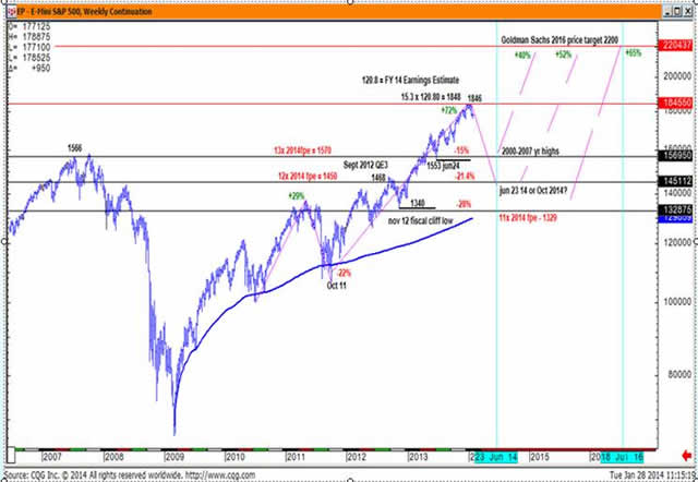
While above 1800, Goldman’s David Kostin noted that 1) the current forward P/E multiple to be high by any historical standards and 2) that further multiple expansion is unlikely.
Under these conditions, Goldman sees risk of a 10% stock market correction. 10% corrections are akin to garden variety weeds that are dismissed by most investors. But as we saw on the previous chart, a mean reversion to the average annual P/E multiple of 13x forward earnings, the SP500 needs to correct 15%, not 10%. By using Goldman’s forward multiple valuation metric, we see Goldman understates what the size of any looming correction should entail for traders and investors.
And, if you will recall, historical evidence suggests that mean reversions following five year bull campaigns a tendency for the Dow Jones to lose 25% or more of its value. For higher beta stocks, the risks would be far greater.
Mean reversions greater than 20% following five year bull campaigns are consistent with the multi-year topping pattern described by George Lindsay known as Three Peaks and Domed House—shown in the illustration on your right.
There are two floors to the Domed House, followed by a dome itself, before the stock market reaches its peak. Both the first floor and the second floor each hammer out some sort of triple top or “three peaks” pattern, then the stock market flushes before heading higher. The Dow Jones tops out on what Lindsay calls point 23, after which a bear market ensues that returns the stock market to its point 10 low before bottoming.
This is the theoretical model. Now let’s look at some actual models, beginning with the present day Three Peak and a Domed House, then look back to the Three Peaks and Domed Houses from 1929, 1973, and 2000.
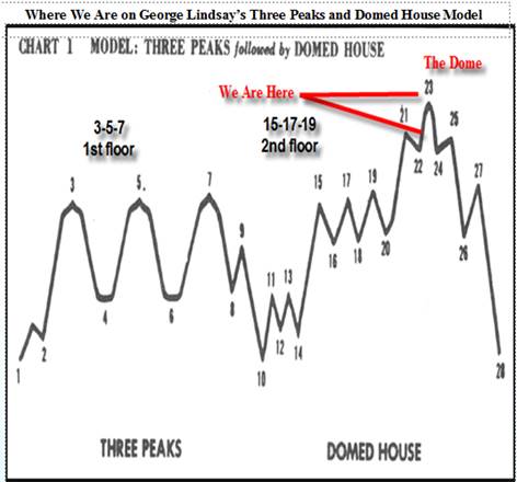
Between the two sets of “three peaks” that hammered out the 1st and second floor is a new count and represents a shift in Lindsay’s theoretical count. It is no longer just 23 points to the Dome. This new count shown below features 25 points to reach the Dome. An extra two points (15 & 16) were added to this count when the fiscal cliff crisis came up in the second half of 2012 and resolved in November 2012.
If you are looking for the count to end on point 23, you might get lost on the pattern. The key attribute to look for the dome to form via a zig-zag pattern after the second set of “three peaks”, and hence the name, three peaks and a domed house. That is the pattern “tell” informing investors and traders that the “end is nigh.”
2009-2013 Domed House
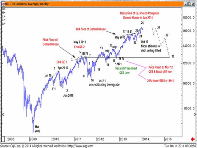
The theoretical implications of the Lindsay theory is that a bear market ensues that will retrace to the point 10 low set in Oct 2011. But I hypothesize that is too low a target. You will find that I have traced out a theoretical bear market correction that takes the Dow Jones only back to the Nov 2012 QE3 low at 12471 .The Nov 2012 low is roughly 11x 2014 forward earnings estimate, two multiples below the average 13x forward earnings multiple (just as the recent high peaked 2x above the 13x average forward multiple).
Again, while there are many other contributing factors, a primary reason I ended the trace near the Dow Jones point 16 low in the 12,500 to 13,000 price zone rather than the point 10 low is because of the low probability that our centrally planned markets would allow the Dow Jones to fall much below the Nov 2012 QE3 low before the Federal Reserve announces some sort of “QE5” program to put a floor under the stock market. What I am hypothesizing, then, is that the correction ends at a much higher level than the traditional Lindsay’s theoretical model posits. Nevertheless, 25% will still be a big hurt—and is in line with other historical –25% mean reversions after a five year bull market campaign.
Adding two points to Lindsay theoretical count of 23 to reach the Domed House is a novel twist. Hypothesizing a higher floor than the point 10 low is also new. This new Lindsay count and features to the Domed House pattern may be partially attributed to the artificial distortions introduced by our policymakers.
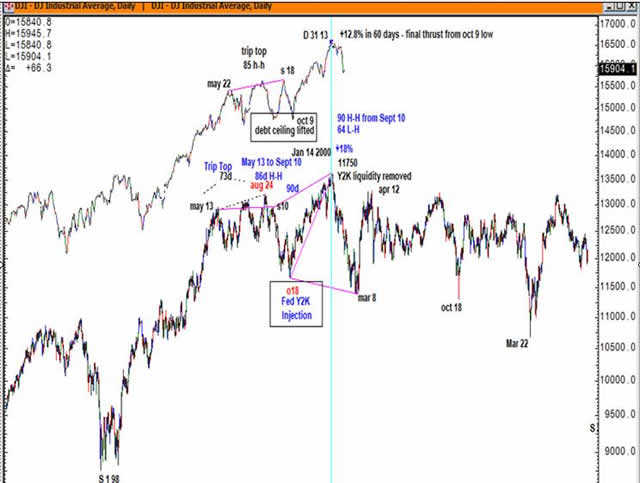
The Dec 31 2013 high at 16588 appears to be the final high of the Domed House. From George Lindsay’s Three Peaks and a Domed House perspective, the Dow Jones top in 1973 and Dow Jones top in 2000 and the Dow Jones top in 2013 all feature a triple top patterning that began in the prior spring that resolved to the upside with a final thrust off an October low. Always, the catalyst for the final thrust off the October low in each case was accompanied by some form of massive stimulus, either monetary stimulus from the Fed or fiscal stimulus from the US government.
A price reset to the Nov 2012 low equates to a mean reversion of ~ 25%. My working hypothesis is that the stock market can “reset” at or above the Nov 2012 low near 12,500, then still see another incredible stock market rally transpire in 2015-2016. A powerful stock market rally in 2015 would also be consistent with decennial tendency for strong bull markets in the 5th year of a decade and be consistent with Kostin’s idea of profit growth expanding in the years ahead.
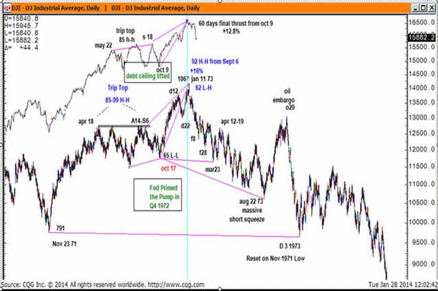
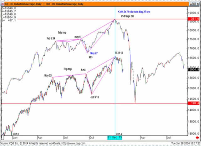
2013-2014 Dow Jones Commonality with Dow Jones 1972-1973
Note the triple top that began in the spring of 1972 and 2013. The final thrust in Oct 1972 was related to the Fed’s massive increase in the money supply ( 1972 source: Edson Gould, Findings and Forecasts Jan 1973). The final thrust in October 2013 was the result of the US government lifting the debt ceiling.
1973 & 2013 Domed Houses
As was the case with the 1973 and 2013 Dow Jones tops, the 2000 Three Peaks and Domed House features a triple top that began in the spring of 1999 followed by a final thrust off an October low. The final thrust off the October 1999 low was massive “Y2K” monetary stimulus. When Y2K never showed up to the party, the Fed removed the liquidity they provided.
Dow Jones 2000 & Dow Jones 2013
If you stayed with me thus far, below you will find a bonus chart: the analog of the Dec 31 2013 top to the Sept 3 1929 high. The 2013 correlation to 1929 is not as strong as the 1973 and 2000 tops, but the three peaks and a domed house pattern is present. If Structural Logic's Research has piqued your interest, you may contact John to become a subscriber at [email protected]. Thank you!
Dow 1929 & Dow 2013
© Structural Logic CTA
thecommoditytradingadvisor.com