Confounding Friday Report, Pesky Housing Details, Stamps and Election Results
The markets rallied on Friday ostensibly because of the First Friday employment data – was it good news (job creation) or bad news (rate is up and the Fed will keep juicing the market). Read on. Next, it is on to a look at housing data that seems to have been under the radar screen of the media. I conclude this week with a look at my election predictions. While I hit a touch over 50% (worthy of baseball hall of fame induction) the folks at the major networks won’t be inviting me to work the election map anytime soon.
First Friday Comes Late This Month
The First Friday report was released on the second Friday – not due to a website issue but the hangover from the government shutdown. While the markets and media were enthused by the top line job growth number (+204,000), I am scratching my head.
The reported numbers show the number of unemployed persons, at 11.3 million changed little and the the unemployment rate, at 7.3 percent, ticked up. But there’s more. When you look a bit deeper, it is disturbing to find that the civilian labor force was down by 720,000 in October (that is a huge number which was not, per the BLS, folks mistakenly counted due to the shutdown). Stop for a second and consider if those no longer in the labor force had remained in the labor force and remained unemployed – odes the rate go higher than 7.3%? The labor force participation rate fell by almost half of a percentage point to “a generational low” of 62.8 percent and the employment-population ratio declined by 0.3 percentage point to 58.3 percent. The report noted that the temporary government shutdown impacted this decline – I prefer to wait until next month to get a better read on that (in other words, I am not sure I buy it).
The First Friday report is a broad stroke look at what is going on in the US – I think our readers focused on the municipal market are better served awaiting the more granular details around States and localities. For that data, we have a couple of weeks or you can harken back to prior commentaries. DIVER subscribers can also access September’s data and quickly decipher the trends.
Housing – Pesky Details
As we move from the employment situation to housing, my point about looking beyond the broad-based statements about the housing market come shining through. As new data is released, we hear the pundits declare how well the housing market is doing, that the housing market has recovered, etc. Mind you, it is the rare soul that will venture to remind folks that this “recovery” (which I will highlight is uneven) is fueled by the Fed’s bond-buying program and near zero rates.
This past week saw the release of data around Homeownership and the Homeowner Vacancy Rate. The Homeowner Vacancy Rate, which measures the percentage of residential housing units that are vacant and for sale, is higher in 30 States than it was one year ago (while Michigan is in this group, you can’t blame it all on Detroit).

DIVER Analytics, Filter Module; US Census Bureau.
The other important data point to consider is the Homeownership Rate – the proportion of houses that are owned. Here, the results are remarkably similar – 30 States have Homeownership Rates less than one year prior.
![]()
DIVER Analytics, Filter Module; US Census Bureau.
To answer your question, no not the same 30 but there are 17 States that fit within both categories. For your reference, I include them below.

DIVER Analytics, Filter Module; US Census Bureau.
Amongst this group, I highlight Michigan, Arizona, Florida, Indiana, Louisiana, Ohio and Oregon – all with Geo Scores of less than five (recall that the Geo Score contemplates data from the housing, employment and income data groups). These States may be worth a closer. For a complete list of State Geo Scores, please visit www.lumesis.com.
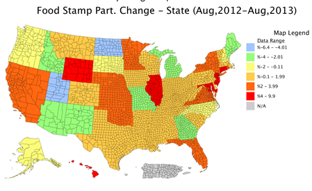
Stamps – Not One’s You Want to Collect
I’ll make this very short and to the point. According to the Department of Agriculture, Food Stamp Participation has increased in 37 States from one year ago. A picture is worth a thousand words. Yellow, green and blue are declines – the rest of the map shows an increase in food stamp participation.
Elections
Last week, I made some predictions for over thirty of the elections that occurred last Tuesday. In doing so, I harked back a few years and decided to see if it really was all about the economy.
Gubernatorial Races: We hit 50% -- with a Christie win but the incumbent party losing in Virginia. That said, we did hedge big time in Virginia noting “Virginia, similarly strong in that it is well-above the mid-point of 5, has seen its score decline by a full point – from 9 to 8. That ranks amongst the bottom four in terms of year-on-year decline when compared to all other States… the challenger may have find some strength in the fact that their relative rank has dropped (more so in VA).”
City Mayoral Races: For the cities, we hit slightly better than 50% getting 18 of my 34 projections correct. It some places, it is indeed the economy, in others tenure or other factors carry the day. That’s politics for you.
Have a great week.
Gregg L. Bienstock, Esq.
CEO & Co-Founder, Lumesis, Inc.
Data Released Last Week:
- Food Stamp Change, State, Aug 2013
- Weekly Initial and Continued Jobless Claims, State, 10/26/2013
- Education Test Scores Table, 2013, State
- Homeownership Rate and Homeowner Vacancy Rate, State, 2013 Q3
- Delinquency Rate (Res. Mortgage), State, Sep 2013
- UPDATED: Bankruptcy Filings - Issuers, State, County, 2013
- UPDATED: Default Filings - Issuers, State, County, 2013
Please direct all inquiries to [email protected] or 203.276.6500.
© Lumesis


