This week, we start with a return to our “tidbits” and then insight and thoughts around the Employment Situation as reported on Friday and our take on that and related data. We also take a look at Homeownership data and wonder if the glass is half full or empty.
DC Takes Care of Congress and Their Aides: While many of us worry about things like, I don’t know, deficit reduction, tax reform, the debt ceiling and the impact of the sequester, we all should be heartened that our elected officials and their staffers will continue to have 75% of their insurance premiums paid by the government (aka, taxpayers). The issue at hand was whether, under the Affordable Care Act , the federal government can continue to pay part of the health insurance premiums for Congress and their aides. With an October deadline looming, the issue resolved last week. Phew! At least we know when critical stuff is really on the line our elected officials can get it done. Perhaps they can focus on more pressing matters – tax reform and its potential impact on the municipal market (amongst others) – that is, after they get back from their six week “recess.”
Data and the Employment Situation Report : Seems folks had too much data to digest this week or they simply had a long weekend planned. At first, as usual, the markets responded to the data released but, it seems, by Friday they grew tired of all that data or maybe they finally are discounting the Employment Situation report. A brief recap in case you missed it:
- Consumer spending is up, consumer confidence is down.
- Weekly initial jobless claims are lower and the “Employment Situation” (which our regular readers know how meaningful I find) released Friday, highlights a lower unemployment rate.
- Job creation is the slowest it has been in months, people are working fewer hours and average hourly wages are declining. By the way, job growth for the prior two months was revised downward by 26,000.
- The number of folks not counted as unemployed but wanted and were available for work – 2.4 million – was “little changed”. However, amongst this group, there were 988,000 discouraged workers in July, up by 136,000 from a year earlier.
- Oh, did you see those less than stellar GDP numbers. I guess the good news for some is that it seems more likely that the Fed will keep the printing presses going a bit longer.
Got all that? All this data and folks trying to make sense of it the moment it hits brings me back to a quote cited a few weeks back:
… I have come to believe that the best performers are those that are well informed but who don’t react to every bit of news [data]… In fact, since everyone in the financial sector seems to be obsessed with obtaining any type of economic or financial news instantly, maybe a better approach would be to obtain the news [data] after a … time delay. Marc Faber, The Gloom, Boom & Doom Report
In the end, it is about understanding what data is important, how and when to use it. Context is also pretty darn critical. Take the Employment Situation report. While the market eagerly awaits this repot, it is, at the end of the day, a survey of 60,000 people. From that, the market projects the results for the entire country!
The Employment Situation – Our Way A tidbit leads into the main course. The Employment Situation gave us a sampling (as cited above). Now, let’s take a look under the hood – employment data for June 2013. I’m going to start with some relatively good news. The Unemployment Rate is down from one year ago in about 1,900 counties (stated another way, it is up in “only” 1,278 counties across 38 States).

DIVER Analytics, Filter Module; BLS.
However, one needs to look beyond rate (heard this one before have you). Let’s contemplate a lower Rate coupled with a flat to rising Labor Force. This is a true indicator of employment growth. Only 815 counties meet the mark (roughly 25% of the counties in the US).

DIVER Analytics, Filter Module; BLS.
A picture is worth a thousand words so here is a look at Job Growth over this one year period – in addition to those counties highlighted above (rate down and labor force up) – this visual focuses on pure Job Growth (percent change in the number of jobs). Not a terribly pretty picture with bright colors – you know, the ones showing real Job Growth. The legend tells the story.

DIVER Analytics, Map Module; BLS.
Before leaving our review of employment data, I wanted to compare another data point reported in the Employment Situation report with data we have at the county level. In other words, a survey of 60,000 v. what’s behind curtain number one (name the how for extra credit). According to the Employment Situation released by the BLS, the employment-population ratio was unchanged at 58.7%. We look at the number of Employed as a % of Population and find the 58.7% hard to replicate. For absolute simplicity, blue is 58.7% or greater.
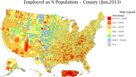
DIVER Analytics, Map Module; BLS, US Census Bureau.
As one contemplates the above, one has to think very seriously about the fiscal well-being of places barely treading water on the employment side of things. In the coming weeks, we will see important wage-related data. Lets hope that is better than what the Employment Situation foretells.
Homeownership
We keep hearing a fare amount about housing and it being a driving factor around any recovery. One data point worth noting is the Homeownership Rate. Candidly, this one is a “beauty is in the eye of the beholder.” In absolute terms, 22 States have seen growth in their Homeownership Rate over the past year. Here’s my dilemma, on the one hand, I am not thrilled that only 22 States have seen growth especially with interest rates so low. On the other hand, you can’t help but wonder if this is part of the new normal – more Americans recognizing they simply can’t afford to own their own home and behaving responsibly. In the long run, that may not be a bad thing.
When contemplating the housing market, one might also consider Housing Prices (think FHFA which covers most of the US v. 20 cities from Case Schiller), Assessed Values, Property Tax Receipts, Delinquency Rate and Foreclosures.
I leave you this week with the full Monty for our recently updated Geo Score at the State level. Do you agree with our scoring? We welcome your feedback – really. The Geo Score is update monthly for all States, counties and over 330 cities.
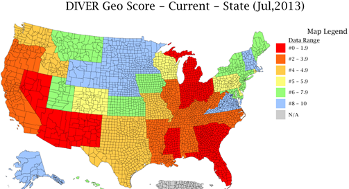
DIVER Analytics, Map Module; Lumesis.
Have a great week.
Gregg L. Bienstock
CEO & Co-Founder, Lumesis, Inc.
This Week’s Data :
- UPDATED: DIVER Geo Score, State, County and Place, Current & Trend, July 2013
- Weekly Initial and Continued Jobless Claims, State, 7/20/2013
- Unemployment, June 2013, County
- Philly Fed Leading Index, June 2013, State
- Job Growth, County, June 2013
- Homeownership Rate and Homeowner Vacancy Rate, State, 2013 Q2
- UPDATED: Employed as % Population, County, June 2013
- Labor Force, County, June 2013
- UPDATED: Default Filings - Issuers, State, County, 2013
- UPDATED: Bankruptcy Filings - Issuers, State, County, 2013
- NEW: Unemployment Rate Change, State, County, 2007-2012
- Drought Intensity, County, July, 2013
- UPDATED: Special Event: Tornadoes, County, 2013
- FEMA Disasters, County, July 2013
© Lumesis