This week we spend time looking back at employment data (promised two weeks back) and offer some perspective from a soon to be published book. We take a look at the DIVER Muni Index and conclude with an introduction of some new and meaningful data now available to our subscribers.
Employed, Unemployed – What’s It All Mean? Over the past year, we have periodically written about employment and, at times, offered our readers an alternative perspective to the “Employment Situation” report released the first Friday of each month. Those commentaries suggested, as we often do with other data points, the need to look beyond the headlines (also last week’s theme as prophesized by some Really Smart People). In doing so, we never doubt the integrity of what is reported but simply want our readers to be sure they understand the distinction between headline numbers splashed across news sources and more detailed numbers that inevitably follow a few weeks later. Inasmuch as we are a society that demands information yesterday, it is understandable why so many, especially the media, harp on these first Friday numbers and why the markets reflexively respond to the same.
This past week, I had the chance to read a small part of a book being written by Bill Dunkelberg and John Mauldin regarding the future of employment. A great quote from Mauldin to set the stage:
“It is said that one should not want to know how sausages or laws are made. I would add government statistics based on surveys to the list.” Mauldin, “Will the Real Unemployed Please Raise Your Hands”, www.mauldineconomics.com, March 20, 2013.
Below are excerpts I think you will find most interesting (you can access – and I encourage you to do so – the Thoughts from the Frontline commentary, “Will the Real Unemployed Please Raise Your Hands?” at www. mauldineconomics.com).
Let’s start with what you already know: Millions of people are unemployed. How do you know this? The same way you know how many Americans believe UFOs are real… All such data comes from surveys.
What we have to remember is that every survey is based on a sample.
Most national surveys use a sample of, at most, a few thousand people. From this, we extrapolate conclusions about a country of 300 million people.
Survey respondents can only answer the questions they are asked, however, so it’s important to ask the right thing in the right way.
Dunkelberg and Mauldin then point out that the BLS is the source of official information about jobs (or lack thereof) and that the BLS reports a huge amount of employment-related data. They go on to describe what is reported that first Friday of the month in the Employment Situation report.
The report [begins] with two key numbers:
- The monthly change in non-farm payroll employment and
- The unemployment rate
How does the BLS know? The numbers come out of not one but two different surveys the agency conducts each month.
- The Establishment Survey asks a sample of employers how many people work for them.
- A separate Household Survey calls on people – not businesses – to determine their employment status. The result is that [X] percent of respondents who “wanted” to be “employed” were not “employed,” as BLS defines those words.
Now why does it take the BLS 41 pages to convey what we just said in a single paragraph? Details, details.
Dunkleberg and Mauldin go on to discuss Seasonal Adjustments and the definition of Labor Force (something we have covered in the past). They then come to a very important point and some facts that are worth digesting.
Now, how does the BLS determine how many Americans are in the labor force? They call us, or at least enough of us to provide a statistically valid sample.
[T]he BLS Household Survey is a monthly sampling of about 60,000 households.
The 60,000 households are called during a “reference week”… Whoever answers the phone is asked a series of questions about their work status. From their answers, BLS classifies each person age 16 or over in the sampled household into one of three categories:
- Employed
- Unemployed
- Not in the Labor Force
Our authors go on to describe the definitions and make the point that the BLS unemployment data has nothing to do with unemployment benefits. How many politicians know that important tidbit? They then go on to discuss the Labor Participation Rate, you know, that U-6 category we often site and have as part of our database and highlight the fact that:
[T]he unemployment rate can change sharply, even if no one is hired or fired, based simply on changes in the participation rate.
Of course, our regular readers know this point. However, they go on to provide a striking example of how markedly the Employment Situation can change if just 1% of those currently not in the labor force started looking – using December’s figures that would add more than 888,000 to the labor force. All to be counted as unemployed. Not an April Fool’s joke.
Sure hope the Fed contemplates these little nuances as they ponder easing and tightening and tie the same to the unemployment rate.
So, you ask, why the extensive quoting of these esteemed gents? On the one hand, a little validation is nice. However, the real reason is to remind our readers to look beyond the headlines.
A few weeks back, I highlighted the then-recent job numbers and expressed initial pleasure with the declining rate. I also suggested we hold the applause and wait for the underlying data. Well, below you have details from the recently released county level data. Unemployment Rate, Number of Unemployed, the Labor Force and Job Growth. For all data points, we looked back one year. The tables below tell more of the story than the headline and should encourage looking beyond the same to States and counties where you have exposure or are contemplating the same. Context – there are 3,215 counties for which the below data is reported.
![]()
![]()
![]()
DIVER Analytics, Filter Module; BLS
The next logical question to ask is, of the above counties, how many are overlapping and do I hold positions in these locations? The answer to the former is 607 counties – that is about 19%.
And where is the Job Growth – you know, greater than 0%? 1,505 counties over the past year. To help round out the picture, below is the visual depiction of where this occurred over the past year. Yellow, green and blue represent growth greater than 0.

DIVER Analytics, Map Module; BLS
This past Friday, State level Unemployment data was released. A snapshot (literally) for you. Recall the national average of 7.7% from the first Friday report and note the legend.
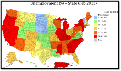
DIVER Analytics, Map Module; BLS
We encourage our subscribers and readers to access and explore the details – in some cases, the devil may be lurking.
Have a great week.
Gregg L. Bienstock
CEO& Co-Founder, Lumesis, Inc.
This Week’s Data :
NEW: Bankruptcy Filings - Issuers, County, 2013, 2012, 2011
NEW: Default Filings - Issuers, County, 2013, 2012, 2011
NEW: Commuting - Average Time to Work, State, County, 2011, 2010, 2009
NEW: Commuting - Inter-County Rates, County, 2011
Muni Index, Point in Time and Trend, March 2013, State
Unemployment and Unempl. Rank Change, February 2013, State
Drought Intensity, County, 3/26/2013
Employment by Industry, State, County, 2012 Q3
Weekly Initial and Continued Jobless Claims, State, 3/16/2013
Philly Fed Leading Index, January 2013, State
Tax Collections by Category, State, 2012 Q4
© Lumesis


