Being on the road gives me a lot of time to read the views and opinions of many very smart people (Faber, Mauldin, Hussman, Hunt and Zhao this week – citations below as they all are worth a read). An interesting thread runs through much of what I absorbed this week: they don’t believe the hype. In other words, the common themes they hear about -- a strong market buoyed by a strengthening domestic economy -- is not fully supported by the data. Well, I decided to put them to the test and, frankly, this ruined my weekend. For you, just another reason to sing, “I don’t like Monday’s” (name the artist).
- Not only isn’t the economy improving, in [Hunt’s] view its getting “progressively weaker.” The tax hikes that hit the middle and upper class have yet to be fully felt and will take 1.8% out of an economy that grew only 3.85% in nominal terms. The effects of a tax increase are seen mainly in the second and third quarters after tax hikes take effect. Initially, consumers try to maintain their standard of living by dipping into savings; later they cut back. … “Its instructive to see consumer confidence fall off so sharply” as the University of Michigan index fell to 71.8 in early March from a final February reading of 77.6. Bad Omens: Mila and the Maestro, Fosyth, Barron’s, citing Lacy Hunt, Chief Economist, Hoisington Management.
- US C onsumer S pending has progressed reasonably well since 2009, income growth has stagnated, suggesting that spending has been partially supported by a falling savings rate. Chen Zhao, Managing Editor, Bank Credit Analyst, cited by Faber.
- Home Price Appreciation, something we hear quite a bit about these days, is uneven as it is driven by expansionary monetary policy and banks have tightened their lending standards (despite encouragement from the government); what happens when QE-forever (not mine but I like it) is gone?! Faber, GBD, March 2013 Report.
- Why has the economic growth been so weak in this recovery? Out on a Limb: An Investor’s Guide to X-Treme Monetary and Fiscal Conditions, Hussman; courtesy of Outside the Box, Mauldin.
On the first point above, time will tell. Digging a bit deeper on the second bullet above, the five year period through 2011 is not pretty. Only North Dakota has Personal Income Change (includes all sources of income) greater than 10%.
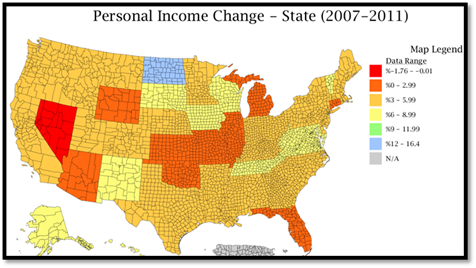
Source: DIVER Analytics, Map Module; Bureau of Economic Analysis
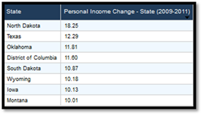
In fact, looking at the Personal Income Change for the periods 2007-2011, 2008-2011 and 2009-2011, only two States have a change greater than 10% -- North Dakota and, ahemm, the District of Columbia – over those periods combined and no State had a greater than 10% increase for 2010-2011. The “standout” two year period is 2009-2011:
Source: DIVER Analytics, Filter Module; Bureau of Economic Analysis
While we don’t yet have full year 2012 data, the average for all States thru the third quarter is 1.44%. Stating the obvious, income drives tax receipts in many States and spending decisions by the population.
Now to the third point : H ome P rice A ppreciation and it being uneven across the country. Let’s start with a look at the States over the 2007 thru 2012 period. The really scary thing is that this map looks remarkably similar to the one above.
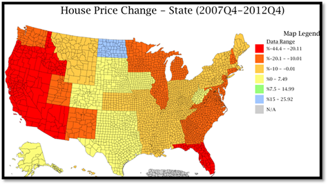
Source: DIVER Analytics, Map Module; Federal Housing Finance Agency
For clarity, the yellow, green and blue States are those with a positive Housing Price Change since the fourth quarter of 2007! Getting a bit more granular: for the same period, of the more than 3,200 counties in the US, the Housing Price Index is greater for only 1,134 counties. If we look for growth greater than 10% over the same period we are left with only 126 counties. Touché Mr. Faber.
As I think about the last point, I am drawn to Job Growth. Following the release of weekly figures a few week’s back, I expressed happiness that we were seeing, what appeared to be, better growth. At least it appears we are trending the right way. However, when we look back and gain broader perspective, we should not forget from where we have come and how far we have to go. Yellow, green and blue represent job growth (>0).

Source: DIVER Analytics, Map Module; Bureau of Labor Statistics
Income, Housing and Jobs – while we may be starting to trend the right way, we have some distance to go. Seems these folks I cited earlier on may have a point.
If all that doesn’t give you reason to pause and look more closely at current data, looking ahead there are a number of deadlines looming that may influence our economy. The current stop-gap spending authorization to keep Washington running expires March 27. By all accounts, this looks like a non-event and, as part of this “fix” members of Congress have gone so far as to make some changes to the sequestration. Incredible what can be done once they stop performing for the media.
Also, news flash, the House and Senate are actually submitting budgets – can you remember the last time that happened? Now the hard part; reconciliation. Good thing they have until the end of the budget year (no need to get it done during or before the year!). Last, and definitely not least, the currently suspended debt-ceiling limit comes back into force on May 19. This may be the biggest uncertainty that influences the economy and markets this Spring. Ahh, let’s leave it to our friends in DC. At least their Personal Income went up!
Have a great week.
Gregg L. Bienstock
CEO& Co-Founder, Lumesis, Inc.
This Week’s Data :
- Weekly Initial and Continued Jobless Claims, State,
- 2013Drought Intensity, County, 3/19/2013
- Coincident Index Change, January 2013, State
- UPDATED: Muni Index, Point in Time and Trend, March 2013, State
- Unemployment and Unempl. Rank Change, January 2013, State
© Lumesis


