We start this week with a look at the DIVER Muni Index and then jump into a discussion about population trends, employment and wages. If you get no further than this opening, the short of it is that you really need to look closely at the data and where things are getting better – really – and where things are perceived to be better. This is especially so as some pundits suggest the higher tax rate on the wealthy will be beneficial to muni-land as more wealthy people seek to offset the increased tax burden.
What we know is that many municipalities have already taken steps over the past few years to rein in spending as they saw tax receipts and property values (assessed values) decline. With the prospect of a slow recovery (yes, I’m somewhat optimistic that the Fed’s printing press will help grow the economy somewhat), higher taxes and more controlled government spending to come, the reality of where various age groups of people are and where the jobs are will become more important to the fiscal reality of State and local governments. Quality matters.
DIVER’s Muni Index
Our DIVER Muni Index contemplates the relative rank of some of the key drivers of the economy (housing, income, employment and foreclosures) at point in time and a blended index that combines point in time and year on year. The below gives some perspective, on a county by county basis, of where things are trending better and worse (lower the number, the better – blue is good, red – not so much). It also reminds us that looking at a single point in time can distort what is happening over time.
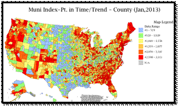
Source: DIVER Analytics, Map Module; Lumesis, Inc.
Population Changes, Labor Force and Wages
A January 9, 2012 Wall Street Journal article focused on the percentage of people moving to a different county, ostensibly for purposes of finding new work. The article cited a 3.9% rate of those seeking “greener pastures at a pace not seen before the recession.” The article does point out that the percentage of movers is still low when compared to past years. “Americans on Move Amid Tepid Recovery”, Wall Street Journal, 1/9/2013.
As I was reading the article, it struck me that the fact that people are moving is, I guess, good. But I wondered, where are they going, where are the jobs and will the working age population be able to keep pace with the over 65 crowd (generally a draw on resources).
We started with a pretty basic look at population data and found that from 2010 to 2011 (the most recent data available) the working age population (18-64) grew – we mean greater than 0% -- in only 740 counties (23%). The good news is that the growth in counties was spread across 46 States. In the map below on the left, the blue counties show growth (>0) of the working age population. Overall, this segment of the population grew by 1.95 million, just under 1%. Source: DIVER Analytics, Data Access Module; US Census Bureau.
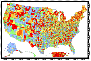
Source: DIVER Analytics, Map Module; US Census Bureau.
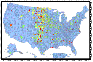
We next looked at the growth in population of people 65 and over across the counties for the same period and found growth across 2,727 counties (52 States and territories). In the above map to the right, the blue counties have growth of the 65 and over population. Overall, this segment of the population grew by 1.149 million or about 1.28%. Source: DIVER Analytics, Data Access Module; US Census Bureau.
There is more to consider. Let’s take a look at the Labor Force, Number of Employed People, a quick look at Average Weekly Wages and the most recent increase for Medicare. Using the Analytics Filter Module and BLS data, we see that for the one year ended November 2012, the Labor Force has increased in 1,435 counties (about 44%), however, it has increased by only .20%. The number of Employed people has increased in 1,972 counties (about 61%) and has increased by 1.14%.
Average Weekly Wages are up in 2,350 counties across most every State and territory. A look at the breakdown of the Average Weekly Wage increases.
|
Average Weekly Wage Increase Equal to or Greater Than |
Number of Counties (cumulative totals) |
|
10% |
112 |
|
8% |
210 |
|
6% |
374 |
|
4% |
765 |
|
2% |
1,511 |
|
0% |
2,313 |
|
Less Than 0 |
3,218 |
Source: DIVER Analytics, Filter Module; Bureau of Labor Statistics.
Why did we take you through this exercise? Two reasons: the end of the Social Security payroll tax holiday and the 2013 cost of living adjustment for Social Security and Supplemental Security Income.
If you have received your first paycheck of 2013 you saw your take-home pay decline. With the expiration of the “payroll tax holiday” all of us saw our tax burden increase by 2%. Recall the wage data presented above: only 1,511 counties (47%) saw their Average Weekly Wages rise by 2% or more. Think about the impact on spending, tax receipts and economic growth – all drivers of the municipal economies.
Our friends relying on Social Security do not fare much better. While their cost of living adjustment is +1.7% -- only 1,630 counties saw an Average Weekly Wage increase of that amount or more. Source: DIVER Analytics, Filter Module; Bureau of Labor Statistics. Also, those receiving Social Security will, in all likelihood, see the rate increase be absorbed be the rate increase they pay for Medicare premiums. Less income means less to spend, means less tax receipts (you get het idea). Add to that the “pay as you go” reality of senior programs – with these numbers – are they sustainable? To sustain the programs, will other aid to States be cut? Will additional revenue be sought via changes to muni tax status?
Back to our initial point: With the prospect of a slow recovery, higher taxes and more controlled government spending to come, the reality of where various age groups of people are and where the jobs are will become more important to the fiscal reality of State and local governments. As you monitor your municipal holdings and evaluate new credits in your search for yield, it is critical to continue to track these and other data points to understand just what may be.
© Lumesis