Does the U.S. Have Too Much Debt?
Membership required
Membership is now required to use this feature. To learn more:
View Membership Benefits Advisor Perspectives welcomes guest contributions. The views presented here do not necessarily represent those of Advisor Perspectives.
Relative to 18 developed economies since 1870, U.S. leverage is high though not unprecedented. However, unless the recent rise in interest rates reverses, the U.S. will need to cut its debt load.
The question of the sustainability of the U.S. national debt load is very complex, and its full resolution, were it even possible, is beyond the scope of this article. (For some interesting takes on this question, see recent pieces by Goldman Sachs, Bloomberg, and Wharton). I take on the much simpler task of summarizing the debt loads of 18 developed market economies dating back to 1870, and seeing what inferences can be drawn from these data. The exercise is made possible by the wonderful data collection efforts of the Macrofinance & Macrohistory Lab at the Kiel Institute for the World Economy, which track country-level macroeconomic outcomes from 1870 to 2020, as of the latest update.
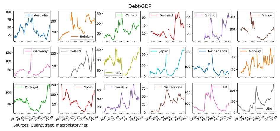
The story begins with the following set of charts which documents the public debt-to-GDP ratios of the 18 countries tracked in the Macrohistory data set. As a percent of GDP, several countries – notably Japan and the U.S. – are hovering close to their 150-year high points of national leverage.
As of the end of 2020, in addition to having very high levels of debt relative to GDP, many of the Macrohistory data set countries also had interest rates close to or at their all-time lows.
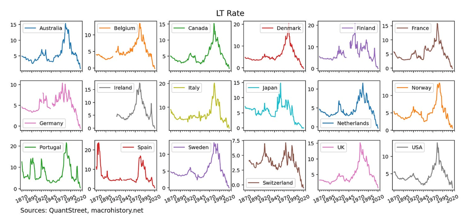
Keep in mind that the level of debt issued by governments is an endogenous outcome – governments can’t issue voluminous amounts of debt without strong investor demand to buy that debt issuance. The low interest rate levels prevalent as of 2020 suggest that investor demand for such debt was quite strong.
For an issuer’s debt load to be sustainable, two factors must coincide. First, when the debt comes due, the issuer must be able to either fully repay the debt or refinance it by issuing new debt. Second, the interest expense associated with the borrowing must be low relative to the issuer’s income. For a national government, interest expense can be measured by multiplying the country’s debt-to-GDP ratios by the average interest rate owed on that debt. The average interest rate depends on the maturities of the sovereign borrowing and on the shape of the yield curve at the time of bond issuance.
While this information is not available in the Macrohistory data set, to get a rough proxy for the interest rate expense, I average the short-term and long-term interest rates (roughly two- and 10-year rates) reported in the Macrohistory data set and multiply each country’s debt-to-GDP ratio by this blended rate. This gives a very rough estimate of each country’s annual interest rate expense relative to its GDP (under the assumption that the interest rates at the time of issuance were similar to the current blended rate).
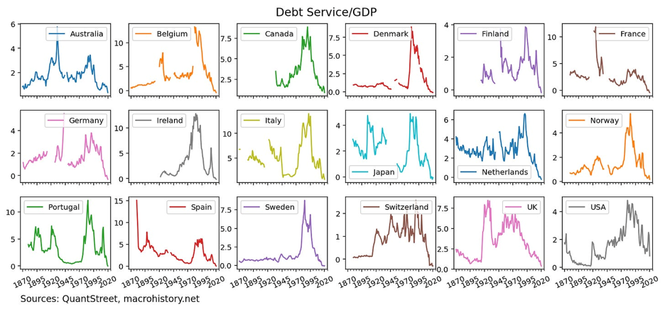
I define the debt service-to-GDP ratio as a country’s debt-to-GDP ratio multiplied by its blended rate. As can be seen in the above charts, for most countries in the sample, as of the end of 2020, their debt service-to-GDP ratio – i.e., the estimated ratio of their annual interest expense to GDP – was actually at all-time lows. So while many countries had very high debt levels, their typical annual interest expense was actually quite low.
Debt and interest rate levels
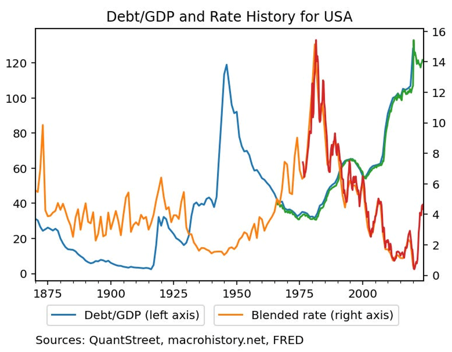
To dig deeper into the relationship between debt and interest rate levels, the next chart plots both series for the U.S. The data start in 1870 and end in 2024. The blue and orange lines are annual series obtained from the Macrohistory data set, and the green and red lines extend these from 2020 to today using data from the FRED website.
It is visually clear that, at least for the U.S., there appears to be an inverse relationship between overall debt levels and the levels of interest rates. High debt levels are associated with low interest rates, and low debt levels are associated with high interest rates. This strongly suggests that the equilibrium outcome in global markets is that countries issue debt at those times when investors are most willing to buy that debt issuance.
To test this relationship more broadly, I regress the Debt/GDP level of all countries in all years of the sample on the countries’ blended interest rates (the average of short- and long-term interest rates) in those years. This regression should not be interpreted in a causal way – i.e., it does not imply that lower interest rates cause countries to have more debt – but it points out the general association of higher debt levels with lower levels of interest rates.
The regression model is extremely simple and ignores important statistical issues like country-level variation in the level of debt and interest rates. But in very broad terms, a typical country with a blended interest rate of five percent would have an average debt-to-GDP ratio of 68.6 percent - 2.86 x five percent = 54.3 percent. For countries with blended interest rates of zero percent, their typical debt-to-GDP ratio would be 68.6 percent and for countries with blended interest rates of 10 percent, their typical debt-to-GDP ratio would be 40 percent. The R-squared of the regression – a measure of how well the model is able to explain the data – is only 5.3 percent, suggesting that this very simple model does not capture a great deal of the variation in debt-to-GDP ratios across countries and across years.
Zooming in
I now zoom in on two countries: Japan and the U.S. Japan has famously had an extremely high debt load for many decades. The next chart shows the debt-to-GDP ratio for Japan, as well as a blue, shaded region. The blue, shaded region shows the range of debt-to-GDP ratios across all countries in a given year. That Japan’s debt-to-GDP ratio is at the top of the blue shaded region indicates that Japan has had the highest sovereign leverage ratio among the 18 Macrohistory countries for the last 20 years. (Japan effectively defaulted on its debt post World War II, which explains the missing observations in the 1940s and the drop in its debt load to near zero by the ‘50s and ‘60s.)
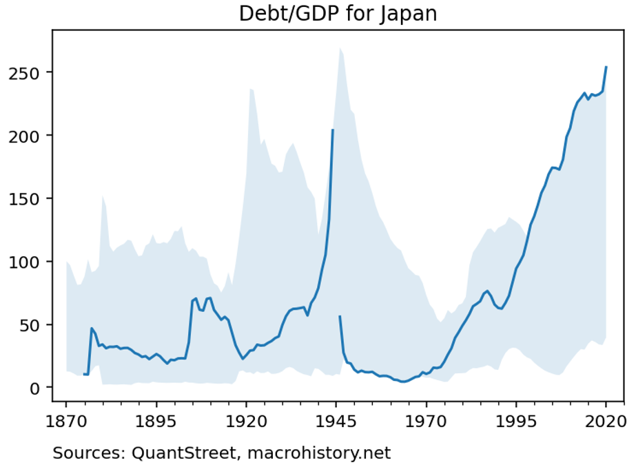
The debt vigilantes have been so enamored of this high debt load that they have been shorting Japanese government bonds for the last two decades, with very little success. In fact, the trade of shorting Japanese government bonds has been so spectacularly unsuccessful, it has been dubbed the widow-maker.
The widow maker’s ensnarement of unsuspecting bond vigilantes can be explained by the next chart.
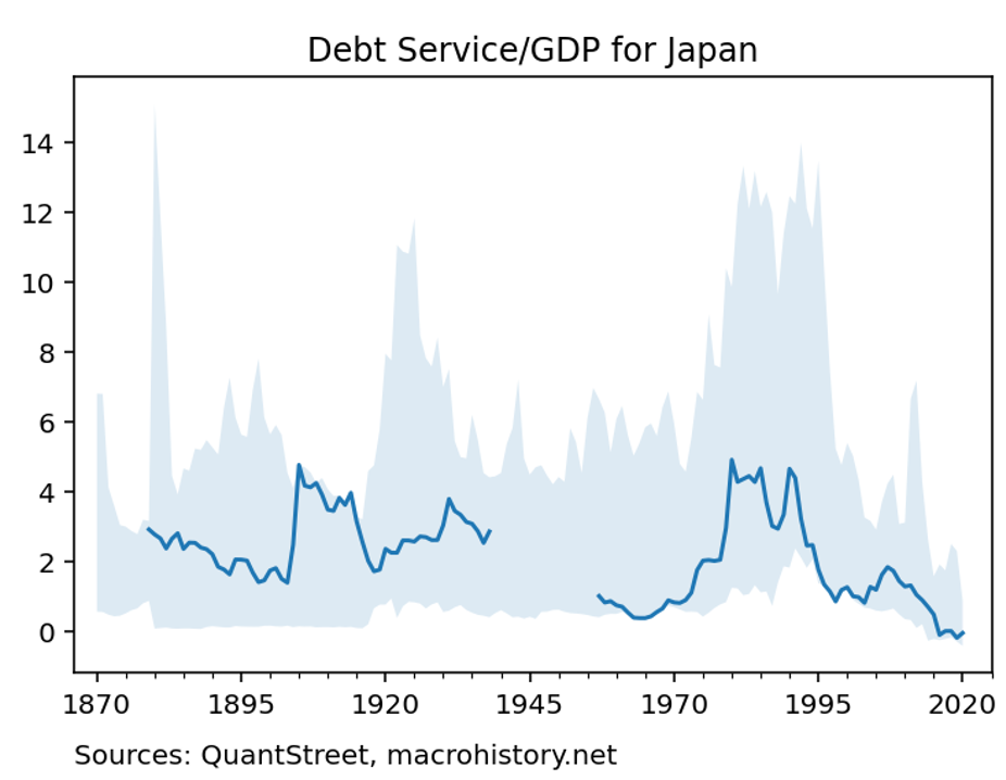
Though it has had a high debt load, Japan’s debt service-to-GDP ratio has tracked near the bottom of the range across the 18 countries in the Macrohistory data set. The shaded region in the above chart shows the minimum and maximum range of debt service ratios across all 18 countries in each year. Apparently, the state of having high debt-to-GDP ratios and low interest rates is persistent and self-sustaining. The low interest rates make servicing even high debt loads relatively inexpensive, which removes credit risk from government bonds, and allows their yields to stay low.
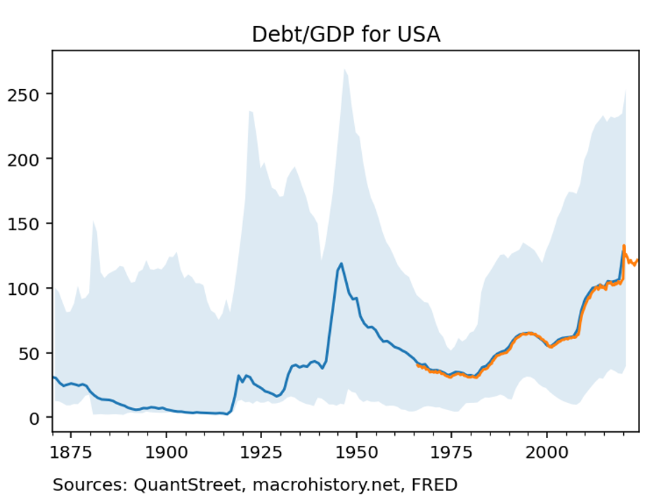
Turning attention to the U.S., the next chart shows that our debt-to-GDP ratio has, indeed, risen since its local trough in the 1970s. But despite the recent rise, U.S. debt-to-GDP sits squarely in the middle of the range of other countries’ leverage ratios, both today and historically. The orange line shows the debt-to-GDP ratio calculated using FRED data, which extends the Macrohistory series to the present day. Compared to prior peaks – for example the one which followed the allies’ heavy borrowing during World War II – the current U.S. debt-to-GDP ratio is not at historically extreme levels.
In fact, as of the end of the Macrohistory data in 2020, the U.S. debt service ratio hovered near all-time lows. However, the rise in rates over the last few years has pushed my measure of debt service to a higher, though not unprecedented, level. Because U.S. government bonds have not all been issued in the last few years, the actual interest expense on U.S. debt relative to GDP is lower than this figure indicates (the Peterson Foundation estimate is 2.4 percent).
What comes next?
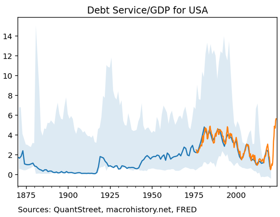
The above figure should be interpreted as offering a preview of what U.S. debt service would look like were the U.S. to refinance all of its current debt at the present level of interest rates. If this happens, the U.S. debt burden will become considerably more costly and nearly six percent of the U.S. GDP will be used to service our national debt.
Of course, it highly unlikely that this is the scenario will actually play out. Why?
First, with such high debt loads, an even small increase in interest rates will have a strong contractionary effect on the U.S. economy. Given the jobs numbers over the last few weeks, high interest rates are already starting to slow economic growth. As growth and inflation come down, interest rates will fall, and the above debt service ratio is likely to retrace a good deal of its recent run-up.
Second, should rates indeed remain at these new high levels for the foreseeable future, it is unlikely – at least one hopes it is unlikely – that the U.S. government will maintain its current spending habits and the current budget deficit will need to come down. At some point, if rates remain high, the White House and Congress will need to get their act together and reduce our national debt level until the debt service ratio falls to more moderate levels.
It is, of course, possible that the U.S. will not get its act together, and our ballooning budget deficit and high interest rates will lock the country into a negative feedback loop along the lines of what happened in the eurozone following the Global Financial Crisis. This would be a crisis solely brought about by our own poor choices.
I’m betting that either scenario one (falling rates) or two (fiscal prudence), or some combination of the two, plays out and the U.S. debt service ratio stabilizes as it has over the last 150 years. Given the dollar’s relative strength, the rest of the world largely buys into this thesis. Investors have to wait and hope that policymakers do the right thing.
Harry Mamaysky is a professor at Columbia Business School and a partner at QuantStreet Capital.
A message from Advisor Perspectives and VettaFi: To learn more about this and other topics, check out our most recent market outlooks.
Membership required
Membership is now required to use this feature. To learn more:
View Membership BenefitsSponsored Content
Upcoming Virtual Events View All