The Importance of Persuasive Architecture
Membership required
Membership is now required to use this feature. To learn more:
View Membership Benefits Advisor Perspectives welcomes guest contributions. The views presented here do not necessarily represent those of Advisor Perspectives.
Web expectations evolve as users search, learn, and shop online. To meet those expectations, your website needs to have more than just a high-quality design.
The way design and content elements are organized, prioritized, and labeled on your website plays a large role in increasing engagement with your visitors.
If you understand what your ideal clients are looking for online, you can guide them through a journey that addresses their key questions, concerns, and goals before they call you, fill out a form, or schedule a consultation.
"Persuasive architecture” is a method for structuring your website’s pages and content. You guide visitors down a path from the moment they land on your homepage until they take action.
This approach relates to both your site’s topline navigation and the order of the content on each page. There are a few key factors to consider to make a user-friendly website using persuasive architecture.
Site navigation
The first part of persuasive architecture relates to your website’s topline navigation or menu. People scan websites in a Z formation – starting in the top left corner, moving across to the right corner, then back across and down to the bottom left corner of their screen.
The layout of your topline navigation should persuade people to explore content in the order that you want.
1. Topline navigation page order
Since people read left to right, start with the most important, highly visited page in your topline navigation.
Ask yourself what you would want to know about a person or company before you choose to work with them. First and foremost, it is who they are and what experience they have, followed by their services, who they work with, and what the client process will look like. Then, start exploring resources or insights.
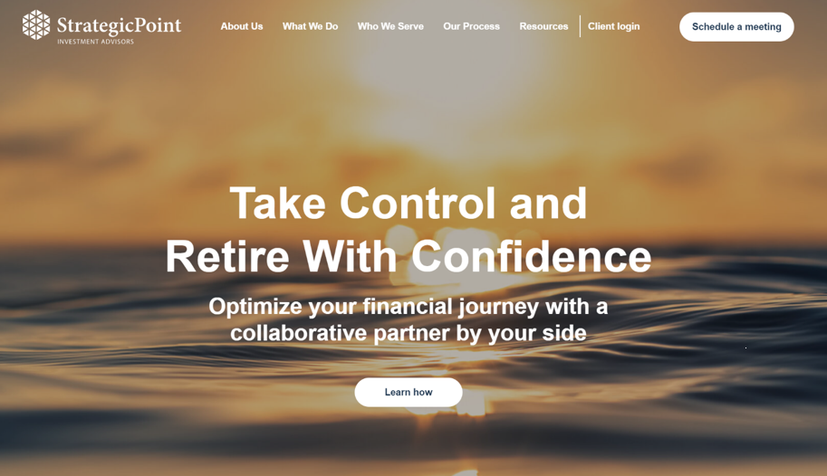
StrategicPoint Investment Advisors follows this order in its topline navigation, making it clear which pages it wants people to explore first.
2. Page titles
To provide a positive user experience, you want to ensure that visitors can easily access the information they’re searching for. Different audiences will have different goals, and it should not be difficult for them to accomplish what they came to your site to do.
Your topline navigation is not the place to get creative. All the words should be clear and simple, and people should know exactly what content they’re accessing based on the page title. For example, “Schedule a Meeting” is a much clearer title than “Let’s Start.”
3. Clear call to action
People form expectations as they browse websites, and they are used to having a button in the top-right corner. This is where you should guide people to your primary call to action.
StrategicPoint’s goal is to have visitors schedule a meeting with them, and this stands out in the site’s topline navigation. For those who aren’t ready to schedule a meeting, StrategicPoint uses persuasive architecture to guide people to “learn how” and explore the services page.
Effective content structure
The second element of persuasive architecture is the order and layout of content on each page of your website. You can imagine that your topline navigation represents chapters in a book and your homepage is the synopsis.
Therefore, the content on your homepage should follow the same order as your topline navigation and be used to introduce each “chapter” or section of content.
1. Home page information
The purpose of your home page is not to answer every question or address every detail of your business. Instead, guide people toward the information they’re interested in by providing entry points into the site’s key pages.
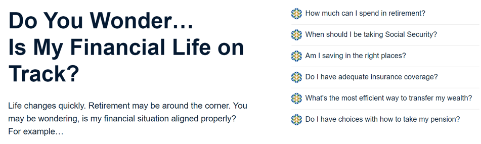
The first panel on StrategicPoint’s home pages lists some of its ideal clients’ key questions. This sets expectations from the start since people can discern whether their goals align with StrategicPoint’s expertise.
The homepage provides enough background that visitors get an overview of the firm without viewing any of the internal pages but doesn’t overwhelm people with paragraph upon paragraph of detail.
2. Panel order
Every web page should start with the most pressing information people are searching for. People’s attention spans are short, so the less they have to scroll or read to get their questions asked, the more effective your site is.

StrategicPoint introduces who they are and what experience they have before guiding someone to learn more and explore the “About Us” page.
The firm’s home page panels follow the same order as their topline navigation. This pattern makes it easy for people to find what they’re looking for while reinforcing the order in which they should explore the site’s content.
3. Guide people through the journey
To follow your persuasive architecture, each page should guide people either to the next step or to other relevant information.
Consider, for instance, what other questions someone will have after they read about your services. They might be ready to reach out and will look for ways to get in touch, or they might have more questions about your process or fees first.
Guide people to the content that’s on their mind to make the navigation experience as seamless as possible.
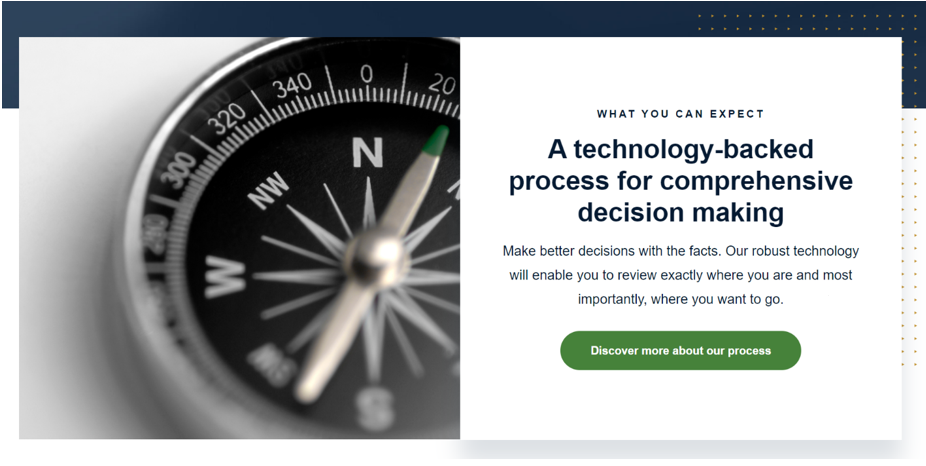
After reading more about what it offers, people will likely wonder what else they can expect if they work with StrategicPoint. The site overcomes this curiosity by guiding people to discover the firm’s process.
4. Call to action
The goal of persuasive architecture is to guide visitors down a path that provides them with enough information to feel comfortable reaching out to you.
You want a clear call to action that’s not too pushy. People need to know what you want them to do next, but they don’t want to feel forced to do it.
A call-to-action page is a great way to share your process, answer any last-minute questions, and call people to action. This page will be the “final destination” in the visitor’s web journey.
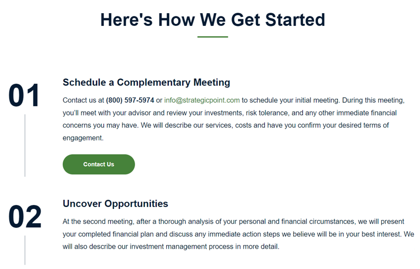
StrategicPoint lays out its four-step approach on a process page before guiding people to schedule a meeting. Sharing this short and simple process answers the unknown and informs people of exactly what they can expect should they choose to engage with the firm.
Conclusion
Persuasive architecture is an effective strategy to create a website that answers your ideal clients’ questions and concerns while guiding them down a path that leads to conversion.
By implementing persuasive architecture, you establish expectations and provide people with the information they’re searching for in an easily accessible and understandable layout.
This approach helps you determine which content to share in which order, allowing you to create a structured user journey.
Mikel Bruce is the CEO of TinyFrog Technologies, a San Diego web design agency specializing in WordPress web design & development and secured hosting & maintenance. Founded in 2003, TinyFrog offers a conversion-based approach to web design and has built over 1,100 websites. TinyFrog also has extensive experience in designing and building websites for financial advisors.
A message from Advisor Perspectives and VettaFi: To learn more about this and other topics, check out our most recent white papers.
Membership required
Membership is now required to use this feature. To learn more:
View Membership BenefitsSponsored Content
Upcoming Virtual Events View All