The Compelling Opportunity in Midcaps
Membership required
Membership is now required to use this feature. To learn more:
View Membership Benefits Advisor Perspectives welcomes guest contributions. The views presented here do not necessarily represent those of Advisor Perspectives.
Investors think about companies as being either large or small. In between those extremes are midcaps. Based on historical performance and fundamentals, midcaps should command more attention.
Academic research long ago identified the size effect: a tendency of firms with small market capitalizations to outperform those will higher market capitalizations over time. An early paper that made this point was Banz (1981), and the idea was popularized in the academic and practitioner factor literatures by the Fama-French 3-factor and 5-factor models.
The general empirical approach to testing the size effect is to sort portfolios of stocks into decile bins based on firms’ historical market capitalizations (the smallest 10% go into bin 1, the next 10% go into bin 2, and so on, until the largest 10% go into bin 10). Then the returns of the 10 size-sorted portfolios are tracked over time. The latter task is made far easier by the rich data repository Ken French makes freely available on his Dartmouth website.
Using his data on size-sorted decile portfolios, and starting the analysis in 1963 (the usual starting point for factor-strategy analysis because the fundamental stock-level data needed to construct these strategies began in 1962), I find that over the last 60 years, small-cap stocks did indeed outperform large caps – exactly in line with the size effect – as small caps (Low 10) earned 11.2% per year while the largest stocks (High 10) earned 10%. Interestingly, the best-performing group of stocks since the 1960s were midcaps (middle-capitalization stocks), as the 5th decile portfolio (Dec 5) was up 12.3% per year.
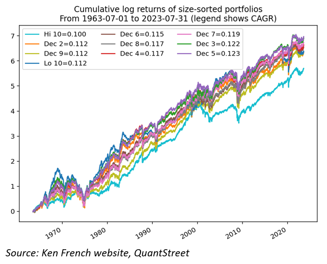
These small differences in annual returns translate to extremely large differences in total return outcomes. Over a 60-year horizon, compounded annualized growth rates (CAGRs) of 10%, 11.2%, and 12.3% mean an initial $1 investment would, after 60 years, grow to $304, $584, and $1,054 dollars, respectively.
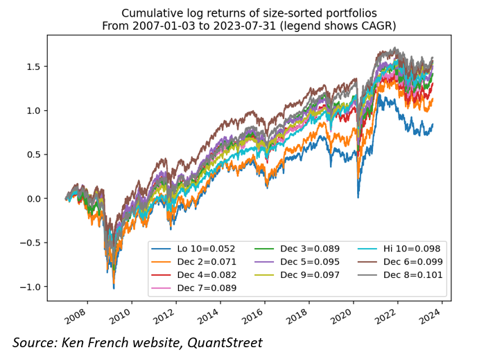
But zooming into the more recent past – in particular the time period after the 2008-2009 global financial crisis – the size effect reversed. The smallest decile of stocks was up 5.2% per year over the last 16.5 years, while the largest decile was up 9.8%, almost double the performance of the smallest capitalization stocks. Interestingly, the midcaps again were near the top of the performance list, with the 6th decile (Dec 6) registering a 9.9% annual compounded growth rate.
Looking across time periods
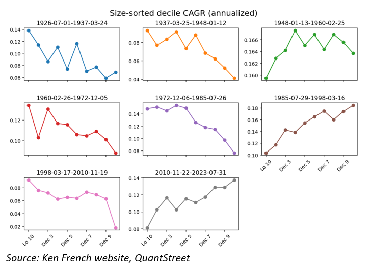
To better understand the time variation in size-related performance, I subdivided the data into eight equal-sized intervals, starting from July 1926 until today. Each subplot in the figure below shows the performance of the size-sorted decile buckets in each subperiod. For example, in the 1926-1937 subperiod, the small-stock effect worked as advertised; small-capitalization stocks returned close to 14% per year over the 10-year period, while large caps returned around 7%. But looking at the most recent subperiod, from 2010-2023, the effect reversed, with large-cap returns close to 14% and small caps returning just over 8%. While midcaps were not the winners in most subperiods, their returns tended to fluctuate less over time than those of the smallest and largest companies, which oscillate from the best to the worst performing subgroups and then back again. Midcaps just chug along at a steady pace.
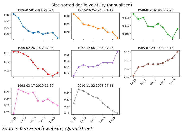
The next chart shows that part of the variation in average returns may be due to variation in realized volatility of the size-sorted stock decile portfolios. Each subplot shows the annualized volatility of each decile bin in the above subperiods. In the early subperiods, small stocks, in addition to outperforming large ones, tended to be considerably more volatile. But in other subperiods, like 1985-1998, the relationship flipped and large caps became more volatile. Interestingly, this subperiod was one where large caps outperformed small caps. Perhaps, then, the return differentials between the different size deciles arose from investors being compensated for owning more volatile stocks.
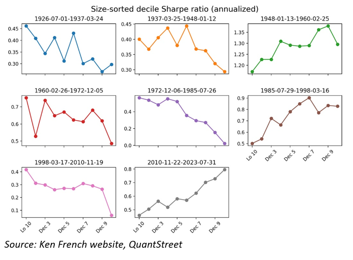
If average returns are, indeed, compensation for additional return volatility, then the average return to realized volatility ratios may not exhibit the same patterns seen in average returns and realized volatilities and may be less dependent on size decile. The next figure shows the Sharpe ratios for the size deciles across the different subperiods (Sharpe ratios are defined as the average excess return, i.e., return above the riskless interest rate, divided by historical volatility of excess returns). But the size patterns do not disappear. In some subperiods, small caps offered better return-risk tradeoffs, and in other subperiods large caps were superior. The Sharpe ratio patterns across time periods mirror the patterns seen in average returns. Midcaps were, again, more stable than either the small or large caps, as their Sharpe ratios exhibit considerably lower variation over time.
Getting midcap exposure
To summarize:
- Midcaps outperformed large- and small-cap stocks over different time periods, both in terms of average returns and Sharpe ratios.
- Midcaps also exhibited less return and Sharpe ratio variability relative to their small- or large-cap peers.
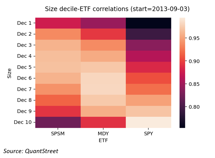
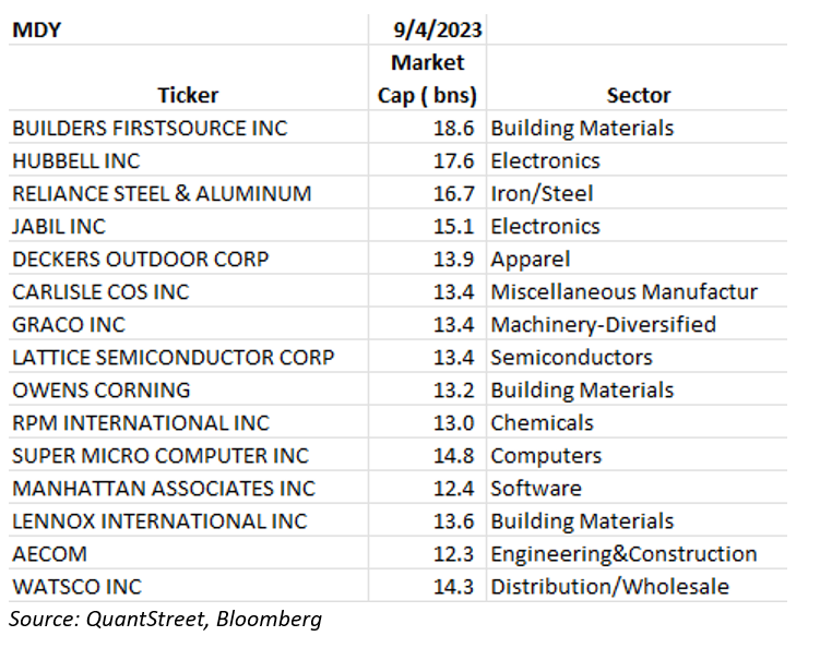
Of course, whether midcaps were or weren’t attractive at any particular point in time depends on other considerations, which I discuss momentarily. But first, I examine how investors can get exposure to the midcap sector. A useful instrument is the MDY exchange-traded fund (ETF), which tracks the S&P 400 Midcap Index. This is a liquid, relatively low-cost ETF that is highly correlated with the middle-size deciles.
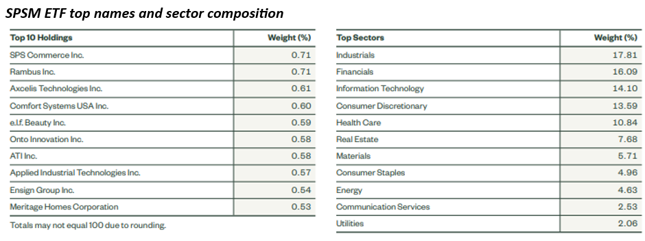
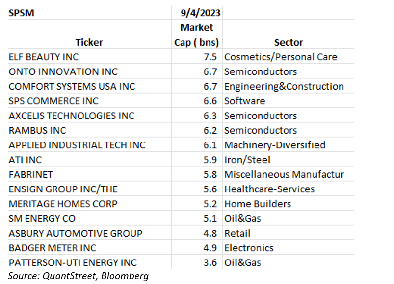
The figure below shows the correlations between three ETFs and the size-sorted decile portfolios. SPSM tracks the S&P 600 Small-cap Index. Over the last 10 years, daily returns on this ETF have been most strongly correlated with the returns of deciles 3, 4 and 5 size-sorted portfolios (first column). The MDY ETF is most highly correlated with size-sorted deciles 6 and 7 (middle column), while the SPY ETF, which tracks the S&P 500 index of the largest U.S. publicly traded firms, is most heavily correlated with the 10th size decile.
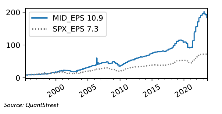
Using the MDY as a proxy for midcaps, I next analyze its fundamental performance over time. Looking at earnings-per-share growth, the midcap index underlying the MDY ETF has had a compound annual growth rate of earnings of 10.9% since the mid-1990s, versus 7.3% for the S&P 500 index. While there are reasons to think that earnings of high-tech firms are understated due to accounting rules (see my piece on this from earlier in 2023), such robust earnings growth in the midcap sector is certainly noteworthy.
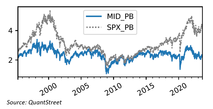
While midcaps and large caps (S&P 500) had similar price-to-book ratios in the years before and after the 2008-2009 global financial crisis, since 2015 there has been a pronounced divergence in valuations between large caps and midcaps. Part of this is justified by the AI revolution and the heavy exposure of the S&P 500 to technology firms – and I am not a believer in mechanical mean-reversion due to divergence of valuations ratios – but given the relative stability of historical midcap performance, and the attractive earnings growth exhibited by midcaps, this divergence in valuations is interesting.
A more robust take on the valuation question comes from QuantStreet’s valuation model applied to the midcap index. Our model starts with a large set of forecasting variables and then selects the subset of those variables that has been most effective at producing year-ahead return forecasts for the asset class in question. The next figure shows the output of QuantStreet’s valuation model for the midcap index as of September 2023. The blue bar means that the average midcap return in our model-training window was 12.57%. The intermediate green and red bars show adjustments to the average forecast due to the fact that some forecasting variables were either above or below their means in our model training window.
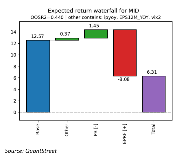
The main deviation comes from the EPRF ratio, which tracks the earning-to-price ratio of midcaps relative to the 10-year Treasury yield. With the recent rise in interest rates and the strong performance of stocks in 2023, the E/P minus 10-year yield measure is now quite low relative to its historical range. The positive historical relationship between this measure and year-ahead returns lowers our midcap forecast by 8.08%. Despite this, the model still predicts that midcap stocks will earn 6.31% over the coming year (although, as with all forecasts, there is a great deal of uncertainty around this estimate).
As a reference point, QuantStreet’s pure model-based year-ahead forecast for the S&P 500 stands at 0.16% as of September 2023. This is not the only relevant signal for allocation decisions – trends matters too, and the S&P 500 looks a lot better on that measure – but from a historical earnings growth and price-to-book ratio perspective, and according to QuantStreet’s valuation model, midcaps look relatively attractive.
A deeper dive
The three stock groups – large, mid, and small caps – differ meaningfully in their industry composition. Large caps are dominated by the well-known technology firms, with tech representing close to 30% of the index as of early-September 2023. There are several trillion-dollar firms, and a relatively steep fall-off in market cap from these to the rest of the (large) firms in the S&P 500 index.
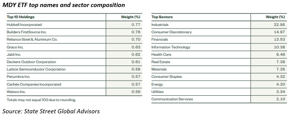
Turning to midcaps, the largest two sectors are industrials and consumer discretionary, at 23% and 15% of the index respectively. Though the largest companies in the midcap ETF (MDY) are not household names, they are nevertheless large firms with market caps close to $20 billion. The drop-off in market capitalization from the largest to the smaller midcap firms is not nearly as dramatic as in the S&P 500.
Finally, turning to small caps, the industry distribution is similar to midcaps, though there is more exposure to financials and less to industrials. The drop-off from the largest small caps to the next largest is also quite gradual.
There is some overlap in the sizes of the companies in each index, with the smallest S&P 500 firms often smaller than the largest midcaps, and the smallest midcaps often smaller than the largest small caps.
Another difference between the company groups is that the smaller companies tend to have lower credit ratings and higher credit risk. S&P 500 firms tend to be solidly investment grade, with many A-level or higher rated companies. Midcap firms tend to be in the low investment grade (BBB) to better high yield (BB) range. And small caps tend to be squarely in high yield, with only a few investment-grade firms. The weaker a firm’s credit quality, the more sensitive that firm typically is to changing economic and funding conditions. We can expect, therefore, that midcaps, and especially small caps, will be more economically sensitive than S&P 500 firms.
Mechanisms
One reason that midcaps performance has been more stable historically is that highly overvalued companies tend to be large caps because of their high valuations. Distressed companies fall into the small-cap bucket because their market valuations are low. Of course, “overvalued” companies do poorly in the future, and (perhaps surprisingly) so do distressed firms. By avoiding these two extremes – overvaluation and distress – midcaps enjoy more stable performance than their larger and smaller cap peers.
In addition, because they are the subject of less analyst scrutiny relative to large caps, there may be systematically less information available about midcaps. That may mean that investors demand additional uncertainty compensation for owning midcaps, resulting in higher average returns relative to large caps. The same argument can be made for small caps, but perhaps small caps are more subject to meme-stock crazes (one notable example), which offsets part of this effect.
There is also recent evidence that midcaps did particularly poorly during times of shifting economic narratives – which are associated with low future stock returns – which might mean that investors demand an extra risk premium for holding midcaps due to this exposure.
Takeaways
While the underlying reasons for the strong historical stock performance of midcaps are not completely understood, the sector is attractive based on its earnings growth history, relatively stable performance over time, and attractive valuations. Of course, investors need to make up their own minds whether the reward-risk and liquidity characteristics of midcaps are a fit for their portfolios. As always, investors who are unsure whether midcaps are a fit should consult with a financial advisor.
Harry Mamaysky is a professor at Columbia Business School and a partner at QuantStreet Capital.
A message from Advisor Perspectives and VettaFi: To learn more about this and other topics, check out our most recent white papers.
Membership required
Membership is now required to use this feature. To learn more:
View Membership BenefitsSponsored Content
Upcoming Virtual Events View All