Deep Analytic Market Insights for 2021
Membership required
Membership is now required to use this feature. To learn more:
View Membership BenefitsAdvisor Perspectives welcomes guest contributions. The views presented here do not necessarily represent those of Advisor Perspectives.
The U.S. stock market had a good year in 2021. What insights can we glean beyond the impressive 28% return? How did it compare it to global equities? I will show you some of the winners and losers, and finish with a few observations on the VIX.
U.S. stock market
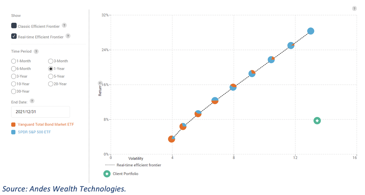
Figure 1 shows how the market deviated from its normal state in 2021 using the efficient frontier visualization. The dimmed line at the bottom is the “normal” efficient frontier formed by a set of models based on their capital market assumptions or long-term averages, while the top line is the actual efficient frontier with the risk and return of each model in 2021.
Figure 1. The actual efficient frontier for 2021 (top line) as compared to the normal efficient frontier based on the capital market assumptions (bottom line).
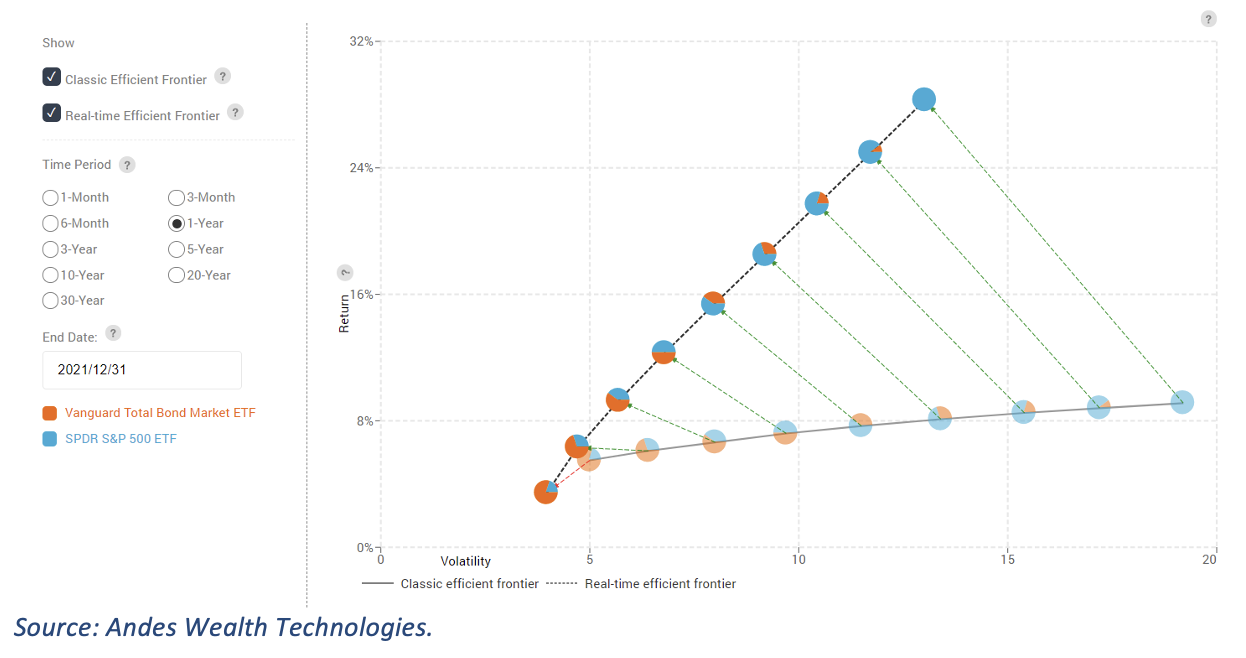
Across the board, the return was much higher than normal and volatility much lower. Advisors can show this to their clients to set the expectation that the same return is not likely next year.
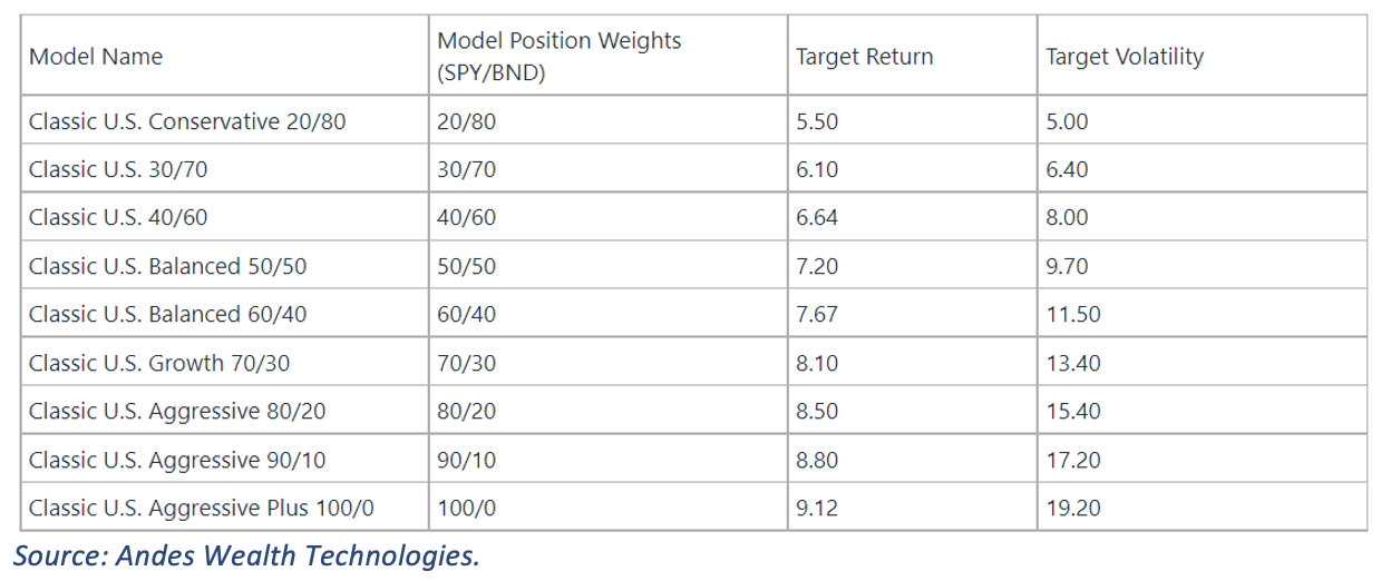
Below is the list of the model portfolios and their capital market assumptions. The long-term volatility for SPY is around 19.
Figure 2. List of model portfolios and their capital market assumptions
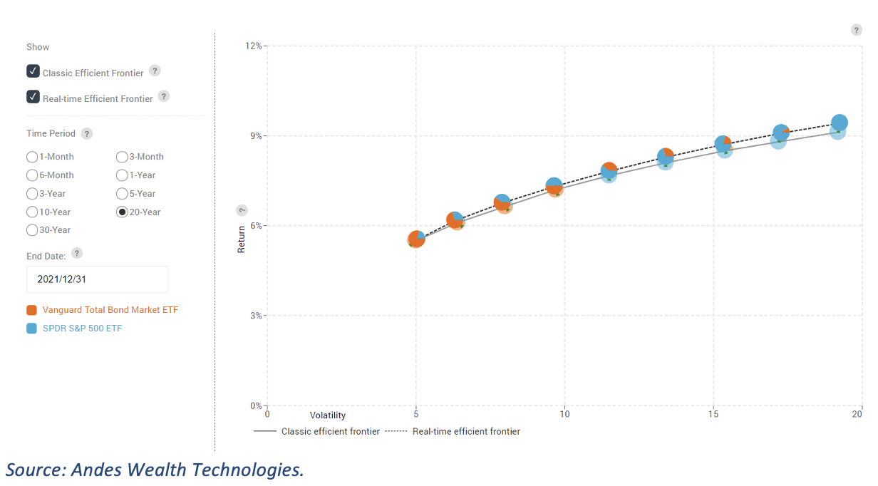
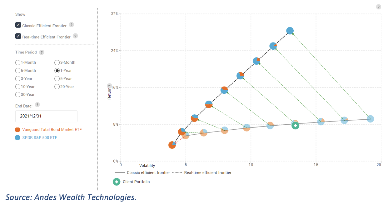
If you look at the past 20 years (see figure 3), the two lines are very close, indicating that the long-term, historical capital market assumptions are adequate.
Figure 3. Actual efficient frontier for 20-year ending 2021/12/31 as compared to the normal efficient frontier based on the capital market assumptions.
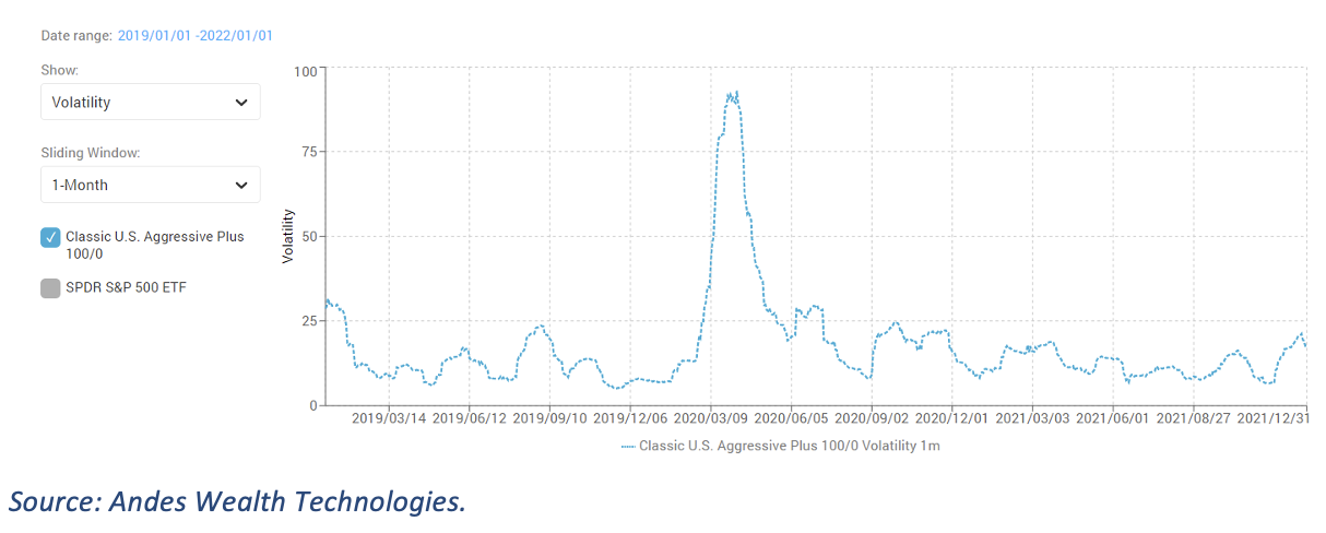
To zoom into 2021, figure 4 is a time-series chart showing the one-month rolling return for the 100/0 model (100% SPY) for the past three years. You can see the huge dip in early 2020, the subsequent strong recovery, and nothing unusual for the entire year.
Figure 4. One-month rolling return for the 100/0 model (100% SPY) for 3-year ending 2021/12/31.
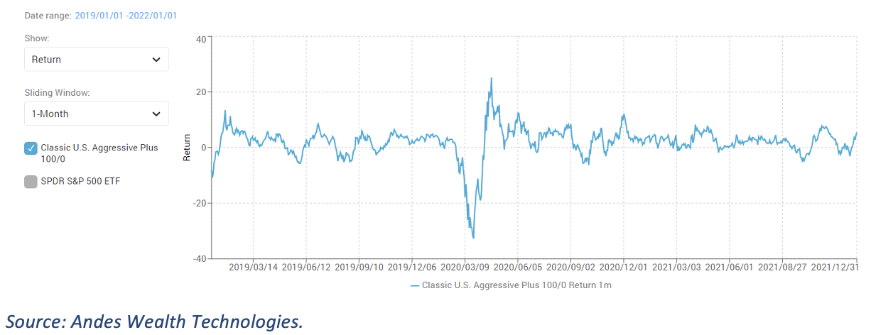
Figure 5 shows the matching volatility, revealing the peak in March of 2020, and that the volatility was below historical average for almost the entire 2021.
Figure 5. One-month rolling volatility for the 100/0 model (100% SPY) for 3-year ending 2021/12/31.
Volatility is only one risk measurement metric, and low volatility doesn’t necessarily mean that everything is fine. For example, if someone has a persistent fever, the volatility of their temperature can be low. However, volatility is a cornerstone of the mean-variance analysis, and one of the most used risk measurements.
The global equity market
Looking beyond the U.S. market, the picture was not as rosy across the globe. Imagine you have a portfolio consisting of 100% ACWX (MSCI ACWI ex US ETF). Figure 6 shows where ACWX stands relative to the efficient frontier formed by models with U.S. equity and bonds.
Figure 6. Risk and return of a 100% ACWX portfolio (the green circle) for 2021 in relative to models with SPY and BND.
Comparing ACWX (the green circle) to SPY (the blue pie chart at top right), you can see a much weaker return but comparable volatility. But it is not as bad as you might think. Figure 7 shows that the risk and return of ACWX in 2021 was comparable to the long-term average of a 70/30 model consisting of 70% SPY and 30% BND.
Figure 7. Risk and return of a 100% ACWX portfolio (the green circle) for 2021 in relative to models with SPY and BND.
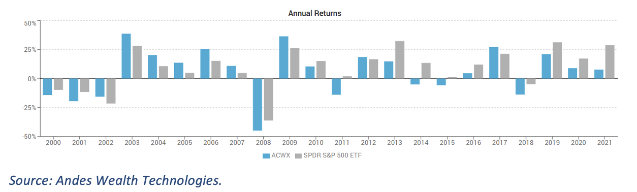
For a longer historical perspective, figure 8 shows the annual return of ACWX versus SPY in the past 20 years. Global equities haven’t been doing well in recent years. The U.S. economy may have many issues, but as people often say, the U.S. is still the “cleanest shirt in the dirty laundry.”
Figure 8. Annual returns of ACWX versus SPY from 2000 to 2021.
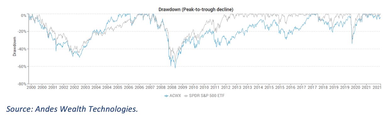
The drawdown1 chart (figure 9) confirms this story, showing that ACWX and SPY suffered similarly in the 2008 financial crisis, but ACWX took much longer to recover.
Figure 9. Drawdown of ACWX versus SPY from 2000 to 2021.
A few more winner and losers
Figure 10 shows the risk and return in 2021 for a basket of securities used in a random group of models.
Figure 10. Risk and return for a basket of securities in 2021
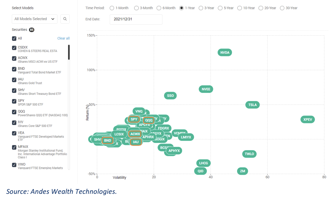
The fixed income funds clustered around BND, while the equity funds clustered around SPY/QQQ/ACWX. If you draw a line between the two clusters, anything along that line is doing a reasonable job. You can also see that IAU (gold) underperformed equities in 2021, NVDA (Nvidia) was a rock star, and QID (an ultra-short Nasdaq ETF) and ZM (Zoom) suffered.
This chart can help financial advisors and portfolio managers get a quick idea which securities and funds in their models were doing a good job, and which ones were not, for any time period of interest.
A closer look at the VIX
The volatility of a security or model for any given period is not readily available. In fact, my firm, Andes Wealth Technologies, is perhaps the only company to calculate such analytics and make it available.
Quite often, people use the VIX as a proxy for market volatility. But the VIX is a prediction of the volatility for S&P 500 for the coming month implied by option pricing, not the actual volatility. Is it a good enough prediction?
Figure 11 compares VIX with the actual one-month rolling volatility of SPY. The blue line is the actual one-month volatility of SPY, while the orange line is VIX2. You can see that the VIX is usually higher than the actual volatility.
Figure 11. Comparing VIX with actual 1-month volatility of SPY from 2019 to 2021
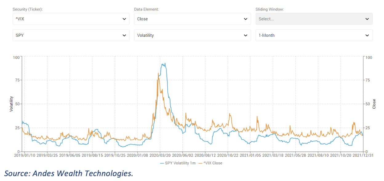
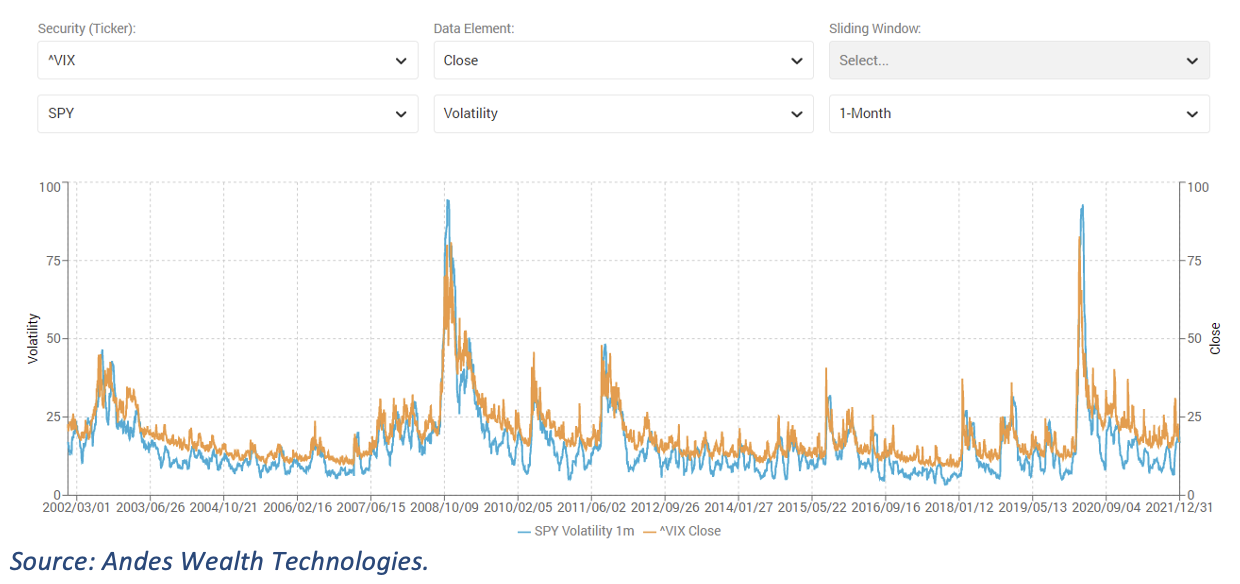
Figure 12 gives a longer historical perspective, showing the same pattern for the past 20 years. Perhaps anticipation is indeed worse than reality?
Figure 12. Comparing VIX with actual 1-month volatility of SPY from 2002 to 2021
Looking ahead to 2022
The continued rising of the market amid the pandemic makes many people nervous. Some believe that a correction is on its way while others believe that asset prices are a form of inflation, in which case the price level can be here to stay.
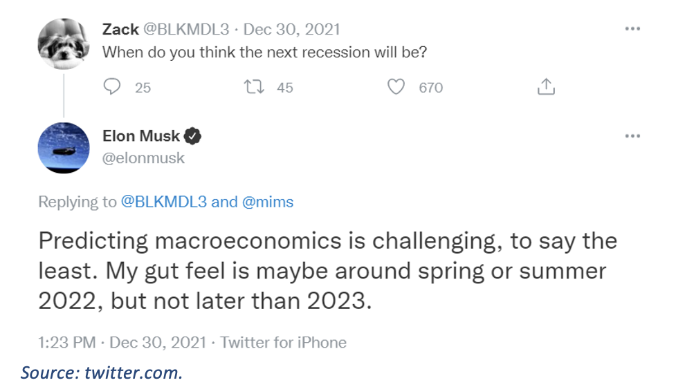
Predicting a recession is difficult, but it doesn’t stop a few brave souls from trying (see figure 13).
Figure 13. Elon Musk predicting a recession
We are not prescient, but some analytics help us see the past and present much clearer. The analytics in this article is an attempt. By calculating this set of analytics daily and going back into the past, we can better monitor market dynamics as it happens and gain a clearer historical perspective. I call it “deep analytics.”
Helen Yang, CFA, is the founder and CEO of Andes Wealth Technologies, a Lexington, MA-based provider of technology solutions for financial advisors.
1Drawdown is defined as the peak to bottom decline. Drawdown has another meaning, which is the withdrawal from a retirement fund, which is not relevant here.
2Since the VIX is forward looking, the line for VIX (the orange line) needs to shift to the right for 1-month so the time period lines up with the actual volatility (the blue line).
Membership required
Membership is now required to use this feature. To learn more:
View Membership BenefitsSponsored Content
Upcoming Virtual Events View All