Advisor Perspectives welcomes guest contributions. The views presented here do not necessarily represent those of Advisor Perspectives.
According to its price-to-earnings ratio (30x), the S&P 500 is valued more than 80% higher than its long-term average (16x).
But the historical averages are irrelevant.
Imagine getting a copy of Sports Illustrated and reading this:
NBA Scoring Is a Massive Bubble, On the Verge Of 1940s-Type Recession
For the last several years, NBA scoring has exceeded its long-term average at an unsustainable pace. Seasons 2018-2020 saw teams scoring over 223 combined points per game. Since 1946, the long-term average score of an NBA game has been 205 points. We’re due for a drop.
I’m predicting a major scoring crash: a total 56 points per game (ppg) reduction to 167 ppg (which happens to be the average from the 1940s) as a form of mean reversion. This would bring us back to the long-term average in about 20 years.
If you’re a sports fan, you realize how ridiculous this is. The game of basketball has changed dramatically over the past 70 years, with dozens of pro-scoring rule revisions along the way. The invention of the shot clock, the three-point line, and freedom-of-movement rules are just a few. Ignoring those rule changes to estimate scoring averages would be insane.
Why do we let stock market “strategists” get away with predicting S&P 500 market meltdowns based on 95-year valuation averages? Not only do market environments change dramatically over time, but so does the composition of the index itself.
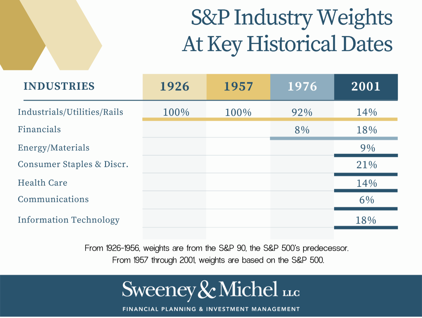
The current compilation of the 505 companies in the S&P 500 is representative of the US economy in over 11 sectors. We forget that it wasn’t always this way. Over time, the index composition has transformed and skewed away from low-value and towards high-value businesses. Let’s review the timeline of the S&P 500:
1926: The Standard & Poor’s Corp develops a composite index representing just 90 stocks: 50 industrials, 20 rails, 20 utilities. Most financial sites still use 1926 as the “starting point” for S&P 500 historical valuations and returns, despite lacking seven sectors and 410 stocks.
1957: The S&P 500 is born. This version consisted of only three sectors made up of 425 industrials, 25 railroads, and 50 utilities.
1976: The S&P committee adds the financial sector and 40 stocks to go in it.
2001: Global Industry Classification Standards divide S&P into 10 sectors, including tech What do you do when the world is waking up to indexes, each month tech is bigger than before, and tech isn’t a sector?” said David Blitzer, S&P Chairman at the time.
During the first 50 years (1926-1976), the S&P 500 was comprised only of industrials, railroads, and utilities. These businesses/sectors often have tremendous infrastructure and inventory costs, low margins, and (appropriately) low valuations (P/E ratios). Then, financials got involved in the late 1970s, also with (usually) low valuations. A few computer companies like Apple and Microsoft snuck in during the 1980s, but we didn’t get full tech sector representation until the early 2000s. The index basically left the shore as a canoe in the 1920s and was rebuilt into a speedboat over the past 20 years.
How can you compare today’s S&P 500 index (dominated by high-margin, global tech, communication and healthcare brands) to an index which was almost exclusively industrial stocks for the five decades spanning jazz to disco?
I’ll leave that to the academics. But today’s stock market isn’t the same as your grandpa’s, and comparisons to the long-term averages should be retired alongside his mid-thigh basketball shorts.
Joe Sweeney is a founding partner at Sweeney & Michel, LLC, a California-based registered investment advisor, and has been with the team since 2010.
Read more articles by Joe Sweeney
 Advisor Perspectives welcomes guest contributions. The views presented here do not necessarily represent those of Advisor Perspectives.