Advisors providing retirement recommendations need to evaluate strategies and present options to clients. Communication is key and it can be a challenge to come up with the best way to compare alternatives. One way involves presenting metrics such as expected bequests and plan failure probabilities. However, it may be more helpful to use a graphical approach to show the year-by-year progression of funds available during retirement. I’ll demonstrate a graphical approach by comparing a variety of strategies.
This example will be based on a 65-year-old retired couple. They have accumulated $1.7 million of retirement savings allocated 50/50 stock/bond, and they also own an un-mortgaged house worth $500,000. They will receive a combined $42,500 in Social Security if they both claim at 65, and their essential expenses are $85,000 increasing with inflation each year. I’ll initially show results based on systematic withdrawals from investments and then successively bring in the following strategy enhancements:
• Delaying Social Security;
• Purchasing of a single-premium immediate annuity (SPIA);
• Using a reverse mortgage;
• Allocating more to stocks; and
• Taking more aggressive withdrawals.
I’ll use a Monte Carlo approach to generate annual investment returns assuming arithmetic-average real returns for stocks of 5% with a 20% standard deviation, and 0.75% for bonds with a 7% standard deviation. I’ll simulate 5,000 retirements for each strategy and make mortality variable for the husband and wife. The life expectancies are age 90 for the wife and age 88 for the husband and the simulated ages at death will vary around these ages. The analysis is pre-tax and all results are shown in real 2018 dollars.
My interest in a visual approach to retirement planning goes back to a meeting a few years ago with British economist David Blake who was doing work on displaying retirement outcomes. Although he was personally comfortable evaluating retirement alternatives by applying economic-utility concepts, he recognized that these were foreign concepts to the general public and most advisors, so something more user-friendly was needed. I have been doing some recent work on the best metrics to use, and decided to see what could be done by including pictures instead of numbers.
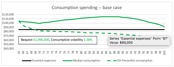
Base case
The chart below is a base case assuming withdrawals from savings in accordance with required minimum distribution (RMD) rules, which require taking withdrawals from tax-deferred savings beginning at age 70 1/2. The IRS RMD rules attempt to conservatively spread retirement withdrawals over remaining lifetimes, so they increase with age, for example 3.65% at age 70, 5.35% at age 80, and 8.77% at age 90. I use the age-70 3.65% requirement for ages 65 – 69. Consumption spending consists of the $42,500 of Social Security plus withdrawals from savings.
I show median consumption from the 5,000 simulations as an expected outcome and display a dashed line for 5th percentile consumption, which is my primary risk measure. I examined the metrics I have used previously and two that don’t get captured in the consumption lines are median bequest and consumption volatility – how much consumption bounces around from year-to-year as a result of underlying investment volatility. So I show these metrics in a text box, and I also include a straight line for the $85,000 real essential-expense level. The goal is to combine pictures and numbers in a way that is both complete and understandable.
Given the investment assumptions and use of RMD factors, we see real consumption increases after age-70 when increasing RMD rules kick in, and we see consumption decreasing later in life as savings are depleted. This is not necessarily an ideal pattern and merits an investigation into other withdrawal strategies, which I touch on later. The 5th percentile consumption can fail to cover essential expenses even before age 70 and gets progressively worse, indicating a need to look at strategies to reduce downside risk.

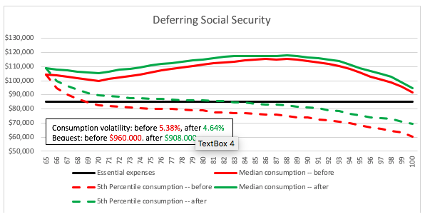
Deferring Social Security
The first strategy alternative we look at involves the husband deferring Social Security to age 70, and the wife to age 66. This will increase Social Security income to $53,800, but will require setting aside $187,000 of savings to provide bridge income until Social Security begins full payments in five years. This leaves $1,513,000 to be withdrawn based on RMD factors. I assume the bridge fund is invested in bonds.
The chart below shows results as “before” (red) and “after” in green in order to compare the new strategy with the prior strategy, in this case the base case. We can see that this Social Security strategy improves both the expected outcome and the 5th percentile downside measure.Consumption volatility also improves slightly with more steady real income from Social Security. The expected bequest (which includes both remaining savings and an assumed 90% recovery of the $500,000 home value) drops slightly due to dedicating a portion of savings to the Social Security bridge fund to be invested in bonds.
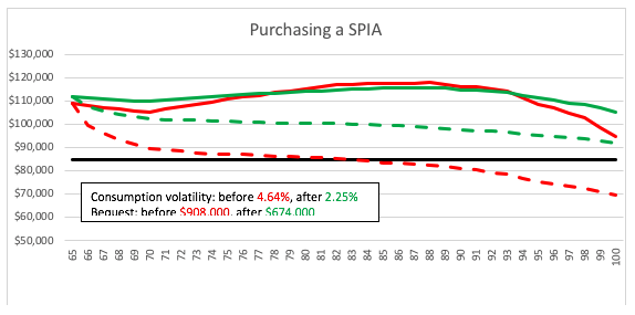
Purchasing a SPIA
Now we begin incorporating additional strategies, so the green “after” of the previous graph becomes the red “before” of the following one. In the chart below we show the impact of purchasing an inflation-adjusted SPIA to fill in the $31,200 gap between $85,000 of essential expenses and deferred Social Security of $53,800. The current payout rate for a joint-life SPIA for this couple is 4.00%, so they would need to spend $780,000 of their remaining $1,513,000 of savings to purchase the SPIA, leaving $733,000 of savings invested in stocks and bonds. (Given state guaranty fund limits, typically $250,000, it would make sense to spread a SPIA purchase of this size among multiple carriers. Limited availability of the inflation-adjusted type of SPIAsmay also affect product selection.)
With the SPIA purchase we do not see much change in median consumption, except for long lives, but there is a big improvement in downside risk. The 5th percentile consumption becomes more than sufficient to cover essential expenses regardless of the length of life. Consumption volatility is reduced by more than half because of the steadying influence of the inflation-adjusted SPIA that adds significantly to the level real-income from Social Security. The bequest drops from $908,000 to $674,000, because the SPIA does not leave a bequest value. The bequest includes $450,000 that is recovered home value, so the savings portion of the expected bequest drops a lot.
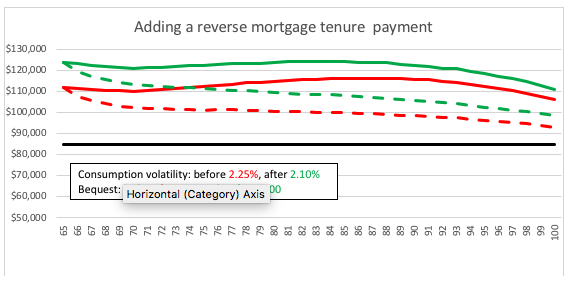
Utilizing a reverse mortgage
Next we utilize home equity in the form of a reverse-mortgage tenure- payment to provide additional funds for consumption. Based on the National Reverse Mortgage Lenders Association (NRMLA) calculator, and current interest rates as of mid-April 2018, the principal limit for a reverse mortgage net of fees for this example would be $199,648, and that would provide monthly payments of $1,044.08 ($12,529 per year) for as long as at least one of the homeowners remained in the home.
As we see in the graph, the impact shifts the lines upward, and because the tenure payments are nominal, the impact in real dollars shown on the graph declines over time. Consumption volatility drops slightly, but the big impact is on the bequest, which drops substantially below the remaining home value. This strategy makes sense for a couple who wants to maximize spending and not leave a bequest, but would not leave a home-equity cushion for potential long-term care (LTC) if the couple did not have LTC insurance.
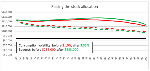
Raising the stock allocation
If we examine the sources of consumption after utilizing all these strategy options, we discover that only about 20% is coming from remaining savings, and 80% is coming from the combination of Social Security, SPIA income and reverse-mortgage tenure payments. Given that savings are allocated 50/50 stock/bond, only 10% of consumption is from the stock allocation.So it is worth testing a higher stock allocation.
The graph below shows the impact of raising the stock allocation to 75%. We see that expected consumption and the bequest improve a bit but the 5th percentile consumption and consumption volatility get a bit worse. So this is a tradeoff and not a big one given that such a small portion of consumption comes from savings.
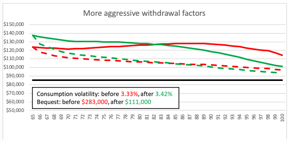
More aggressive withdrawals
RMDs belong in the general category of variable-withdrawal strategies, where the dollar amount of withdrawals is a function of the current level of savings and therefore will vary with investment performance. The RMD rules are conservative, which is why we see real consumption increasing until late in life, however, retirees may wish to consume more during the early retirement years when they are more active. A straightforward way to test out such a strategy involves multiplying the RMD percentages by a factor.
In the graph below, all the RMD factors are multiplied by 1.5. The path of consumption shifts with higher consumption in the early retirement years and a gradual decline over the full span of retirement. The small bequest is cut by more than half, so more aggressive withdrawals may fit with a strategy of minimizing bequests and maximizing spending.
Conclusion
The main purpose of this article has not been to advocate a particular retirement strategy, but to illustrate a technique for comparing strategies using a combination of consumption line graphs and supplementary metrics. My own view is that this type of approach provides more meaningful information than presenting metrics only. It is the type of approach that software developers (possessing better graphics skills than my own) should consider. It will be particularly useful for interactive sessions where advisors and clients test out strategy alternatives.
Joe Tomlinson, an actuary and financial planner, is managing director of Tomlinson Financial Planning, LLC in Greenville, Maine. Most of his current work involves research and writing on financial planning and investment topics.
Read more articles by Joe Tomlinson