Advisor Perspectives welcomes guest contributions. The views presented here do not necessarily represent those of Advisor Perspectives.
This is the first of a four-part empirical research study into the fallacy of the “random walk” view on investment reward and risk. The first two parts focus on the inefficacy of such a view on asset price behaviors. Part 3 deals with random walk's deficiency in characterizing risk. The final paper presents a new framework for defining and managing investment reward and risk.
Modern finance blossomed after the 1960s and brought us Nobel Prize-winning ideas such as Modern Portfolio Theory, Capital Asset Pricing Model, Arbitrage Pricing Theory, the Black-Scholes option formula, Efficient Market Hypothesis and others. They all have one common theme – asset prices move in a random walk, a term popularized by Burton Malkiel's classic book entitled "A Random Walk Down Wall Street."
What is a random walk? How does one prove that prices follow a random walk? Are short-term random walks different from long-term ones? Do prices have memories? Do returns scale with time and volatilities scale with the square root of time? Can prices still be random if they do not follow a random walk? Why are prices so difficult to model? Are some passive index fund advocates like Jack Bogle, Burton Malkiel and Eugene Fama insincere when they favor certain regions, assets or factors over others if they truly believe in random walk and efficient markets?
I address some of these questions using the daily closes of the Dow Jones Industrial Average (DJIA) from 1900 to 2016. In Part 2, I extend the quest to six asset classes – large-caps (the S&P 500), small-caps (the Russell 2000), emerging markets, gold, the dollar and the 10-year Treasury bond. I will challenge many modern finance doctrines that are based on the random walk paradigm.
What is a random walk?
In 1900, Louis Bachelier planted the mathematical seeds of random walk. Some 50 years later, Harry Markowitz and others cultivated his seeds into a blooming field called modern finance. Bachelier theorized that prices fluctuated in a Brownian motion – a term used by Albert Einstein in the title of his 1905 paper. Einstein reasoned that molecules diffuse in a manner resembling the way pollens jiggle in water – an observation first made by botanist Robert Brown in 1827.
The terms random walk, Brownian motion (arithmetic and geometric), and Gaussian distribution (normal and log-normal) have subtle mathematical differences. In modern finance, however, these terms are used interchangeably by Markowitz, Osborne and Fama. In this and the three follow-up articles, the term random walk refers to Gaussian statistics (bell-shaped distributions).
Modern finance is built on the notion that rational investors speculate in an efficient market like pollens and molecules wander mindlessly in a fluid. Hence, distributions of all asset price returns should follow the bell-shaped probability density functions (PDFs). To find out how well the random walk model reflects reality, I compare the theoretical PDFs to actual return histograms over various time horizons from one day to 10 years using the daily closing prices of the DJIA from 1900 to 2016. In all time horizons, two types of histogram are used – linear and logarithmic. A tutorial on the basics of probability density function and the construction of both linear and logarithmic histograms are presented in the Appendix.
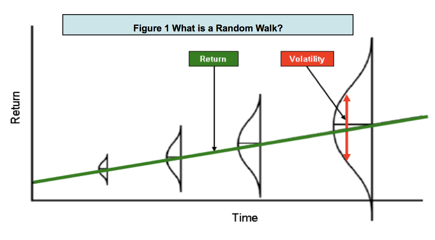
Figure 1 illustrates graphically several key random walk assertions. Asset returns follow a bell curve. The peak of the bell curve (the mean) grows with time and the width (volatility) spreads out with the square root of time. Volatility and risk are synonymous. To earn higher returns, one has to take more risk. Do these claims have empirical support? Let's fact check each in more detail.

Do short-horizon returns follow a random walk?
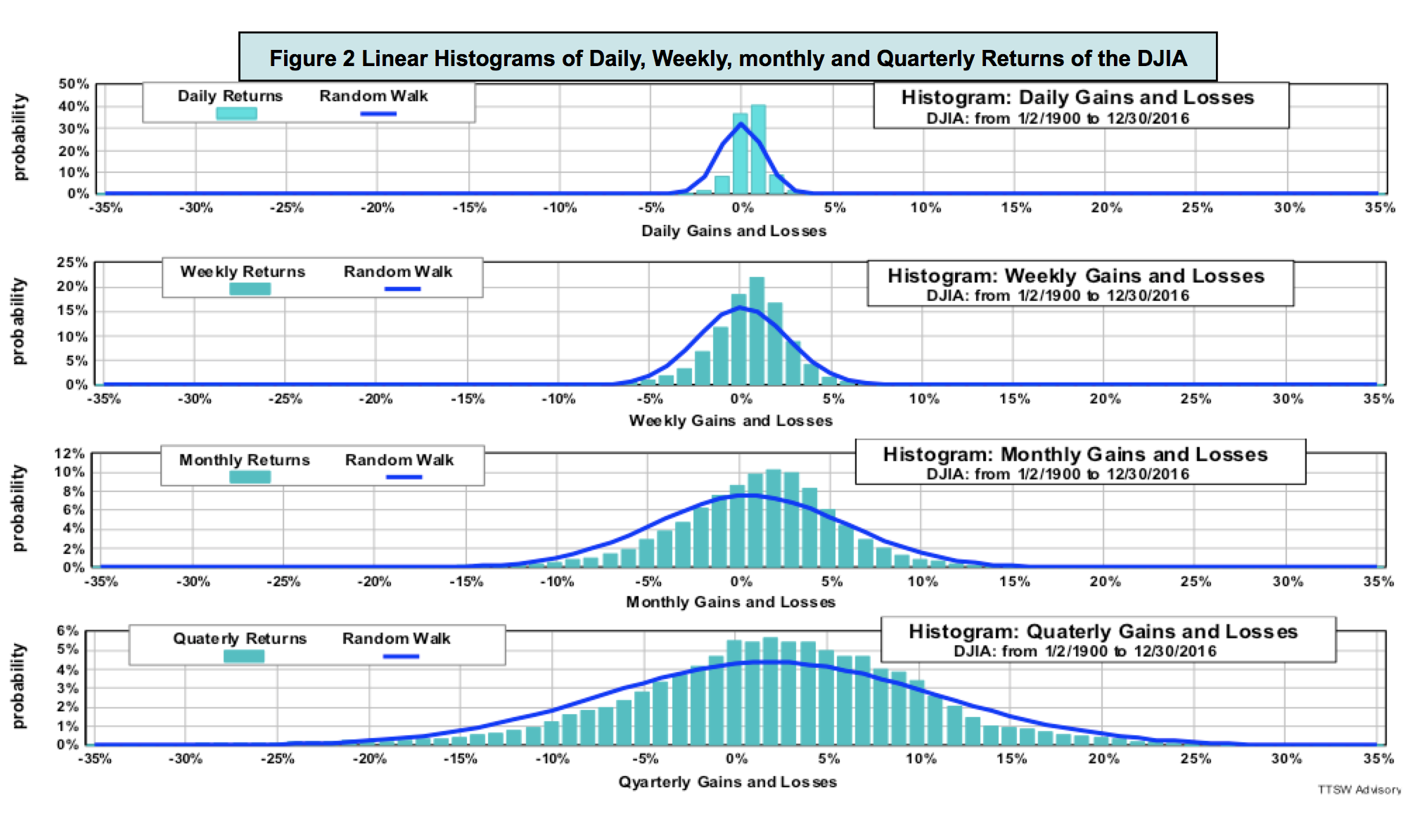
Figure 2 shows linear histograms of short-horizon returns from daily, weekly, monthly to quarterly prices (top to bottom). The light blue bars are data and the dark blue curves are the random-walk PDFs. Even though both the data distributions and the random walk PDFs appear to have similar shapes, they do not match exactly.
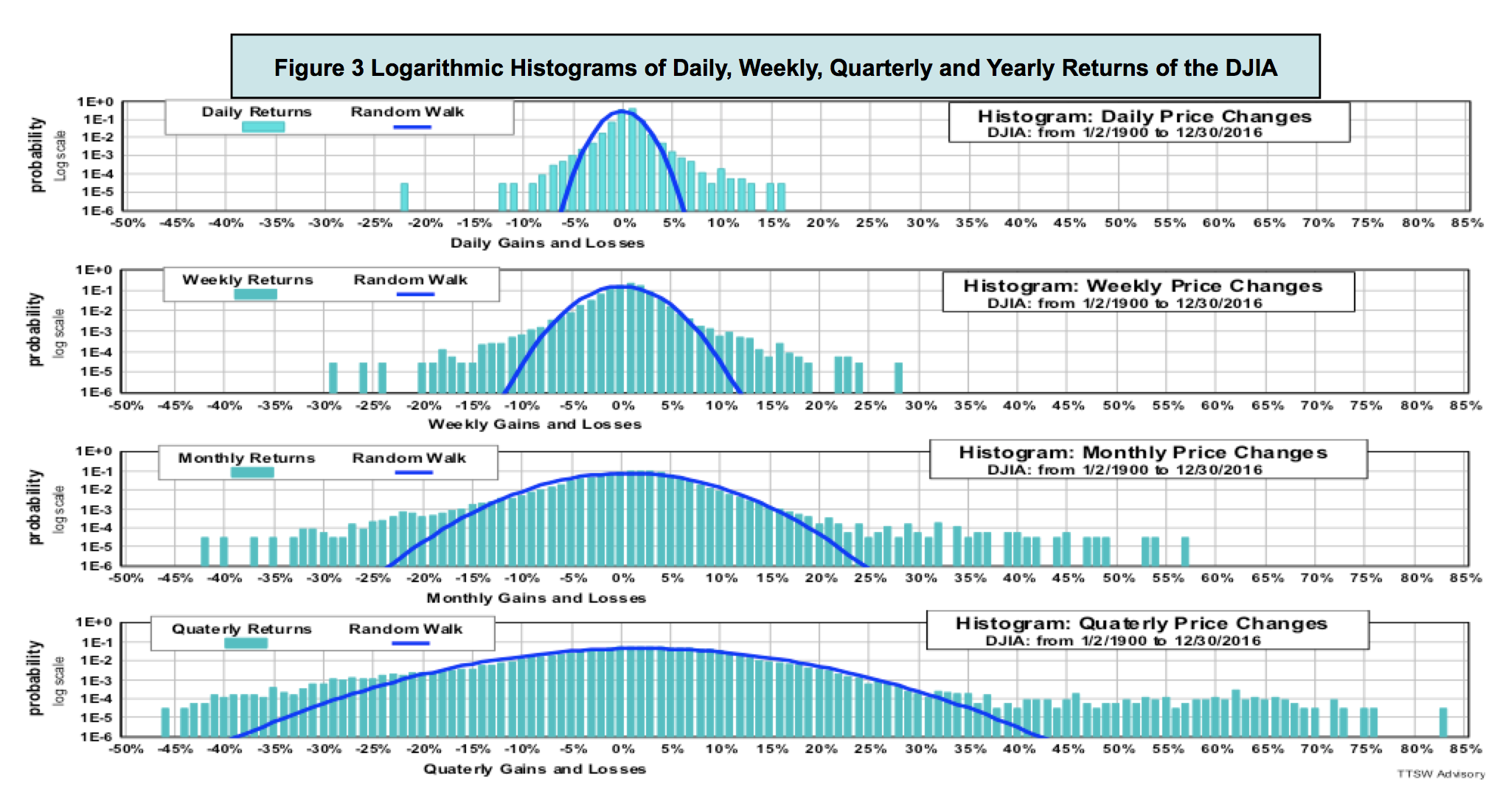
Figure 3 shows the same data with the y-axes in a log scale. The ranges on the x-axes are expanded to accommodate the extended log-scale ranges. In all return horizons, the PDFs only match the data near the central regions of the histograms. All PDFs in all four time horizons miss the fat tails visible on both positive and negative return extremes.
Do long-horizon returns follow a random walk?
Figure 4 shows histograms of returns in 1-year, 5-year and 10-year horizons (top to bottom). Beyond one year, empirical distributions are no longer bell-shaped. They are multi-modal (more than one peak) and asymmetric (uneven sides). The random walk model only works for bell-shaped distributions with a single central mean and a definable variance. For horizons longer than one year, the model clearly fails to reflect realities.
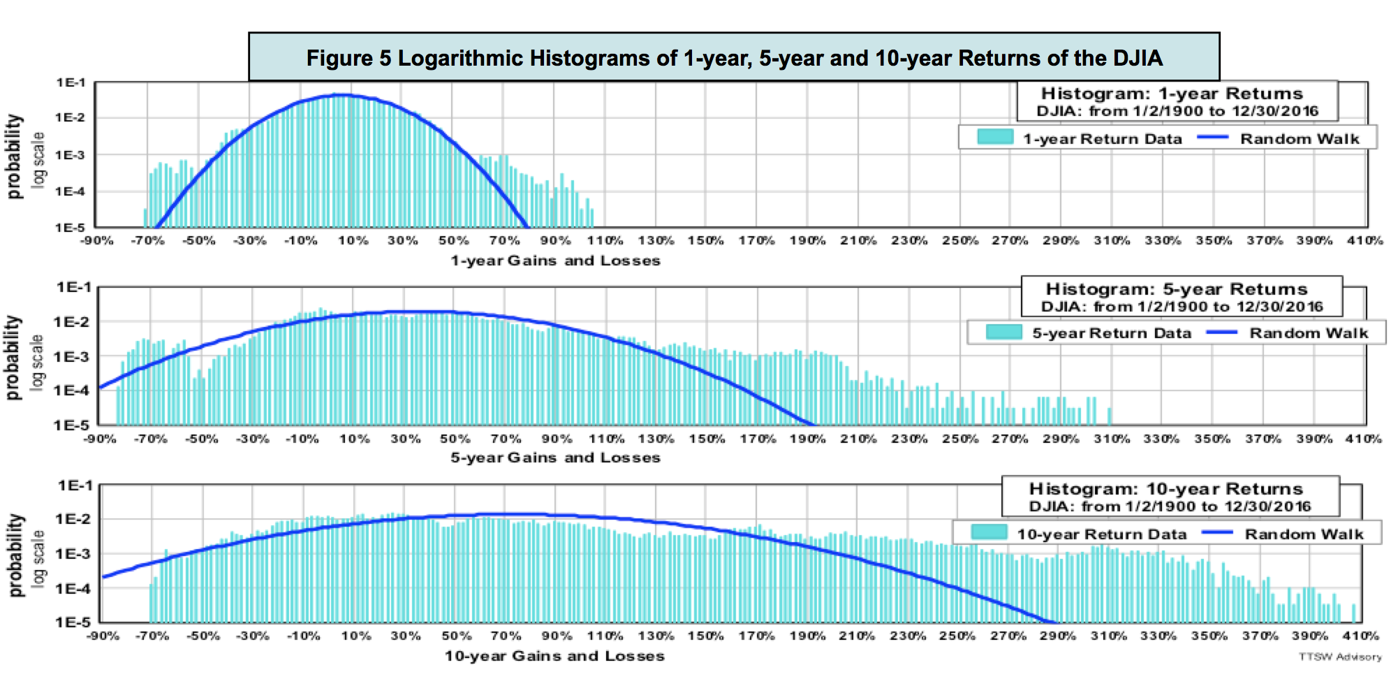
Figure 5 shows the same data as those in Figure 4 but displays them in a log scale. Fat tails are prominent in all three charts. Positive fat tails dominate negative ones. The random-walk PDFs not only underestimate risk (left fat tails), but also understate potential rewards (right fat tails). Random walk PDFs consistently miss both returns and risks. These shortfalls have huge implications for investors. I will cover these topics in detail in the second and third paper.
What is random walk's IID assumption?
Random walk theorists assume that asset prices follow an independent and identically distributed (IID) stochastic process. The term "independent" means that prices today are not coupled to prices in the past. The term "identically distributed" means that histograms taken from different time periods should have similar looks so that their means and variances can be summed or subtracted.
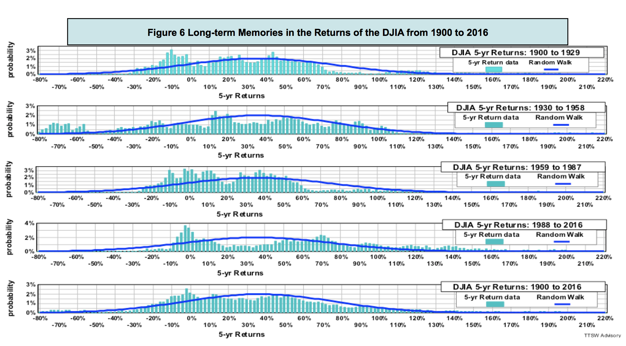
To fact check the IID assumption, I divided 116 years of the daily DJIA data into four 30-year segments: 1900-1929, 1930-1958, 1959-1987 and 1988-2016. Figure 6 shows that the random walk PDFs (dark blue curves) of all five periods are identical according to the IID assumption. The top four charts in Figure 6 show five-year return histograms in each of these four time segments. The bottom chart shows the five-year return histogram of the entire 116 years.
The actual return distributions (light blue bars) are totally different in all five periods. The histogram shows each time period has multiple peaks but none of the peaks line up with those in the other periods. The dispersions in the distributions within all five time segments are drastically different. Their variances are not even definable, let alone additive. Empirical data clearly refutes the random walk assumption that asset prices are independent and identically distributed (IID).
Do asset prices have memories?
Through an IID lens, prices should have no short-term or long-term memories. The second chart in figure 6 has an unusually long left tail running from -55% to -80%. No other period exhibits a comparable pattern. One plausible explanation for such a gigantic tail is that the dark memories from the 1929 Great Depression haunted investors for the next 30 years. Prices have memories because investors do.
The academics assume that investors are mechanical robots like pollens and molecules with no memory of their past and no aspiration for their future. Pollens floating in water may have no memory and no direction, but investors speculating on Wall Street remember the past and contemplate the future. Investors not only act according to their own experiences and dreams, they can also be affected by the actions of other investors. The random walk assumption that humans act like mindless particles is naïve leading to many unsound investment concepts and practices. One such erroneous practice is the time scaling methodology to be discussed next.
The temporal scaling rules for return and volatility
The notion of random walk came from Brown's observation of the spatial dispersion of pollens and Einstein's depiction of the spatial diffusion of molecules. In a spatial random walk, the mean walking distance is proportional to the number of steps and the deviation from the mean is proportional to the square root of the number of steps. In a price random walk postulated by Bachelier, space is replaced with time. By analogy, the mean of asset returns should scale with time and the volatility should scale with the square root of time.
For example, to annualize daily return, analysts are told to multiply (the more precise term is "daily compound") the daily return by 252. To annualize daily volatility, analysts multiply the daily volatility by the square root of 252. The number 252 is the average trading days in a year. Such scaling rules are valid if and only if prices follow a random walk. If prices do not adhere to a bell curve, these normalization standards adopted by the academic and analysts will certainly lead to erroneous results.
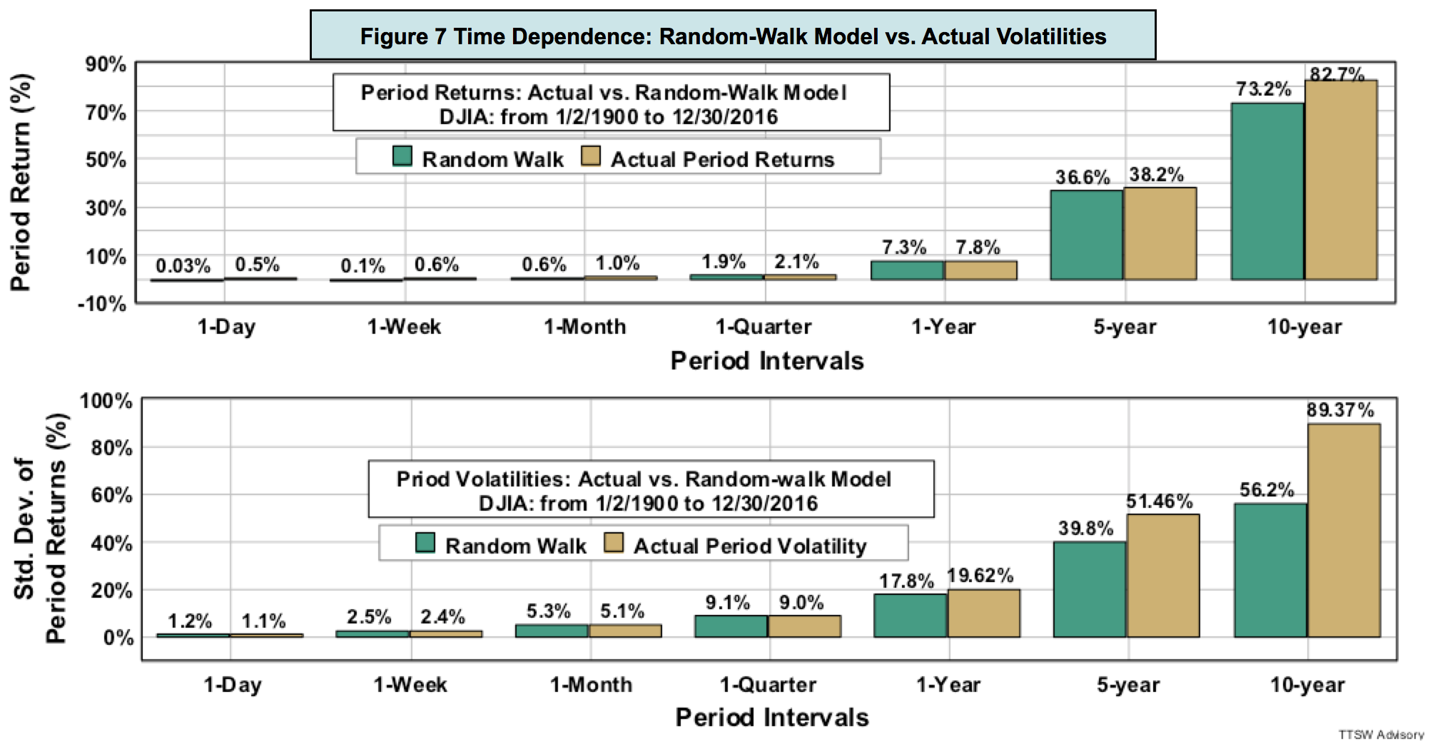
Figure 7 compares the random walk prescribed returns and volatilities (teal-blue bars) to the actual returns and volatilities (sand-brown bars) for various time intervals from one day to 2,520 days (10 years). Returns and volatilities measured from daily to quarterly intervals more or less agree with the model. As the interval reaches one year, however, divergences emerge. Beyond one year, the gaps between data and model widen with increasing time horizons.
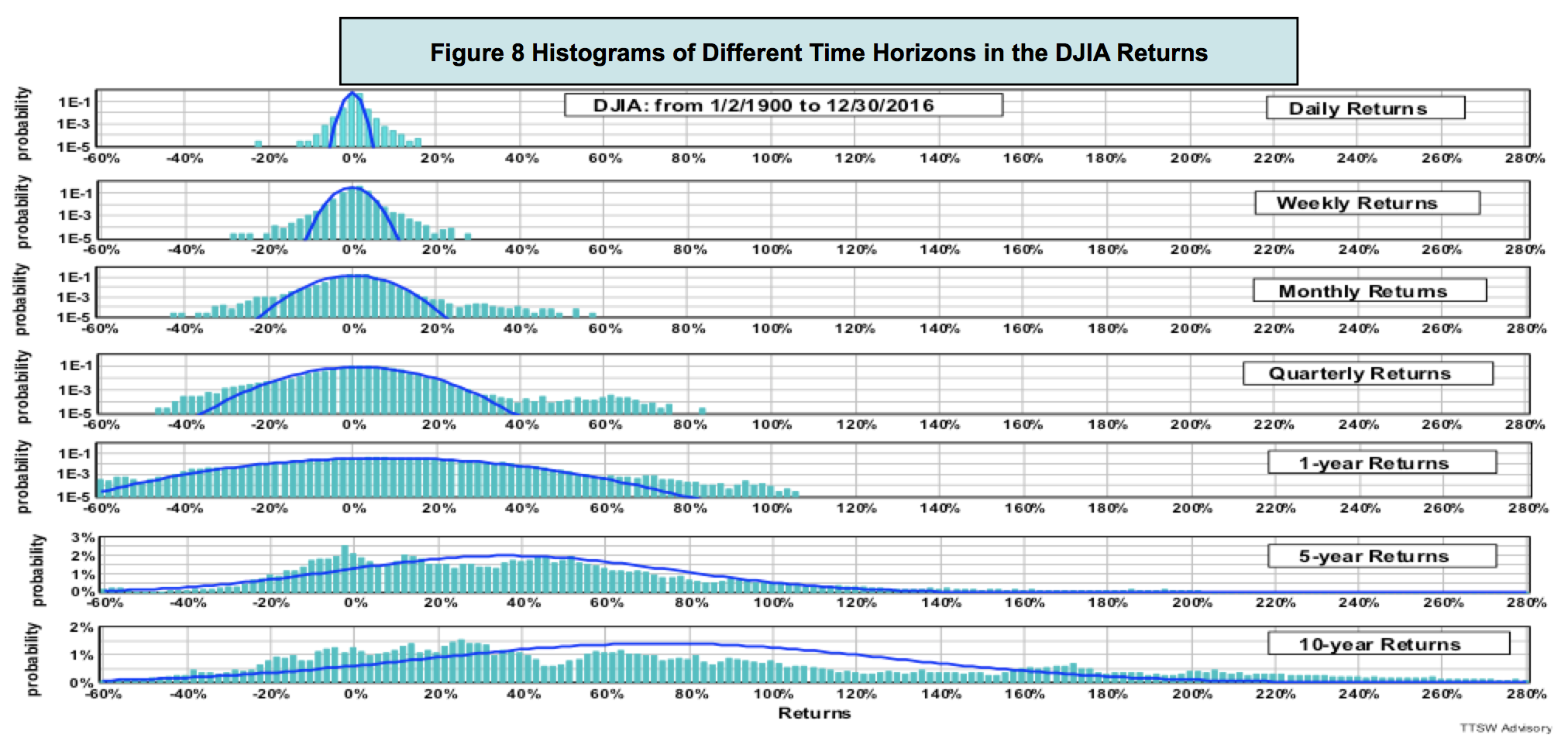
What causes the scaling rules to fail? Figure 8 shows that for short horizons from one day to one year (the top four log histograms), returns roughly adhere to the PDFs if fat tails are ignored. For time horizons longer than one year (bottom two charts), the linear histograms are no longer bell-shaped. That's when the random-walk time scaling rules break down.
Concluding remarks
Empirical evidence from figures 7 and 8 clearly shows that the random walk cartoon portrayed in Figure 1 is nothing but an illusion. For time horizons shorter than a year, fat tails outside the bell curves are prominent. For periods longer than one year, mean and volatility do not obey the random walk time scaling rules. When distributions are no longer Gaussians, the notions of mean and volatility are statistically meaningless.
The 1929 crash was conveniently cast away by the academics as a one-off event because it was not on the bell curve. Then in 1987, an even bigger shock came on the October 19th Black Monday. Again, it was treated by the random walkers as an anomaly. In 1997, the market was hit by the Asian currency collapse; in 1998, the Russian sovereign debt default; and in 2000, the U.S. dot-com crash. Eight short years later in 2008, the global financial system had a total meltdown. The professors, however, continued to call these huge recurring shocks anomalous outliers. Data are anomalous only because they cannot be explained by the models. When a model fails to explain the data, physical scientists would have no choice but to reject the model. Economists, on the other hand, would stubbornly cling on to their pet theory and selectively dismiss all contradicting evidence as anomalies.
There are many types of randomness beside random walk. Benoît Mandelbrot in 1963 used the power-law distributions (also known as Pareto-Lévy distributions) to account for fat tails observed in cotton prices that the random-walk model missed. The academy was slow to accept Mandelbrot's model because of its unwieldy math, such as infinite variance and all higher central moments. Paul Cootner, editor of "The Random Character of Stock Market Prices" had the candor to admit that "If Mandelbrot is right, almost all of our statistical tools are obsolete. Before consigning centuries of work to the ash pile, I would like to have some assurance that all our work is truly useless." If Cootner were alive today, he would have the assurance he seeks from piles of data invalidating the random walk statistics.
Random walk is the mathematical bedrock of modern finance. If the math is built on shaky ground, then all the economic theories and investment models constructed on the modern finance foundation could be theoretical landmines.
Is the Dow Jones Industrial Average the only index that does not follow random walk? In part 2, I will fact check a broad basket of asset prices including those of large-caps, small-caps, emerging markets, gold, the U.S. dollar and the U.S. Treasury bond. The empirical findings yield new insights on the true nature of asset price behaviors.
Theodore Wong graduated from MIT with a BSEE and MSEE degree and earned an MBA degree from Temple University. He served as general manager in several Fortune-500 companies that produced infrared sensors for satellite and military applications. After selling the hi-tech company that he started with a private equity firm, he launched TTSW Advisory, a consulting firm offering clients investment research services. For almost four decades, Ted has developed a true passion for studying the financial markets. He applies engineering design principles and statistical tools to achieve absolute investment returns by actively managing risk in both up and down markets. He can be reached at mailto:[email protected].
Appendix: Probability Density Function; Linear and Logarithmic Histograms
An excellent review on the probability theories applicable to the financial markets can be found in this reference.
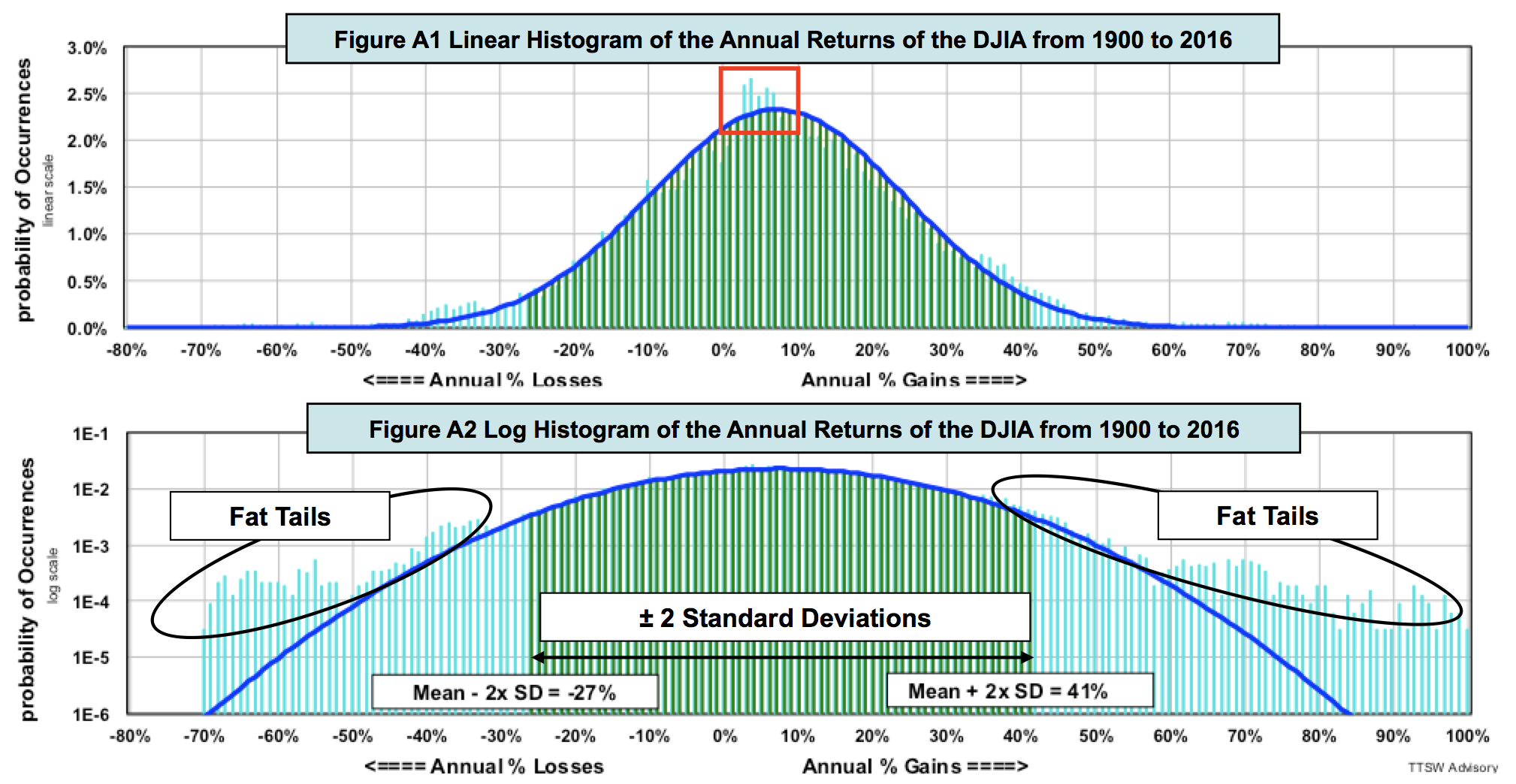
The random walk probability density function (PDF) is at the heart of all Gaussian distributions. An asset price return histogram is a plot of the probability distributions of all observed returns. The x-axis of a return histogram is constructed by grouping all returns into small but equal bins. The y-axis displays the probability in each bin. Figure 1A is a histogram of all annual returns of the DJIA from 1900 to 2016. To find the probability of an annual return of +10%, for instance, go to the +10% tick mark on the x-axis and trace a vertical line up until it intercepts the blue PDF curve. Then moving horizontally across to the y-axis, one finds a probability value of 2.25%.
The empirical return distribution in Figure 1A appears to match the model PDF fairly well. But appearances can be deceiving. A random walk PDF is bell-shaped only if the y-axis is displayed in a linear scale. A linear histogram suppresses all probability contents beyond one standard deviation from the mean. Figure 1B is a log histogram, which removes such scale distortion and shows all probability contents in ratio proportions. Figure 1B displays the same contents in Figure 1A but in a log scale. The differences are striking. Beyond two standard deviations on both sides, fat tails eclipse the random walk PDF. The gaps continue to widen as the PDF curve declines exponentially with increasing gains and losses.
In both Figures 1A and 1B, the light blue bars are the actual DJIA annual returns. The dark blue curves are the computed random walk PDFs based on a measured mean (the expected value of returns) of 7.3% and a measured volatility (annualized standard deviation of returns) of 17.1%. The green bars in the central regions are the probabilities within ±2 standard deviations, which covers 95.5% of the total area under the PDF curves. The ±2 standard deviations from the mean are, respectively, +41.5% (7.3% + 2 x 17.1%) and -26.9% (7.3% - 2 x 17.1%).
Linear and log histograms are complementary. Linear histograms detect gaps better in the central region. For instance, Figure A1 shows that the odds of returns from 2% to 7% are higher than those predicted by the random walk PDF (red box). Such discrepancies are hidden in Figure A2. Log histograms, like Figure A2, expose fat tails at both extremes that are invisible in a linear plot. With both types of displays, one can detect discrepancies over the entire return spectrum.
Read more articles by Theodore Wong