By now, almost every investor has heard of the Nobel Prize-winning Yale professor Robert Shiller’s stock market valuation metric, the cyclically adjusted price earnings (CAPE) ratio.1 This measure is designed as an improvement on the traditional price-to-earnings, or P/E, ratio. To correct for earnings cyclicality, the CAPE uses an average of the last 10 years’ real, or inflation-adjusted, earnings in the denominator instead of just one year’s (trailing or forecast) earnings.
The CAPE ratio has been discussed in Advisor Perspectives by Doug Short, William Hester and the famed Wharton professor Jeremy Siegel. In other words, it’s quite a hot topic.
Siegel and Shiller made competing presentations at the Q Group’s fall 2013 meeting in Scottsdale, Arizona, on Oct. 15. (The Q Group is a discussion group of senior investment professionals, chiefly “quants,” that organizes prestigious conferences where academics and practitioners interact.) I wish I could say they faced off – they were scheduled to – but Shiller had been informed the previous morning that he had won the Nobel Prize, so he used a video connection to attend remotely. This article will report on their differing views and attempt to draw some conclusions about the market’s prospects.2
CAPE basics
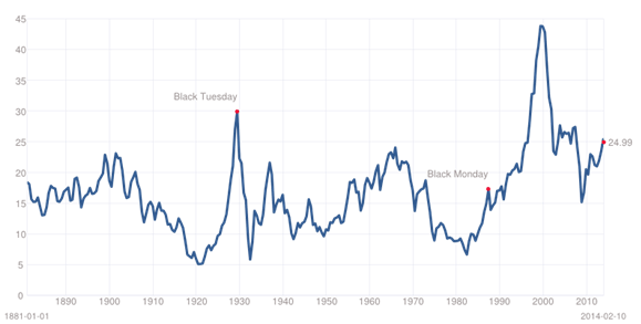
Figure 1 shows the evolution of the CAPE ratio from 1881 to 2014. By historical standards, the CAPE ratio today is quite high, around 25. That is, the S&P 500 is priced at 25 times the 10-year average of real, trailing, reported earnings. This ratio is about 50% above its historical average and is considered by many analysts, including Shiller himself, to be indicative of low expected returns from this point forward.
Figure 1
Cyclically Adjusted Price Earnings (CAPE) ratio, January 1881-February 2014

Current CAPE Ratio: 24.99 (as of close on Feb. 10, 2014)
| Mean: |
16.51
|
|
Median:
|
15.90
|
|
Min:
|
4.78
|
(Dec 1920)
|
|
Max:
|
44.20
|
(Dec 1999)
|
Source: http://www.multpl.com/shiller-pe, based on data from Robert Shiller’s web page.
Others are not so sure. Siegel, who supports the use of the CAPE ratio methodology in principle, believes that the current CAPE ratio of 25 cannot be directly compared with past or average values of the ratio for several reasons. First, the past 10 years still include the earnings collapse associated with global financial crisis, when S&P 500 quarterly earnings went negative. Second, real earnings growth accelerated after 1945, so it’s misleading to compare today’s valuation ratios with averages that go all the way back to 1871 or 1881. Third, accounting standards have changed and result in misleading data. Fourth, large losses suffered by specific companies are aggregated improperly into cap-weighted indices such as the S&P.
In a recent presentation at ETF.com’s Inside ETFs conference in Hollywood, Florida, on Jan. 28, Siegel calculated a traditional (one-year) P/E of 17.2 for the S&P 500, compared with a median value, from 1954 to 2014, of 16.5. These ratios are price-to-forward (forecast) earnings. “There is no bubble here,” Siegel said.
Clearly, the traditional P/E tells a more bullish tale than the CAPE. (I am really struggling to avoid jokes about bulls, bullfighters, capes and tails.)
What’s right with CAPE
At the Q Group, Siegel began by saying that CAPE has been a good forecaster of stock returns. It also has a sound theoretical basis. “The CAPE methodology is brilliant and works; the data are the problem,” he wrote in the paper he distributed at the Q Group. Variation in CAPE has explained about one-third of the variation in actual subsequent 10-year stock returns, a very good track record.
The CAPE level of 43 in the spring of 2000 was a sign that a long period of bad times would follow. It did. Today, the CAPE method forecasts a 4.16% real return on stocks in the next 10 years, about two percentage points below the historical real return. This does not sound like a bearish forecast to me, but if one is counting on future returns being equal to long-run historical returns, it will be a little disappointing.3
Enigmatically, the equity-to-market-capitalization ratio is an even better forecaster. I’ll return to that later. In fact, price divided by any scaling variable — that is, any variable that makes it possible to compare price levels over time — appears to have some forecast value.
1. Also called the Shiller P/E or PE10.
2. Shiller did not respond directly to Siegel but made a related presentation on current vs. historical valuation of equity-market sectors and industries. One must admit that Shiller’s Nobel excuse for not showing up – or directly rebutting Siegel – was unique.
3. My own 10-year forecast, in Grinold, Kroner, and Siegel [2011], was for stocks to provide a nominal total return of 7%. Because inflation at the time was 2.4%, my implied real total return forecast was 4.6%, which is not very different from the CAPE forecast. I’d also note that my article foreshadowed Siegel’s (or else we unwittingly compared notes). I wrote,
The current Shiller P/E, by averaging 10 years of trailing earnings, includes an earnings collapse in 2008-2009 that is almost literally unprecedented; even the Great Depression did not see as sharp a contraction in S&P earnings, although overall [NIPA] corporate profits in 1932 were negative. (Huge losses in a few large companies, such as occurred in 2008-2009, go a long way toward erasing the profits of the other companies when summed across an index.) Only the depression of 1920-1921 is comparable.
What’s wrong with CAPE
Let’s refer back to Figure 1. Around 1991, the average CAPE shifted upward, from an average in the mid- to high teens to an average in the low 20s. In fact, from 1992 to 2014, the CAPE fell as low as its long-run average of 16.5 only once, during the worst weeks of the 2008-09 market collapse. In other words, a comparison of the current to the historical average CAPE shows that it completely failed to predict the bull market of 2009-14. What went wrong?
There are several possibilities. A simple, but unsatisfactory, answer is that stocks have been overpriced since the early 1990s, except at bear-market bottoms.
The simplest equilibrium explanation is that the fair-value CAPE rose. Investors are willing to pay more for a dollar of earnings than they once were, making current stock prices higher and future returns lower. If that is the case, then investors hoping to earn historical-average returns on stocks in the future and waiting for a decline to (or through) the historical average CAPE will have a long wait. It is better to buy stocks at today’s high prices and earn a smaller equity risk premium, this logic says, than to earn really stingy returns on bonds.
Another possibility is that, as Siegel suggests, the data used in the CAPE are biased or inconsistent. I’ll explore that possibility in some detail.
Earnings denominator depressed by a double-dip depression
When one uses the CAPE ratio at any time between 2008 and 2013, the denominator (10-year trailing average real earnings) picks up two earnings depressions, boosting the CAPE by a huge amount. That explains much of today’s high CAPE. If we take out one or both of the earnings crashes, the CAPE comes down to a more reasonable level. Those depressions will come out in 2019, when the second crash ages out of the 10-year history. At that time, for a given market level, the CAPE will fall considerably and look more “normal.”
But in analyzing a time series, we can’t take out the data we don’t like. The earnings crashes happened, and they could happen again.
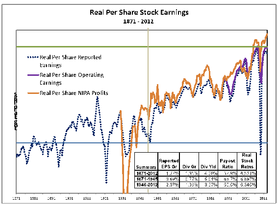
Or did they? Figure 2 shows S&P 500 reported and operating earnings and national income and product accounts (NIPA) corporate profits from 1871-2012. NIPA profits represent the profits of the entire corporate sector of the economy, including privately held businesses. Note that S&P reported earnings plunged in the 1991 recession while NIPA profits continued to grow. Then, in 2002-03 and 2008-09, S&P reported earnings fell sharply while NIPA profits fell much less.
Figure 2
Real S&P 500 earnings and real NIPA profits, 1871-2012
Source: Jeremy Siegel, The Shiller CAPE Ratio: A New Look, Q Group presentation, October 2013.
Siegel attributes the difference to accounting practices, not to real differences in performance, and suggests that NIPA profits are more representative of what was really going on with the companies in the S&P 500. That is, he believes that corporate America was not in as bad shape in 2008-09 as it appeared from reported earnings numbers. By recalculating the current CAPE ratio using NIPA profits, he finds no overvaluation in the market at all. He also finds that the fit between forecast and realized returns (on the S&P 500) is tighter when NIPA is used to calculate the CAPE ratio than when earnings on the S&P 500 itself are used to calculate it.
The use of NIPA strikes me as very odd, because the corporate sector is much broader than the S&P 500. Privately held businesses, small-cap stocks and the S&P 500 have often gone in separate directions, with little to suggest that one set of companies can be used as a proxy for the other. This switcheroo also smacks of data mining – did Siegel examine multiple series before he found one that showed no stock market overvaluation? But Siegel’s argument is intriguing:
It is particularly puzzling that the decline in S&P reported earnings in the 2008-2009 recession, where the maximum decline in GDP was just over 5%, was much greater than the 63.4% decline in S&P’s recorded earnings in the Great Depression, which was five times as deep. In fact NIPA corporate profits were negative in 1931 and 1932, far more in line with other economic data. These disparities suggest that there has been a change in the S&P methodology from likely understating earnings declines in recessions to significantly overstating these declines.4
Faster real earnings growth after 1945
Siegel also objects to comparing the current CAPE ratio to historical values extending back more than a century, because real earnings growth accelerated after 1945. Before 1945, dividend-payout ratios were high and retained earnings were low, so companies tended to grow more slowly than they do today (despite GDP growth being faster than it is now). The data supporting these assertions are in the lower right-hand corner of Figure 2.
This logic says we should drop the earlier years in calculating a CAPE average. But the impact is not dramatic. The average CAPE from 1945 to 2014 is only 5.6% higher than the average from 1881 to 2014, and the forecast of the equity return rises only 51 basis points per year as a result of this adjustment.
Accounting standards have changed
Siegel contends that, due to accounting changes in the 1990s, the CAPE uses downward-biased earnings data. Companies are required to write off losses that occur when assets they hold fall in price. When an asset rises in price, however, they are not allowed to report the gain until the asset is sold, which could involve a long wait. In the words of GMO’s James Montier, “goodwill accounting misses half the data.”5 This bias causes the CAPE to be higher and the forecast equity return lower than they would be with symmetrical or unbiased accounting.
The much greater volatility of reported earnings in Figure 2, as compared with operating earnings (shown from 1989 to 2012), suggests that this concern is valid.
The concern over goodwill accounting would be less serious if accounting standards had been consistent over the time period for which the historical average CAPE is calculated. We would be comparing a biased CAPE today with a similarly biased CAPE in the past. But because the accounting change was fairly recent, the CAPE average includes many decades when accounting was less conservative, causing reported earnings to be higher than they would be under today’s standards. This phenomenon is meticulously documented by an unsigned (but very skilled) essayist at the Philosophical Economics blog, whom I quote in violation of Advisor Perspectives’ standard against citing unsigned work:
Now, [Financial Accounting Standard or] FAS 142 may be a more accurate accounting standard than its predecessor, but that isn’t the issue for the Shiller CAPE. The issue for the Shiller CAPE is that the accounting standard is not being applied consistently across time. None of the “reported” earnings numbers used in the Shiller CAPE for years before 2001 were held to the harsh standard of FAS 142. But all of the “reported” earnings numbers used in the metric for years after 2001 were held to that standard. Consequently, any comparison between the present value of the metric and pre-2001 values is a comparison between inconsistently measured data points. The present values end up looking more expensive relative to the past than they actually are.
You might think that these accounting changes aren’t a big deal. But they’re a huge deal.
How huge? Writedowns by S&P 500 companies in 2008 amounted to $301 billion – enough to bump up the CAPE by a full point, just from that year. Add up the effects over a decade, and it really makes a difference to the CAPE calculation.
Losses don’t reach across companies
Finally, Siegel argues that reported earnings, and by extension CAPE, handle large losses by individual companies in a way that is misleading when aggregated up to the index level. This “aggregation bias” is difficult for some to understand. Siegel does a masterly job of explaining it:
This bias [comes from] the large losses of a few firms dominat[ing] aggregate data. The S&P methodology adds gains and losses of each S&P 500 [company] together to compute the aggregate earnings on the index and then [divides] the sum of all the earnings [into] the sum of all the values of the individual stocks [to arrive at a PE ratio]. This is identical to how one would value a single firm with 500 divisions, each division reporting its profits and losses.
But this methodology understates the valuation of a portfolio that contains 500 separate firms. Finance theory states that the value of a stock is an option on the value of the firm. … [T]he sum of the value[s] of the 500 [separate] options on the value of each firm, which add up to the market value of the S&P 500, must exceed the value of [an] option on the earnings of a single firm with 500 divisions. … This is because the value of an individual stock can never go below zero no matter how great the losses since these losses are borne by other stakeholders (such as bondholders) and not by the equity holders of other firms.
The aggregation bias was particularly acute in the last recession. The unprecedented $23.25 [per share] loss in reported earnings for S&P 500 firms in the fourth quarter of 2008 was primarily caused by the huge write-downs of three financial firms: AIG, Citigroup, and BankAmerica. AIG recorded a $61 billion fourth quarter 2008 loss. Although AIG had a weight [of] less than 0.2% in the S&P 500 index at the time, this loss more than wiped out the total profits of the 30 most profitable firms in the S&P 500 in that quarter, firms whose market values comprised almost half the index.6
When a few firms report huge losses wiping out the profits of hundreds of other firms at the index level, the aggregation bias is large. It needs to be taken into account when interpreting the CAPE, the traditional P/E ratio and index-aggregate earnings numbers in general.
Defending the Shiller CAPE
While Shiller has not specifically responded to Siegel’s suggested revisions of the CAPE ratio, the “pure” Shiller CAPE has attracted a chorus of passionate defenders. To clarify the view that the CAPE indicates an overpriced market, I rely principally on Doug Short and William Hester, referenced earlier, and on Cliff Asness, whose article, An Old Friend: The Stock Market’s Shiller P/E, appeared in late 2012. (I especially recommend Asness to readers who enjoy chuckling at the latest fads in sloppy investment thinking, which he skewered in his recent Financial Analysts Journal article, My Top Ten Peeves.)
First, Siegel tries awfully hard to get the CAPE ratio down and the expected return on the stock market up. All of his adjustments are in the same direction. A cynic might regard Siegel’s adjustments to CAPE as part of a lifelong attempt to portray whatever information is available as bullish. (To his credit, Siegel turned bearish in the late 1990s and forecast a future return much lower than the historical.7)
While it’s tempting to take out the earnings crash of 2008-09 and recalculate the CAPE to get a more balanced view, Doug Short, writing in Advisor Perspectives on Feb. 3, says:
[In place of the actual data] I've used the December 2007 [trailing 12-month] earnings of 66.18 as a constant for the next 29 months to totally eliminate the collapse in earnings of the Great Recession.
What impact does this have on the [CAPE]? The mean (average) only drops from 16.5 to 16.4. The lower bound of the top quintile drops from 20.9 to 20.6. Instead of a [CAPE] of 24.9 at the end of December, the "no crash" version would still be in the top quintile at 22.6. That's 37% above the mean instead of 51% above mean with the authentic data.
The bias in the way FAS 142 treats writedowns can be eliminated by using operating earnings or making some similar adjustment that lessens the impact of the writedowns on the CAPE ratio. However, Asness warns that operating earnings are “earnings before deducting bad things.” Bad things happen to good companies (as well as bad ones) and need to be reflected in proper accounting. There is peril in simply removing bad things from the data.
Finally, Shiller’s supporters argue that a metric should be evaluated according to its predictive power. It does not have to be logically perfect in every detail. This is not to say there is never a process switch, or transition from a period where one model works to a period when another model is better, but the presumption should not be that “this time is different.” Hester writes,
Despite the various arguments and defenses surrounding the CAPE, the evidence is perfectly able to speak for itself. … [A version that] adjusts the growth rate of earnings, based on the Shiller profit margin, [has a] correlation with subsequent returns [of] over 90% in historical data.
It’s worth noting both the general accuracy and the occasional errors. At points where actual subsequent 10-year returns deviated from the 10-year returns that were expected, the reason was that the market had reached very high levels or very low levels of ending valuation. …Actual 10-year returns came in below the expected returns in 1936 and 1964 because of how undervalued the market became in 1946 and 1974. The [opposite] is true for 1990 and 2003 [because the market price level was high in 2000 and 2013].
The CAPE Ratio is doing exactly what it has always done, which is to help investors anticipate the investment returns they should expect over the next decade. Those returns will very likely be in the low, single digits.
Who’s right?
While the CAPE ratio has all the flaws Siegel identifies and probably some others that point in the opposite direction, it still gives a forecast of real equity returns8 that is not out of line with long-term equilibrium expectations. This suggests that the market is not all that overpriced. As a measure of long-term equilibrium, I use my own real return estimate of 4.6%, written up in Grinold, Kroner, and Siegel (2011).9 (Because this latter estimate was produced in 2011, when the market was lower, an updated estimate would also be lower, perhaps quite close to the 4.16% CAPE forecast.)
A real equity return a little above 4% is not bad. It’s lower than the historical average return, much of which was produced in the fabulous second half of the 20th century when the United States achieved its dominant position in the world economy. It is reasonable to think that such high returns will not be repeated. Investors need to budget for lower returns.
Thus, it’s not necessary to adjust CAPE in the many ways recommended by Siegel to get reasonable stock market forecasts. Many of his adjustments are justified, and to the extent that they produce higher forecasts, so much the better. However, the adjustments are not needed to motivate most investors to hold a substantial (but not above-average) equity position.
Meanwhile, don’t expect CAPE to revert to its long-term average. It is more likely to fluctuate around its 1990-2014 average.
Price-to-anything?
Perhaps the quest for a single metric that gauges the cheapness or expensiveness of the stock market is misguided. We’d be better off using a variety of metrics, including CAPE for reported earnings, CAPE adjusted as Siegel would prefer, the traditional P/E, price-to-book, price-to-sales, price-to-dividends and capitalization-to-GDP.
The anonymous Philosophical Economics blogger finds that the tightest fit between forecast and realized 10-year stock returns is achieved with the quirky equity-to-capitalization ratio, the value of corporate equities divided by the value of equities plus debt.10 This ratio doesn’t even have a measure of fundamental value in it. How can it possibly work?
The answer is that the amount of debt a company can issue, or chooses to issue, scales the price so that prices can be compared across companies and across time. This scaling effect is no different than the scaling effect of dividing price by earnings. In fact, all of the metrics listed above are scaled prices. I encourage readers to use all these metrics and to seek out other metrics not yet discovered.
Conclusion
My forecast says that the market is close to being fairly valued, with the expected return roughly equal to the market-required rate of return even at a CAPE of 25. Am I saying that this time it’s different? Yes – while underlying principles of finance and valuation are always the same, the facts and circumstances are different in each period. The data support an expected real return of 4%, which makes equities worth holding.
To reverse the familiar Mark Twain quote, history rhymes, but it doesn’t repeat itself. Every time is different.
7. Siegel, Jeremy. “The Shrinking Equity Premium.” Journal of Portfolio Management, Fall 1999, pp. 10-19.
8. Siegel [2013], page 3, in footnote 3. Cliff Asness gets a lower number, based on a historical analysis of returns at various CAPE starting points.
9. In Grinold, Kroner, and Siegel [2011], the expected real return of 4.6% (not separately reported in that article) is the expected nominal return of 7.0% minus expected inflation of 2.4%.
10. The Single Greatest Predictor of Future Stock Market Returns, December 20, 2013. I haven’t checked the data or math, but the work seems right. I have encountered the equity-to-capitalization ratio (or debt-to-capitalization, which is one minus equity-to-capitalization) in other contexts, and it’s cross-sectionally predictive of stock returns (that it, it helps to determine which stocks will beat the market). It’s not surprising that the ratio is also useful for predicting the way that the overall return on the market varies over time.
Read more articles by Laurence B. Siegel