With the new year upon us, pundits are issuing their forecasts of market returns for 2013 and beyond. But returns don’t occur in a vacuum – meeting clients’ goals requires an asset allocation that appropriately balances return and risk. So what follows are my predictions for risk across major asset classes, based on a theoretically sound approach that has proven to be reliable in the past.
A number of big uncertainties loom on the horizon. Will economic growth rise to its historical average? Will unemployment drop? Will the Eurozone get back on track? Will emerging economies decouple from the over-leveraged developed economies?
Risk lurks in all these questions. But we can get a sense of the magnitudes of those risks by considering different sectors in the options markets.
I will reveal the forecast for risk and volatility for key asset classes – along with the likelihood of a catastrophic, black-swan event – but first let’s review the theoretical basis for using options as a tool to project risk and the key assumptions upon which my methodology depends.
Theoretical background
Option prices are primarily determined by the market’s consensus view of future volatility, akin to how expected future earnings determine the price of a stock. It’s unsurprising, then, that multiple studies have shown option prices to be the best predictors of future volatility.
In early 2007, for example, the options markets reflected a very clear consensus view that market volatility would increase dramatically, contradicting the widespread belief that the markets had undergone a “great moderation” of risk – a prescient warning of what was to come in 2008.
There’s a simple reason why option markets offer such accurate predictions. The fact that someone is willing to sell you risk protection (in the form of an option) reflects the conviction of the seller. In the same way that purveyors of hurricane insurance have the strongest incentives to forecast storm activity accurately, the market-makers in options have a strong incentive to estimate future risk as well as possible. For a robust market in options to persist, market makers cannot systematically misprice the options that they sell; if their predictions weren’t accurate, the market would not exist.
Implied volatility is not a perfect forecast, of course, but it is clearly the best predictor of risk we have.
The asset classes
I surveyed options that expire in January 2014 for a number of key asset classes.
For bonds, I focused on two types: long-dated Treasury bonds and high-yield bonds – because they provide pure exposure to interest-rate risk and default risk, respectively. Put options on those two asset classes dictate the price of insurance against losses due to corporate defaults or a rise in interest rates.
For equities, I examined options on the S&P 500 index (via the ETF SPY), the EAFE index (EFA), emerging markets (EEM), and two of the largest individual emerging markets, Brazil (EWZ) and China (FXI).
For alternative asset classes, I examined options on gold (GLD) and REITs (IYR).
Baseline volatility projections
I’ll compare historical volatility to the implied volatility for options that are at-the-money (ATM). Those options have a strike price equal to the current price of the asset. An ATM put option provides the buyer with protection against any decline in price in that asset class from today until expiration.
The third column in the table below shows the trailing three-year volatilities for each asset class I identified above, while the fourth column shows the implied volatility for ATM put options on the ETFs that track them. Higher implied volatility corresponds to greater risk that the price will decline.
Historical, Projected, and Implied Volatility (Put Implied Volatilities are from Morningstar)
|
Asset Class
|
Ticker
|
Trailing 3-Year Volatility
|
Put Implied Volatility
|
QPP Projected Volatility
|
|
S&P 500 Index
|
SPY
|
15%
|
18%
|
18%
|
|
EAFE Index
|
EFA
|
20%
|
21%
|
22%
|
|
MSCI Emerging Mkt Index
|
EEM
|
24%
|
22%
|
25%
|
|
Long-Term Treasury Bonds
|
TLT
|
16%
|
16%
|
19%
|
|
High-Yield Bond
|
HYG
|
10%
|
12%
|
11%
|
|
Brazil Stocks
|
EWZ
|
29%
|
24%
|
29%
|
|
REITs
|
ICF
|
19%
|
20%
|
23%
|
|
China Stocks
|
FXI
|
24%
|
25%
|
28%
|
|
Gold
|
GLD
|
19%
|
17%
|
23%
|
For the S&P 500, the options market is projecting volatility over the next year that is somewhat higher than we have experienced, on average, over the past three years: The trailing three-year volatility for the S&P 500 (SPY) is approximately 15%, while the put-implied volatility (PIV) is 18%.
To generate my predictions, I calibrated my Monte Carlo simulation, Quantext Portfolio Planner (QPP), to assume future volatility for the S&P 500 will equal the implied volatility of the current ATM put options on SPY. QPP then projected the future volatility of all other asset classes based on a combination of the S&P’s expected volatility, historical volatilities, and correlation data. The final column in the table above shows those projections for the other asset classes.
One striking feature of this table is that trailing and forward risk levels are remarkably similar. Contrast this with the situation just before the 2008 crash – when projected volatility and PIV were both much higher than trailing volatility – and with the situation in late 2008, when the investors were exceptionally risk averse and implied volatility far exceeded QPP’s projections.
For purposes of portfolio planning, I assume the worst-case annual returns for an asset class to be roughly twice the expected volatility – two standard deviations below current returns. The worst-case scenario for emerging market stocks on this basis is a return of -44% to -50%, while the worst case for the S&P 500 is perhaps -36% over the next year. These returns are consistent with the outcomes investors experienced in 2008, when EEM lost 49% and SPY lost 37%. Similarly, EWZ could lose 48% to 58% by this measure; it lost 55% in 2008. I don’t foresee a decline of those magnitudes, but the relationship between projected volatility and maximum loss potential has been reliable in the past. Note that this is a heuristic for planning, and is not part of QPP’s calculations.
For more detail on this phenomenon, see Appendix A, a short case study that looks at how well this approach to predicting volatility across a range of asset classes performed for the three-year period from 2010-2012.
The volatility smile
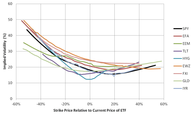
An ATM put option is like insurance with a zero deductible. Any decline in price is covered by the option. In practice, investors tolerate some degree of loss. Just as higher risk capacity equates to higher deductibles in the insurance world, in the case of put options higher risk capacity corresponds to strike prices lower than the current price. To protect against truly extreme events (so-called black swans), you might select a strike price to cover losses exceeding 40%. As the strike price of the put option decreases, so does the premium, but the volatility that price implies tends to increase. The chart below shows the implied volatility of options as a function of the strike price for the core asset classes, with 0% on the horizontal axis representing ATM options.
Volatility Smile for Core Asset Classes (Implied Volatility from Morningstar)

This chart illustrates nicely the standard behavior of option price volatility, which is often referred to as a “volatility smile.” Implied volatility increases for options with strike prices less than the current price, which are on the left side of the chart, and the same effect is evident on the right side of the chart, though to a lesser degree. Because of this asymmetry, some people refer to the volatility smile as the “volatility smirk.”
Put options decrease in price as their strike price drops below the current price of the underlying ETF. But the volatility smile shows that, even though these options are out-of-the-money (OTM), they are relatively more expensive for the coverage they provide than ATM options. In the case of put options, that is because extreme events are relatively harder to hedge for the seller of the option.
The far left side of this chart is black-swan territory. Exceedingly high implied volatility here would indicate that there is an unusually high risk of an extreme loss.
A 2005 paper in the American Actuarial Journal provided extensive analysis of the volatility smile for options on the S&P500. That analysis suggested that it is not uncommon for options with a strike that is 40%-50% below the current price to have implied volatility that is twice that of the ATM options. The results shown here are consistent with that finding across a range of asset classes. So the volatility smile observed across the range of ETFs is consistent with history, and the far-out-of-the-money implied volatility we see today is not especially high.
Implied volatility alone doesn’t reveal the meaning of options prices, however, especially the cost of protecting against a large decline. In the next section, I present a more intuitive way to weigh the costs of downside protection.
What options prices tell us
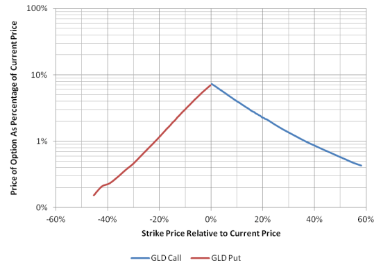
The chart below shows the prices of put and call options as a percentage of the price of gold (GLD) on the vertical axis against the strike price of the option relative to the current price of GLD. As in the previous examples, a value of -10% on the horizontal axis corresponds to a strike price 10% below the current price of GLD.
Price of Jan 2014 Options on GLD
It is worth spending some time to understand this chart, because it contains a great deal of useful information. For a bit more than 1% of the price of GLD, you can purchase a put option that will provide protection against any losses on GLD beyond 20% of the current value, between now and January of 2014. If you wanted to sell a call option against a share of GLD to cover the price of buying the put option, meanwhile, its strike price would be 35% above the current price of GLD. In other words, you can cover the potential losses on GLD beyond -20% by selling off the potential for gains above 35%.
This chart tells us, then, that call options on GLD are relatively expensive compared with put options, which is consistent with the belief that gold serves as a hedge against inflation (I explored this strategy in a previous article). The cost of insuring against a major decline in GLD (buying a put option on GLD that is far out of the money) is similarly very reasonable.
While the cost of insuring against a loss of 20% or more in GLD is only 1%, the cost of a put option for limiting losses to 10% of the current price of GLD is three times that – 3% of current price of GLD. This situation is common among risky asset classes and explains why we see a linear slope to the sides of the ‘mountain’ in the chart above, even though the vertical axis is in log coordinates.
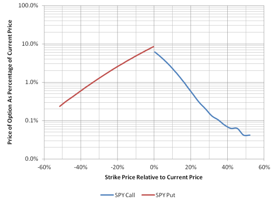
The market dynamics for gold are quite simple, but for equities the situation is more complex, because of dividends. The chart below shows the “mountain” chart for options on SPY. A useful way to consider this chart is to look at the put option that could be purchased on the basis of the dividend yield of the underlying asset. In this case, the yield of SPY is 2%, which would be enough to buy a put that would protect against losses exceeding 24% on SPY.
Price of Jan 2014 Options on SPY
If we look at ATM options, the difference between the cost of the call and the put is equal to the dividend yield on SPY, a gap that is visible in the previous chart.
The chart on the previous page also shows that the probability of a surprise rally in the S&P 500 is very low. You can buy a call option on SPY with a strike that is 20% above the current price for only 0.7% of the current value of SPY. Similarly, you could buy all the potential price gains for the S&P 500 beyond 10% (that is, you could buy a call option with a strike price that is 10% above the current value) for 2.3% of the current value.
The mountain chart for options on the EAFE index (represented here by EFA) looks very similar to that for SPY.
Price of Jan 2014 Options on EFA
The primary difference between the options on EFA and those for SPY is that downside risk protection is more expensive for European than for domestic stocks – a put option to protect against a 20% decline in EFA, for example, costs 3% of the current price of EFA, versus only 2.5% for SPY. This difference in pricing of OTM put options is consistent with the higher volatility of the EAFE index that we saw in an earlier table, and it suggests that the market has assessed a higher probability of extreme events (black swans) in the European stock market.
Similar to SPY, the decline in value of call options with increasing strike price is more extreme than the corresponding gain in the value of put options with strike price. Therefore, any investor seeking to cover downside risk by giving up potential for gains (buying a put funded with proceeds from selling a call) gives up a larger range of potential gains than the range of potential losses he is protecting against.
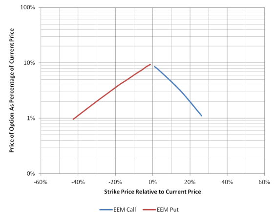
When we look at emerging markets stocks (via EEM), we see similar structure (below). As you’d expect with riskier assets, both calls and puts are relatively more expensive than corresponding options on less-volatile asset classes. An investor in EEM could purchase a put option on EEM with a strike 30% below the current price for 2% of the current price of EEM. Given that emerging market indexes dropped by 49% in 2008, that seems like a quite reasonable price to pay for downside insurance.
Price of Jan 2014 Options on EEM
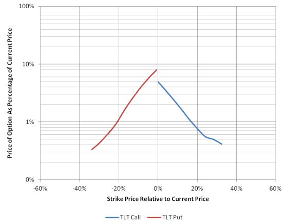
For Treasury bonds, there is modest evidence of a relative increase in the cost of puts as the strike price declines, as evidenced by the slight curvature as the put option price moves to -20% and lower. This slight fat-tail effect occurs because investors are using put options on long Treasury bonds as a hedge against an inflation shock.
Price of Jan 2014 Options on Long-Term Treasury Bonds (TLT)
Summary
Having surveyed option pricing for a range of ETFs, a number of expectations for 2013 have emerged. Here’s what my analysis tells us:
- The options markets foresee no more black-swan loss potential for stocks than we’ve historically come to expect.
- The cost of insurance against major declines is reasonable for Europe, the U.S. and emerging equity markets.
- The cost of insuring against tail risk for EAFE stocks is very similar to that for emerging market stocks, but the potential upside (as estimated by call prices) is considerably greater for emerging markets.
- Expected levels of risk are consistent across asset classes when I compare implied volatility to Monte Carlo projected volatility.
- Gold has a disproportionately low risk of a major decline. (While its overall volatility is consistent with that of stocks, the volatility smile for gold is very flat.)
- Long-term Treasury bonds have a modest fat tail, consistent with investors using deeply out-of-the-money put options to protect against interest rate increases.
- Expected risk across major asset classes is somewhat higher than what we have experienced in the last three years, but not dramatically so.
- The maximum loss potential associated with the asset classes examined here is consistent with the magnitude of losses investors experienced in 2008.
Options prices in 2007 accurately predicted that volatility was likely to increase dramatically. After the crash, in late 2008, options prices predicted that volatility on many assets was far too high and would decline. Both predictions were spot-on. Today, options prices on core asset classes indicate that the risk levels that we have seen over the past three years are approximately what we can expect for 2013.
Similarly, we can expect normal levels of volatility for equities, REITs, gold, and bonds, and the options markets are putting a low probability on extreme downside events for 2013, which bodes well for investors.
Those who disagree with this sanguine outlook, however, can purchase downside protection quite cheaply.
Appendix A: Predicting asset class volatility for 2010-2012
In my book, Survival Guide for a Post-Pension World, I provided a table (on page 78) that included implied volatility for a series of core asset classes, along with my QPP-projected volatilities. As in the examples provided in this article, I calibrated QPP’s expected volatility for the S&P 500 to the implied volatility of the S&P 500. The volatilities of other asset classes were then projected based off of the S&P 500 expectation. The table below compares the projections from the end of 2009 to the realized volatility for each of these asset classes for the subsequent 3-year period, 2010-2012.
Comparing projected volatility to realized volatility over the past three years
|
Asset Class
|
Ticker
|
Projected From Dec 2009
|
3-Year Annualized Volatility Through Dec 2012
|
|
Monte Carlo Projected Volatility
|
Implied Volatility for Long-Dated Options
|
|
Intermediate Gov't Bonds
|
IEF
|
9%
|
10%
|
6%
|
|
Long-Term Gov't Bonds
|
TLT
|
18%
|
18%
|
15%
|
|
S&P500
|
SPY
|
22%
|
22%
|
15%
|
|
NASDAQ
|
QQQ
|
26%
|
22%
|
18%
|
|
EAFE
|
EFA
|
26%
|
25%
|
20%
|
|
Russell 2000
|
IWM
|
25%
|
25%
|
21%
|
|
Gold
|
GLD
|
24%
|
28%
|
19%
|
|
MSCI Emerging Mkts
|
EEM
|
35%
|
30%
|
24%
|
The Monte Carlo projected volatility and the implied volatility agreed very closely. When these projections were made, using data through the end of 2009, the implied volatility for the S&P500 was somewhat higher than it is today. Overall market volatility has subsided considerably since the end of 2009, and the options markets were not anticipating this level of stabilization, so the projected volatilities and implied volatilities are uniformly higher than the realized volatilities.
Geoff Considine is founder of Quantext and the developer of Quantext Portfolio Planner, a portfolio management tool. More information is available at www.quantext.com.
Geoff’s firm, Quantext is a strategic adviser to Folio Investing. (www.folioinvesting.com), an innovative brokerage firm specializing in offering and trading portfolios for advisors and individual investors.
Read more articles by Geoff Considine