Despite constant admonitions against using historical performance as a guide to future returns, advisors routinely construct portfolios based on the track records of the underlying funds, with predictably spotty results. Such ineffective measures are pervasive. Someday, the advisors of the future will look back at the measures that that we’re using today to evaluate investments and regard us like we would the Saxon architects of the 1100s, who defined a “yard” as the precise distance from the tip of English King Henry I’s nose to the end of his outstretched thumb.
Take the concept of beta, for example. You know what beta is; it measures an investment’s volatility (absurdly, down to two decimal places) against that of some benchmark index. Chances are you think twice about putting client money in a mutual fund with a beta of 1.3 or more. More recently, sophisticated portfolio managers have started creating a “risk budget” for client portfolios, using beta as their measuring tool.
Most of us use the same yardstick, applied somewhat differently, to compare individual funds’ track records to market returns. How often have you looked at a graph of a fund’s performance vs. the S&P 500 over different time periods?
This may produce meaningful results for funds that closely track indices (meaning they have a high R-squared), but of course the most interesting funds are run more creatively. Do you really want to pay a management fee based on the entire fund portfolio when only a small part of it is actually deviating from the market? And if you’re investing a fund whose research staff is actively managing the entire portfolio, what confidence do you have that you’re actually looking at an extraordinary track record? Morningstar’s Don Phillips has memorably remarked that the best way to beat an index over the long term is to invest in things other than what the index is holding.
Meanwhile, using tools he co-developed with the Nobel-prize winning economist Bill Sharpe, one advisor – whose approach I’m about to describe – has found that he can reliably outperform an appropriate benchmark. His work proves it is possible to build a portfolio knowledgably. You just need the right tools to get the job done; the 21st century equivalent of yardsticks based on royal anatomy won’t cut it.
Next-generation style analysis
Gary Miller, founder and chief investment officer of Frontier Asset Management, LLC, in Sheridan, WY, has spent the last 25 years looking for ways to lend precision to the nose-to-thumb yardsticks to which we’ve all grown accustomed. His alternative is something called “style analysis,” sometimes also called “factor analysis.”
Style analysis is fairly simple in theory. You take the weekly or monthly returns of a fund portfolio, then you run a regression analysis on many different mixes of investment indices over the past three years, until you find the blend that best matches the portfolio’s results. Doing so allowed Miller to shine an X-ray through the veil of secrecy that surrounds funds, which only report their holdings quarterly, and it gave him a pretty good approximation of the asset mix in a fund portfolio. Instead of comparing a fund manager to “the market,” he could now compare a manager’s track record to the index returns of the actual asset mix that the manager was investing in – and tease out an alpha factor that measured skill in stock selection. Was the fund manager consistently investing in stocks that beat this customized benchmark, or not?
Of course, this calibration mechanism had to be refined over the ensuing decades. Any regression analysis relies on data from today, yesterday, the day before, six months ago and three years before that. So if the manager moved out of government bonds in 2009, factor analysis will still contain their echoes in the data. In other words, there may be ghostly images on that x-ray that simply aren’t relevant. Miller has added algorithms that give more weight to recent data and less to longer-ago signals, and he has also calculated the R-squared on the performance vs. customized benchmark, which tells him whether he’s looking at precision or noise.
The earliest versions of style analysis delivered a lot of “false positives” – that is, the best fit regression might include a percentage allocation to government bonds when, in fact, the manager in question had never invested in government bonds during his entire career. The false positive might come from any number of sources; a large holding in a stock that behaves differently from the market (and may actually be sensitive to changes in bond rates), for example, or a temporary similarity in the return patterns of two or more investment categories. (The last three months of 2008, when everything was in free fall, is a particularly stark recent example.)
Miller says that he now “cheats” – he looks at each fund’s quarterly portfolio disclosures and constrains the model by leaving out asset classes that the manager doesn’t own. He also looks at regressions over different time periods, to weed out the false positives that appear and then vanish when certain assets are moving in tandem.
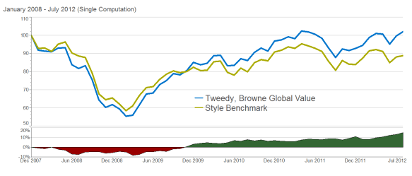
How does this work in the real world? Let’s look at the Tweedy Browne Global Value Fund, which most of us would agree has been an extraordinarily good investment in recent years – the recent unpleasantness in Europe notwithstanding. Below is a look at the fund’s performance from January 2008 through July 2012, compared with “the market” – in this case, the MSCI EAFE Value index.
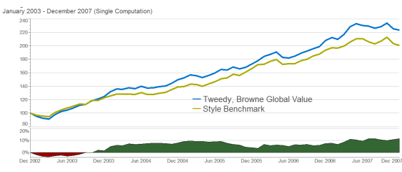
If you were fortunate enough to identify this fund before 2008, you would have (to use an imprecise standard that King Henry might have appreciated) “beaten the market.” But would you have picked this fund out of the myriad of alternatives? Below is the fund’s performance, using the same crude comparison with “the market” over the previous five years, from January 2003 through the end of December 2007.
During that prior time period, the fund didn’t exactly look like a world-beater, based on conventional nose-to-thumb yardsticks. Chances are, looking at this track record, you don’t see any hint of the fund’s soon-to-be-outstanding performance.
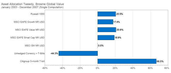
Using the more precise instruments of style analysis, however, that earlier five-year track record can be compared with something much closer to the actual investment mix that the fund was holding – which Miller calculates in the chart below. The bottom two bars together signify the degree to which the portfolio was hedged against currency fluctuation; add the two together and you end up with a net long position in cash, which rounds out the holdings.
The important thing to notice is that the fund held a very different asset mix from the index that our traditional “market” yardstick used.
When Miller compares Tweedy Brown Global Value’s 2003 through 2007 returns with the actual investment mix it was holding, a somewhat different picture comes into focus: consistent (though not dramatic) outperformance through virtually the entire period. What a different view of its track record!
Below is the asset mix that Miller’s style analysis measurement identified for the subsequent five years, when the fund was kicking the tar out of the EAFE value index.
Comparing the fund’s performance with its customized benchmark since January 2008 shows a more modest outperformance than the crude measure of its eye-popping success against “the market,” most of which apparently owes simply to a willingness to ride out the downturn and capture the recovery.
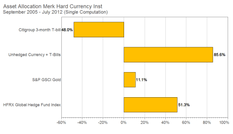
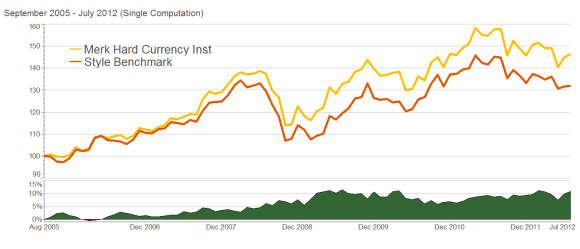
The more precise tool is especially helpful when you’re trying to evaluate a fund that isn’t comparable to any particular benchmark – and, of course, the market has been flooded with these “nontraditional asset class” or “noncorrelated asset” funds since 2008. Against what yardstick do you measure these managers? By way of example, Miller offers a quick look at the Merk Hard Currency fund set against its customized benchmark, and here too you can see evidence of managerial talent that might have been invisible to more traditional metrics.
These graphs are, themselves, a crude representation of an even more precise tool. Instead of performing a style analysis once and then looking at track record vs. customized benchmark, Miller actually recalculates and recalibrates each fund’s customized benchmark on a regular basis, in order to account for any asset allocation changes the manager makes as he or she navigates the markets.
Practical applications of correlation coefficients
Let’s turn our attention to another primitive measurement tool that Miller is trying to improve on: the correlation coefficient, which is getting a lot of attention these days. You almost certainly know what we’re talking about: a statistical comparison of one investment’s return pattern compared with another’s, on a scale of 1 (perfect correlation) to 0 (no visible correlation) to -1 (perfect inverse correlation).
What’s crude about that? I actually think that correlation coefficients will eventually be regarded as more primitive than the beta or performance measurements against “the market” – more like what came even before the Saxon “yard” was “standardized” by the length of King Henry’s arm. At that time, before about 1130 AD, architects building castles in England and Normandy used a unit defined by the length of the sash that was tied loosely around the waist of the nearest Saxon noble. (Since Saxon nobles enjoyed varying degrees of corpulence, so, too, the measurement of a yard ballooned and contracted.)
Today, we measure the correlation between investments by a single number, generally based on the past three years of data. But during that time, there will have been almost as many minor fluctuations – and some major ones – in the relationship between the returns of the two investments in question as there are trading days. Some advisors – notably Michael Kitces of Pinnacle Advisory Group in Columbia, MD, and Jerry Miccolis of Brinton Eaton Wealth Advisors in Madison, NJ – have proposed that we make this measuring stick incrementally more precise by using two or perhaps even three correlation coefficients, depending on the market regime. We assume a higher correlation coefficient when the VIX is bouncing around like the EKG of a heart attack victim (think late 2008) and a lower one under more normal market conditions. But this is hardly a dramatic improvement in precision or utility.
Correlation coefficients are typically used to draw an efficient frontier. But each decade’s efficient frontier, with the benefit of hindsight, turns out to be very different from the previous one’s, or the next – and if you divided the research into individual years, or months, you would find much greater variability.
Finally, we measure correlations on an asset class level, rather than between the individual investments you actually use – for obvious reasons. Calculating the long-term relationship between return patterns is hard enough for ten or a dozen indices. It is astronomically difficult to calculate these relationships for more volatile individual funds or securities – and it is astronomically harder still to calculate what would be truly useful: the overall correlation patterns among 15-30 different individual mutual funds that you are considering for an investment portfolio (or 50-100 individual stocks and bonds), and how these differ from the 15 or 20 or 100 or 1,000 other possible portfolio mixes you might be considering.
As Miller was considering the challenge of fashioning a more precise correlation tool, he realized that much of the value to be found in non-correlated investments arises at the micro level. Individual funds may exhibit very different return behaviors compared with other individual funds because, in addition to the different behaviors of the different underlying allocations, the behaviors of the managers will be different. Some managers will stay the course, while others will adjust their allocations in light of shifting economic conditions.
To be truly useful, a proper correlation-measurement tool would need to show you which group of funds (or stocks) works best together in a portfolio through years of shifting, adjusting, dynamic changes in the return pattern relationships. If there is any validity to the Brinson research, then more of the portfolio’s volatility and overall behavior will be determined by how you model the allocation than by the small return differences between funds.
Building a better portfolio through optimization
So where do you get that extra level of precision? Miller’s answer is something he calls a “complementary optimization process.” It starts when you create a target asset allocation mix. For the example here, let’s assume that a very aggressive client’s allocation mix looks like this:
Asset Class |
Index |
Allocation |
US Large Cap |
S&P 500 |
45.00% |
US Small Cap |
Russell 2000 |
15.00% |
Intl Developed Lg St |
MSCI EAFE |
30.00% |
Intl Emerging Mrkts St |
MSCI EM |
10.00% |
Step two is to pick the pool of funds you intend to use. If you divide U.S. Large Cap, U.S. Small Cap and International Large Developed Stock into Growth, Blend, and Value, you get 10 fund categories. In his own office, Miller will have as many as 40 funds to work with, identified using the style analysis tools described earlier. For purposes of this illustration, however, let’s keep things a bit simpler and select the largest Morningstar 5-Star fund in each category, as of December 31, 2007, with at least a ten-year track record. The resulting fund list and allocation looks like this.
Base Model 5‐Star Funds
Category |
Fund |
Ticker |
Allocation |
US Large Growth |
Fidelity Contrafund |
FCNTX |
15.00% |
US Large Blend |
American Fds Fund. Investors A |
ANCFX |
15.00% |
US Large Value |
Dodge & Cox Stock |
DODGX |
15.00% |
US Small Growth |
Baron Growth Retail |
BGRFX |
5.00% |
US Small Blend |
Neuberger Berman Genesis Inv |
NBGNX |
5.00% |
US Small Value |
Allianz NFJ Small Cap Value Instl |
PSVIX |
5.00% |
Intl Large Growth |
Janus Overseas T |
JAOSX |
10.00% |
Intl Large Blend |
American Funds EuroPacific Gr F‐1 |
AEGFX |
10.00% |
Intl Large Value |
Harbor International Instl |
HAINX |
10.00% |
Emerging Markets |
Acadian Emerging Markets Instl |
AEMGX |
10.00% |
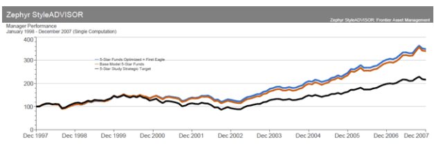
Now let’s imagine that we’re employing complementary optimization in January of 2008, before the downturn. That will mean looking at the overall returns produced by thousands of different combinations of these funds – in the example here, for the period from the beginning of 1998 through 2007 – and seeking out the combination that would have, with the benefit of hindsight, produced the best return. The computer is instructed to look at only those fund combinations that achieve our target asset allocation mix.
Normally, Miller runs this analysis using just over 100 funds that he has identified through the processes mentioned earlier – and the list is different for taxable and qualified clients. To keep this illustration manageable, however, Miller ran a complementary optimization model using the more constrained 5-star fund list, plus one other fund that happened to be on his favored fund list: the First Eagle Global fund. Looking at all the permutations of those 11 funds that produce the pre-specified asset allocation, the winning portfolio, which performed best during the 1998-2007 period, looked like this:
Category |
Fund |
Allocation |
US Large Growth |
Fidelity Contrafund |
6.51% |
US Large Blend |
American Fds Fundamental Investors A |
18.45% |
US Large Value |
Dodge & Cox Stock |
9.17% |
US Small Growth |
Baron Growth Retail |
0.00% |
US Small Value |
Allianz NFJ Small Cap Value Instl |
0.00% |
Intl Large Growth |
Janus Overseas T |
7.64% |
Intl Large Blend |
American Funds EuroPacific Gr F‐1 |
0.45% |
Intl Large Value |
Harbor International Instl |
11.16% |
Emerging Markets |
Acadian Emerging Markets Instl |
4.85% |
World Allocation |
First Eagle Global |
26.33% |
Looking back, this portfolio (blue line) would have achieved a slightly higher return than the base model of the funds (13.31% annualized, vs. 13.01%), with a lower standard deviation (12.69 vs. 14.03).
But of course, that’s hindsight. What did this “optimized” portfolio give us going forward? From January 2008 through September of 2012, you can see the blue line outperforming the asset allocation mix and the base model of 5-star funds.
In calendar year 2008, the target asset allocation mix lost 40.1%, the base model lost 42.6%, and the optimized portfolio that included First Eagle Global only lost 37.8%. The optimized portfolio then beat the target mix again in 2009 (36.5% vs. 33.0%) and in 2010 (16.1% vs. 15.0%).
From the sash around the waist to a blade micrometer
Miller has found that the “winning” portfolio that emerges from this complementary optimization process is never a combination of the highest-returning funds; it is the combination of funds that work the best together through varied market environments. In effect, the winning portfolio represents a triumph of correlation over return: the optimal mix of ever-shifting correlations proves superior to a portfolio made up purely by selecting the best track records. Compared to building a portfolio with an optimizer that uses a single, static set of correlation coefficients, complementary optimization is like advancing from the 12th-century sash around the waist to a 21st-century blade micrometer.
There are more refinements to Miller’s model than it is possible to describe here. As mentioned earlier, he uses a much wider range of funds, which allows him to test out a broader array of possible portfolios. In addition, each month, he looks at whether the portfolio mix should be adjusted, whereas here the graph shows a mix of funds that doesn’t change over 57 months. To gain a bit more precision, Miller's optimization process time-weights the data by 5% a year, meaning that the returns in 2007 are 5% more important than 2006, 2006 is 5% more important than 2005, and so on. Miller also weights the data so that periods where market valuations and interest rates were similar to the present’s will be weighted more heavily. Finally, he also changes his target allocations in real time, based on market conditions.
Astute advisors who have some mathematical and spreadsheet skills can put these more precise instruments to use right now, if they want to. The day is coming when style analysis and complementary optimization instruments will be as commonplace as yardsticks and measuring tapes are today. We can move from sash metrics to King's arm metrics to micrometers just as soon as advisors demand better tools; that, in turn, requires all of us first to look at our investment measures and recognize their dismal imprecision.
If you’re using investment metrics that advisors 30 or 40 years in the future will laugh at, you should at least recognize the joke. You might even petition the king for something better.
Bob Veres’ Inside Information service is the best practice management, marketing, client service resource for financial services professionals. To invest in your practice and professional career, the annual cost is $299 a year with discount code 55DF: www.bobveres.com.
Read more articles by Bob Veres